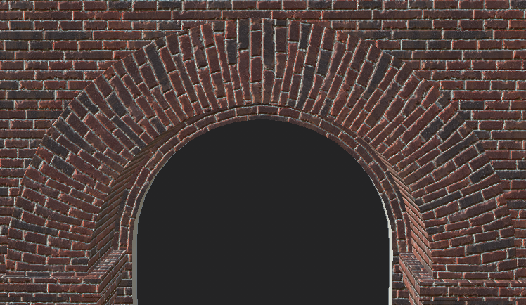
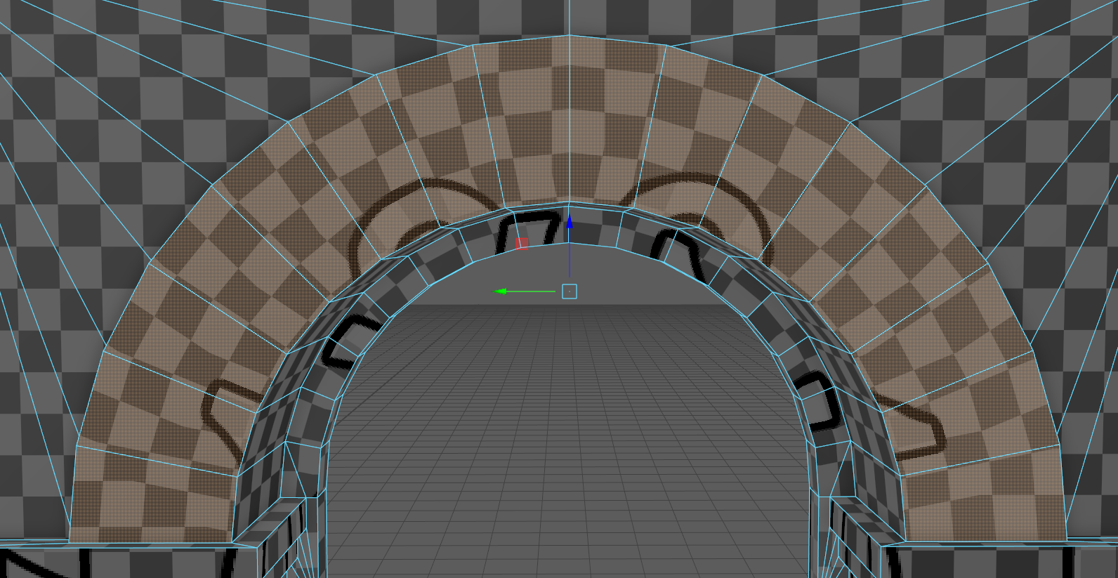
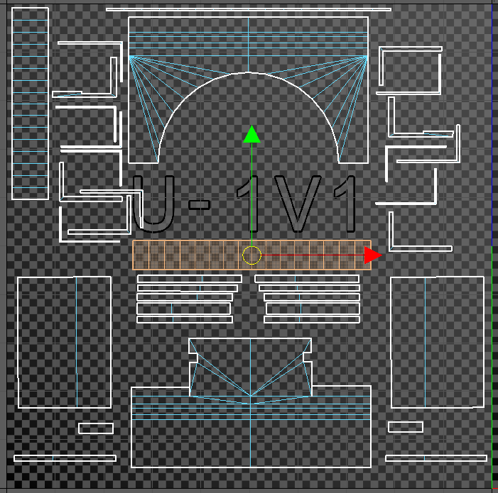
Hi guys, I'm trying to texture a brick arch and I get some bad distortions on my textures. Any clues on how to fix them? My aim is to have the bricks follow the shape of the arch nicely. I'm using Maya 2018. Any help is appreciated! Thanks
just a guess here, but the upper edge of the arch should be a little wider in the UV layout. Grab the UV's on the upper edge and scale outwards in the x slowly, watching viewport results, and see if that helps. could also grab them and use optimize tool, then realign vertically.
I think the problem is that when I select one of the loops and use the straighten UV tool it doesn't keep the correct distance. Notice how the middle ones are straight and the ones on the sides are skewed. They should all be skewed except the center one right? Is there another way to make all the UVs straight but keeping the original distance?
I just tested out and only solution I could get was add one level of smooth. If you can get your hands on some assets like this from professional enviro artist and you see higher amount of geometry for arches that would confirm that it's the probably the best way. I couldn't find a way to take out waviness that low amount of edges, but maybe some experienced enviro guy knows.
you need to do some render to texture jiggery pokery ii'm afraid....
first create a object of a single face of the arch. and add planar map to it, render the template of the uv's out so you have the shape of the segement, Draw/scale the a brick texture in to this so it looks like how you want the final result.
something like this (it's a bit rushed )....
Now create a second map channel on the object (map channel 2 would be cool) add create a square face map [0,0] [0,1][1,0][1,1] as if the arch segement was a perfect rectangular quad. now add the texture you created to a material on the segement. Open render to texture and create a diffuse output with mapping coordinate set to use existing channel and the channel set to 2. press render. You should now have a distorted texture that if place in "rectangular" mapping look undistorted.
the result will look something like this
it looks like shit but it corrects for the distortion
I would like to think that there is a way to do this without so much complications. If i can find a way to align the vertices while retaining the original space between them, that would do the trick.
The distortion comes in with the [automatic] triangulation of the mesh.
You can see in the gif below, the distortion goes one way, until I manually triangulate it the other way, then the distortion changes its angle.
The reason for this is, behind the scenes, all geometry exists as triangles. The wider top of the arch, to the smaller bottom of the arch has a fair bit of spacial distortion, compared to your straight UVs.
When the UVs are figuring out how to apply the texture to the geometry, it's looking at the individual UV's and how they relate to the physical geometry.
Essentially it's calculating distortion based on the faces that make it up. So in this case, where the rectangle is wider on top, the top face is getting distorted bigger (since the top part of the arch is bigger), and the bottom face is getting distorted smaller (since the bottom part of the arch is smaller). And the edge between those two areas is where the transition happens.
The only solution, in this case, is to add more geometry to the arch.
If you cannot add much more geometry you can try this approach, though it is a bit more work and you have to triangulate that part. Distortion is still there but more even and therefore a bit less obvious.
Replies
The vertices get too close. Its not the same relation they had before
If i can find a way to align the vertices while retaining the original space between them, that would do the trick.
The distortion comes in with the [automatic] triangulation of the mesh.
You can see in the gif below, the distortion goes one way, until I manually triangulate it the other way, then the distortion changes its angle.
The reason for this is, behind the scenes, all geometry exists as triangles. The wider top of the arch, to the smaller bottom of the arch has a fair bit of spacial distortion, compared to your straight UVs.
When the UVs are figuring out how to apply the texture to the geometry, it's looking at the individual UV's and how they relate to the physical geometry.
Essentially it's calculating distortion based on the faces that make it up. So in this case, where the rectangle is wider on top, the top face is getting distorted bigger (since the top part of the arch is bigger), and the bottom face is getting distorted smaller (since the bottom part of the arch is smaller). And the edge between those two areas is where the transition happens.
The only solution, in this case, is to add more geometry to the arch.
Distortion is still there but more even and therefore a bit less obvious.