The BRAWL² Tournament Challenge has been announced!
It starts May 12, and ends Oct 17. Let's see what you got!
https://polycount.com/discussion/237047/the-brawl²-tournament
It starts May 12, and ends Oct 17. Let's see what you got!
https://polycount.com/discussion/237047/the-brawl²-tournament
My first 3D project - Prague Metro [UE4] - WIP
Hey! I'm Nick, and I would like to share this with you, looking for feedback and all opinions so I can develop and improve.
I'm quite new to 3D modelling, I've done a few bits and bobs in the past but nothing major, very basic stuff. Like this thing here. Which obviously has many issues.
model
I wanted to get into it more, so I can create my own scenes and environments to use in UE4. I'm a big fan of post-apocalyptic and war-torn places, big fan of Stalker, Metro similar games, so making something gritty, abandoned was a no brainer for me.
I've done some research and decided to make a metro station, inspired by Metro in Prague, Czech Republic. I considered it being quite simple, easy layout... well. I wasn't exactly right
So I started my research, watched quite a few videos and used Google Images to search for references.
This is what my station will be based on


I wasn't sure how should I approach the shape of the wall, should I use just a normal map or actually model the shape? I choose the later, which eventually with some difficulties I managed to pull off.
My workflow was a total mess, I had models all over my viewport and I wasn't really doing well with sizing the items correctly, due to my lack of experience. I've made some improvements though, but it's still not optimal.
I've started using Substance Painter for texturing, which helped a lot as well as some resources from Quixel Megascans. This helped me work towards more realistic looks, as you are able to set a live link directly from UE4 to SP, combining this with Adobe Photoshop turned out to be a very efficient way for me to texture at a decent rate.
Start of the project

A few days later

After another few days of experimenting, learning and fighting with UV's I've had some basic models and textures, which were not perfect.. and still are not perfect, but I was quite happy with the result.. however I felt like it was lacking depth... some realism.. and felt like all the materials looked the same and dull. I tried playing with some lights to see if I can make it look the way I want but the results were mildly disappointing. As you can see here below


At this time I was desperate.. I felt like the task I took was too big for me.. with my lack of level design, texturing, modelling, setting up lighting in UE4

Combination of Bunker assets from UE4 marketplace gave me just temporary satisfaction and left me with a sour taste of defeat in my mouth.

I was gutted that I will never finish this project. I've decided to combine what I've had with some other assets from some kit bought on UE4 store to give it the look I wanted.. but I decided not to give up, not to stop.. not to reuse someone's assets.
Some sleepless nights later, I finally achieved the look I was going for. I reworked some textures, model, did some research and finally managed to make it look the way I wanted to.
Some sleepless nights later, I finally achieved the look I was going for. I reworked some textures, model, did some research and finally managed to make it look the way I wanted to.
Please keep in mind that this is still WIP, I've since reworked some textures and made some decals, so features like graffiti can be added to objects without having them on the texture itself.


With Decals added

Now, I've finally finished the project, waiting for Epic Store approval, this is the final result
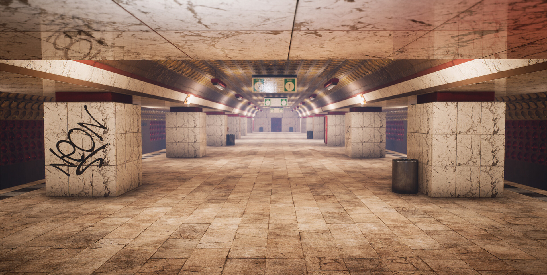
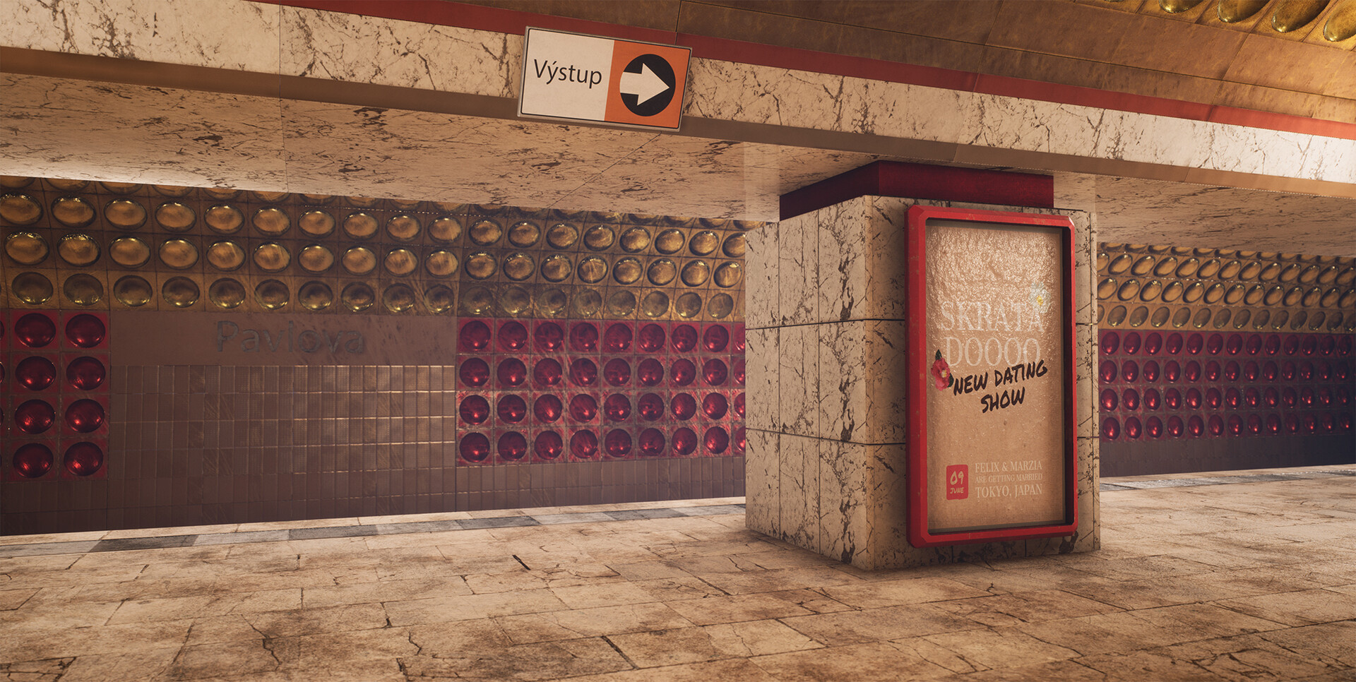
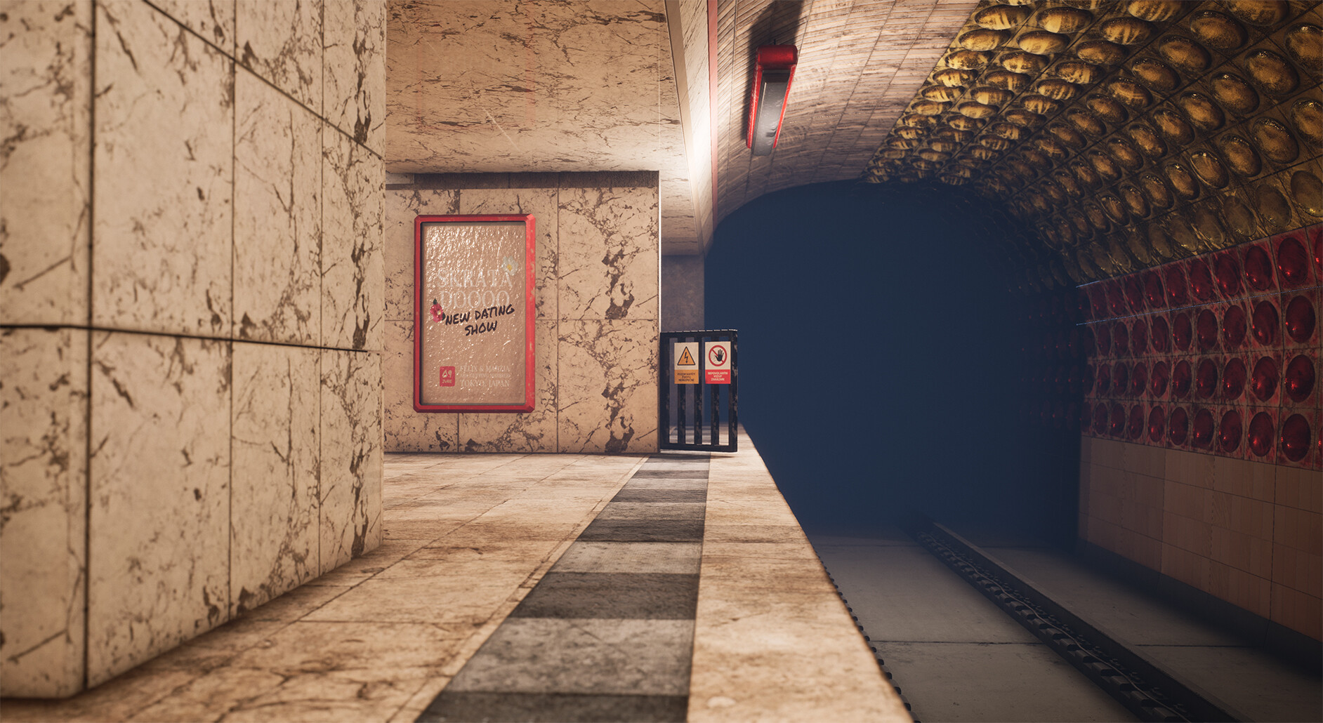
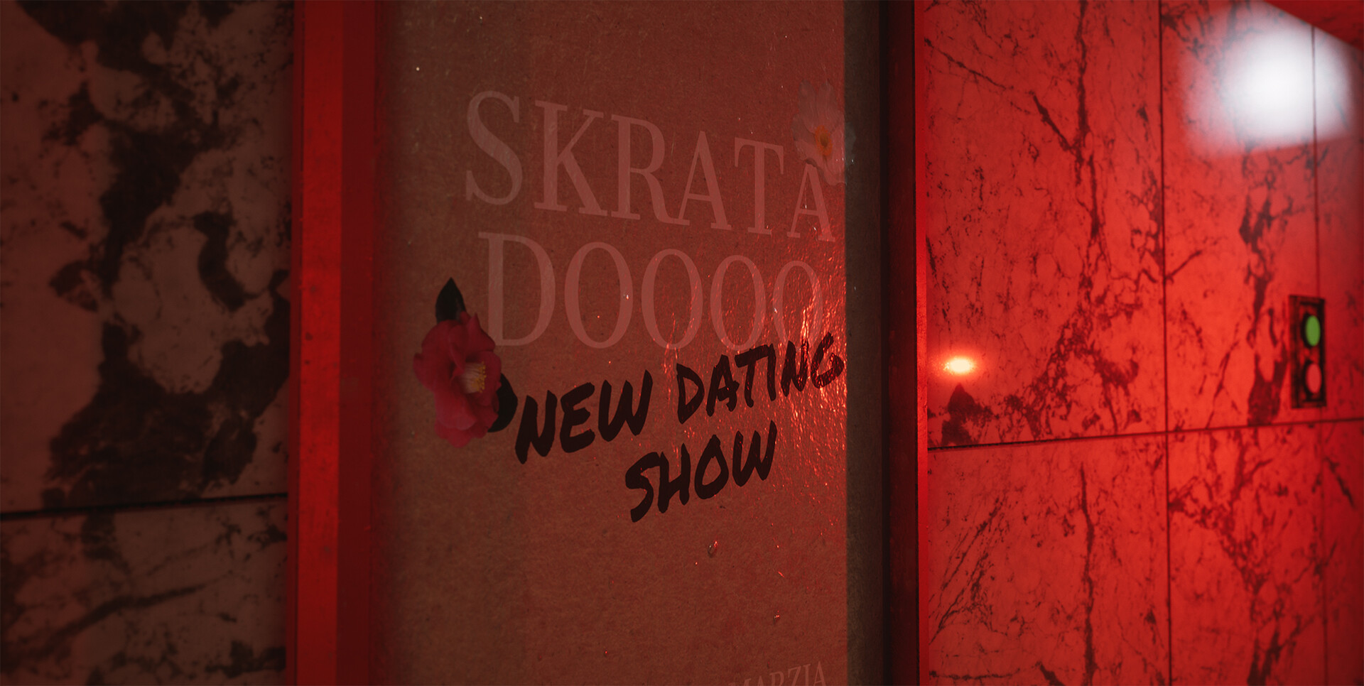
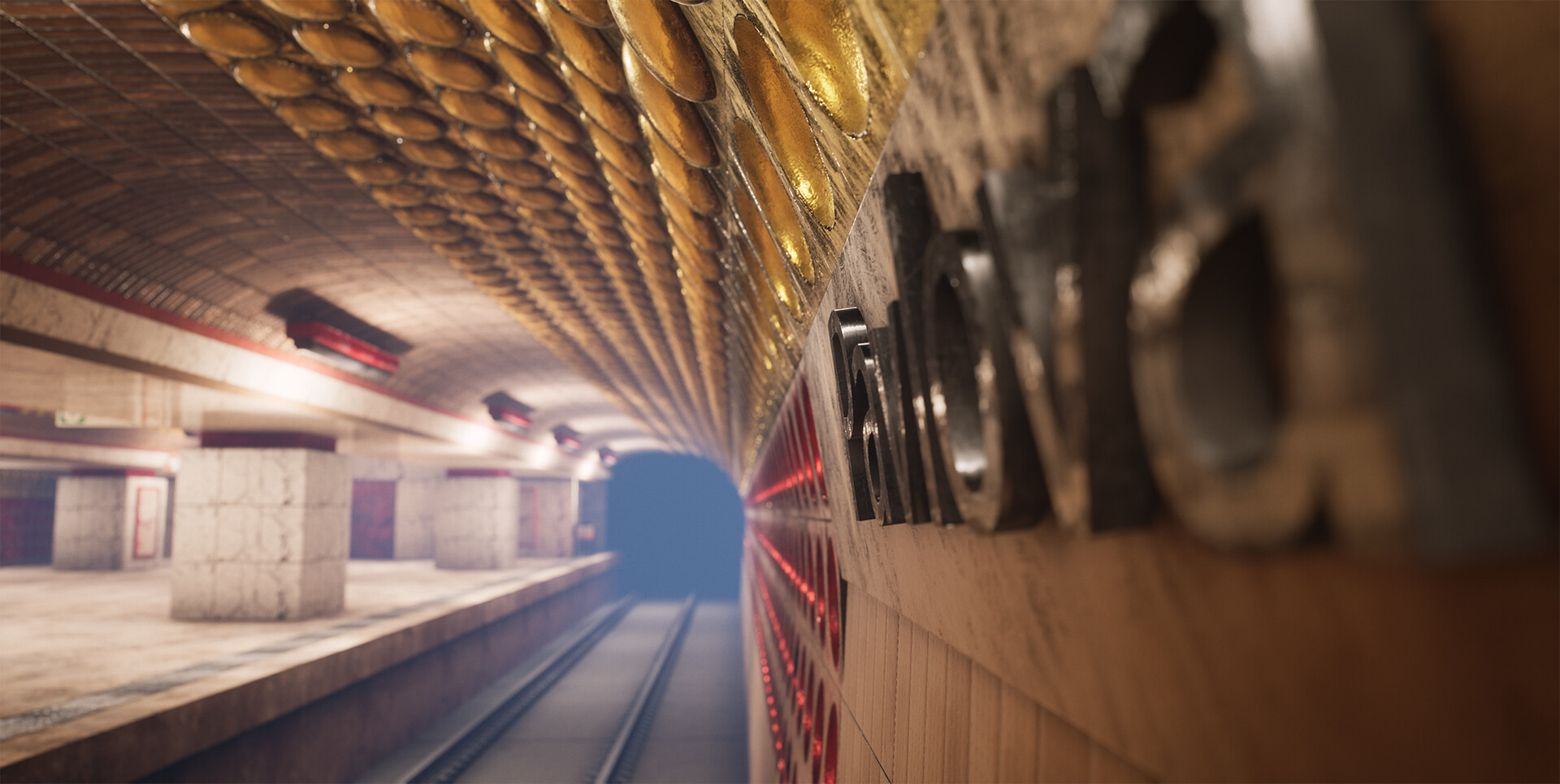
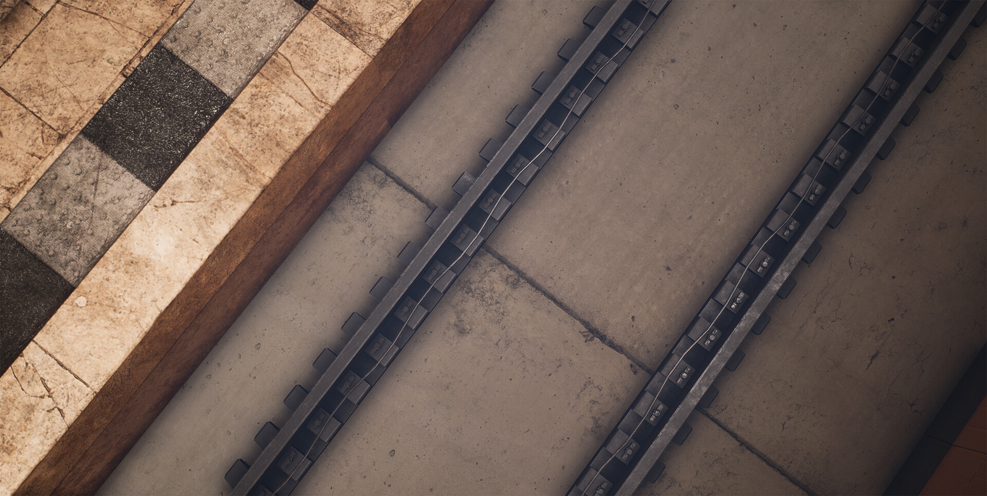
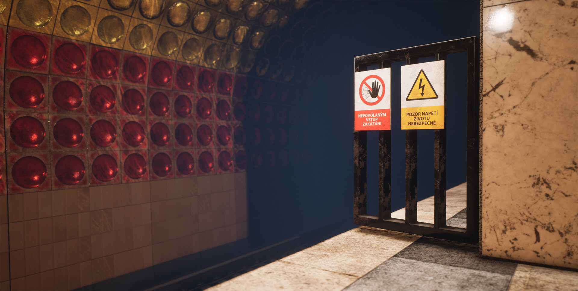
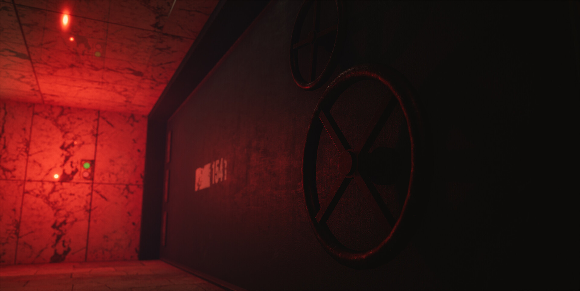
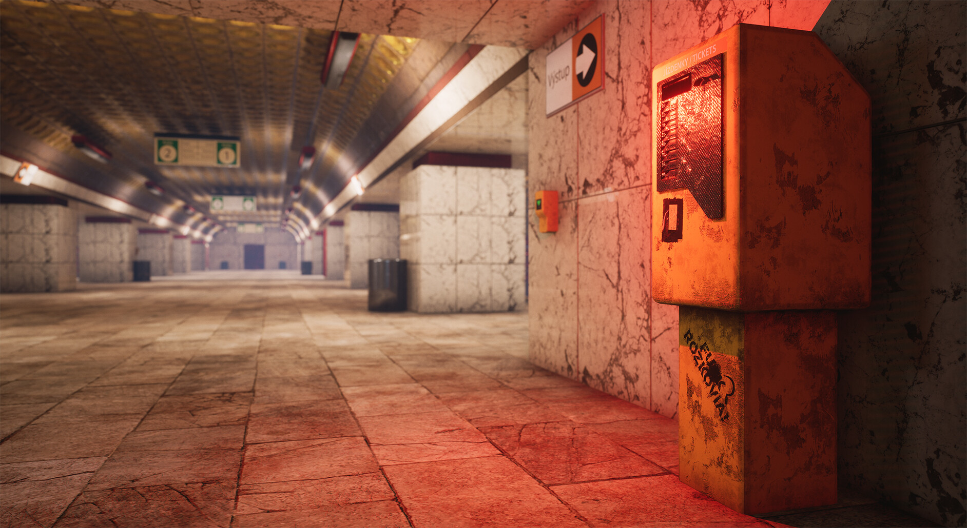
What do you think? What is your optimal way of working on projects like this, what tools and programs do you use? If you could share some thoughts, advice and help I would be very grateful. What other items would you expect to find in an environment like this?
Thank you for your time!
