Home 3D Art Showcase & Critiques

UE4 Environment - Frozen Dystopia in the Forest

polycounter lvl 13
Offline / Send Message
Pdude2K7 polycounter lvl 13
Hey guys,
I've been working on this environment in UE4. It's based on a concept by Ilya Dykov.
The mood I'm going for is morning/mid afternoon, as if you just stumbled upon this dystopian thing in the middle
of the woods.

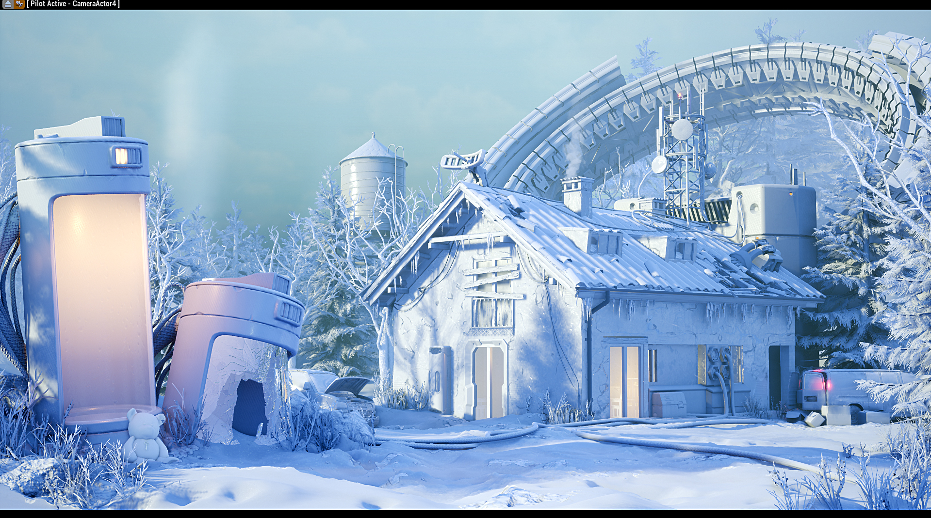
Here's where it currently is:
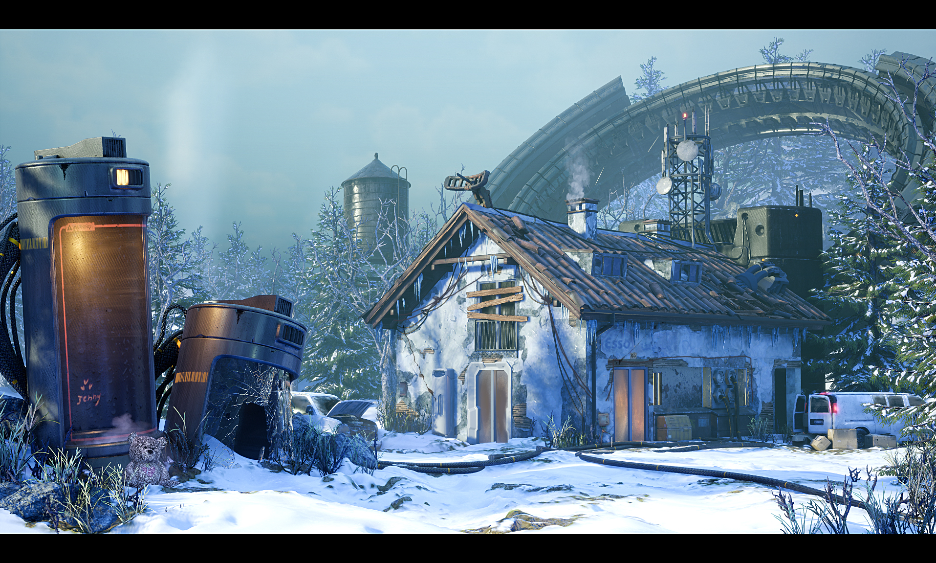

Concept:
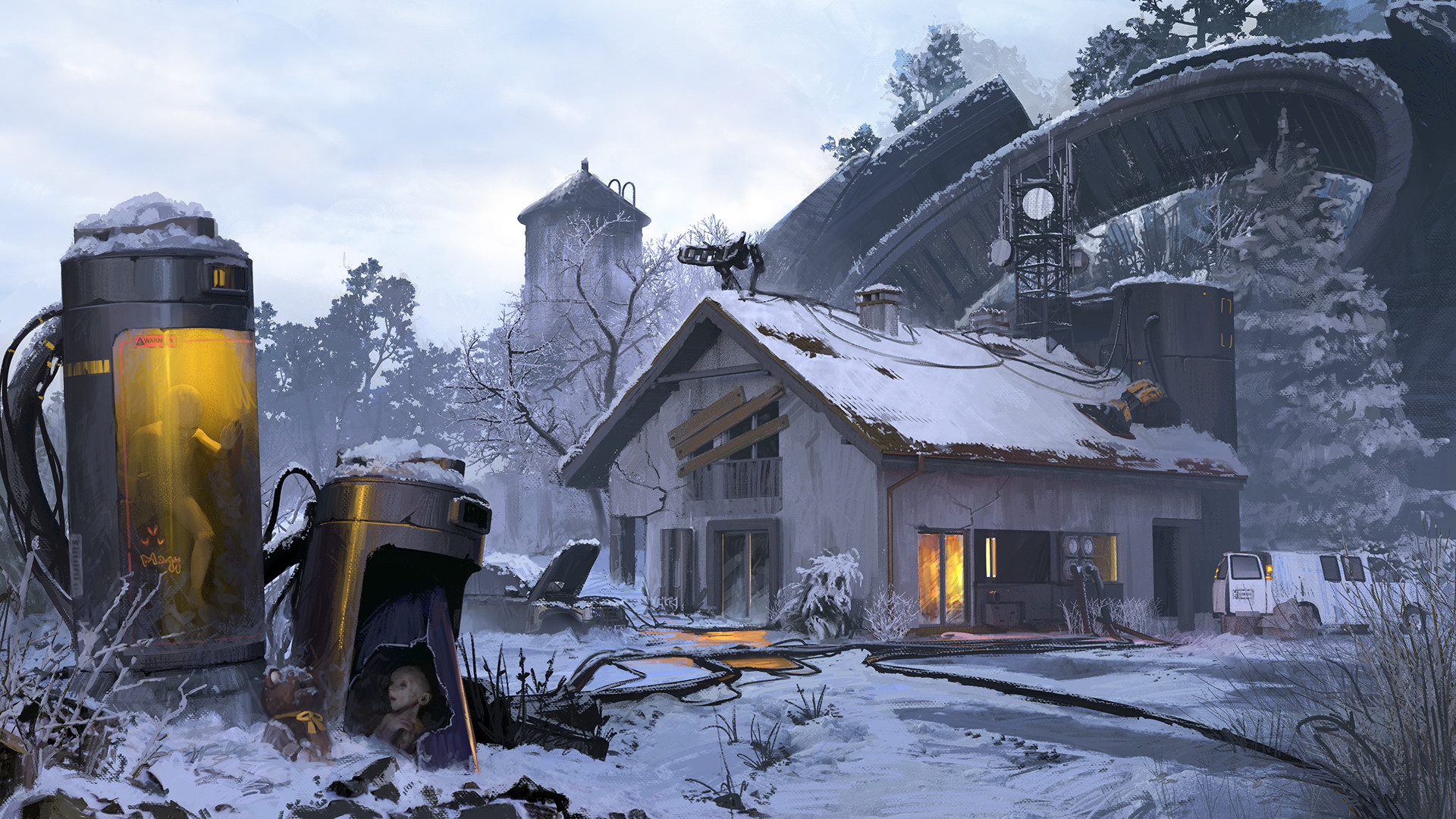

There's still much I need to do but I'd appreciate any and all pointers and comments! Thanks!
Max

Replies

  • Blendermonkey
    Offline / Send Message
    Blendermonkey polycounter lvl 10
    Nice stuff @Pdude2K7
    I like that you went in a more stylized direction rather than photo realistic.
    Overall I think you need to work on your lighting more. The concept indicates that something is going on inside right now, it's connected to the clones, and the person is taking or dropping something off (indicated by the lights on the van and the door). You might not be going for the same story, but the lighting feels too flat without a focus point to me. I would use the light and fog to push the ring more into the distance. Right now it almost looks like part of the house.

    Another thing that I see as a problem is the boarded window. Why and how would someone board it from the outside. It's not even broken. Looks like one of those things added into the design without really thinking it through (like belts and one shoulder armorplates).

    Great work on this. I only gave crits since you asked for some. It's nearly there.
  • Pdude2K7
    Offline / Send Message
    Pdude2K7 polycounter lvl 13
    Thanks a lot @Blendermonkey
    I definitely agree, lighting isnt my strong suit so with this scene I really have to take baby steps and iterate
    to get something that looks good. Right now it does lack focus. I'll try adding a bit more fog and maybe
    use some more light to make it closer to the original.

    Yeah those boards really look a bit odd, I just followed the concept there. I'll rework that entire window thing
    and have it boarded up more like this perhaps:


    Did a quick test in Designer for a door, not really sure if it'll fit but we'll see:


    Again, thanks man! I appreciate the comments.

  • Pdude2K7
    Offline / Send Message
    Pdude2K7 polycounter lvl 13
    Filling in the scene a bit for now :)


    I updated the unreal 4.21 which for some reason broke the displacement on terrain but made the snow blue-er...hmm..
  • Pdude2K7
    Offline / Send Message
    Pdude2K7 polycounter lvl 13
    Another iteration, snow on rocks, new plumbing, decals etc

  • Pdude2K7
    Offline / Send Message
    Pdude2K7 polycounter lvl 13
    Getting a few more minor fixes and some snow before the big changes:

  • CrackRockSteady
    this is coming along nicely, looking forward to seeing more.  I dig the style, at first glance I thought your latest was the concept art. 

    One minor thing bugging me is the texture on the teddy bear, it's very speckly/noisy, looks a bit weird.

    Keep the updates coming :smile:


  • Pdude2K7
    Offline / Send Message
    Pdude2K7 polycounter lvl 13
    Thanks @CrackRockSteady! I decided to go after a more stylized version but still I want to try and maintain
    the lighting that's in the concept. The bear does look noisy, in fact, its so noisy that the key on it's neck is
    virtually invisible :P

    More updates- WIP van retexture:

    And in scene:

    Not too happy with how the texture on the van looks in the scene but it's due to the reflection so donno what I'm
    gonna do about it for now...
  • Pdude2K7
    Offline / Send Message
    Pdude2K7 polycounter lvl 13
    Doing some volumetric fog tests and probably gonna redesign the switchboard area(right now based on a Pray concept):


  • Aydhe
    Offline / Send Message
    Aydhe polycounter lvl 5
    This looks awesome. I would realy love to see more breakdowns for your assets and how you're approaching creation of environment like this.
  • Pdude2K7
    Offline / Send Message
    Pdude2K7 polycounter lvl 13
    Thanks @Aydhe ! There's still a ways to go but I'll definitely break it down once it's finished.

    Been trying some drastic tests for fog and testing direction for new trees, so placeholders for now(Thanks Koola!)

    It's a bit over the top and prototype-y but I'd like to hear which direction is better to go for?

    A:


    B:


  • Ole
    Offline / Send Message
    Ole polycounter lvl 7
    I love this concept and I think you are really nailing it! I would definitely go for option A, since it has more controlled values and looks more painterly overall. When I now see the option B again it seems too noisy. I also like the color palette in option A better.


    Here you can see how the values in option B are all over the place. You could maybe increase the contrast in the FG with the pods a tiny bit to separate it more from the background with the house.

    But overall I think it's really good and I can't wait to see the finished results! :smiley:
  • MorbidPandaUK
    Offline / Send Message
    MorbidPandaUK polycounter lvl 2
    That's looking really impressive! Great work on the textures and giving it a chilly atmosphere.

    I would go with A! It's a bit easier on the eyes.
  • Pdude2K7
    Offline / Send Message
    Pdude2K7 polycounter lvl 13
    Thanks @Ole for the value comparison, it definitely helps making it easier to decide!

    @MorbidPandaUK - Yeah that's definitely what I'm going for, even though I'm a bit torn between
    making it chilly and cold and half life citadel like, or warmer like A currently is....

    Thanks @Optimus :)


    Here's another small incremental update(cables on building, interior lights and a few small things here and there):

    And the lighting only(Terrain bugs out for some reason in this mode):

    I'm thinking about redoing the house and instead of just blending materials as it is now making the whole
    thing in zbrush, it will surely look better close up but I am not sure it'll be worth if for the camera's view...

  • Pdude2K7
    Offline / Send Message
    Pdude2K7 polycounter lvl 13
    Time for another update! Added a whole bunch of stuff as well as wip stuff for now.
    Not too happy about the building concrete redo but for now it should work until I go over it again to
    make more holes in sensible places as opposed to now...


    Let me know if you're got some feedback! :)
  • TheGabmeister
    Offline / Send Message
    TheGabmeister interpolator
    Fantastic work!
  • JesseL
    Offline / Send Message
    JesseL polycounter lvl 5
    Looks fantastic, the color composition looks like it could use some work I did a little bit of filtering to give you an idea of what I have in my head. I would also love to see some of the yellow light from the pod on the left reflect on the ground and irradiate outward. I think the mountains in the background blend a little too much into the sky, I would love to see more of that silhouette but probably not by much more

    Also is it just me or is the car on the right (and left) extremely small


  • Pdude2K7
    Offline / Send Message
    Pdude2K7 polycounter lvl 13
    Thanks TheGabmeister !

    Great notes JesseL -
    I agree with all of them and you're spot on as far as this is where I'd like to go. As far as the color
    balance at the moment, its definitely up in the air and subject to change. I'll go over that when I have most of the props done.

    Fleshing out the scene some more. There's still lots of temp meshes in there but bit by bit I'll go through all of em.
    Trying to keep from spending too much time on each asset and focusing more on the scene and mood.

    Here's some quick shots:


    Any feedback is very welcome! Thanks.

  • Pdude2K7
    Offline / Send Message
    Pdude2K7 polycounter lvl 13
Sign In or Register to comment.