Home 3D Art Showcase & Critiques

Trashboi (WIP Artstation Challenge) [Finished]

interpolator
Offline / Send Message
Johnnynapalmsc interpolator

Link: https://www.artstation.com/contests/nvidia-metropia-2042/challenges/61/submissions/42800

(Will be posting on both forums at the same time most likely)


Description:


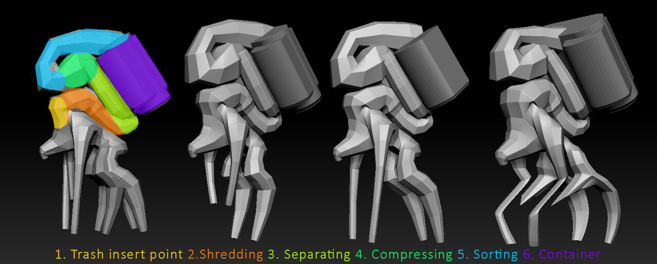
Trashboi collects trash off the road and from small bins. Trashboi puts the trash into his recycling container, the trash is then proccessed by shredding, separating, magnetizing and compressing it. A lot of the processes are on the display for the public to see the recycling process. Trashboi is a highly advanced AI mech whose purpose it is to keep the streets clean. It’s a mobile garbage processing/recycling unit.


Process: Shredding, Separating, Compressing, Sorting, Containing


Shredding: Material gets shredded to leave more manageable material


Separating: Glass, paper, plastic and metal are divided


Compressing: Compresses material into spheres/cubes


Sorting: The compressed material is then separated into metal, plastic and paper again to be contained


Containing: The compressed material is stored in the big container unit on the back


First 30 min blockout ideas:


This is super ugly for now, but just wanted to post something from the earliest stage

Replies

  • Johnnynapalmsc
    Offline / Send Message
    Johnnynapalmsc interpolator

    Dropped it in to Keyshot quickly to see how the light works with the shapes

    Staying loose, having fun blocking in some more big shapes and paneling ideas. Haven't really touched the top part that much. Likely to keep the framing hidden behind the rubber "skin" and only exposing some of joints etc.

  • Johnnynapalmsc
    Offline / Send Message
    Johnnynapalmsc interpolator

    Quickly threw together a few different compositions of the back, seeing what works and what doesn't :)
  • jamecz
    Offline / Send Message
    jamecz polycounter lvl 3
    These shapes are awesome! If you want critique I think number 4 is the best as its the most graphic and its easiest to read at first glance.
  • Johnnynapalmsc
    Offline / Send Message
    Johnnynapalmsc interpolator
    jamecz said:
    These shapes are awesome! If you want critique I think number 4 is the best as its the most graphic and its easiest to read at first glance.
    Thanks for comment, still working out the best one for the back :)

    Had a few hours today to dynamesh the whole thing and experiment a bit further. Still playing around with the design and seeing where I want to take it. The one on the left shouldn't be all black, but didn't have time to paint in paneling for that one :)

  • Johnnynapalmsc
    Offline / Send Message
    Johnnynapalmsc interpolator

    Did a new version of this guy that is more graphical and easy to read. Will most likely go with the middle one in terms of colors, but I also put left and black versions next to it. Let me know what you think!
  • ThePowFin
    Offline / Send Message
    ThePowFin polycounter lvl 5

    Did a new version of this guy that is more graphical and easy to read. Will most likely go with the middle one in terms of colors, but I also put left and black versions next to it. Let me know what you think!
    I like the first one the most. It has a nice ratio with colors of elements where the white is the main shape to keep an eye on readability-wise.

    Second one has so much variation, and the tank makes its color ratio of black and white almost 1-to-1 which makes it maybe a bit less readable.

    The dark one feels a bit heavier but also a tad uniform without much other colors present. It could also be interesting if it had some variating materials and/or maybe some metallic, non-painted detailing going around it, I'm sure.

    Maybe the body of the middle one could also work with first one's tank, as it seems to have some nice extra detailing going on? Either way, I'd maybe ask someone to go with a blend of 1 and 2, with more emphasis on the first one and a bit of added detailing from the second while keeping the value ratio somewhat where it is already on number 1.

    Liking this bot very much by the way, especially the silhouette. Is the green some sort of highly reflective painted metal now, or something that's supposed to be a see-through like material?
  • Johnnynapalmsc
    Offline / Send Message
    Johnnynapalmsc interpolator
    ThePowFin said:

    Did a new version of this guy that is more graphical and easy to read. Will most likely go with the middle one in terms of colors, but I also put left and black versions next to it. Let me know what you think!
    I like the first one the most. It has a nice ratio with colors of elements where the white is the main shape to keep an eye on readability-wise.

    Second one has so much variation, and the tank makes its color ratio of black and white almost 1-to-1 which makes it maybe a bit less readable.

    The dark one feels a bit heavier but also a tad uniform without much other colors present. It could also be interesting if it had some variating materials and/or maybe some metallic, non-painted detailing going around it, I'm sure.

    Maybe the body of the middle one could also work with first one's tank, as it seems to have some nice extra detailing going on? Either way, I'd maybe ask someone to go with a blend of 1 and 2, with more emphasis on the first one and a bit of added detailing from the second while keeping the value ratio somewhat where it is already on number 1.

    Liking this bot very much by the way, especially the silhouette. Is the green some sort of highly reflective painted metal now, or something that's supposed to be a see-through like material?
    Hey man, thanks for the feedback! Some very good points, that I agree with. Was also considering something between the first one and the second one :)
  • Johnnynapalmsc
    Offline / Send Message
    Johnnynapalmsc interpolator
    Unfortunately lost a lot of progress with this guy and ran out of time in the end, but managed to hand something in for the deadline of the Artstation challenge.
    Link: https://www.artstation.com/contests/nvidia-metropia-2042/challenges/61/submissions/42800


Sign In or Register to comment.