Home 3D Art Showcase & Critiques

[Game Environment]: Tropical Subterranean Industry

polycounter lvl 2
Offline / Send Message
Retribution polycounter lvl 2

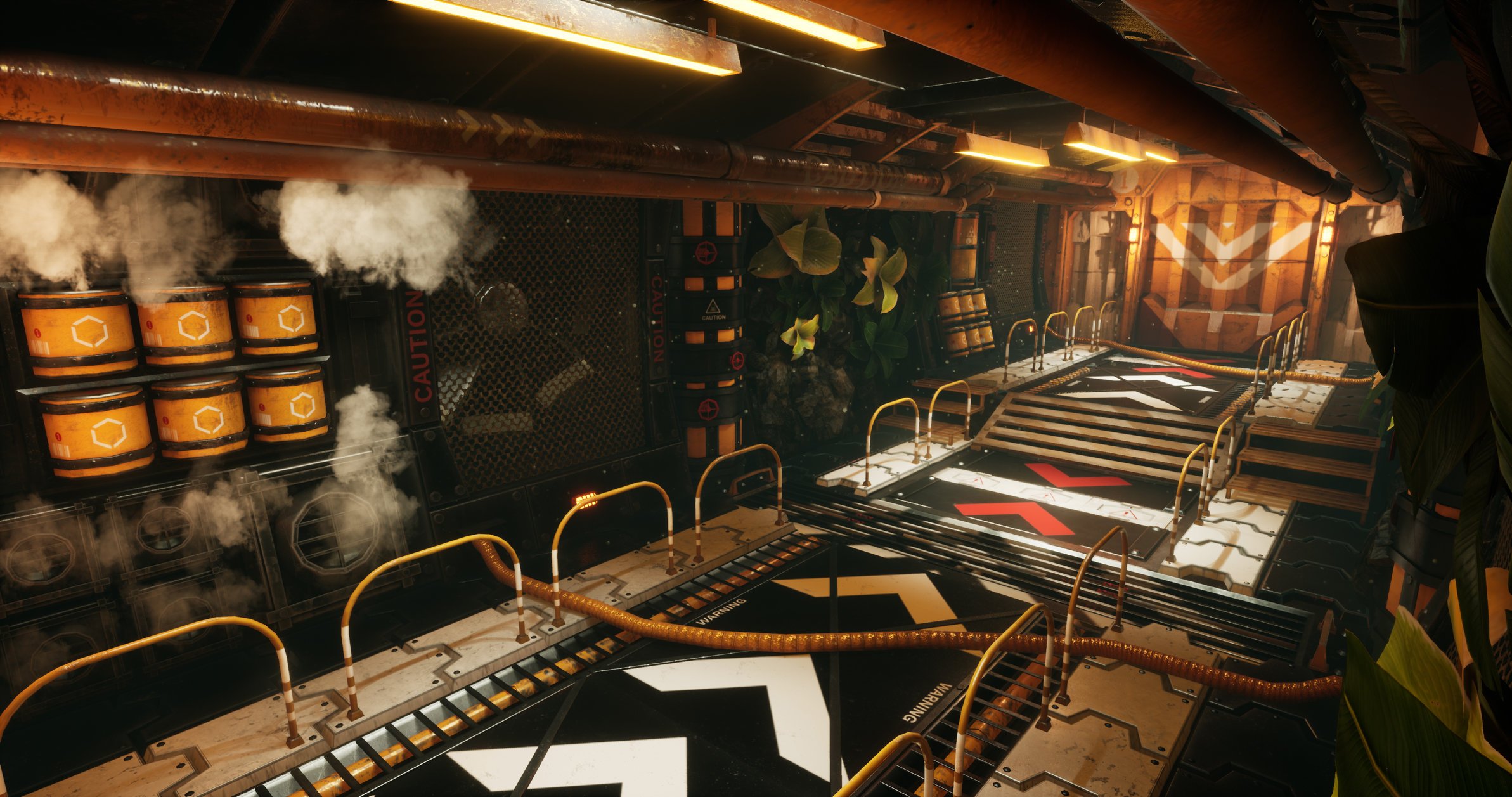
"Tropical Subterranean Industry"

The latest addition to my game environment portfolio! My intent was to create an underground tropical biome, embedded with heavy industrial vibes. I also wanted to introduce bright colours that made the scene pop. This corridor is entirely modular, and you can reduce or add more assets on to the walls as required. Additionally, the walls are all exchangeable with one another. 
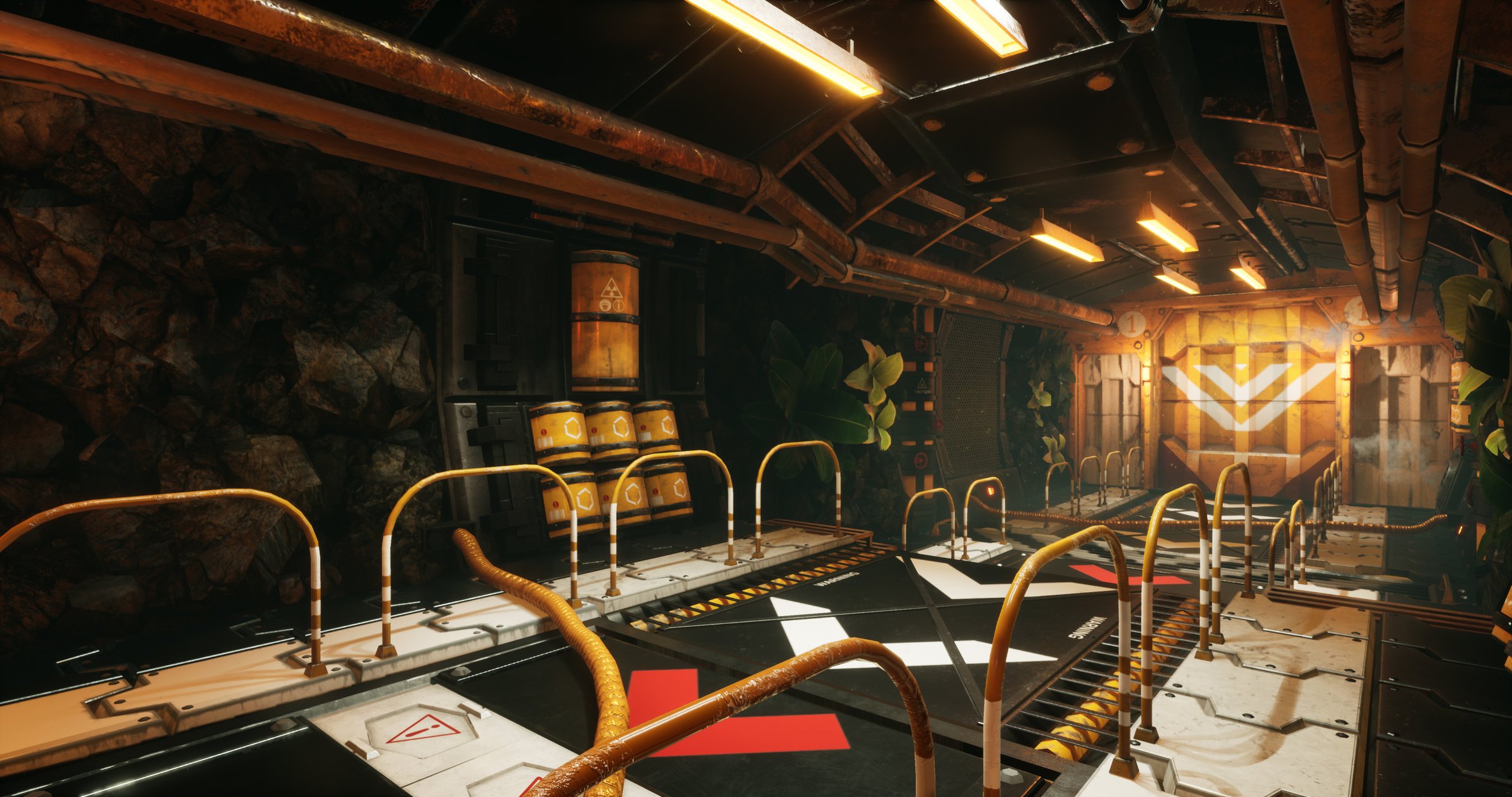

I used Maya to model, Substance Painter for texturing and the scene was built in the Unreal Engine. 

You can check out all the still images on my artstation, including a video fly-through & breakdown of the modular corridor assets:

https://www.artstation.com/artwork/k42Vl2

I would love to hear your thoughts; positive or negative, especially as I'm considering applying to environment artist roles very soon. 

Replies

  • mrgesy
    Offline / Send Message
    mrgesy polycounter lvl 7
    Looks great. I like the color scheme. Although there's something strange with the lighting. There are too many pitch black spots that should at least have a bit of light. Also there seems to be almost no material definition. It's like everything has the same or no roughness values.
  • Retribution
    Offline / Send Message
    Retribution polycounter lvl 2
    That's an interesting observation and a fair comment, I think the dark metal is likely a big reason behind that. This scene was the first time I had used substance painter, converting the textures in to materials for Unreal lost some character along the way. (The metal was a lot brighter in Substance). It's definitely taught me to ensure that if I have dark surfaces, vast roughness variation is very important for light reflections to sell material definition.  

    Thanks for the feedback! 


  • Ashervisalis
    Offline / Send Message
    Ashervisalis grand marshal polycounter
    I would add more geo to the yellow cylinders. Also, those hoses across the path are a massive tripping hazard. They look like they're there permanently, so realistically they'd be built into the floor or go along the ceiling. Other than that, I think you did a cool job!
  • Retribution
    Offline / Send Message
    Retribution polycounter lvl 2
    I think I made the cylinders, with the idea that players would be running by them too quickly to validate many polys, but your probably right - a few extra polys to remove the occasional noticeable hard lines there would of been beneficial. Also, yeah - someone should definitely get in touch with the health & safety department over those damn trip-hazards! :D Thanks for the feedback, Ash. 
  • redhonour
    Offline / Send Message
    redhonour polycounter lvl 8
    Great scene! I like the choice of palette here and the colors feel well balanced. I really like the steamy particles. They're very screenshot-able. I think my favorite materials in the scene are the pipes on the ceiling. You can clearly see some definition on those pieces where the grime covers the cleaner pipes.

    For my 2 cents, I think revisiting your values and another lighting pass would greatly improve the readability of the scene. The walkway in particular is very high contrast and my eye is drawn back to it constantly. The arrow decals read just as brightly as your emissives and particles.

    Thank you for posting this! There's a lot of potential here!

  • Retribution
    Offline / Send Message
    Retribution polycounter lvl 2
    Thank you for the feedback & high praise, indeed, Red! I appreciate what you're saying, I'm currently working on another project (mainly organic, this time) but I have a feeling I may have to re-visit those aforementioned material values, to see if I can take the scene any further at a later time. :-) 
Sign In or Register to comment.