Design critique needed on a fighting game character!
Hello Polycount,
I'm working on a character for my game.
It's also going to serve as a main piece in my portfolio so I need it to be as good as possible.
Lore
The initial description I gave him was a werewolf samurai in a Sci-Fi theme. He ended up being more an upright wolf than werewolf. His entire race has been enslaved by another race that see science almost like a religion. The scientist race used his race as lab rats. So all sorts of torturous experiments were done on him. The last experiment they did on him was to convert his body into a powerful energy source for whatever tech that was implanted or used by him, like his jetpack, bionic arm, sword and throwing knives. The experiment worked so well that he was able to use that new found energy to break free.
Every character in the game is also infested with a bloodstone that gives them powers and makes them immortal. The stones fuse with the characters in different locations, in his case it could be the eye.
Design restrictions
He needs to be able to fly. Every character can fly and this needs to be somehow explained in the design.
He needs the bloodstone fused somewhere on his body.
Most interesting stuff should happen on right side as that's the side that is facing the camera.
Current state

This is what the character looks like currently still in a work in progress state. The fur planes are especially temp in this picture.
Problems I see with the current state of the model.
Problems I see with the current state of the model.
- He lacks personality.
- He is too symmetrical.
- His story is not shown through his design.
- The game is Sci-Fi themed and he lacks more Sci-Fi elements.
- He is too groomed/clean to look at, doesn't give me that slave vibe.
- No clear design focus point.
- Bloodstone looks ugly and is dominating the attention to his chest which is not interesting.
- Glove things look dorky and feel like useless detail.
- Proportions/silhouette need more appeal.
- Needs a more interesting color scheme.
- Jet pack design is not that great looking.
Redesigns


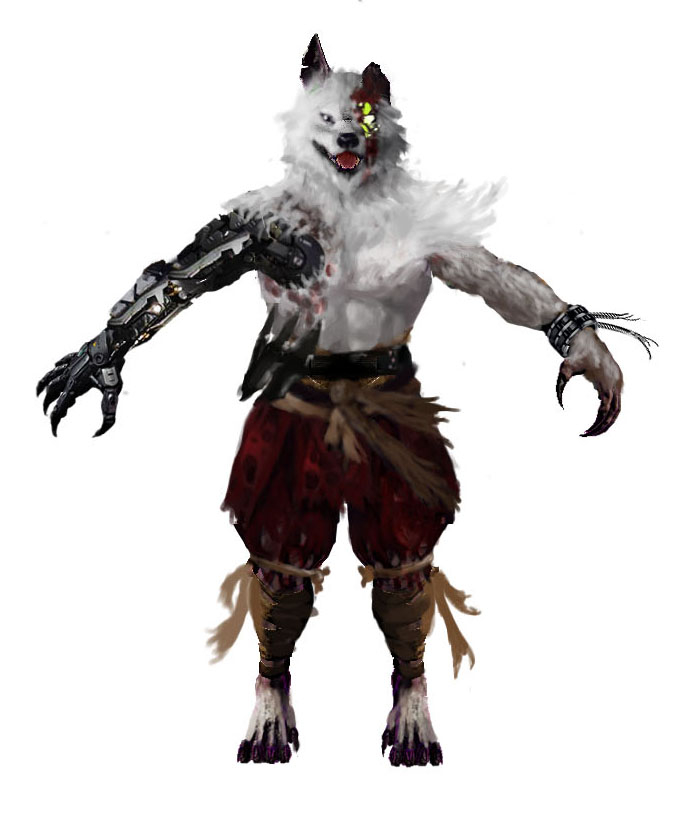
These are 2 rough Photoshop redesigns I am considering where I tried to combat all those problems.
Before I continue to remodeling him, I wan't to be absolutely sure that he is exactly where he needs to be.
Before I continue to remodeling him, I wan't to be absolutely sure that he is exactly where he needs to be.
I personally feel like it's already a huge improvement design wise, although I am torn on whether he should have a bionic arm or not.
So I would appreciate any comment or brutal critique 
Note : The bionic arm is quickly just photo raped into the concept to see if a bionic arm could work, it isn't meant as final design as it's completely stolen :P
I'm also not really interested in modeling critique at the moment, this is purely to get feedback on the concept. I only show the current model to show a reference to the current design.