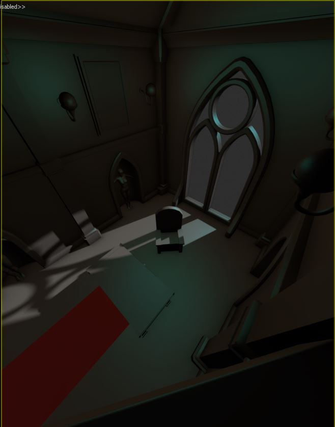
Batman Arkham Inspired Scene (semester exam project)
Hi there,
at my Digital Environment Creation lessons at the Games Academy we got the assignment to create a scene matching one of several games our teacher (Jussi Keteli) gave us and I chose to go with "Batman Arkham Knight".
The goal for this assignment is to create a visual appealing (Focus: Composition) small scene with only a few assets (max. 5 different props and 3 tiling textures, but as much environment geo as we like). The scene should match the chosen games style as good as possible.
I want to take the chance and document the development here and hope that some of you can give me valuable feedback and by this help in completing this task. I plan to update this post on a regular base (1-2 times/week).
The Project
Status:
Concept: Done
Blockout: Done
Prototyping: Ongoing
I took a closer look at Batman Arkham and identified the style as neo-gothic combined with modern architecture of the 19th century (think of the Eifeltower or the Grand Palais in Paris).
After some brainstorming I came up with the idea of a office placed in a church.
The office belongs to some anti-hero version of Bruce Wayne (think of Xanatos from the Gargoyles cartoon).
Since he's always ready to disappear the office will not contain any personal items, instead it's minimalistic and functional. (This will also help me with staying within the limits of this assignment).
Since most of the shots from the Batman Arkham series have also dramatic lights, I decided I want something similar here and went with a big church window as the central point of this composition.
I also wanted to have a very high camera with a wide FoV, like Batman is sitting in the woodwork and is looking down.
I did a first sketch:

(Yeah this is really a rough sketch)
Based on this I blocked out the scene in max to get a better feeling of the perspektive, forms and placements.
I exchanged the round window with a classic church window to make it more prominent.
I also changed the format from square to vertical to give it a comic book cover feeling.

Props:
Church-Window
Desk (WIP)
Chair
Lanterns
Tiling Textures:
Wall
Floor
Carpet
Pillars/trims
I also did a first quick prototype of the desk, but I'm not 100% sure if it fits the Batman Style.

If you already have any feedback or hints how to tackle or improve this project feel free to post here.
at my Digital Environment Creation lessons at the Games Academy we got the assignment to create a scene matching one of several games our teacher (Jussi Keteli) gave us and I chose to go with "Batman Arkham Knight".
The goal for this assignment is to create a visual appealing (Focus: Composition) small scene with only a few assets (max. 5 different props and 3 tiling textures, but as much environment geo as we like). The scene should match the chosen games style as good as possible.
I want to take the chance and document the development here and hope that some of you can give me valuable feedback and by this help in completing this task. I plan to update this post on a regular base (1-2 times/week).
The Project
Status:
Concept: Done
Blockout: Done
Prototyping: Ongoing
I took a closer look at Batman Arkham and identified the style as neo-gothic combined with modern architecture of the 19th century (think of the Eifeltower or the Grand Palais in Paris).
After some brainstorming I came up with the idea of a office placed in a church.
The office belongs to some anti-hero version of Bruce Wayne (think of Xanatos from the Gargoyles cartoon).
Since he's always ready to disappear the office will not contain any personal items, instead it's minimalistic and functional. (This will also help me with staying within the limits of this assignment).
Since most of the shots from the Batman Arkham series have also dramatic lights, I decided I want something similar here and went with a big church window as the central point of this composition.
I also wanted to have a very high camera with a wide FoV, like Batman is sitting in the woodwork and is looking down.
I did a first sketch:

(Yeah this is really a rough sketch)
Based on this I blocked out the scene in max to get a better feeling of the perspektive, forms and placements.
I exchanged the round window with a classic church window to make it more prominent.
I also changed the format from square to vertical to give it a comic book cover feeling.

Props:
Church-Window
Desk (WIP)
Chair
Lanterns
Tiling Textures:
Wall
Floor
Carpet
Pillars/trims
I also did a first quick prototype of the desk, but I'm not 100% sure if it fits the Batman Style.

If you already have any feedback or hints how to tackle or improve this project feel free to post here.

Replies
Having worked on Arkham Knight I hope I can give you some tips!
You identified a key idea we often explored when making the environments. Take a location "X" and combine it with theme/character/environment "Y". Often X and Y were contrasting and it leads to lots of fun little ideas. An example would be the old airships combined with Stagg's modern technology or an abandoned orphanage mixed with Riddlers traps and puzzles.
Keeping the two stories distinct is part of the challenge so that it doesn't all blend. Having a minimal scene will make this a bit more difficult as you will really have to make each piece count. Try to firmly decide which camp each asset belongs. I like your choice of viewpoint, the FOV may be a little wide as some of your assets look a little warped. Dont be afraid to move the camera further back and hide the geo in front of it if you're just going for an image. Dramatic lighting is key, good choice with the window as your key light and try not to mute it too much with the other lights. We usually fall off wiht a nice gradient in light from a bright ground level to dark ceiling area because Batman is a bit self conscious.
Lastly I'd say decide if your anti-hero brought the desk with him or if it's something he re purposed from your Gothic church location - this might give you idea's for the styling. Best of luck
I'm completed the scene layout today.
Next are the tiling textures (floor, wall, carpet and trims) as they make up the biggest part of the scene.
Current status:
I did some small changes and worked on the pillars.
I decided to go with metal bars as main parts of the pillars as reference to the 19th century architecture and to create some conflict in the architecture style (something which I think is present in many of the buildings in Arkham).
The exact camera is still work in progress and will be possible subject to change until all the parts are finished.
But I took this time off to focus on this one and push it as far as I can.
Currently I focus on the window, since this will be the main focus of the whole scene.
I did some changes and detailed the window itself.
Now I have to create the textures for it.
I plan to use a tiling stone brick texture for the flat areas, a one-directional tiling texture for the frame/ trim and a unique one for the window glass and the small insets at the window "corners" and the top.
The column will be textured later, since they will be duplicated along the wall.
The textures for the lamps and pillars are still missing. I also have to correct the UV of the windows.
Also Im currently looking to push it more towards Batman Arkham City by adding more gothic metal parts, but I'm not sure where to put them.
The first idea was to replace the upper wall with a metal grid, but this would also mean that I need to build something behind it...
Unreal Screenshot:
Close-Up of the chair (Substance Painter):
It's still far from finished, but I hope I'm on a good way.
I also did some first tests with the lighting in Unreal, but still have some strange bleeding problems (especially around the window).
model
I plan to add some more clutter and use some old worn textures for wall and floor (maybe also break on of the windows) to show that this is an old, abandon church which was "re-used" as an office by some evil mastermind.
Any feedback, especially on how to make it feel more "Batman" are welcome.
I redid the complete tiling texture, worked some of the feedback I got into the scene and brought it into unreal.
There are still some things missing an the light is just some quick and dirty WIP but I think it's a on a good way.
Next things to add is a big screen to the wall and then some cables.
The desk will also get a new texture and some additional props.
The scene/light setup isn't yet finished and I will definitely have to put some more time into this.
I'm currently working on get the assets done as quickly as possible (including the items on the table^^), so I have then everything in engine and can start the scene set-up. (Deadline is end of February^^).
Removed also the exp. height fog for the moment.
Things to do:
- Update the cables texture
- work on the texture of the screens
- redo the pillars and the pillar/window frame material
Comments and Critcs are welcome (I plan to push it a little further before adding it to my portfolio (https://www.artstation.com/dethling)