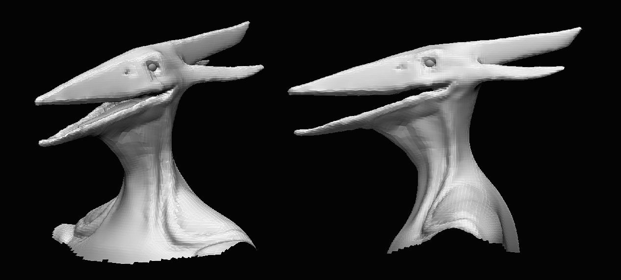
Hey everyone. I wanted to try creating a model in time for an upcoming movie. I've seen other artists do it before and their piece ends up being really popular when the movie is out. I chose Godzilla: King of the Monsters which comes out in May--I figured this was enough time. I'm attempting to create a stylized version of the pterosaur Rodan.
As far as reference goes for the style I want to shoot for, I'm looking at World of War Craft--particularly creatures like this:
I just started on this project a few weeks ago and I have a block out sculpt. Hopefully this is a decent start. I need feedback on forms, proportions, and possibly anatomy. Please let me know what more I can do in this block-out stage and how I can balance the realism of the creature with the stylization I'm going for. Thank you in advanced.
Hey everybody. I know it's still really early on and that there may not be much to say, but I need something to go off for this piece. Again I want to make sure the proportions are in check and that the anatomy looks okay to start out with. Again your feedback is welcome. Thanks in advance
Do some studies of creatures similar to this. Focus on just one thing at a time, like the beak, or the wings. It looks like everything's a bit mushy and doesn't actually sit on a believable bone structure. Once you understand and can show that, then you'll be able to exaggerate the forms and make it more stylized.
Do you think for a stylized creature the proportions are okay? And do you think they capture all of this creature's iconic features (muscular body and legs, exoskeleton back, etc.)?
I think even for the block out you still have a ways to go and more to push on this. Like Gannon says, it doesn't look like it has bones, especially in the torso area. It looks more like it has a beetle body, rather than a bone structure. The back profile is mostly there, the front is off.
For sure. This blockout was really more about proportions, but right now I'm working to flesh out the bone-structure more. For the face I've been looking at the Pteranodon skull and the Pteranodon from Jurassic Park 3. As for the front, I can't find any other pictures of the new Rodon but it looks like his torso is some sort of exoskeleton. One of his most famous features is the spikes on his torso. Of course I'll go over that area too and see how I can make it less beetle-like. Thanks @Skinner3D.
I've done some sculpting and fleshing out on Rodan's body overall. Now I think I have the bone structures and muscle forms I want. I had to make up some anatomy based on the concept and on real pteranodon anatomy--especially on the wings. Please let me know what your opinions are on this block out and how the anatomy can be improved. Thanks in advanced.
Hey everybody. Here's another update. I have the primary forms for Rodan's body blocked out, based on the concept above, and I feel much more satisfied with this overall silhouette and forms. Adding the teeth and spines really added to the Rodan essence. Before I begin on secondary details, I need your feedback once again on anatomy and forms. Please let me know how I can improve on this checkpoint. Thanks in advanced.
I took another look at some of the forms and redid them. Especially the legs and deltoids. I feel now that he's resembling the essence of the concept better. Let me know what you think, and please I cannot move forward without your feedback. Thank you in advance.
Also I've added a front view torso image. Hopefully this helps.
Much improved from last time. The arms still look a bit off though. I think the biceps need to be a little smaller. The concept art shows the neck at a similar diameter to the bicep, for reference.
Hey everyone. I've done a whole lot of work on Rodan since my last update. First, I widened his wingspan by a lot. I wanted to be loyal to his real proportions: 154 ft body height, 871 ft wingspan.
And as you can see I've began secondary details. I had to guess in some parts, like with the back. For the legs I looked at T-Rex legs. I looked at bat wings for the wings. I still feel like I don't exactly have those down. Bats seem to have a forearm similar to ours, and then the rest of the wing ligaments are single bones. I'm trying to achieve that here.
Here is another close up of his face. I also had a little trouble with the deltoids. It looks like all of the vessels curve and connect to the back some how. It was hard not to make it look like a big ovular yarn ball. But I think his face is definitely looking good.
I feel like he's coming along I really do. Please, I really really need your feedback. Thank you in advance.
Hey everybody. I changed the design up a little bit. This is a fusion of the original concept by Sabastian Mora and some design features from a friend. I really liked the idea of going more dragon-like and giving him a manta ray tail. I think now he looks more streamline and fierce. I finished sculpting in the primary muscle forms and fleshed them out. Again, please comment with any feedback you have. Thanks in advance.
That's a good note. One of the things I'm trying to accomplish is "putting skin" on the character after I've blocked out the muscles. Yeah I want to show that I know my anatomy but I don't want him to look like a comic book superhero. But I'm glad the design seems to be working okay. Thanks man!
Hello again! Here is another Rodan update. I fleshed out the rest of his forms and have him textured. I tried to avoid making the textures look too artificial or noisy. Please reply with your feedback as soon as you can. Thanks in advance.
Okay everybody, paint job! The last time I did a creature model the paint job came out too muddy. I want to avoid the same mistakes on Rodan. I charred the wings and tail because I'm planning to have lava dripping from them in the air like he did the trailer. Also I'm a little concerned about the scars. This is why I showed the other side of the head closeup. I didn't want them to fade into the skin texture, but I also didn't want them to look artificially obvious. Please let me know what you think ASAP. Thanks in advance.
I took a step backward and added to the scale details. I hope it doesn't look too chaotic. I wanted to make his skin more tactile and similar to dragon skin. Please let me know what you think as soon as possible. Thanks in advance.
Here's what it looked like previously, for comparison:
Hey everyone. I finally made it to rendering tests in Marmoset. Here some images. Please let me know what you think as far as lighting and rendering and posing. Also, I was going to have lava dripping off of his wings like he does in the movie trailer, but that wasn't really working out. Do you think it is really necessary, and if so do you have any suggestions on how I can make it look good. Please let me know what you think. Thanks in advance!
I'm on final presentation images now. I feel I'm satisfied with the lighting and his pose. But before I go forward and touch up these images, do you have any final feedback about the rendering of this model? Thanks in advance!
Replies
The back profile is mostly there, the front is off.
Also I've added a front view torso image. Hopefully this helps.
And as you can see I've began secondary details. I had to guess in some parts, like with the back. For the legs I looked at T-Rex legs. I looked at bat wings for the wings. I still feel like I don't exactly have those down. Bats seem to have a forearm similar to ours, and then the rest of the wing ligaments are single bones. I'm trying to achieve that here.
Here is another close up of his face. I also had a little trouble with the deltoids. It looks like all of the vessels curve and connect to the back some how. It was hard not to make it look like a big ovular yarn ball. But I think his face is definitely looking good.
I feel like he's coming along I really do. Please, I really really need your feedback. Thank you in advance.
So much of this is gonna be probably the noise and details of the texture.
Maybe there's some medium details in the sculpt that's needed, but obscene muscle fiber definition might be too much.
MAYBE something to do if you're feeling for it. Like a Rob Liefeld superhero drawing.
Here's what it looked like previously, for comparison: