[FINISHED!!!] Bathroom from "The Woman in Black" movie - Environment Scene
Hi! 
-I've recently watched the movie "The Woman in Black" and got inspired by the antique architecture and style of the haunted house, so i started working on my personal environment piece based on the bathroom from the house. I plan to present the whole scene in UE4. Maybe i will finish the whole house with a couple of friends, but for now, the haunted bathroom!
-I've went trough the movie and captured all the frames in the scenes from the bathroom, narrowed them down to 4 and did a breakdown of most of the assets in the scene:


- After that i made a notepad where i extracted all of the assets that are circled out and tried searching the web for references of the exact same objects as i can see them in the frames, this gave me more grey hairs than it should.
-TIP: i would highly recommend checking out and using PureRef for watching and organizing references while working, works wonders!
-These are some references, missing about 30-40 of them in total:

-After that, i went straight to grinding! Decided to first to all the high poly and bakes, after which i would place the assets at the correct positions in UE4, scale and re-do proportions if needed and do the most important thing that i have trouble with - light (ps: if anyone has some good unreal lighting tutorials of the scene this kind, a share would be much appreciated!). After i've figured out all of the above, straight to textures in Substance Painter, while maybe improving my knowledge in Designer by making some tileables like the floor, walls, ceiling etc. (plan to add the wood normal details trough texturing, what do you think about that?). Plan to add the walls, windows, door, ceiling and the rest later on. Personally i think this pipeline would work, but if you have any suggestions don't hesitate to add!
-Note: Modeling and Sculpting done in Blender + ZBrush
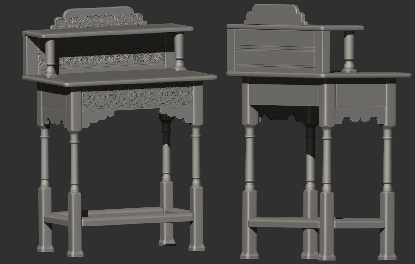
-These are the current sculpts i've manage to finish (along with their bakes in SP), not much left for the objects i've circled out from the scene tho.


-I've recently watched the movie "The Woman in Black" and got inspired by the antique architecture and style of the haunted house, so i started working on my personal environment piece based on the bathroom from the house. I plan to present the whole scene in UE4. Maybe i will finish the whole house with a couple of friends, but for now, the haunted bathroom!
-I've went trough the movie and captured all the frames in the scenes from the bathroom, narrowed them down to 4 and did a breakdown of most of the assets in the scene:


- After that i made a notepad where i extracted all of the assets that are circled out and tried searching the web for references of the exact same objects as i can see them in the frames, this gave me more grey hairs than it should.
-TIP: i would highly recommend checking out and using PureRef for watching and organizing references while working, works wonders!
-These are some references, missing about 30-40 of them in total:

-After that, i went straight to grinding! Decided to first to all the high poly and bakes, after which i would place the assets at the correct positions in UE4, scale and re-do proportions if needed and do the most important thing that i have trouble with - light (ps: if anyone has some good unreal lighting tutorials of the scene this kind, a share would be much appreciated!). After i've figured out all of the above, straight to textures in Substance Painter, while maybe improving my knowledge in Designer by making some tileables like the floor, walls, ceiling etc. (plan to add the wood normal details trough texturing, what do you think about that?). Plan to add the walls, windows, door, ceiling and the rest later on. Personally i think this pipeline would work, but if you have any suggestions don't hesitate to add!
-Note: Modeling and Sculpting done in Blender + ZBrush
-These are the current sculpts i've manage to finish (along with their bakes in SP), not much left for the objects i've circled out from the scene tho.


Replies
-Next: Going to import everything in UE4 and start constructing the scene with lighting and everything else, wish me luck!
One suggestion: Try to introduce some variation in your details. Even though they are ornamental, they might be handcarved and therefore show some little differences. On this one for example: https://us.v-cdn.net/5021068/uploads/editor/8d/kfyobscxjxf7.png
It looks just a little copy and pasted. Small, very subtle differences could add alot.
Looking forward to see your work in Unreal !
Thanks for the comment and suggestion
You've got a point, the variation could really make a difference by looking more natural. For other details and some textures like the wood, i was hoping to do them in SP while texturing and not by adding those details in the sculpt directly, not sure which would produce the better, more believable results tho.
- Baked and placed everything like in the movie scene, in UE4
- Modeled, baked and textured missed parts: walls, ceiling, moldings, wood floor planks, carpet, chandelier holder, door and window
(PS: i am probably going to add more texture detail after i'm happy with the lighting)
- For the moldings i've made an trim texture, so i can easily cut the floor moldings, middle panels and ceiling moldings to my liking
- After i placed all of the above to the correct positions as in the movie night scene, i was a little bit lost with what direction i want the lighting to go to. As it is a night scene and there is no light coming trough anywhere but the fireplace and the candles, it's a bit tricky to get it to look good. These are screenshots with the light coming only trough the fire place, didn't yet place the lights from candles tho.
- Also, i placed 2 SphereReflectionCapture like on the screenshot below, do you think that is correct? I am kind of confused with the results
- The other screenshots are "clay" preview with "Detail Lighting" shader model in UE4. I've turned off the Light Source and left out the SkyLight with a small value so the scene doesn't look really dark
(PS: the lighting isn't build yet)
- What would you suggest me to do with the scene lighting?
- It would be great to get some advice, tutorials or anything helpful that comes to mind
(The night scenes with almost no lighting rather than the fireplace and candles are tricky
- Played with the lighting a bunch. Added candle lights and the light from the wall oil lamps.
-Also, added some fake lighting because the overall scene was very dark.
-Baked everything and played with the PostProcessVolume to get more interesting results
What do you think?
(PS: off to materials for now)
- Textured everything, made fireplace, dust and candle particles, added various decals to aid and make the room more interesting and added some thrilling horror storytelling (i hope) from the actual movie, and some of my own twists (note the window by your own expense
- I had so much ups and downs, change of directions, lighting, color, mood, storytelling etc. etc. with this, and i don't know should i call this one done?
- At this moment C&C and your general thoughts would be greatly appreciated, thank you!
- Which one do you preffer, bluish or reddish?
- What do you think?
Had fun doing this piece, which was a bigger project for me doing everything solo + learning new things in UE4, regarding mostly with lighting. With good planning from the beginning it actually wasn't that frightening.
Gonna be on my artstation soon: https://www.artstation.com/stexara
Still need to film a small walktrough the scene
- These are the final shots i'm going with:
- Clay:
- Room in UE4:
- Materials:
- High poly beauty shots:
Thank you for sticking trough this with me, cheers!
Maybe a simple suggestion for the next environment, try to have a bit of variety of colors in the color scheme (cool vs warm). At one point, the scene was rather reddish. You corrected that with post process, which is awesome
Sort of agree with Natm that the scene feels a little too 1 colour. But for me its due to the room feeling a tad too evenly lit. I think like a just a little bit more contrast would really make the lit areas pop.
Take the above with a pinch of salt as what you have created is far better than anything I can create at the moment. A beautiful environment and for me a level to aspire to reach.
Managed to record and finish the whole video, you can check it here, cheers!!
https://www.youtube.com/watch?v=4WyqH72Cn4s
Also, i've put it on Artstation:
https://www.artstation.com/artwork/kgXNd
Wireframes (forgot to add):
Thanks for bearing trough with me, much love
I think the lighting could use some work however, currently it is not doing justice to the rest of the work in the scene. Do you have reference for the look you are trying to achieve?
Additionally, I think the DoF in the shots does more to obscure your work than it does to add to the overall presentation.
Hey dude, thanks for the comment!
The problem is that there was no lighting reference per say because the movie scene was really dark and not even the fireplace was burnt
As for the DoF i had an expression that it looked more interesting than without it, with the post process particle effects and rest.
Cheers!
For me, the lighting adds a unique quality to the scene. While most horror scenes try to use a really dark atmosphere to convey that suspense, you've opted for a more brightly lit and even warm environment. To me, that contrast itself adds a supernatural characteristic which makes it all the more terrifying. Nice job!