I need an experienced eye to help me understand what I'm seeing here...
Not sure if this is the proper place to post this, but it seemed like a "technique" question, and therefore a "technical" one as well, so here goes:
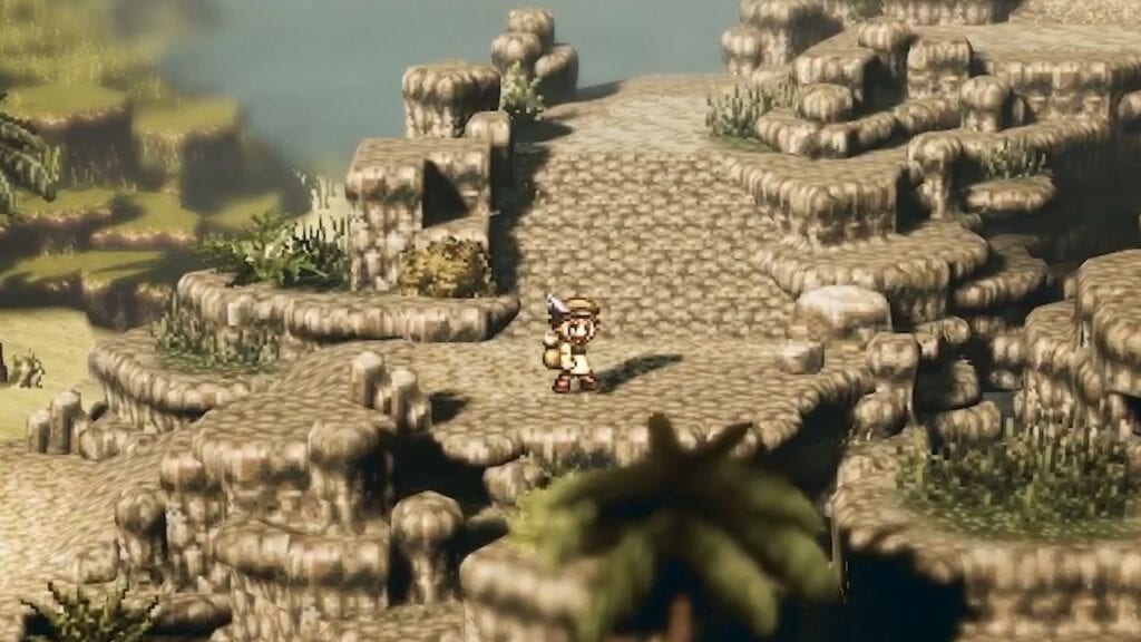
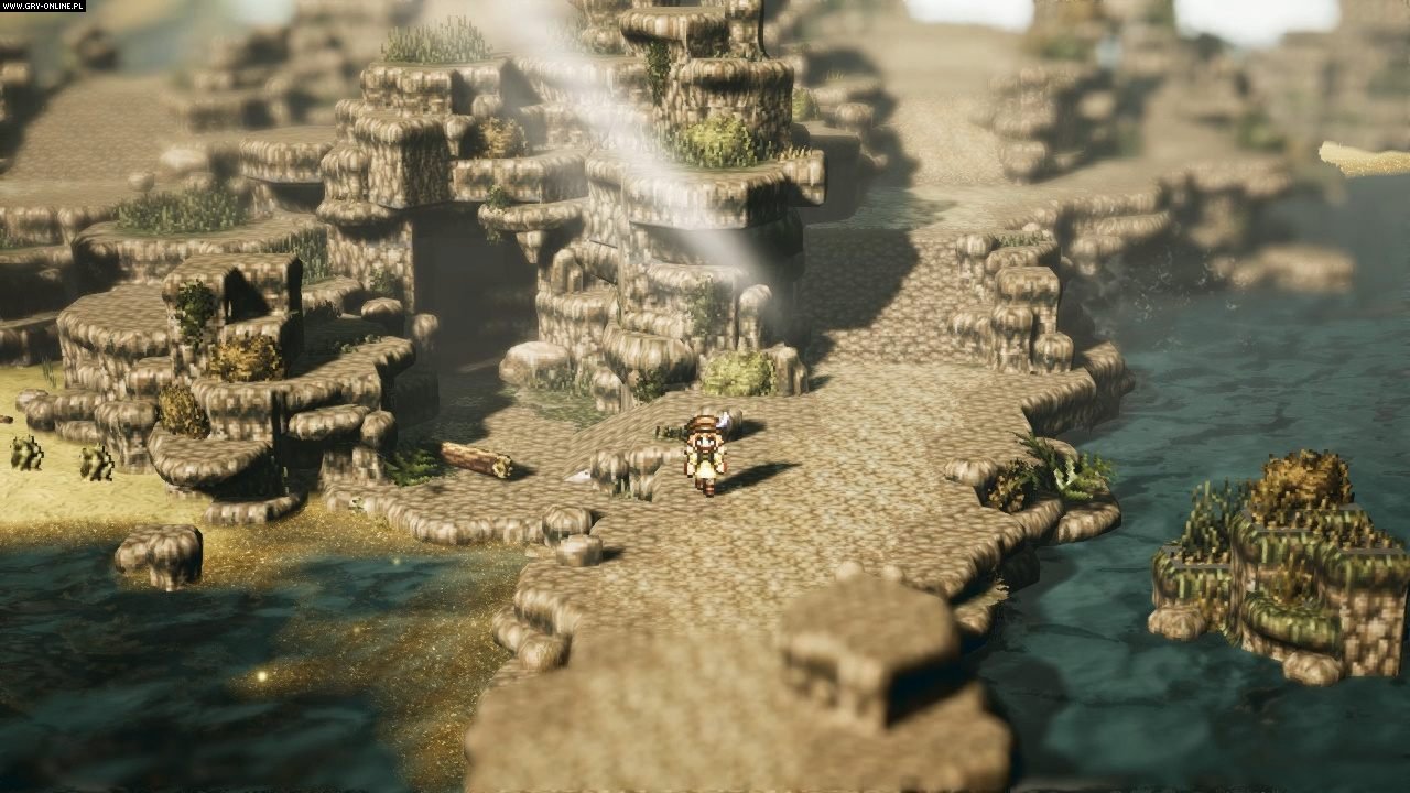
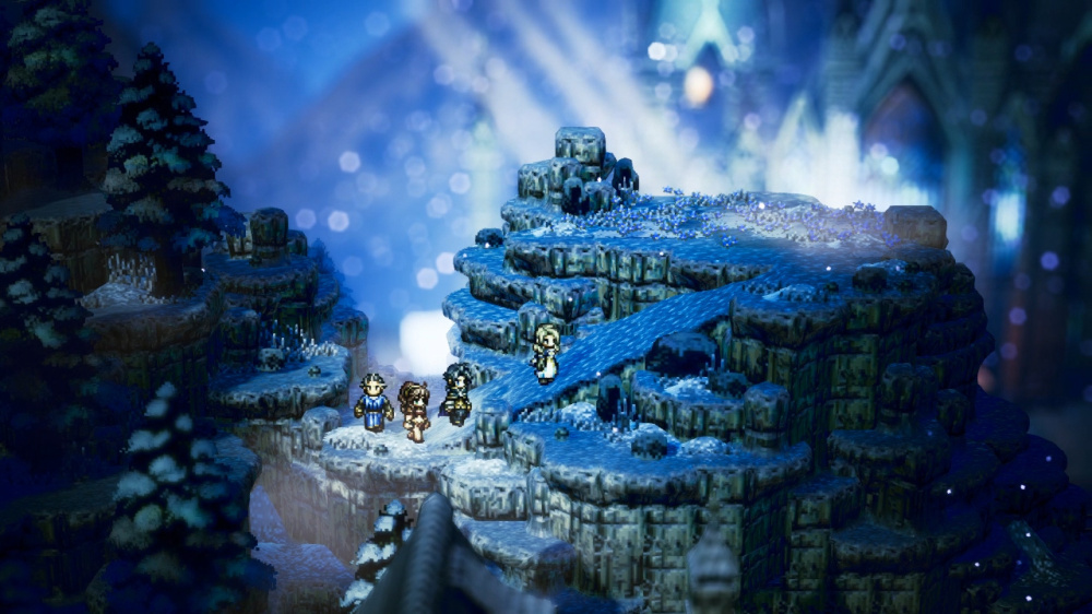
As you can see in the images below, Octopath Traveler harkens back to old-school tile-based aesthetics. However, I'm not concerned about the aesthetic as much as I am curious about how the "tiled" meshes were constructed and/or placed into the world.
Notice the rock "arch" (in the 3rd picture down), and how the grass "blends" with each subsequent "step" of the cliffs:


Has anyone here ever done something similar (mesh-wise) to the above?
Part of me thinks this is more "shader-trickery" than actual "mesh-construction" -- How off am I on this?
I'm having a hard time believing that the "tiled" look of these meshes was hand-made. How would one construct the meshes to be easily placed in the environment in a form like this? -- Obviously "blending" is another matter, but maybe not.
Is this a voxel-engine or a modified triplanar shader? -- As said before, the meshes seem too complex to have been hand-made. I was just wondering if anyone else had any insight as to if there was any shader "trickery" going on here...
As you can see in the images below, Octopath Traveler harkens back to old-school tile-based aesthetics. However, I'm not concerned about the aesthetic as much as I am curious about how the "tiled" meshes were constructed and/or placed into the world.
Notice the rock "arch" (in the 3rd picture down), and how the grass "blends" with each subsequent "step" of the cliffs:


Has anyone here ever done something similar (mesh-wise) to the above?
Part of me thinks this is more "shader-trickery" than actual "mesh-construction" -- How off am I on this?
I'm having a hard time believing that the "tiled" look of these meshes was hand-made. How would one construct the meshes to be easily placed in the environment in a form like this? -- Obviously "blending" is another matter, but maybe not.
Is this a voxel-engine or a modified triplanar shader? -- As said before, the meshes seem too complex to have been hand-made. I was just wondering if anyone else had any insight as to if there was any shader "trickery" going on here...

Replies
I wouldn't get too bogged down in the specifics of how tbh. you could do the effect in screenspace if you were so inclined and you wouldn't even need uvs.
I think you're onto something there. I definitely noticed the modular assets in some places.
What throws me off about them is that some of the tiles appear to be blended really well with the geometry normals (for example, there are overhangs on some assets, while on others, they seem to blend right into the ground geometry, including the transitional grass texture on the walls a bit as the normals line up with the ground)
The slopes also seem to have some nice "normal" transitions from the flat ground areas too. Do you think this is simply a plane with some vertex channel info on it to pick the texture?
Are you suggesting a triplanar shader here -- or something else? This sounds like something I'd be interested in, especially if I can figure out how they get their normal blending / grass transitions setup on the rocks that contact the groundplanes.
To me it looks like a matter of model/uv creation, at first I thought maybe well-placed UV shells with a world offset. But after looking for a while, I don't even think that. Just a dozen or so of kit parts to make levels from. It does look like they're probably able to vertex paint material blends "live" in their editor rather than vert color baked into the mesh. Watch how they're using transitions and decor to hide seams. Here's some of the things I'm looking at in the first picture. Also around the highest peak, there's some stretching in the overhangs at the top and base, which makes me think they're not doing triplanar blending.
The screenspace thing was semi facetious. You could do all the projection and texture application in screenspace as a post process effect if the mood took you (it's probably not a sensible approach though)
Looking it it more closely you can see seams all over the place. I suspect throttlekitty is entirely correct about it being simple modular bits in most places.
I definitely see what you're saying there -- and I think you're right!! -- Those places you've marked there were what confused me about this whole "shader" thing. However, when you mentioned the decorations and vertex painting in-editor and them helping to hide seams, it finally "clicked" for me -- they're legitimately "kit-bashing" it!
Thanks to the (sadly, underwhelming) victory you just earned for completely debunking this "mysterious shader" lol (no idea how I didn't see that coming!) -- I now have a new question...
I wonder if this effect could have been achieved better (and more easily) without having to manually hand-paint (or decorate) all of the seams? -- For example, say I have a rough subdivided "cube" with beveled corners on all 8 points -- What if I have a lot of these I want to intersect with one another and "blend" these beveled/subdivided "cubes" together? -- Would it be best to use world coordinates with a triplanar shader to get the effect these guys were apparently going for -- or would there be a better approach we could take with shaders (performance aside) to make creating levels like the ones in those screenshots more easy to do?
Any ideas how one might better "blend" lots of these little "kit-bashing" cube meshes I mentioned without having to manually paint to cover up the seams? -- There *has* to be a better way than what we see here.
If it were it me doing something like this style, I'd treat each terraced part as two separate meshes: The walls and the floor. The walls mapped to a horizontally tiled texture with an opacity fade at the top, and the floor is just the average tiling texture. In this picture, I've got the two as separate objects with simple colors. I could have three opacity variations, so i can blend the top, bottom, or both. UV'ing the walls becomes a very simple task, and a generic plane could be cut into very easily for more 'wobbly' forms. Nice and clean, ready for world space offsets.
This thread might also give you some ideas.
http://polycount.com/discussion/172852/battlefronts-level-construction-how-can-everything-just-sort-of-match-and-blend
I've not played with world-coordinates much yet, but would the plane on the top work well enough for slopes as well? From what I gather from your idea, I can't see any reason why it wouldn't, but I'm thinking there might be potential issues with normals on steeper slopes..
Also, would the bottom of overhanging / overlapping cube structures also need to be world-mapped separately (like the top), or would they still work properly with your setup being only floor/walls? (In this example case, I'm thinking about the bottom of the geometry where the player might be looking up from below at an arbitrary arrangement of rounded cubes with closed bottoms globbed together.)
@kwyjibo -- That's definitely another way I had considered. In fact, I was totally sure when I started this thread that Octopath Traveler was doing exactly this.
Sadly, I'm not sure vertex coloring in certain places can be totally avoided at some point, so I'm sure I'll have to go that route at some point. The method @throttlekitty offers is definitely a good approach to manage things a little less manually in the end with the drawback of being a little more manual in the beginning, so that too has its pros/cons (mainly the major pro I see is that you get to control exactly where on the mesh the texture is applied.)
The biggest issue I see is determining what method should be used to blend the normals between the meshes. I saw something in the Battlefront video discussing the blending of the base texture, but couldn't quite suss-out what made the geometry normals blend so well on the rock edges too.
Off-topic, but -- blurry SNES-styled "pixel art" is worse to me than just tossing the "retro" look altogether. To be honest, I'd rather have blurry 2-colored NES sprites than nicely drawn SNES-styled pixel graphics that just get crapped-on by photoshop filters.
The way I see it, those overhang/overlaps are esentially "walls", and I would unwrap them as such.
Blending the normals is pretty easy these days. In most software you could be making some extra geometry cuts around where edges meet to hold the normal along the main shape. The edges themselves would be modified so they match between assets. (hope this makes sense, I'm kinda fuzzy headed today)
For the blurring, I did remember something. In External World, Oreilley had set a rule for only using aliased lines and wanted to do a blur. Realizing this would break the style rule, he opted for something like a "defocus" effect, I'm sure that I saw the same in 16bit games too. The trick there is to duplicate the objects, lower the opacity and move them away, kind of like putting your hand in front of your face.
As you can see below, after playing with this a bit, I'm probably aiming at a more "general-purpose" shader than what Octopath Traveler might have done. Really, something more along the lines of the Battlefront shader (but with tiling decals) is probably more along the lines of something I'm now aiming at. The below is a start on one (without the "tiling" decals), but it doesn't yet blend with materials of the same type (see the green and white monkey-heads -- they don't blend, but they are the same material):
As you can see, I'm not really trying to mimic the "pixel" look of the environments in Octopath, so "blurry" or a slight stretch isn't really a bad thing for me. I'm more about blending the seams on the edges of the geometry intersections (as you can see in the image above). Unfortunately the mesh-normals in a particularly "harsh" intersections (such as where the white and green materials overlap) are giving me problems since these are all separate objects, and clearly I cannot blend two materials that dodge the depth-buffer in Unity.
Probably a weird depth-sorting issue in ASE (Amplify Shader Editor) or Unity...
I wonder if there's any way to get the "depth" of the normal map intersections in ASE without having to grab stuff from the depth buffer...