[WIP] Heroine Character from 'Purgare' Concept

polycounter lvl 2
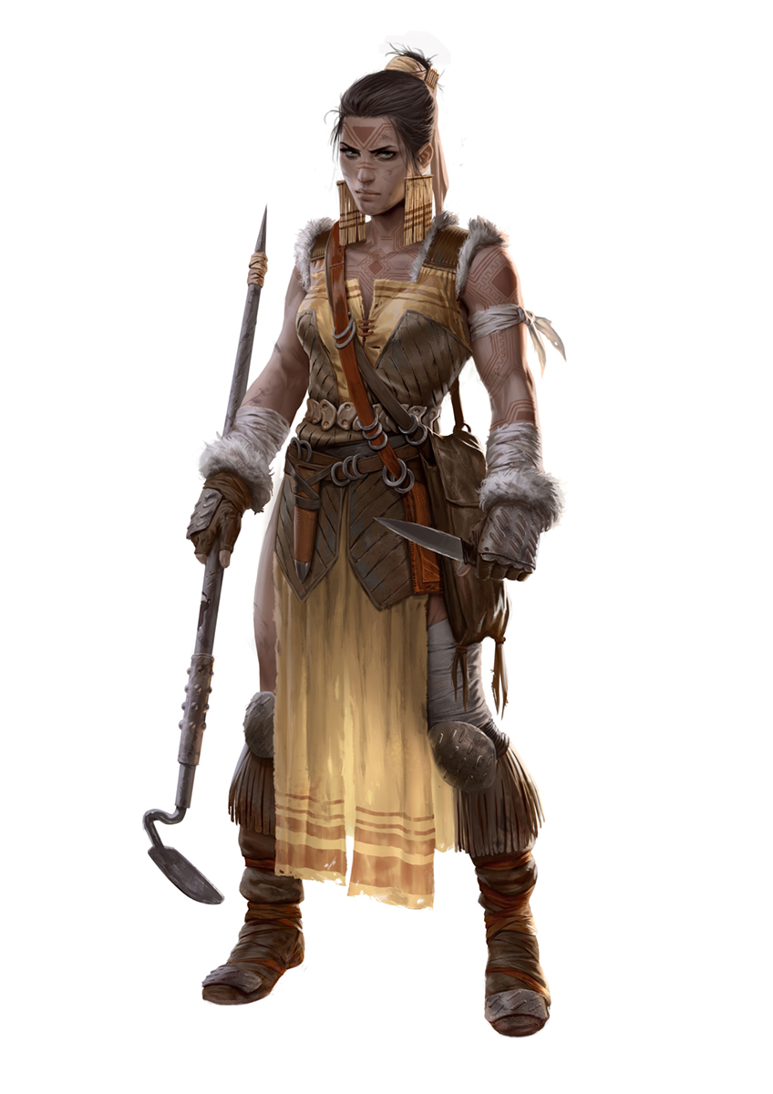
Hey polycount peeps! ")
I've never posted here before,.. but I'd be really happy to finally become part of the polycount gang.
Here's what I've been working on for a while now:
My goal is to translate a 2D concept into 3D to the best of my abilities, without deviating from the concept if not necessary (some areas aren't defined well in the concept, which I take as a chance to express my personal interpretation, creativity and interest to complement the concept in regards to keeping the character, but also make her functional for the potential following parts of a pipeline such as rigging and animating.
Style wise, I'd like to aim in between Horizon Zero Dawn and Rise of the Tomb Raider.
Link to the concept from 'Purgare', which was created by Marko Djurdjevic:
https://orig00.deviantart.net/950e/f/2014/252/b/6/purgare_by_marko_djurdjevic-d7yk7t7.jpg
Currently in the texturing stage, would love to have some fresh, harsh eyes take a look at the textures and really appreciate your feedback!
Link to the High Res picture of my WIP post: https://i.imgur.com/MbAkKwA.jpg
All best,
Thomas

EDIT: I hope the file size of the image isn't too big for an individual upload.
I've never posted here before,.. but I'd be really happy to finally become part of the polycount gang.
Here's what I've been working on for a while now:
My goal is to translate a 2D concept into 3D to the best of my abilities, without deviating from the concept if not necessary (some areas aren't defined well in the concept, which I take as a chance to express my personal interpretation, creativity and interest to complement the concept in regards to keeping the character, but also make her functional for the potential following parts of a pipeline such as rigging and animating.
Style wise, I'd like to aim in between Horizon Zero Dawn and Rise of the Tomb Raider.
Link to the concept from 'Purgare', which was created by Marko Djurdjevic:
https://orig00.deviantart.net/950e/f/2014/252/b/6/purgare_by_marko_djurdjevic-d7yk7t7.jpg
Currently in the texturing stage, would love to have some fresh, harsh eyes take a look at the textures and really appreciate your feedback!
Link to the High Res picture of my WIP post: https://i.imgur.com/MbAkKwA.jpg
All best,
Thomas
EDIT: I hope the file size of the image isn't too big for an individual upload.
Replies
-I'd just go full eyeliner. It's less about making a character more seductive and more so of covering up the uncanny valley.
-You probably don't have to accent the eyebrows to that extent, which could probably be tuned to that with the face rig anyways.
-If you want to place dirt and dust on skin you should just go for it. Make it seem noticeable and intentional, I don't think the mid-ground is a good compromise.
-For the cloth it'd be nice if you could try out some alphas wear out the edges a bit.
-And if you could focus more on long vertical dirt/wear on the cloth, it'd be more in tune with the concept. Kinda reminds me of rubbery bathroom curtains at the moment.
Hope that helps.
- I had a tough time with eyebrows + lashes, but I'll go dive back in, your changes are too motivational. They push her character a lot. It pushes into a different direction than what I was aiming for, but your paintover instantly gives me a much more characteristic feel than what I currently have, thank you so much!
- I agree on the dirt, just had not started to work on that yet.
- Now that you say it, they look like rubbery bathroom curtains to me, too. I will try out adding some wear'n'tear alphas for the cloth. Makes the cloth look much more like the thin, destructable material that it is supposed to be. I didnt see before how the vertical dirt makes this so much better, thank you for your observations.
edit: one quick question, if you don't mind:
- Would you say I should try to paint an eyeliner or just increase the amount of eyelashes?
And if its convenient it'd make sense to set up strong eyeliner and lashes foundations in the software, and you could probably tune the settings between the two to get a good balance, or turn off one of them altogether. Also an article I read mentioned a "Eye Occlusion Geo & Tearline" which I've never tried before, but it might interest you if you haven't tried already.
Here are the eyelashes I already had and a thin eyeliner.. I think the eyelashes don't look great though. Would probably look better if the lower eyelashes are more curved towards the cheek, and probably make all eyelashes longer. And shape the eyebrows the way you suggested and possibly make them less thick, what do you think Owls?
Also very interesting article, thank you for sharing it, I missed this one and its pure gold! I already have a tearline, but I guess its barely visible. Wonder how he approached the lowpoly for the eyebrow,... or is it baked down to the head? In that case it looks insanely good.
Yep I'll follow the article you linked for that. Think I will also try to bake the eyelashes down to one plane because I need to save some time.
That eyeliner gradient makes a lot of sense, good call. First and foremost because it is much more realistic since it starts to wash out after a while.
I'll post with some results tomorrow or monday, thank you for your input man!
Here's where I'm at and would love to hear some feedback ( noticed that the colar bones and pit of the neck aren't showing, that is due to me messing up the lighting there).
I posted this character on therookies, I didn't believe I am close to finishing. Not really sure anymore about that. Should I push this character further (to increase the chance of getting an interview somewhere?) (and if so, what should I improve on next? or should I move on to a new character? Can't really tell what is the right decision..
I've finally finished her. Here she is:
https://www.artstation.com/artwork/JAYzZ
I love the presentation although I feel like it could use a brighter key light on the left to brighten up the contrast of the shadows a little bit more