PZM-7 Śmiały (Fan Art)
Project
For my Uni module, we had to present 3 different designs of a mech based on a concept art and then choose one of them and model it. After some searching I decided to go with a concept art by Jakub Rozalski. The mech is the PZM-7 Śmiały which is going to appear on an upcoming strategy video game called Iron Harvest which is placed after WW1.

Artstation link: https://www.artstation.com/artwork/n28D4
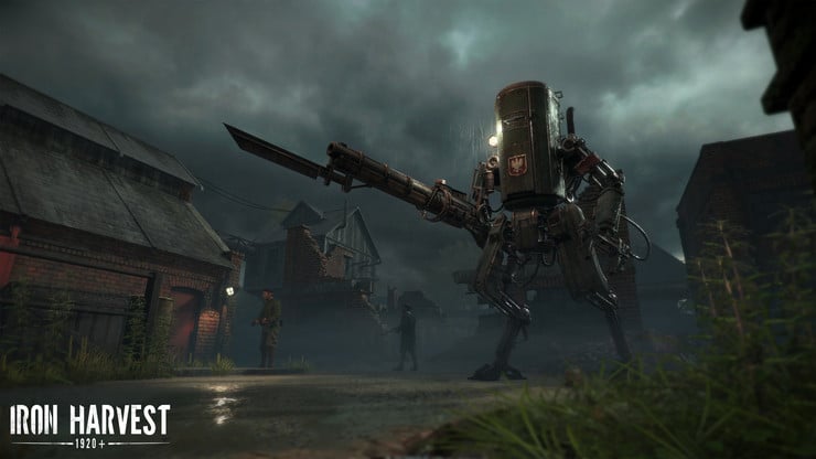
Original Design
Firstly I modeled the blockout of the original concept art.


1st Design
References
For my first design I wanted to follow the Polish style so I added to the mech Hussars' wings and a szabla sword. The wings that were used by the fearless Hussars, an elite Polish cavalry known for their skills in battle. According to many they were used to terrify the enemy which is one of the reasons that I wanted to add them on my mech. I watched a trailer of the game and in one of the scenes, this particular mech (Smialy) was presented charging an enemy's mech and Hussars are well known for charging with their long spears so it was also another good reason to use them.


I also wanted to add a second weapon. Normally on its right hand it has a rifle so on the left hand I wanted to add a szabla (szable) sword for melee attack which could help to come up with some cool animations.

I also added a second projector on the top of the main torso (cabin) which is going to light the area around. The projector is based on WW2 projectors.

Renders
And here are the renders of my first design's blockout.

Color Design
For coloring, I wanted to go with WW1-WW2 Russian/ English forest green armored vehicles/ tanks colors. The projector's light is going to be yellowish/white which represents hope and the "good guys".

Decals

The wings will be wooden, most of the wires will be made by rub except some metallic parts.


2nd Design
References
For the second design I wanted to make the mech look like is captured by the enemy (German army) which means it will have different weaponry and different colors/decals.
It has as well a projector and a WW2 antenna which can be seen mostly on German armored vehicles.

On the top of the main gate I added the "spike" which was also placed on the German helmets.

For weapons I decided to use a flamethrower based on WW1 and WW2 actual flamethrowers.

On the other hand I placed a WW2 German chainsaw.

Renders
Here are the renders of the second design's blockout.

Color Design
For coloring, I wanted to go with WW1-WW2 German blue/grey armored vehicles/ tanks colors.

Decals

The light's color is going to be close to red which represents the evil, alert and danger.


3rd Design
References
For my last design I wanted to combine the modern warface style with the medieval look which is pretty much was also what happened in WW1 if we consider that soldiers where still using knight armors and swords/spears. The mech would be a mercenary mech or an outcast, fighting under no flag.

WW1 armors

For a melee weapon I chose the gauntlet dagger. It 's interesting to see what human can come up with according to kill each other.

On the upper shoulder on the left side is placed a maxim machine gun.

On the right hand I palxed a short rifle with an axe in the end which looks pretty cool and it can work very well with the dagger on the other hand. ( I am not sure if this type of rifle was ever used on a battle but is very possible I guess ).
).

Renders

Color Design

Decals
Decals here will be more random.
Projector's light is going to be orange which is mostly neutral.


Rigging-Animations
Modeling is been done on 3ds Max but for rigging and animating I am going to use Blender because it was my first 3d modeling software and I feel more comfortable using this one for animating/posing.
Rigging the mech is something that we didn't have to do for the module but I did it because I wanted to see that my way of modeling the mech is actual going to help animators on their work and to see also that my mech can actually operate.


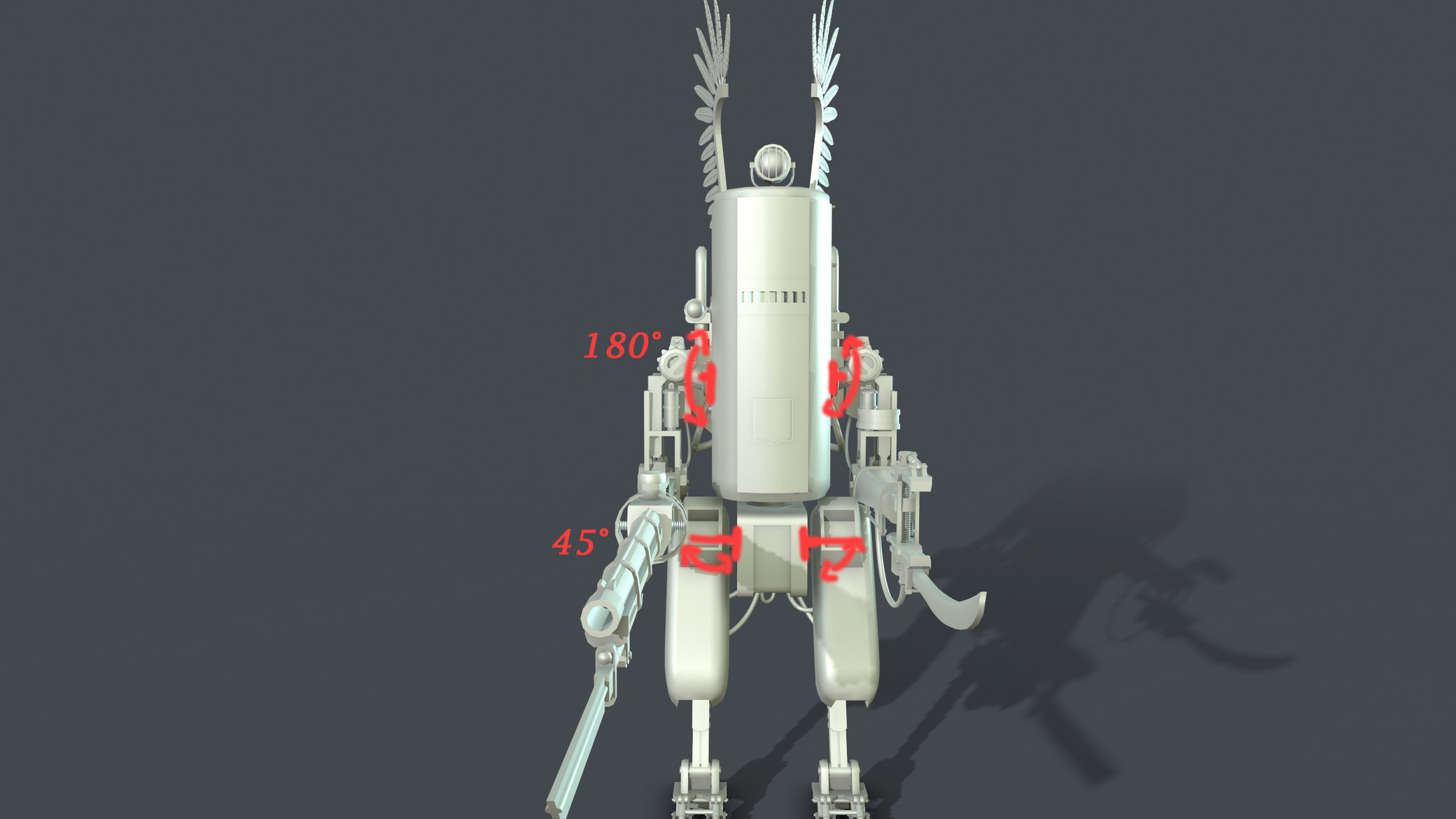

I did some basic animations just to check how my mech will look like. I didn't want to spend a lot of time on this because the model is just a blockout and I will spend more time on this with my final model.
Sorry for the bad quality of the video, especially for 2018.
 http://www.youtube.com/watch?v=AliHqSyZR44
Finally after all my 3 designs I chose to finish the 1st one, the Polish version.

Sorry for the long post and thank you for your patience and your time. Cheers!
For my Uni module, we had to present 3 different designs of a mech based on a concept art and then choose one of them and model it. After some searching I decided to go with a concept art by Jakub Rozalski. The mech is the PZM-7 Śmiały which is going to appear on an upcoming strategy video game called Iron Harvest which is placed after WW1.

Artstation link: https://www.artstation.com/artwork/n28D4

Original Design
Firstly I modeled the blockout of the original concept art.


1st Design
References
For my first design I wanted to follow the Polish style so I added to the mech Hussars' wings and a szabla sword. The wings that were used by the fearless Hussars, an elite Polish cavalry known for their skills in battle. According to many they were used to terrify the enemy which is one of the reasons that I wanted to add them on my mech. I watched a trailer of the game and in one of the scenes, this particular mech (Smialy) was presented charging an enemy's mech and Hussars are well known for charging with their long spears so it was also another good reason to use them.


I also wanted to add a second weapon. Normally on its right hand it has a rifle so on the left hand I wanted to add a szabla (szable) sword for melee attack which could help to come up with some cool animations.

I also added a second projector on the top of the main torso (cabin) which is going to light the area around. The projector is based on WW2 projectors.

Renders
And here are the renders of my first design's blockout.

Color Design
For coloring, I wanted to go with WW1-WW2 Russian/ English forest green armored vehicles/ tanks colors. The projector's light is going to be yellowish/white which represents hope and the "good guys".

Decals

The wings will be wooden, most of the wires will be made by rub except some metallic parts.


2nd Design
References
For the second design I wanted to make the mech look like is captured by the enemy (German army) which means it will have different weaponry and different colors/decals.
It has as well a projector and a WW2 antenna which can be seen mostly on German armored vehicles.

On the top of the main gate I added the "spike" which was also placed on the German helmets.

For weapons I decided to use a flamethrower based on WW1 and WW2 actual flamethrowers.

On the other hand I placed a WW2 German chainsaw.

Renders
Here are the renders of the second design's blockout.

Color Design
For coloring, I wanted to go with WW1-WW2 German blue/grey armored vehicles/ tanks colors.

Decals

The light's color is going to be close to red which represents the evil, alert and danger.


3rd Design
References
For my last design I wanted to combine the modern warface style with the medieval look which is pretty much was also what happened in WW1 if we consider that soldiers where still using knight armors and swords/spears. The mech would be a mercenary mech or an outcast, fighting under no flag.
For the cabin (main body) I changed the face and made it look more like a medieval fortress/tower.

WW1 armors

For a melee weapon I chose the gauntlet dagger. It 's interesting to see what human can come up with according to kill each other.

On the upper shoulder on the left side is placed a maxim machine gun.

On the right hand I palxed a short rifle with an axe in the end which looks pretty cool and it can work very well with the dagger on the other hand. ( I am not sure if this type of rifle was ever used on a battle but is very possible I guess

Renders

Color Design

Decals
Decals here will be more random.
Projector's light is going to be orange which is mostly neutral.


Rigging-Animations
Modeling is been done on 3ds Max but for rigging and animating I am going to use Blender because it was my first 3d modeling software and I feel more comfortable using this one for animating/posing.
Rigging the mech is something that we didn't have to do for the module but I did it because I wanted to see that my way of modeling the mech is actual going to help animators on their work and to see also that my mech can actually operate.


I did some basic animations just to check how my mech will look like. I didn't want to spend a lot of time on this because the model is just a blockout and I will spend more time on this with my final model.
Sorry for the bad quality of the video, especially for 2018.
 http://www.youtube.com/watch?v=AliHqSyZR44
Finally after all my 3 designs I chose to finish the 1st one, the Polish version.

Sorry for the long post and thank you for your patience and your time. Cheers!

Replies
I love your research and explanations for the three variants.
Only thing which bothers me a little bit are the wings of the polish version, maybe make them a little bigger and attach them lower at the torso (maybe extruding from the backpack thingy), because currently they are looking like antennas.
Cheers!
As it is on the original concept art I chose the Polish national symbol.
For the sword I chose to place a Polish phrase : "CHWALA WIELKIEJ POLSCE" which means Glory to the Great Poland.
High Poly Model Renders
Cheers!
Nice job overall though, models all look solid
Here are some renders of my mech in Marmoset. For my final Marmoset renders I will prepare a small diorama to make it more interesting.
On the front under the Polish National Symbol there is a Polish phrase which was used in posters during WW1 to encourage Polish people during the war. The phrase is "POLACY! IDŹCIE NA BÓJ NA PRAWY - ZA ZIEMIĘ POLSKĄ, ZA POKRZYWDZONĄ which means : Poles go into the fight for the right - for Polish land, for the disadvantaged."
Final presentation is going to be in UE4. I made some extra props as is a late WW1 German helmet, a German flag, shells and some low poly posed soldiers to make the scene a bit more alive.
For the terrain I followed Jacob Norris's tutorial "Forest Snow Ground Complete Package".
UE4 Renders:
Music by a friend of mine Kostas Sisikis.