[Riot Creative Contest 2017] - Fakado
Hey all, my name's Vidas Rimkevicius and I want to try my best in participating in this contest! If curious, here's my portfolio for those wanting to take a look  https://www.artstation.com/fakado
I wish the best of luck to all the participants, a lot of amazing entries so far!
For the contest I'm making a channeled laser attack that becomes more powerful over time. Here's a few WIPs.
First WIP:
The first WIP started as more of an aura rather than an impact, it felt weak without any 'oomf'. At this point in time, I was hoping for the effect to look rough, and intentionally unrefined with the sandy looking textures, but the first thing people pointed out when I sent this out for critique, was how the sandy materials looked terrible and were just too overkill.

Second WIP:
In the second WIP, I added a placeholder beam to show the point of impact that the impact originates from. I also modified the material a bit to be cleaner and less rough, though arguably not enough. I also have black highlights happening here in the effect. With those, I was hoping to bring the effect into an 'evil' side, but frankly with how I'm using really bright and energetic colours, the black just looked out of plack.

Third WIP:
In this WIP, I ended up further modifying the material, now I'm using an extremely smooth circular texture, which whilst looking a lot less chaotic, ends up looking far cleaner and more energetic. I also added an initial burst of particles at the start of the effect which I will be building up more in the future to act as thresholds for the beam.

Fourth WIP, split in two due to file size:
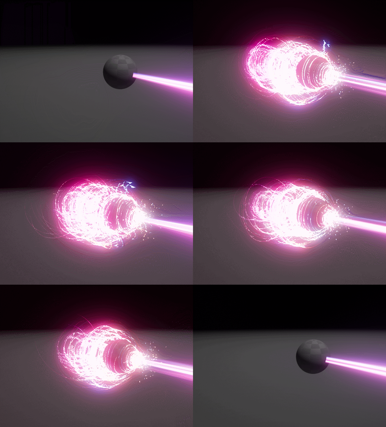
In these WIPs, I made quite a few changes. I've made the sizes of the circles more randomized but still keeping to the shape of the ball, I added sparks to the point of impact as well as a few extra layers overall.
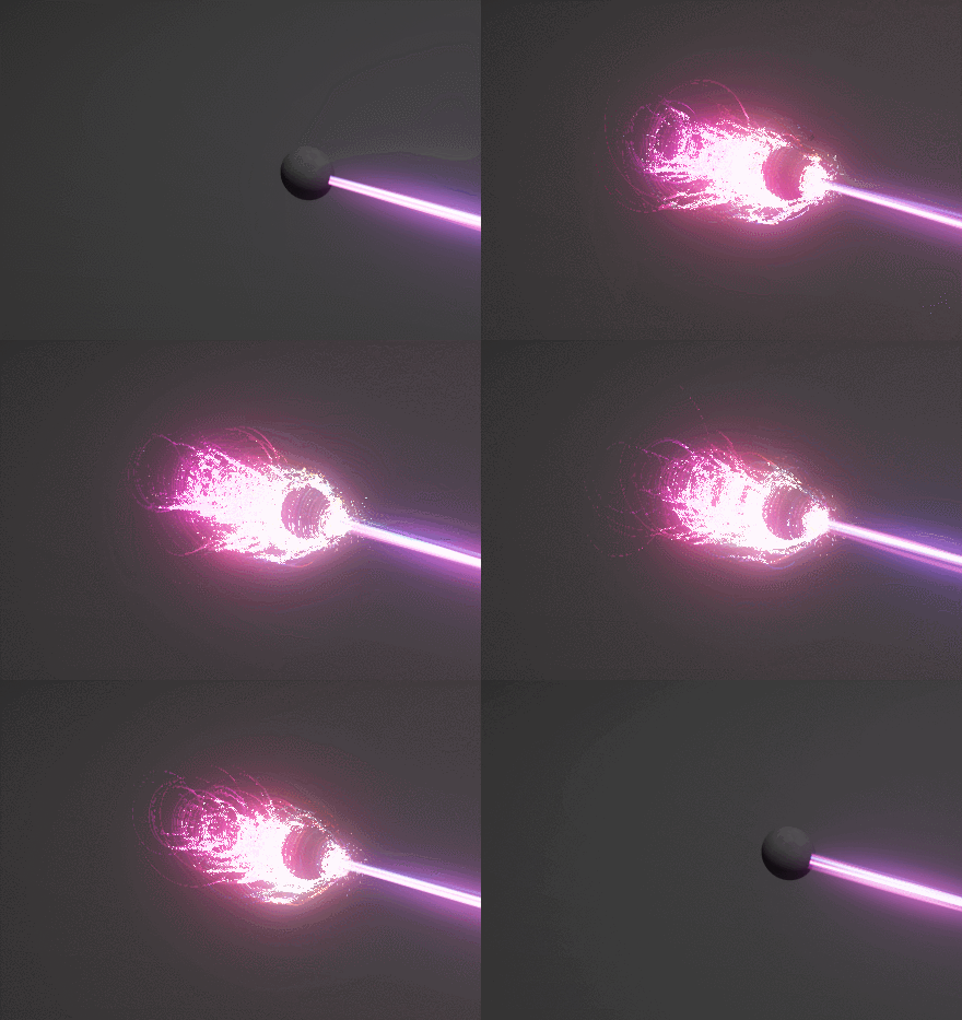
And for an aerial shot, more akin to the League of Legends camera angle.
I personally like the way it looks from this angle, it looks as if the laser is actively burning the target and causing arcane flame to shoot out from behind the point of impact, perhaps as though the target were to be blocking it with a magical shield.
The next step here that I'd like to do is to bring this effect into stages. I want the laser attack to build up over a period of 6-8 seconds, with thresholds at 2,4,6 and 8 seconds perhaps. This way the laser would begin quite weak but grow more visually powerful over time. From this point I may add a 'final' explosion at the end of it all, but will have to see depending on how long the effect ends up being and whether any additional content to it at the end would make it just look badly overcluttered.
I'd be happy to hear any critique or thoughts anyone has so I can improve this or for moving forward!
I wish the best of luck to all the participants, a lot of amazing entries so far!
For the contest I'm making a channeled laser attack that becomes more powerful over time. Here's a few WIPs.
First WIP:
The first WIP started as more of an aura rather than an impact, it felt weak without any 'oomf'. At this point in time, I was hoping for the effect to look rough, and intentionally unrefined with the sandy looking textures, but the first thing people pointed out when I sent this out for critique, was how the sandy materials looked terrible and were just too overkill.

Second WIP:
In the second WIP, I added a placeholder beam to show the point of impact that the impact originates from. I also modified the material a bit to be cleaner and less rough, though arguably not enough. I also have black highlights happening here in the effect. With those, I was hoping to bring the effect into an 'evil' side, but frankly with how I'm using really bright and energetic colours, the black just looked out of plack.

Third WIP:
In this WIP, I ended up further modifying the material, now I'm using an extremely smooth circular texture, which whilst looking a lot less chaotic, ends up looking far cleaner and more energetic. I also added an initial burst of particles at the start of the effect which I will be building up more in the future to act as thresholds for the beam.

Fourth WIP, split in two due to file size:
In these WIPs, I made quite a few changes. I've made the sizes of the circles more randomized but still keeping to the shape of the ball, I added sparks to the point of impact as well as a few extra layers overall.


And for an aerial shot, more akin to the League of Legends camera angle.
I personally like the way it looks from this angle, it looks as if the laser is actively burning the target and causing arcane flame to shoot out from behind the point of impact, perhaps as though the target were to be blocking it with a magical shield.

The next step here that I'd like to do is to bring this effect into stages. I want the laser attack to build up over a period of 6-8 seconds, with thresholds at 2,4,6 and 8 seconds perhaps. This way the laser would begin quite weak but grow more visually powerful over time. From this point I may add a 'final' explosion at the end of it all, but will have to see depending on how long the effect ends up being and whether any additional content to it at the end would make it just look badly overcluttered.
I'd be happy to hear any critique or thoughts anyone has so I can improve this or for moving forward!

Replies
I also want to try adding some smoke and maybe some refraction behind the sphere to give it more oomf.
Calling it done on the impact for the time being unless I need to re-adjust the timing more to fit with the laser/cast. Beam at the moment is still early stages, will be looking to overhaul the material a bit as well as add more oomf to it… somehow :P
Still thinking I may need to tune down the overall brightness of the whole thing, I suppose in the further away zoom it’s not too bad, but close-up shots are kinda bright.
Anyway, I think the biggest concern is that you convey the beam's power solely through the use of color. The size of the beam may change but it is super small and not noticeable. I think if the beam changes its size more dramatically, it would communicate the strength of power better. You might also want to tone down the particle on the earlier stage also, to clarify the power and damage of the beam.
For the right side. A my humble suggestion is that it charges an orb of energy (if you want to make it go slow, kamehameha-style) or a bright flash of light erupt with something to suggest a motion used to cast this ability, like a swipe, flash, then channel or something. While channeling, a dust could form around the caster to visualize its power. Lastly, I think you could play more with the shape and particle of the right side.
Can't wait to see the next update! Cheers!
I think you're right on all that you've said. The beam size difference between stage 1 and 4 is quite large but with the 4 threshold stages the transition ends up being almost unnoticable since it progressively grows larger with each threshold. Will have a look at seeing what I can do to accentuate the beam becoming more powerful, like maybe some energy swirling around the beam. I'm not sure if I can make it larger at the end, otherwise the beam will engulf the character sphere entirely haha.
By 'tone down the particle on the earlier stage', do you mean that for the first part of the effect before the first burst of power, that the impact on the left should look weaker? Or do you mean that I should make the beam look weaker to begin with?
Yeah, the right side at the moment is still elusive to me, I'm not too sure what I want to do. I was thinking of removing the current <) shape I have going on at the beam currently, and instead have a Portal that slowly opens up, the beam fires directly from it with maybe a lens flare or a bright flash of light as you suggest, and the portal would get larger and more wild for each threshold of power. What do you think about that?
Also that dust cloud forming around the caster is a brilliant idea! Will definitely implement that in!
Also for the last two days I was editing my materials and meshes slightly, the beam visually is Slightly different, and the Impact travels further out and in more of a cone shape, hopefully maybe this looks a bit better, or does it look worse?
About the updated version. IMO I think the beam's motion is much, much better, but the particle toward the end is kind of overwhelming. Also the second pulse has orange particle on impact but the beam is still visually the same, so you might want to look into that!
Will see what I can work out to fix the end of the effect, as you're right, the amount of red and overall colours is a little overwhelming. I will need to find a good balance of visual power and clarity.
Thanks again for the great feedback!
Also toned down stage 4 impact to be less overwhelming, reduced particle count there by 1/4th which makes stage 4 a bit more visually clear whilst (I think?) still looking powerful.
Curious what people think
Haven't done anything to the right side yet as I wanted to get the rest of Kassyndra's suggestions in place first.
Today’s progress: Changed the beam a bunch more, added some sparkly bits here and there to better accentuate the shift in colour and power. Hopefully now it feels a bit more powerful again. Also modified Stages 1 and 4 of the impact to have less particles being spawned. This is to better display the difference in power between stage 1 and 4, as well as because Stage 4 had too much going on and was visually overwhelming, hopefully at the moment it’s a bit better.
Also started working on the casting effect. Currently early wip but it sorta shows the idea I’m trying to aim for with a gradually increasing ‘portal’ of sorts from where the beam comes out from.
Need to fix that laser clipping in the portal area :’)
Better every time! I like that last update a lot :P
I know you just started it and its an early wip but I find your refraction to noisy and have really sharp edge(I prefer smooth personally) ^^
Also I found this a little weird (the fact that it's half noise/half smooth):
Hope it helps
Yeah, I'm not happy with the refraction I have at the moment, I wanted it to feel powerful, but at the moment it's far too strong and dark, will definitely be taking a look to fix up that tomorrow with something more sensible.
Ha, yeah that part in the picture is giving me trouble. because the lightning travels with velocity along the beam, but the beam disappears all at once once the duration is up, I end up with a problem of either having that gap of no lightning against a smooth beam, or left-over lightning still travelling along when the beam is already gone xD Will be seeing if I can come up with a solution so that it all blends together more nicely.
Or maybe try scaling the width down slowly while the lightning stops spawning ^^
Or since it's for a unique point of view, you could use a mesh instead of a beam, put the pivot point at the end part of the beam, and then scale it down on the length ^^
I am considering making this much faster, maybe even have another 'burst' of power like the previous threshold bursts, but here it'd be 'Burst > Disappear' rather than another powerup.
Looks bad atm xD
The 'end particle' could be scattered more and have shorter lifespan, but overall a great direction you've taken!
(TBH I am more excited about your work than mine)
I'll be playing around a bit more with the timing and shape for that last bit. Glad you like it
Do you lot think it looks better with the black ring inside and I should try to make it work? My idea atm is that I'll have energy sparks constantly gathering towards the center of the cast orb, it'll get bigger and brighter with time and then at the 2, 4, 6 thresholds BAM > refraction > release burst of power on beam > caster orb becomes a bit smaller but bigger than at the beginning of stage 1. Rinse and repeat for each threshold, with the last thresholds' caster orb being quite large and wild to represent the power of the beam more accuracetely. (maybe :P)
Also added a fire/burn type effect at the end of it all as I -think- that was required by the rules, but I'm not too happy with it at the moment. I'm thinking something more like a \_/ cone shape ground burn decal behind the left sphere might look better at the end, with some smoke coming off the ground.
I, as a dust and smoke enthusiast, suggest that the black smoke part at the end can have their duration reduced and has their speed dampened over the life time. Real smoke dissipate as they travel, so this could help give the illusion. If possible, maybe make it bigger over time too.
The smoke against the caster look lovely! The only thing I'd point out is that you should also makes them more intense as the channels go!, similar to the target side's.
I also personally thing the delay between the charge and the beam is too long and kinda awkward. But right now I think things are good to go!
That's a good idea for the smoke at the end, it was feeling a bit weird and out of place, I'll change that up to be more interesting.
Will also have a look at fixing the caster dust. I wanted it to be just like the same on the left side but I spaced out and forgot about it xD
I'll see what I can do about the delay between the charge and the beam, a friend suggested that I should make the refraction that explodes at the very start just as the beam fires faster as well. I'll go make those changes!
Thanks again!
Finally finished with the channeled laser. It's been great fun stepping out of my comfort zone of fantasy explosions and doing a full effect like this. I learnt a great deal and am super glad that I ended up taking part in the competition. It's been very inspiring seeing what other contestants are doing for their entries and the feedback we all were giving each other has helped us push our pieces even further.
I want to thank everyone who's given critique of any shape or form, you're the reason this effect became what it is today. I hope that in the future I can also rely on everyone again for more critique to help push my visual effects further and further!