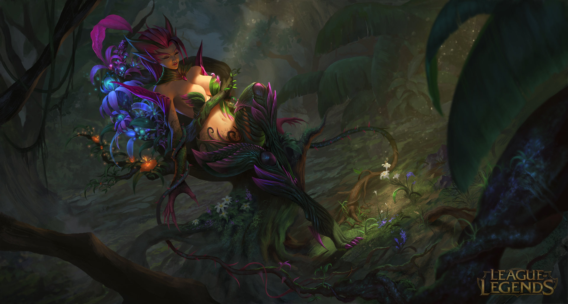
[Riot Creative Contest 2017] Dragon Zyra, Shyvana and Aurelion Sol
Hi Everyone, this is my entry for the Riot Contest.
This is the 2nd time I enter the contest. I still don't play the game and I have no Idea about all the champion.The first one I did back then in 2014 is Zyra. This time I did read some biography and Story of the champion hoping I can find something that could get my interest. but I guess my love for Zyra, especially her dragon Skin is way too strong, so here I am making the new illustration for her, but this time I want to add more character with the same theme, dragon , so I bring along Shyvana and Aurelion Sol to Join the party.
This is the illustration I did for the first challenge in 2014

And, here's my first step for the new take
A friend of mine point out some advice to make it better, so this is the new rough sketch
 These are my progress so far. I hope you guys dig it and all the best for all the participant
This is the 2nd time I enter the contest. I still don't play the game and I have no Idea about all the champion.The first one I did back then in 2014 is Zyra. This time I did read some biography and Story of the champion hoping I can find something that could get my interest. but I guess my love for Zyra, especially her dragon Skin is way too strong, so here I am making the new illustration for her, but this time I want to add more character with the same theme, dragon , so I bring along Shyvana and Aurelion Sol to Join the party.
This is the illustration I did for the first challenge in 2014

And, here's my first step for the new take

A friend of mine point out some advice to make it better, so this is the new rough sketch
 These are my progress so far. I hope you guys dig it and all the best for all the participant
Replies
Rough color. still feel unsure about the background, I think I'm gonna make it darker to guide the focus more on the Zyra
once again thank you very much
Her dragon skin is also one of my favorite skins in the game! Looking forward to seeing your progress.
I decided to put Aurelion Sol way back in the shadow to help maintain the focus on Zyra.
Cheers everybody!
@yararstss thank you for all the support you gave me! I'm also looking forward for your Darius as well, the sculpting looks great! all the best to you
You stole my heart..
PS If you can, try another face looks, maybe try a (really) little less angry look. Sorry for any mistakes.
My only critique so far is that I want to see a little more of A. Sol's face and a little less of the blurred egg in the foreground. I think that shrinking/moving the egg will balance out the composition a little better.
Keep it up, looks awesome so far.
First of all, let me say Happy New Year to all of you! and Thank youuu so Much for all the love, critique and support that you gave. it blew my mind
Anyway let me reply all your comment and critique
@gyllenhaal Thank you so much! I hope you didn't get bored waiting for the finished piece. ^^
@thornyzyra OMG< thank you very much for your support and your patience for checking everyday, I feel so guilty for not giving an update for a long time, I'm so sorry, I'll try to post it within this week, I promise
@Darkzan @kuhleesee Thanks a lot! please wait for the final, I hope you'll like it!
@AndresDunkel Thank you so much! I'll do my best
@ShadowForever Thanks a lot!
@TempestWorks @BeccaBeeArts Thank you so much for your critique and I Agree! the egg size is wrong ^^ I've shrink and moved it to make the composition better, Thank you for noticing and letting me know
@J0shdsgn @Mariah22 Thanks a looootttt!
just finished Shyvana and I made some changes to the lighting by darkening some part that too bright earlier so that the focus will still maintained at the egg. Reduced the size and moved of the foreground egg as well.
It's looking awesome, nice rendering
I did a small paintover because I think a few things are off with the face and some proportions
What I did :
- Changed face proportions a bit (both characters)
- Scaled Shyvana's whole head up to improve proportions (with the perspective it looked a bit off), and to reduce the neck size (her neck is a bit too tall)
- Light adjustment on Zyra's head
- I tried improving the perspective on Shyvana's arm but I'm not really good at it so you might need to look for a few references because my version isn't accurate
Good luck with the contest!
Love this so far!
and the FINAL VERSION
I think I'm gonna call this Final. decided to take away Aurelion sol's body because it make the composition to full/ crowded, so had to erase it. I hope you enjoy it. if there's something coming up my mind , I'll try to add it later.
Thank you and all the best for the other participants ^^
- so I cropped the frame a little bit at the right side,
- make Shyvana and Zyra closer ,
- change Shyvana's right hand to tap zyra's shoulder to give it more interaction,
- add more rim light to Zyra and Shyvana from Aurelion sol glowing head
- add more foreground for better framing
- more atmosphere added to Aurelion sol to reduce the contrast
- and some level adjustment to make the whole image a little brighter
@SpiritHide Thank you so much for your support
@iwanaga Thank you Sensei, Omedeto for the wedding! all the best
@julshii Thank you very much! I'm glad you love it
@NekomancerZ likewise, yours is awesome, looking forward for the final piece