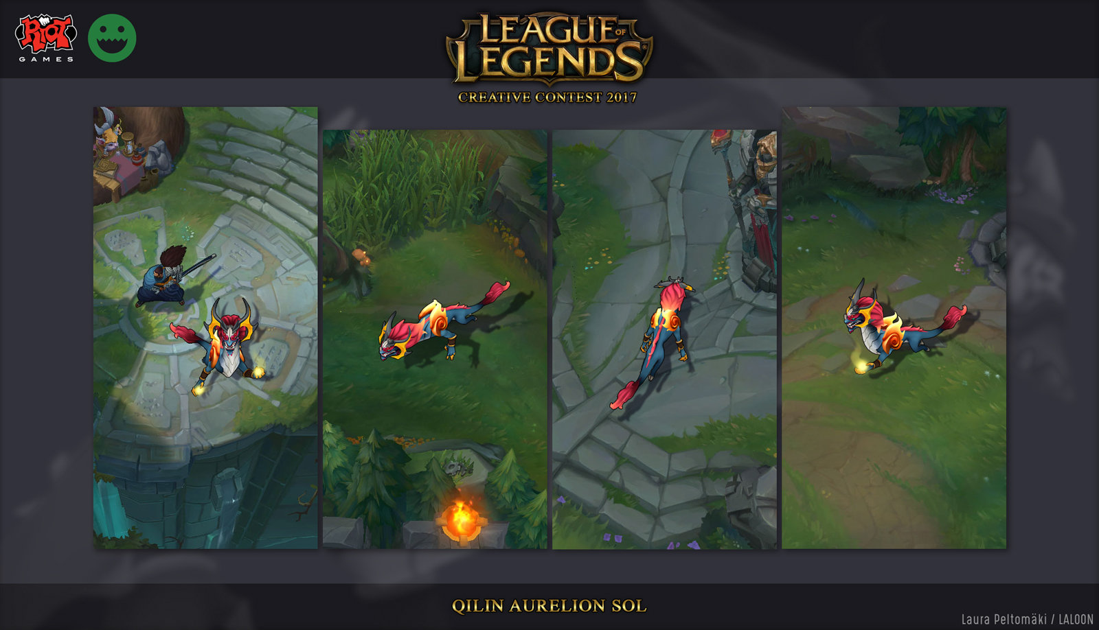
[RIOT CREATIVE CONTEST 2017] Character Art - Qilin Aurelion Sol
Latest update:

Hey guys!

Hey guys!
My project is going to be a Qilin skin for Aurelion Sol. He's me favorite champion design so I've always wanted to do something with him.
Qilin is a mythological chimera creature from East Asia. I was originally thinking about a Chinese dragon design but I've never personally liked how they looked and I want to make him look really cool and kinda creepy.


He's not going to be 100% qilin as I want him to keep some of his original dragon features, especially his front-facing horns. He's also probably going to have some ideas from komainus, the guardian lion-dogs of Japanese temples. They have pretty similar design elements so I think they will mesh well.
A really quick test if the main qilin features actually work with him. I especially have to pay attention to his horns and neck area to get a good balance of the reference and understandable silhouette.

A really quick test if the main qilin features actually work with him. I especially have to pay attention to his horns and neck area to get a good balance of the reference and understandable silhouette.


Replies
I'm currently making three kinds of swirls to test out which works best with the style. Though they might end up to be completely different materials in the end so some variation might be good.
Floaty heads.
Also I really I apparently really, really hate sculpting the shoulder things
More details today. Trying to figure out what's a good amount to keep things interesting but to still work in small scale.
Also testing super quick color schemes. I was originally thinking making him green (1) but realized that he'd be too similar with the green environments to really stand out. Right now I'm kinda into anything that has gold in it.
2 & 6 are my fav ones.
@Jager Thanks!
Thank you guys for the color feedback! 6 seemed overall the most popular one so wanted to make a bit more polished version of it to see if there's enough colors going on. Probably going to make similar versions of a couple other color schemes as well.
Game screenshot test. I quite like the head area but the shoulder things need more details to avoid looking like a red blob from this angle. Also need to start thinking about how to do the transparency, if that's needed.
Turned him into grey scale for now to avoid getting stuck on one color. It's easier to see the values this way too.
Also I've ignored his tail for too long now so that got a big update. It's a lot longer and smaller than the previous one, more akin to Aurelion's original tail shape.
Next up horns and metallic parts!
Polish mostly done! Changed his chest area quite a lot, wanted more gradients to use compared to the previous more plated design.
Once I've done the retopo I'll add more details and fix whatever things the lowpoly silhouette needs. Also I most likely have to make his shoulder things smaller, right now he can't really use his arms without clipping
The lowpoly model and base textures. Decided to go with the blue/red color scheme since it's been my favorite for a long time now. 9,909 tris which is a small miracle, had it at 15k at some point.
Might fix a few things here and there but it's working well enough.
He is such a pain to pose for a format like this. Stupid long snek.