Hearthstone Board - Starcraft 2 Style
EDIT:
Hey guys
I call this one done At my Artstation you can finde the whole scene inside Marmoset Viewer
Final Render:
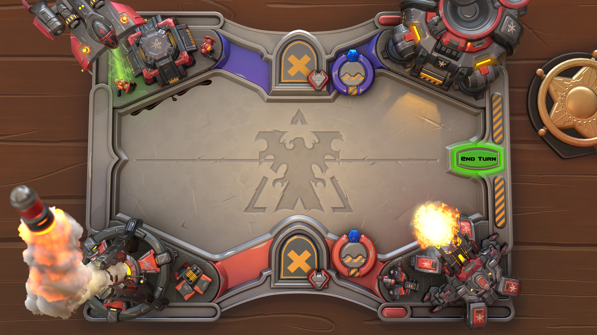
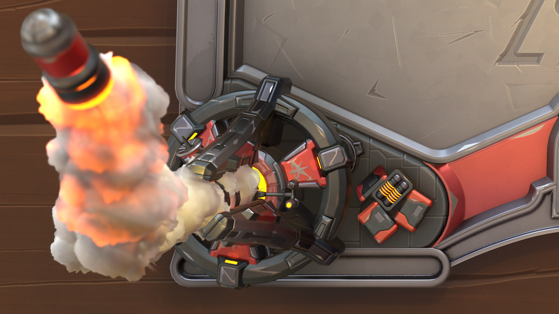
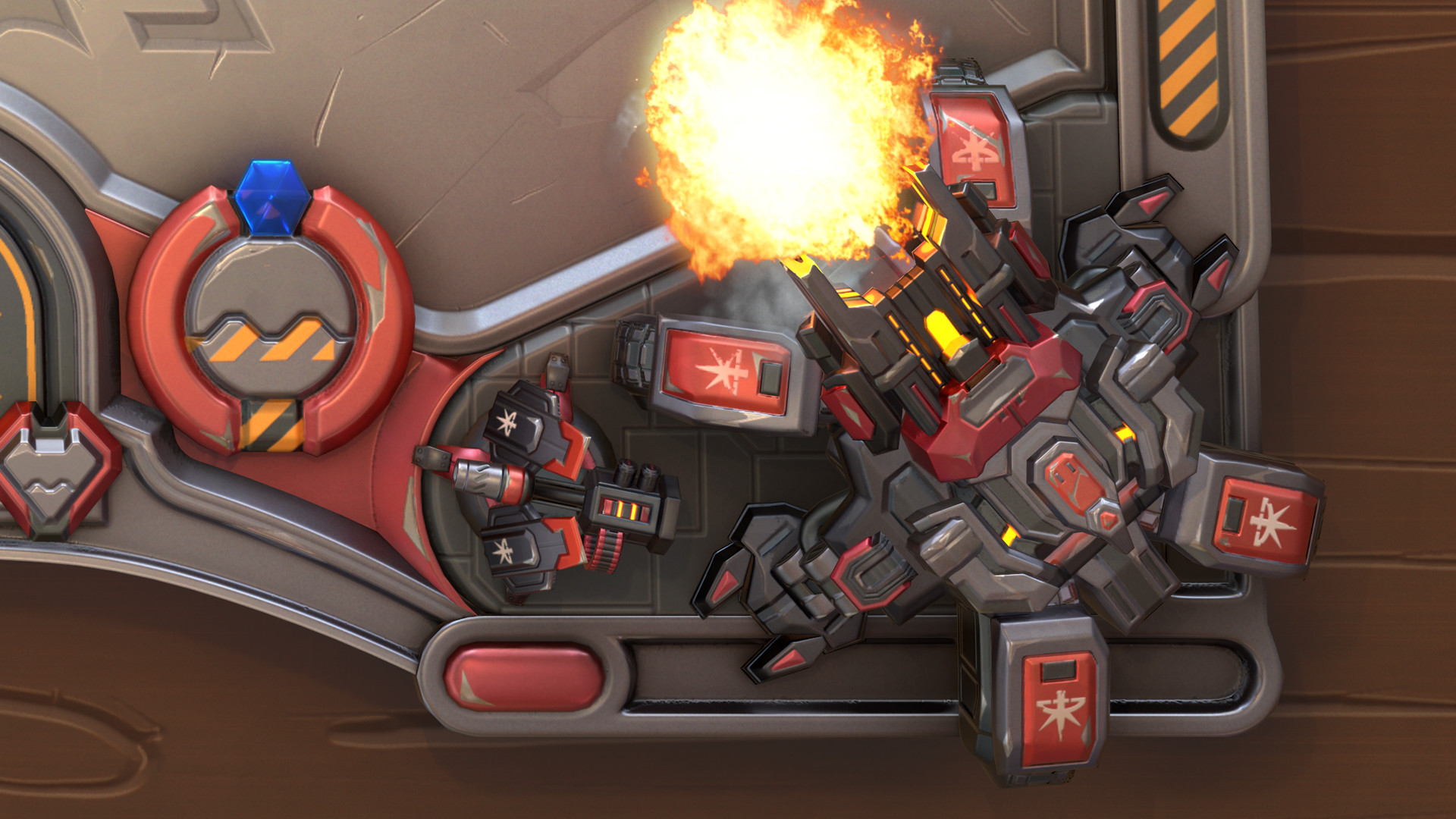
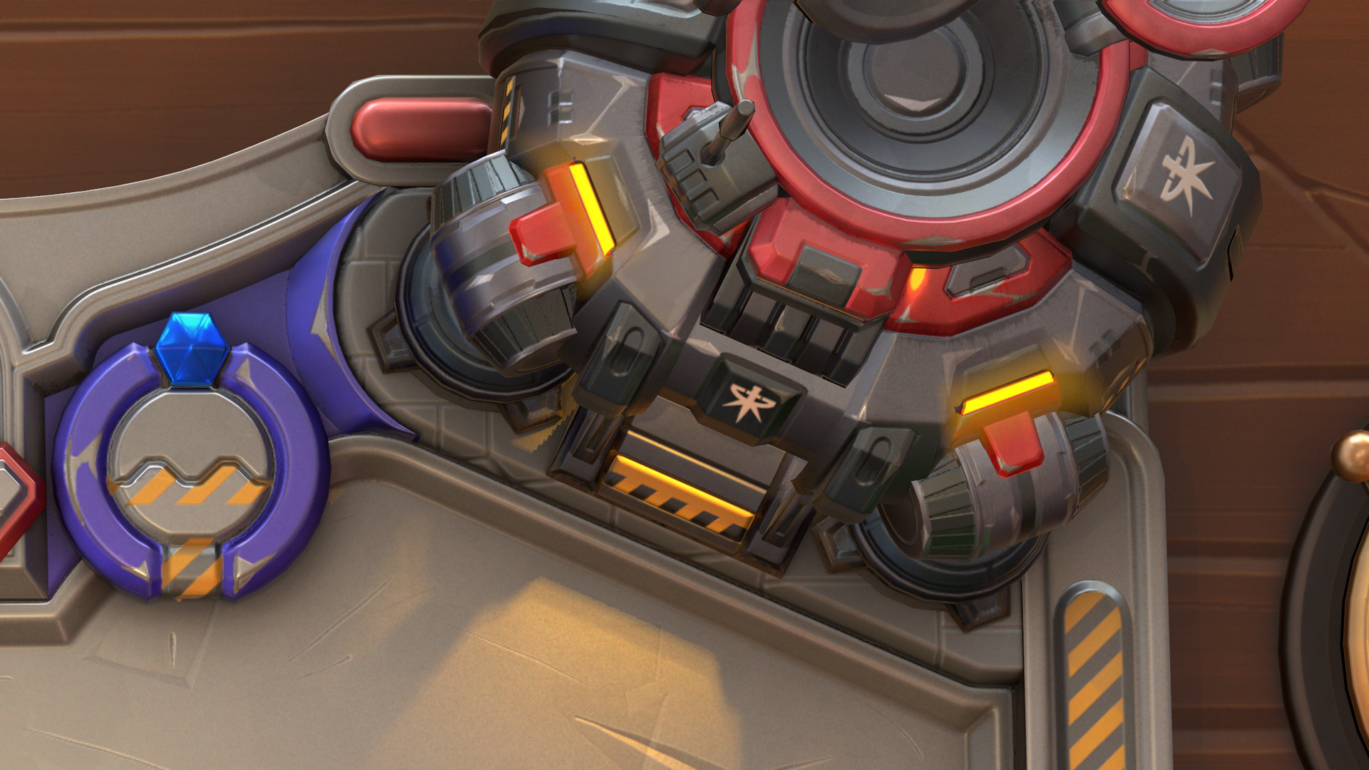
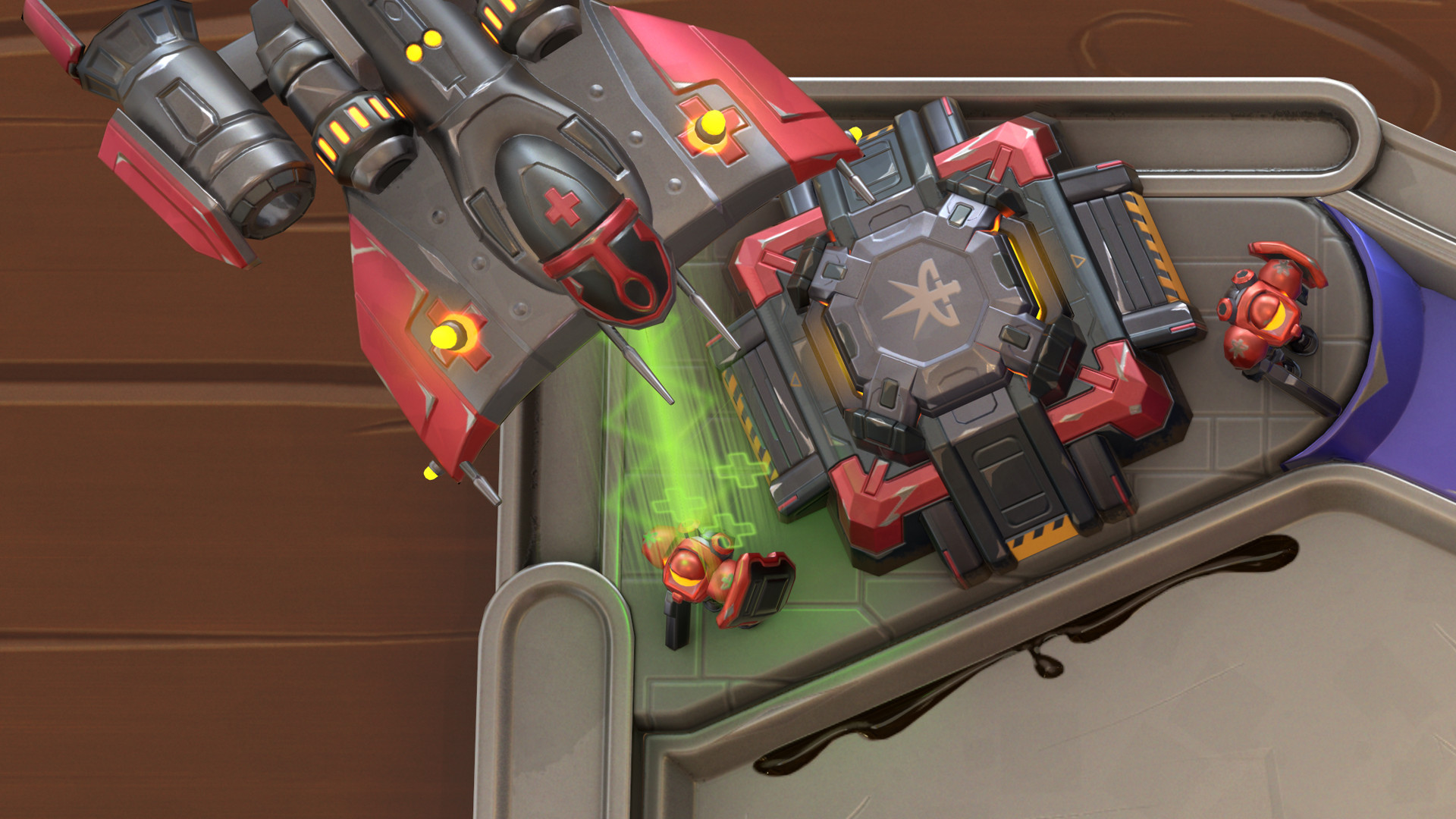
Close ups:
HR:
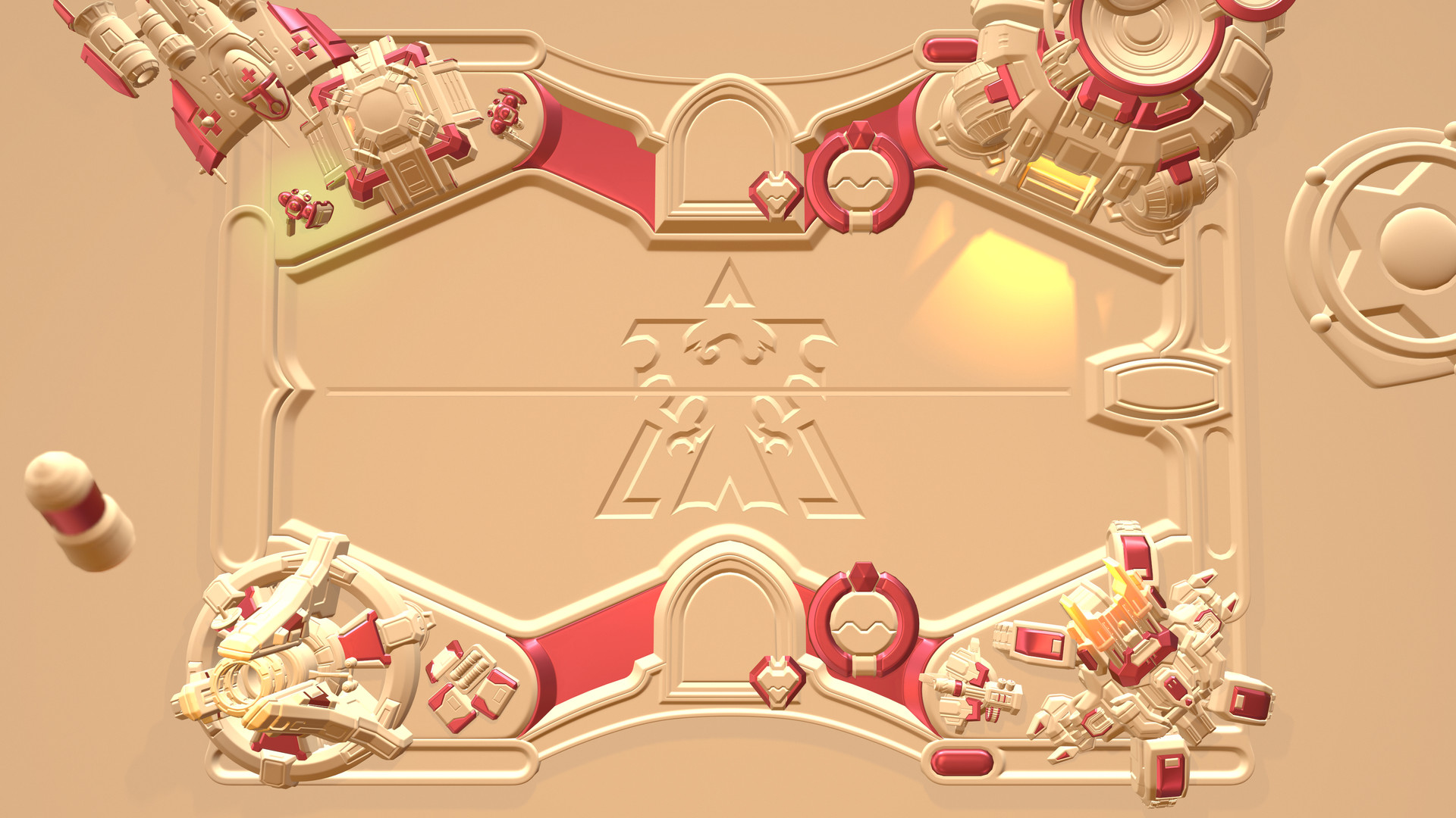

right now im working on a hearthstone board in StarCraft 2 style.
the way i create it is, i create 5 different assets
1 board
4 corners
as high and lowpoly with 5 different texture sheets
right now i am basically finishing the highpoly on everything
there are just a few questions i need to find answers to.
maybe one of you guys has an idea. what can i put next to the siege tank, the ghost Academy and behind the space marines?
and what do you guys think of the health and coin symbols?

i am thankful for every critic and comment
thank you guys in advance
cheers
Hey guys
I call this one done
Final Render:

Close ups:


HR:

I had a blast creating this!
My workflow for this was rather basic, at first I created all the assets as highpoly models.
At this point I started staging the whole scene, while creating the final render camera.
Next I created the lowpoly models (25.000 tris) and three different texture sets. One for the backdrop with the badge, the second for the board with the coins, and the third for all the assets in the corners.
While texturing and creating the effects I always rendered the scene in marmoset to get the lighting, shading right.
I hope you guys like it and if you have any questions just ask in the comments ![]()
cheers
Florian
__________________________________________________________________
hey guysright now im working on a hearthstone board in StarCraft 2 style.
the way i create it is, i create 5 different assets
1 board
4 corners
as high and lowpoly with 5 different texture sheets
right now i am basically finishing the highpoly on everything
there are just a few questions i need to find answers to.
maybe one of you guys has an idea. what can i put next to the siege tank, the ghost Academy and behind the space marines?
and what do you guys think of the health and coin symbols?

i am thankful for every critic and comment
thank you guys in advance
cheers

Replies
thank you for your ideas
i like the idea of the bunker underneath the medivac. maybe i will put a missile turret next to the tank and some fuel rods next to the ghost academy ...
for the ground floor i was going to use some sc2 maps as reference
@pmiller001
thanks
Hey
i will go for a heroes of the strom look
i think the highpoly stage is finished and i can start doing all the lowpoly models
andy futher suggestions?
comments and critics are very welcome
Hey guys
today i started with texturing everything
i think i'm on the right track, just some more details, but i think the colors etc. are already not too bad.
next to that i have to start with the effects, but first i have to find out how and what i'm going to make.
thanks for stopping by, and comments and critics are as always very welcome
cheers
I call this one done
Final Render:
Close ups:
HR:
I had a blast creating this!
My workflow for this was rather basic, at first I created all the assets as highpoly models.
At this point I started staging the whole scene, while creating the final render camera.
Next I created the lowpoly models (25.000 tris) and three different texture sets. One for the backdrop with the badge, the second for the board with the coins, and the third for all the assets in the corners.
While texturing and creating the effects I always rendered the scene in marmoset to get the lighting, shading right.
I hope you guys like it and if you have any questions just ask in the comments
cheers
Florian
The table could stand to be a dirty metal bar table, like on Jim Raynor might be drinking on because of alcoholism.
And, perhaps as an extra idea, you could probably make an infested version of this board right quick. Just another texture atlas for the additional Zerg bits.
Thanks for the inputs
I went for the wooden backtrop with the badge because of the opening sequence of starcraft in witch jim sits in a bar. And its a better contrast than abother metal piece.
The infestion idea sounds nice, but it is mor work than just changin texturs... and right now i don't have the time. ..
But thank you for your comment
here is the final render:
I'm SUPER curious how you did the smoke form the nuke! it looks really nice!
Thanks you, yea for the board background i was going for the bar, jim sits in at the opening cinematic of sc2.
the smoke was rather tricky
here is a small breakdown:
1. create some spheres and arrange them.
2. Uv them, so the cover the whole smoke texture. i just grabbed one out of google
3. Create the shader shown
4. put some lights into the mesh, to simulate the fire on top.
i hope it helps
Hey
well i tried that, but than i lost the feel of hearthstone, if you know what i mean.
so i took a look at how blizzard changed the boards etc. for all their boards.
i came to the conclusion to change as little as possible on the overall look and feeld of the board, so it will read as hearthstone.
https://80.lv/articles/making-a-custom-arena-for-hearthstone/
Thanks a lot