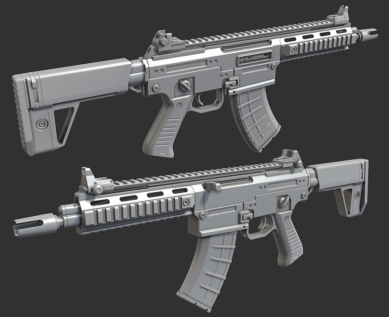
QBZ26 Gen 2 Carbine
Haven't done a game-res gun in some time so here we go.
I think I want to do both a base version and an "operator" one with some attachments and paint and stuff but no promises.
C&C welcome. Praise also welcome. Even insults welcome. This is a free comment zone
Concept by Weihao Wei: https://www.artstation.com/artwork/YGZR3
HP, done with the proboolean / dynamesh workflow I detailed here http://polycount.com/discussion/168610/proboolean-dynamesh-hardsurface-workflow-tutorial/p1


Test bakes at about 18k tris. I squeezed it all into one 4k map, for a production project I'd use a few 2ks for the sake of performance with texture streaming, but for personal work it's just more convenient to work in one file.


I think I want to do both a base version and an "operator" one with some attachments and paint and stuff but no promises.
C&C welcome. Praise also welcome. Even insults welcome. This is a free comment zone
Concept by Weihao Wei: https://www.artstation.com/artwork/YGZR3
HP, done with the proboolean / dynamesh workflow I detailed here http://polycount.com/discussion/168610/proboolean-dynamesh-hardsurface-workflow-tutorial/p1


Test bakes at about 18k tris. I squeezed it all into one 4k map, for a production project I'd use a few 2ks for the sake of performance with texture streaming, but for personal work it's just more convenient to work in one file.


Replies
I try to keep density parametric across all operands as much as possible, meaning using cylinders so you can change the side counts, turbosmooth on poly objects so that you can ramp down the subd, and chamfer so the segments can be dialed down. If you do this consistently then you don't really end up having to manually decimate anything or retopologize.
There's still manual work stitching up n-gons, Sometimes Turn to Poly is good enough but sometimes it triangulates things awkwardly. I also add control edges manually to make the normals more precise.
Hey Ben, Just wanted to say your models are tacky and I hate you.
nah looks cool, looking forward for more.
I actually used this "technique(?)" on my recent lantern model. Especially on those holes there, because otherwise I would've had long and thin triangles by collapsing those edges:
http://i.imgur.com/FEEImxO.jpg
And here it's without wireframe. The shading isn't pretty, BUT normal map baked onto that perfectly by looking really good on Marmoset, so no problem. Everything here is on one smoothing group, no hard edges, to avoid gaps in the normal map, and also I didn't have to split UVs more than I needed because of the lack of those. http://i.imgur.com/zUyZVrv.jpg
But I'm just always thinking with optimization by taking every wasted poly away which aren't affecting to the silhouette of high poly, but I think it's okay to leave those "shading controlling vertices" laying around for the sake of less gradients in the normal map, right? This "issue" is also something which isn't highlighted enough well in the technical sticky threads. Correct me if I'm wrong though.
Pointed out few things on the flat surfaces of your model which wondered me (But I think those edge loops on the magazine are really not necessary though). There might be more of these, but at least you get the point:
Or is this me just nitpicking?
EDIT: "I also add control edges manually to make the normals more precise." Oh, you actually stated this just before, lol. But anyway, just wanted to know more about this. Optimization to the max vs. controlling the low poly shading.
BUT, I can see the benefit especially on mipmapping when textures get to lower resolutions where your original low poly shading starts to push through low rez normal maps.
If you want to optimize for tricount alone then you could do without many of the supporting edges I put in there, and some parts that are connected could even be floating. I like to use the extra edges because it makes the normal map have to do less work to correct the mesh normals, meaning less gradients. This is helpful if the normal map ever needs to be downsized, and for edge-finding algorithms, and for the unfortunate cases where tangent basis differs in the renderer from what you baked in. It also reduces skewing in the bake caused by the cage being pushed out along vertex normals.
I think that cages and bakes should never be manually edited because those edits come back to haunt you if revisions ever come down and you need to re-create them. I always want to be able to auto-push a cage from the LP, do a new bake, and have maps that are "ready to go." So if there's ever a very long plane with some interior details (especially near edges) it can be smart to add extra geo to help preserve them. Otherwise you can end up having to combine bakes or paint out a skew map or whatever. Test bakes help you identify where these areas are.
I don't really specifically optimize for minimum triangle count. I think in COD:AW we had a 60,000 triangle gun. Every game, engine, and client is going to be different but when the client is myself I don't worry about it too much.
There's also a few places where I just forget to delete pointless edges. These guns have a lot of features on them and sometimes you develop perceptual blindness after working for a bit. I've fixed this area since but it's a good example:
But yeah, I've had moments where I forgot to delete some unnecessary loops, and the model was already UV'd and baked. The frustration was there, but of course I had to go back to fix it and redo UV's from that certain part and bake again. Luckily we have MT3's baker which is just amazing for quick iterating and baking/re-baking. No exploding or external cages.
I think the base version is nearly wrapped up... still thinking about doing some attachments for an alt version
suppressor model tonight
Another thing I noticed is on the concept, below the bolt, the inset there has the serial number; on yours it looks like the magazine plastic material is showing through, at first I was wondering if that was meant to be a faked hole to see the mag for some reason, but that doesn't seem right. But if it's not a fake hole why is it rough plastic? If it's an inset to support the mag surely it would be steel.
AND just because I'm a total bastard; slight eye twitch at the center vertex on those cylinder caps on that suppressor; what is it about 3ds max that causes this to happen to everyone
The workflow looks like fun, I don't have Zbrush to try it though.
My only critiques are not critiques, more a question of taste
First the markings, I would prefer the Chinese version as in the concept.
Second, the iron sight has a very strong horizontal line, makes it look a bit bulky. Breaking it up a bit might help, something like this.
Bit late in the process for this.
Yes, it gets kind of bad at grazing angles like in FPV
The lower rec is mirrored so I couldn't get any text in there, I just texturized it to look like a grip point or something. I might do a text sheet so I can float more writing and icons across the gun on cards.
I used to avoid fan caps for cylinders for tricount reasons, but now I use them because 3ds max seems to use contiguous edges to inform vert normals, at least for pushing a mesh out (for the cage). So at least in 3ds, using the fan cap instead of a ladder cap ensures an even projection because the outer verts all have the same angle to their inner cap edge.
Toolbag itself has artifacts with grazing angles that are not resolution dependent.
I use substance designer / painter at work and sooner or later I'll switch over to that at home as well.
Sorry for no-update bump, next post will have some content
I also much prefer AO bakes in Xnormal, they're not all that great for procedural work, but they work better as actual AO maps, but again. This might be just me.