The BRAWL² Tournament Challenge has been announced!
It starts May 12, and ends Oct 17. Let's see what you got!
https://polycount.com/discussion/237047/the-brawl²-tournament
It starts May 12, and ends Oct 17. Let's see what you got!
https://polycount.com/discussion/237047/the-brawl²-tournament
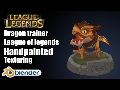
League of Legends Tristana dragon handpainted texturing in Blender
polycounter lvl 10
| GAME ART | League of Legends Texture Tristana dragon handpainted texturing in Blender , I play league of legends pretty much everyday, and Tristana is my main character to play, so I decided to do a fan art for her little dragon puppy.
 https://youtu.be/U34QYKmaZ-I

 http://polycount.com/post/discussion/3d-art-showcase-critiques
https://youtu.be/U34QYKmaZ-Ihttp://polycount.com/post/discussion/3d-art-showcase-critiques
Replies
This turned out nicely.
That being said, I think adding some gradient might give this little guy a tiny bit extra pop.
Other than that, great job!