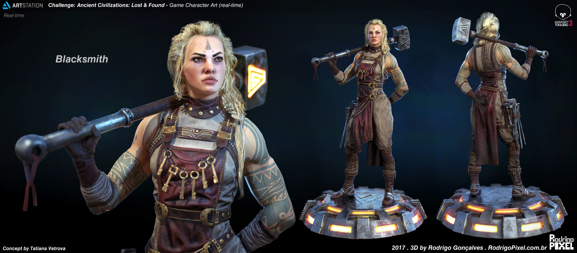
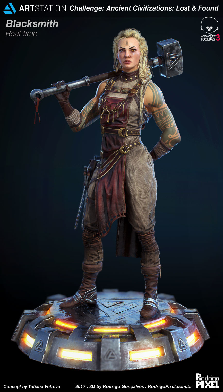
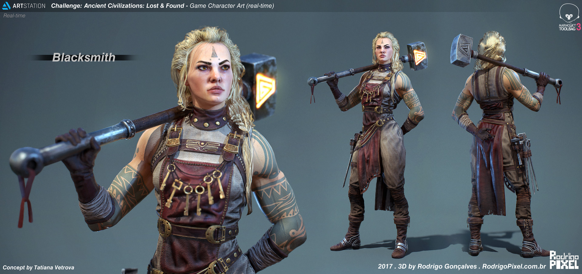
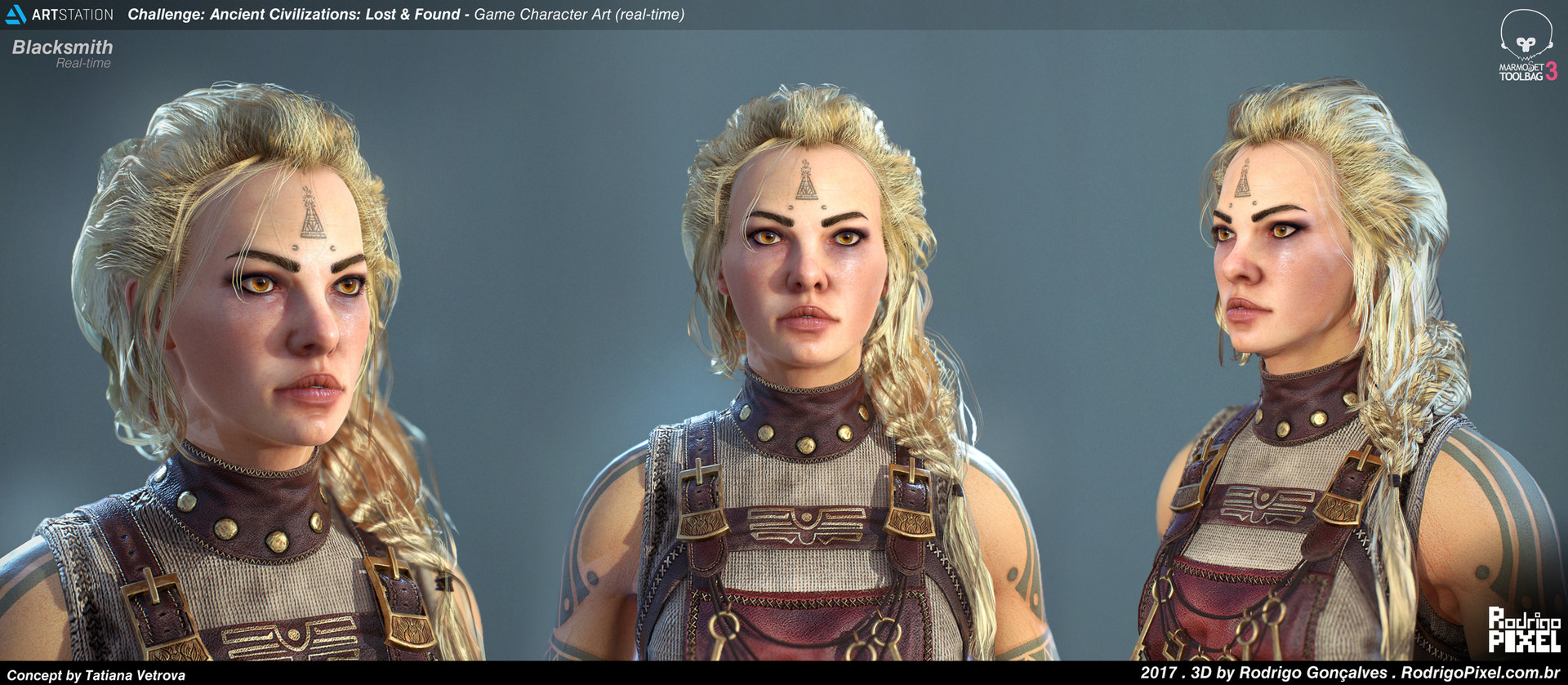
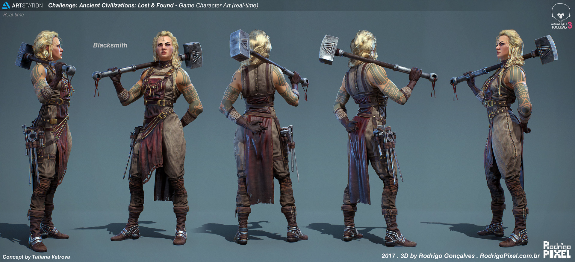
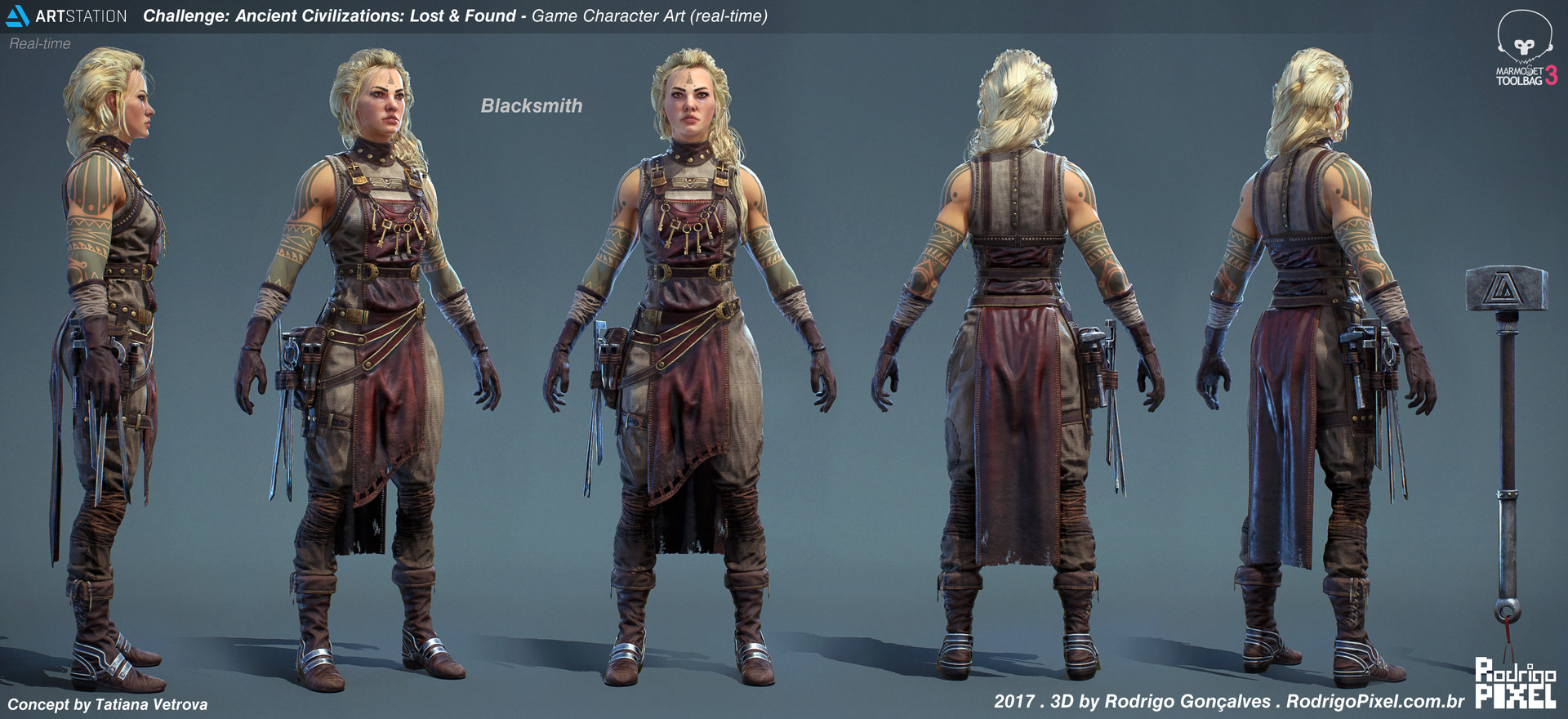
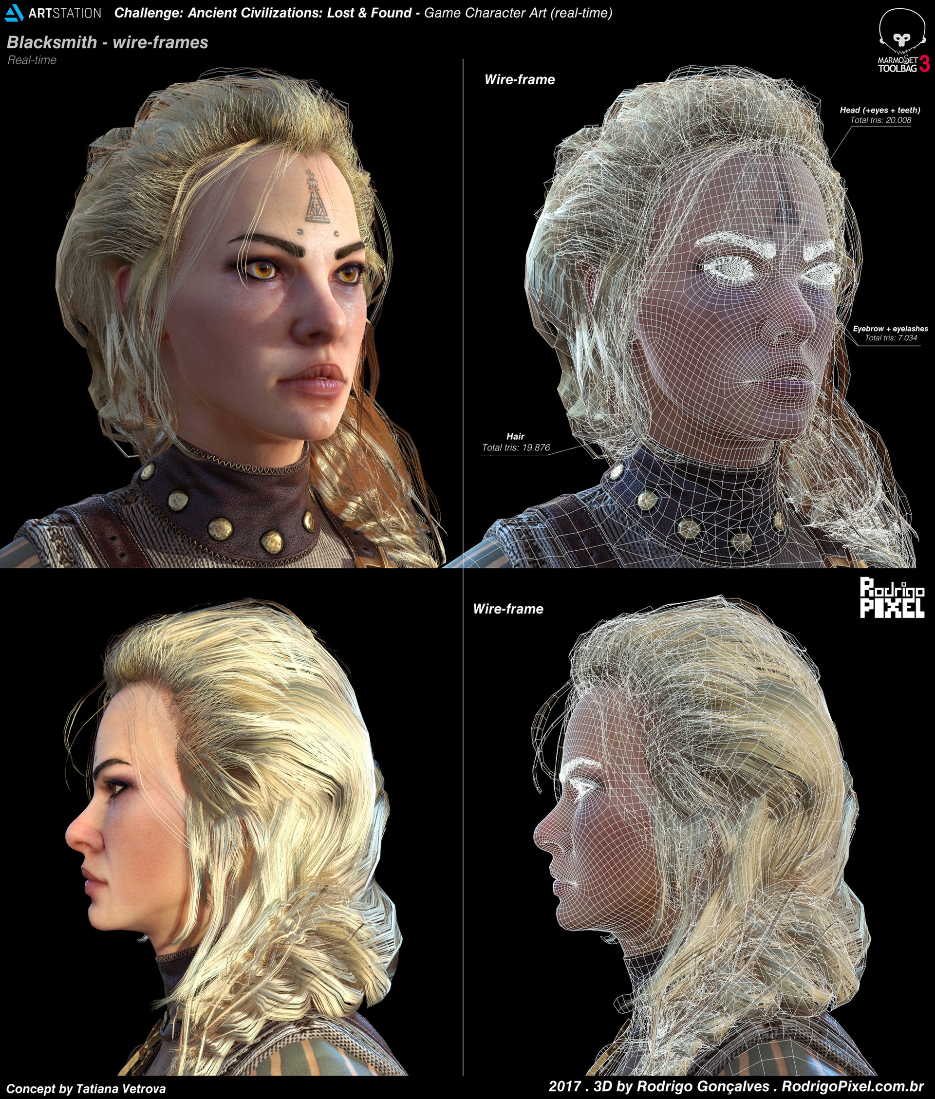
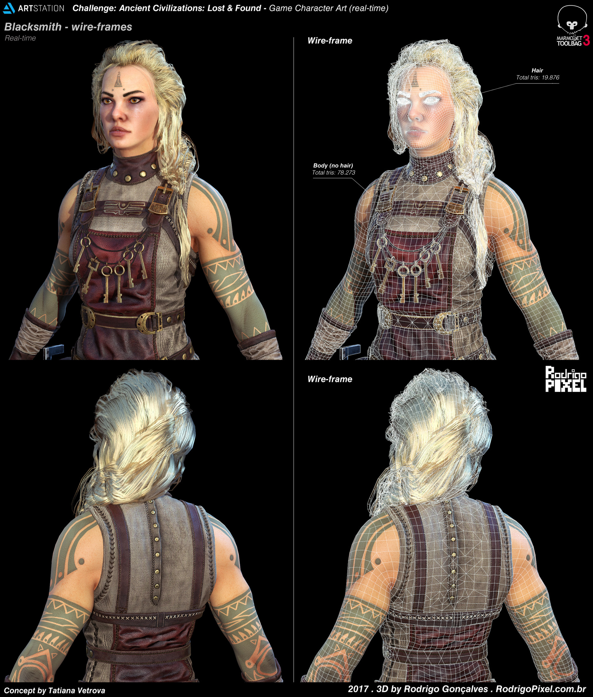
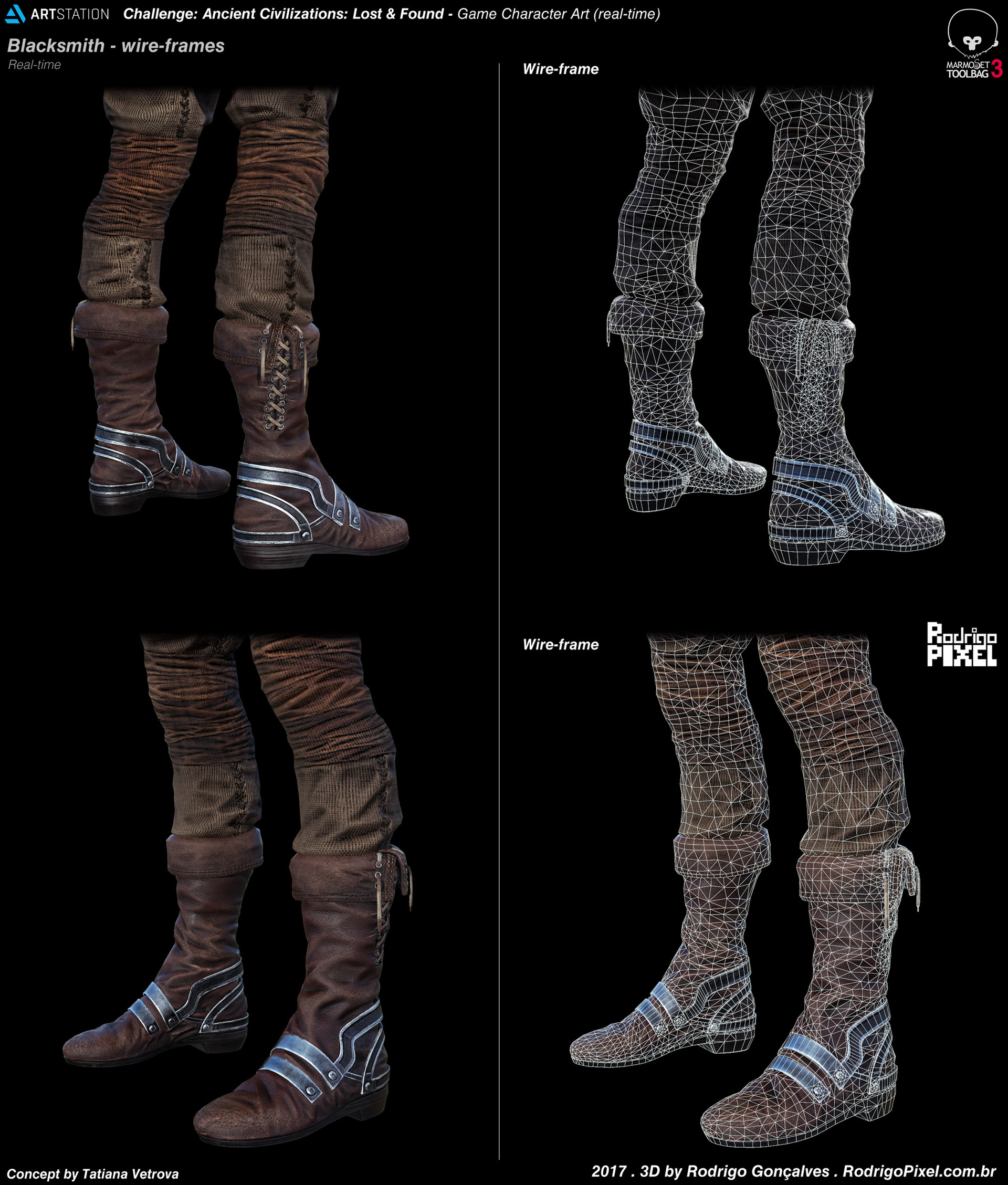
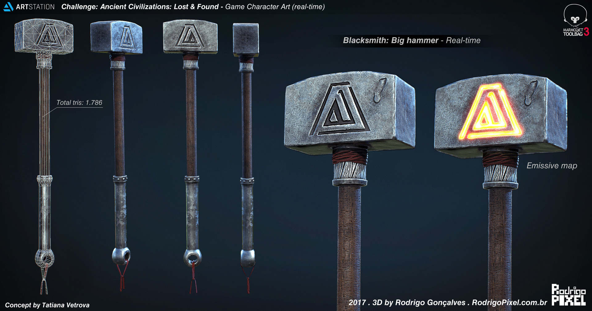
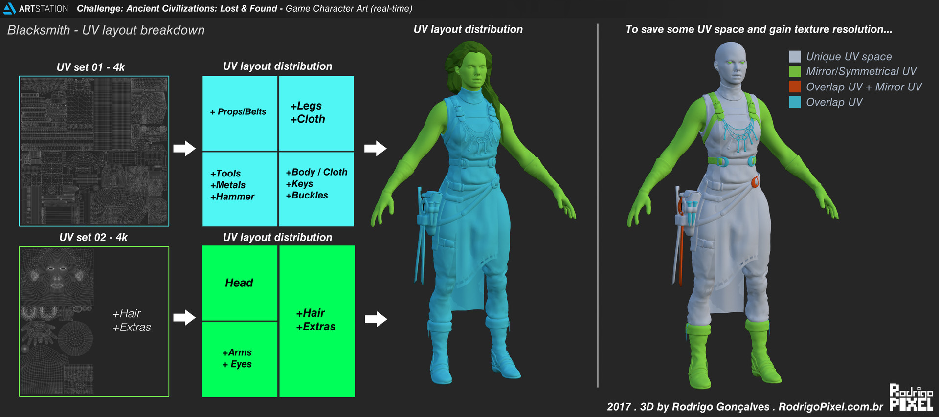
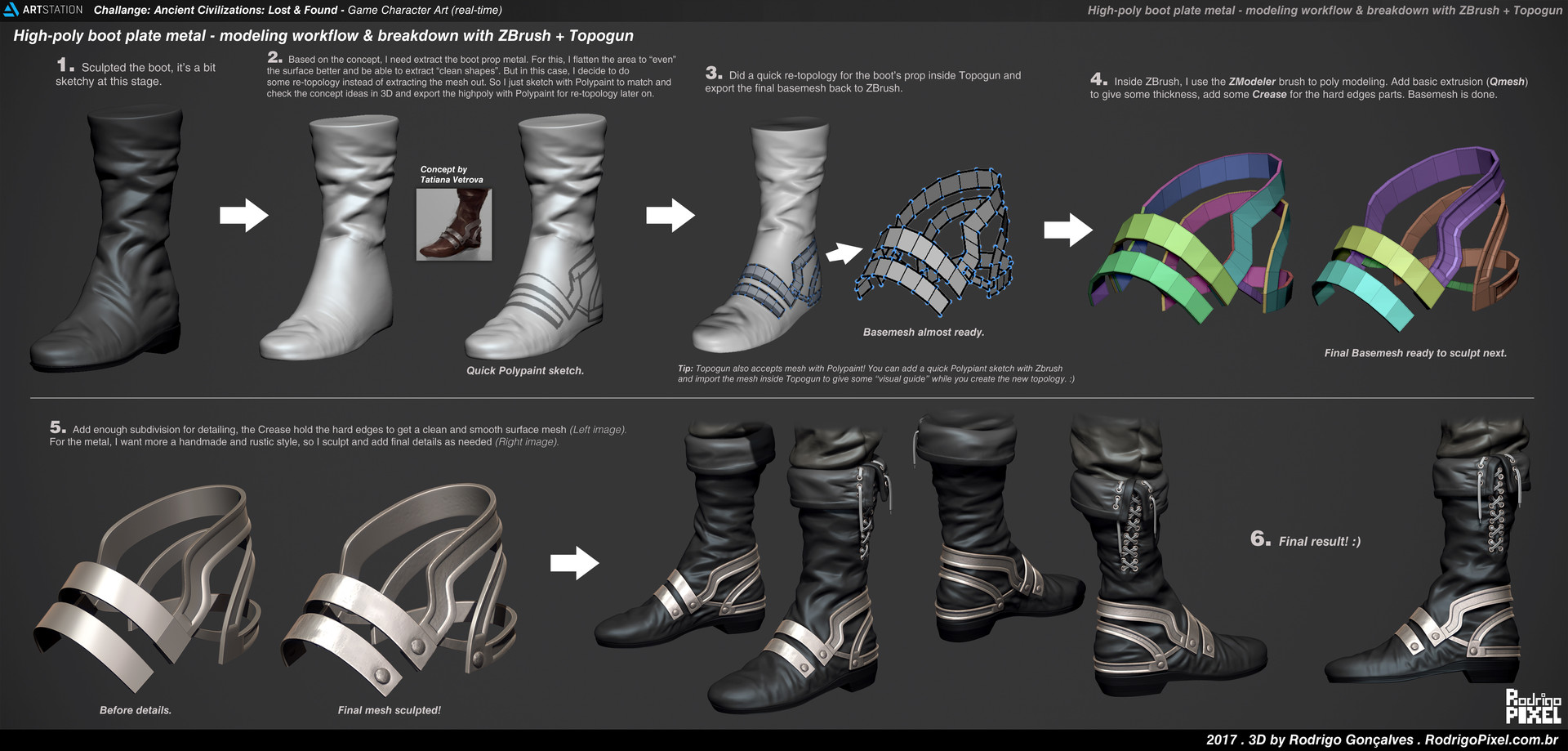
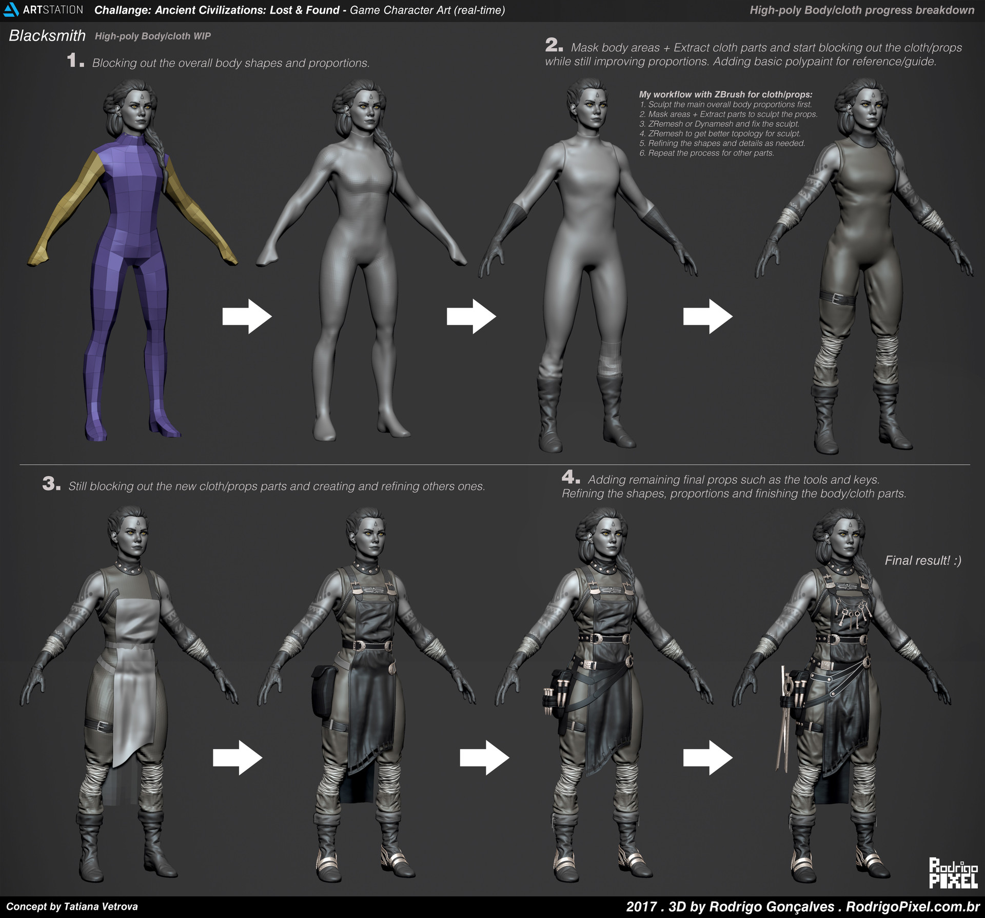
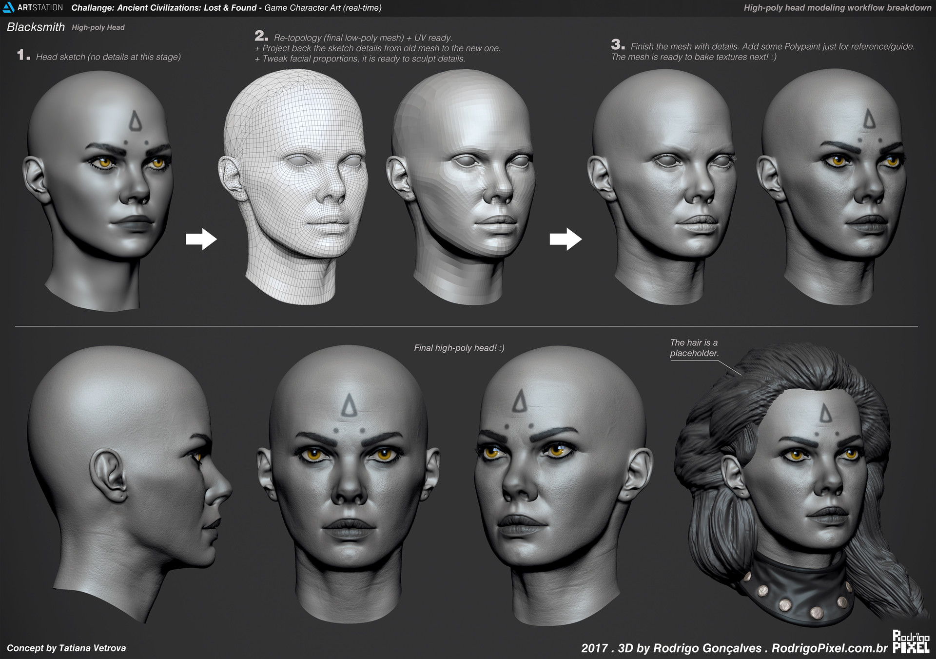
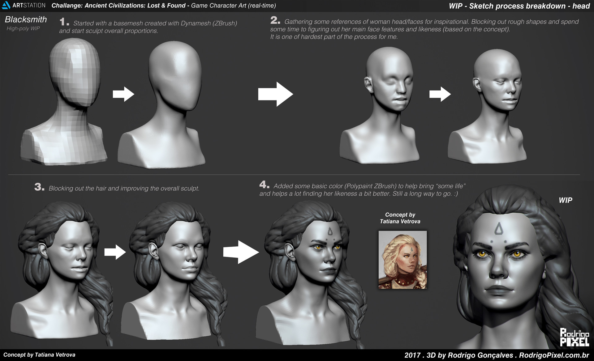
This is my favorite submission from the challenge you really nailed the concept. Really like the boots they look great. Also thanks for the breakdown the only things I'm wondering is how you did the hair did you place them by hand the cards? And how did you add more details to the face texture from the base color you did in zbrush?
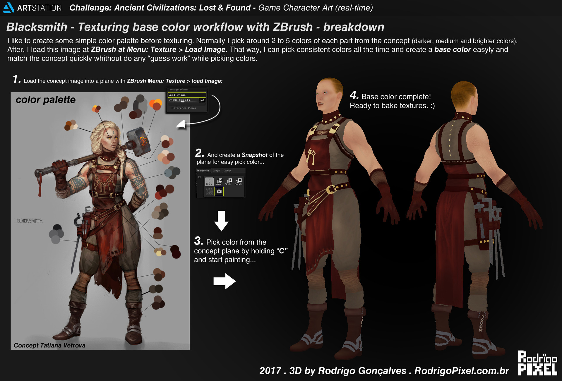
Hey Sunray! Thank you so much for the support. i'm glad you liked. About the skin texture, I did a polypaint inside zbrush and bake it out the base color map from high-poly to low-poly, and after I continue enhance the texturing with photoshop to get final diffuse/albedo map. I also create the roughness for the skin at Photoshop and adding a bit of cavity and convexity (from curvature) maps to help break the highlights and paint over area with black and white to get more or less roughness/glossy in some parts of the face. Hope it makes sense.
Also check this video from Marmoset it show a bit of skin shader workflow with Marmoset, I tried to use something similar with the sss shaders for the skin.
Regarding the hair, I think you just asked in the right time Here is a breakdown how I did the hair cards inside ZBrush. Hope that is useful for something! Cheers!
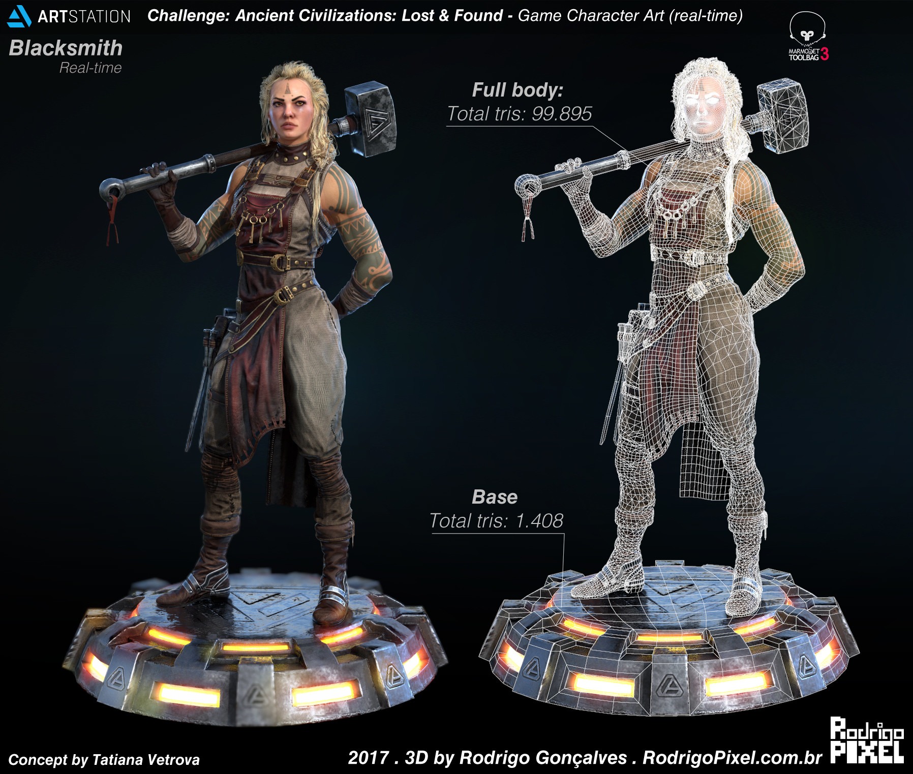
Yep great model. I wish I could do something like this, but my skill is beneath that But as an conceptual graphic designer, I can't get the purpose of this base.
It looks a bit sci-fyisch and it doesn't fit very well to the rest of the model and this is very sad I think. The model is very great and a nice looking and meaningful base would be far greater. I participated to the challenge as well, and I thought well, the base need some meaning to it - so I decided to get in contact with the concept artist and ask her about the character and lifestyle of the concepted figure. She told me she is a nifty old shaman lady - had wih some dirty tricks behind her back to cheat their customers. So I decided to implement some hidden features on her body and on the base. From the presented angle, you were not be able to spot the 'magic-making-machines' but after watching her back, you see some assets of bertraying.
The base sould define the world of the character. It's a important feature for the character- at the moment it's just a weak hint
Anyway - thanks for you informational ressource. They are indeed amazing!
Thanks so much everyone for the feedback and support! I'm glad to know the breakdowns can be useful for something somehow.
- gestoryscht, Thank you so much for thoughtful feedback, it helps a lot. I totally agree with your points for the base. I will improve next time! Cheers!
Here is one more breakdown, how I did the tattoos for Blacksmith. Hope it is useful for something.
This turned out really nice man! Did you do all your texturing in zbrush? The tattoo looks like something you could do very easily in Substance Painter for example. Either way, fantastic results!
Thank you so much everyone for the great feedback and support for me to improve!
@Sam Hatami, Wow, thanks for that, I'm happy to know that those breakdowns can be useful somehow for someone. Means a lot!
@kreativbloc, thanks a lot for the feedback. Definitely I need to improve the folds sculpts skills! I will get better next time.
@slosh, Thank you so much for the feedback for me to improve. It helps a lot! Regarding the texturing, I do my base color on the highpoly inside zbrush to start (but no further detail, just basic colors, or gradients variations), I found better and quick to do hand-paint for the base color in zbrush (just preference) to have a base diffuse/albedo to start texturing. Like in this image. High-res image link
Regarding Tattoos workflow/breakdown. Thanks for the tip! Definitely I know and understand that this can be achievable similar and easily in SPainter too or other similar software, and that is great. But in this case, I decided to do that tattoo using this workflow with Zbrush + Photoshop. Also, I know I could do a mask inside SPainter and export that as mask if need too, etc...but for this specific case, I few more comfortable do handpaint mask inside Zbrush, just feel better while painting handpaint stuff in some cases. But again, tools are just preference, and workflows too, and there are tons of ways of achieve same results, faster or simpler and I guess there is no right or wrong answer for that. I think as long as I can deliver stuff on time with good results enough for the project, I think that is the goal on the end. Here is my basic workflow I use between software while texturing if that helps answering anything. High-res image link
Also, regarding the breakdowns that I create in general. I never assume everyone
knows what I did, so while some trick/workflow, for sure might be simple and easy for some more
experienced/exports artists, maybe it might not be so simple and easy for others
who might want to start. Also, I try to explaining "the logic behind" the workflow itself and not just focus too much the "press here button" workflow. So that way, in most cases that info can be
easily translate for whatever similar software you like, like SPainter, Mari, 3D-coat etc. Hope it makes sense.
Again, thank you som much Slosh for you support and great feedback! Cheers!
Thank you so much everyone for the great feedback and support for me to improve!
I'll always have a respect for artist who put the time to share their workflow. So, thank you! Final results looks freaking amazing too, congrats. Hope to see more from you.
I appreciate so much your time in these breakdowns! I've learned a lot!
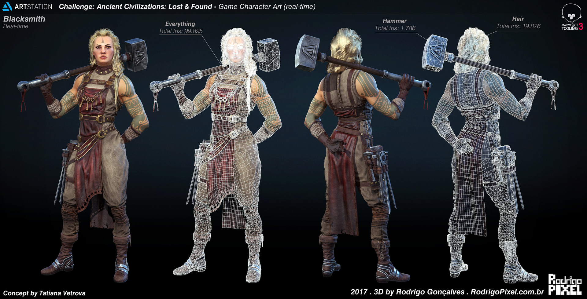
My friend, as a constructive feedback, the only thing you should try to "master" a bit more right now is the hair. It was the only thing that bugged me in the character cause i can see all the planes and it's a bit messy (form, depth and color wise).
I'm no expert on the matter, and it's a workflow that still confuses me a lot because there is not much updated info or tutorial. I know it's hard as hell XD but here are some people with cool examples, where you might try to dig some info out:
@JimmyRustler,Thanks so much for the support! I'm glad you liked the breakdowns! Means a lot.
@andrelopes, Thanks you for the references and feedback!I Awesome references indeed, I will check that links further. Thanks a lot for that. I totally agree with your points, by no means this hair I did is perfect and I would spend more time polishing everything if I had that time to spent for this challenge. Definitely hair always will be a eternal WIP for me and is something that I guess will learn over time by practicing more. Thanks for feedback for improvements! It helps a lot! Cheers!
Rodrigo, that makes a lot of sense! Definitely a lot of ways to do stuff with character art and there is certainly no right or wrong. All that matters is the final product looks great and you have done that!
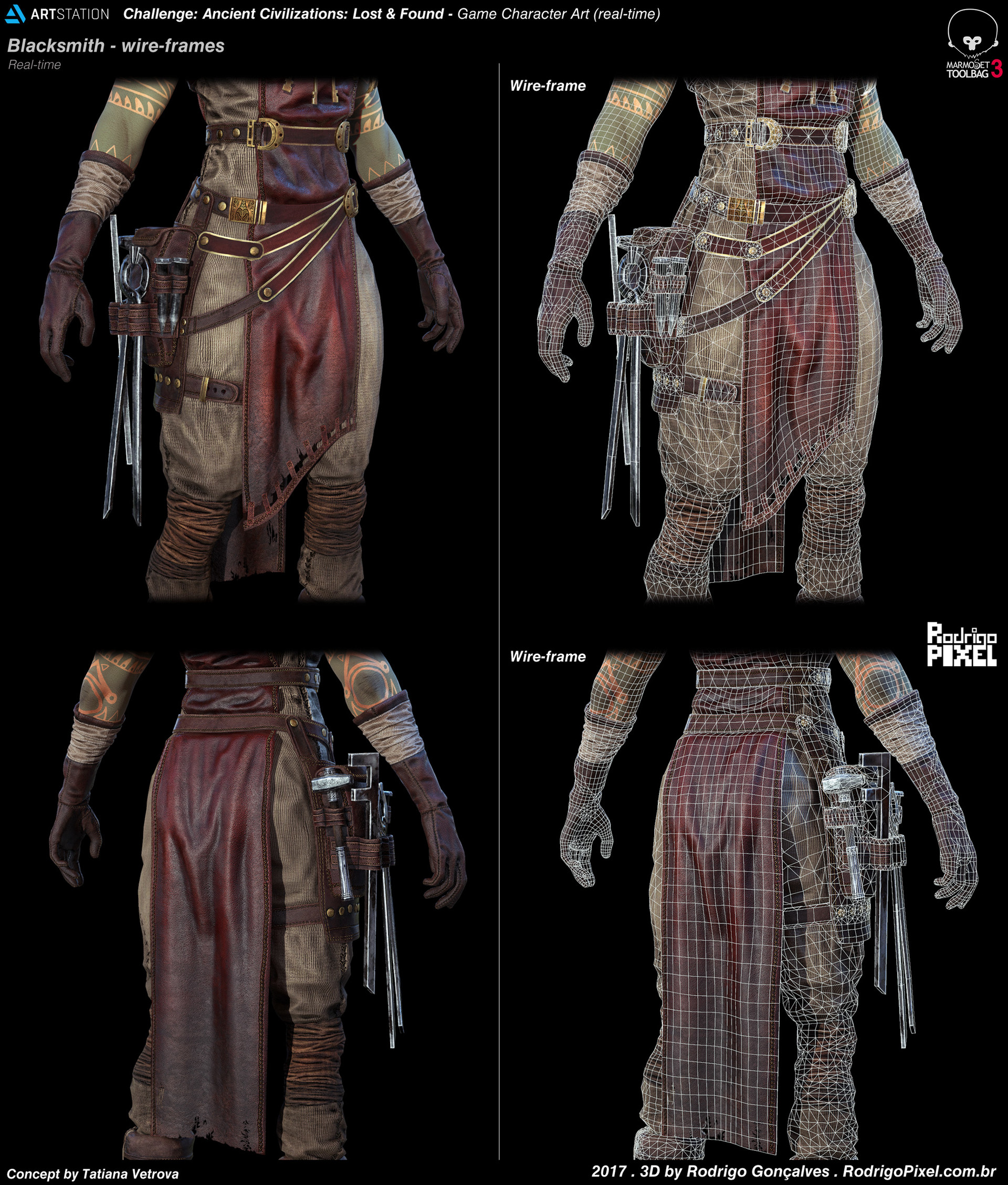
Looks very good, I think the folds, especially on the thighs, leave a little to be desired, they don't really flow naturally to me but as a whole this is a great piece.
Rodrigo, this is so fantastic. Thank you for putting together so many resources on the different pieces of your workflow! Very illuminating and inspiring
The only thing I don't think you touched on in your breakdowns and that I personally am finding a little underwhelming about the finished piece is the pose. I love how the character model itself came out, but even though I can see in the turn-around that she's crossing her fingers behind her back, on first look it really reads as one of those "artist hides hands behind back because hands are hard to draw" pose. For a character with so much personality in her clothes and props, I wish that she had more character in her pose! Besides that, really stunning work! I just know this is a thread I'm going to be revisiting to take a look at these breakdowns and tips again in the future!
Slosh, thanks for your understanding. I know that I still have a lot to improve though.
@Maxilator, thanks a lot for the feedback. Definitely I need to improve the folds sculpts skills! I will get better next time.
@wingaersheek, thanks a lot for your feedback I'm glad you liked some stuff! I totally understand your points about improve the pose, thanks for that. But I kindly don't agree with some part of it. Because, one thing is lack of experience/skill/knowledge to do/apply a proper pose, if that is the case, I agree, I might just need to spend more time with posing and experimenting with different poses to be good enough for that purpose. But another totally different thing is think that a "artist [hides] hands behind back because hands are hard to draw" pose. That is not true! I don't know if you saw the concept (by Tatiana Vetrova).
So technically, I just try to keep the same idea from the original pose, If that can be another better pose for her, this might be another question and maybe a matter of trying new poses until be better. Also, by no mean what I did is free from errors at all. Actually is totally opposite, I understand that I have a lot to improve and learn, and I already see much better the mistakes I did from all the great feedback to improve so far, and I really appreciate your time to do that too, it helps a lot, I mean that. But please, don't "judge a artist by its art" and assuming that I "hide" things, that simply is not true. Hope it makes sense.
Also, I don't think that is so "weak" pose, might not be a better pose for her, but is not a that weak pose either. I always try to look a strong silhouette while posing. Hope it makes sense. Again, thanks for your feedback. Cheers!
@rodgon - I hadn't actually seen the concept, it absolutely makes sense that you were following that in terms of pose! I didn't mean at all that your execution was a reflection of your ability in being able to pose a character. I'm sorry if it came across that way. You completely nailed it in terms of following the concept!! But as some who personally went through a phase of hiding hands when I was an amateur artist, that's what first came to mind when I saw the pose. The silhouette does read very strong, I guess I'm just really strongly feeling the "negative space" where the hand itself would be. The exact same pose with her hand on her hip and visible to the viewer from the front would make it feel more complete to me, but of course that's an artistic choice that would deviate from the concept
Serious kudos for the amazing work. The look, feel and pose is perfectly to the concept
@wingaersheek, no worries, It's all good, thanks for your understanding and time for clarifying things. I really appreciate your time to give me feedback, and I really mean it in good way. It helps me think where I can improve. Also, I understand your thoughts about the pose choices, there are always room for improvements in many things, anatomy, face, hair, pose, cloth folds, etc, and if could, I would expend more time improve and polishing everything and try new ideas for bases, etc, but this challenge hit an end deadline, so mistakes are expected for sure, but I will improve on next project. I just need keep practicing more in the right direction and that is why is important have good feedback for improvement. Again, thanks for the support and great feedback! Keep rocking! Cheers!
Replies
This is my favorite submission from the challenge you really nailed the concept. Really like the boots they look great. Also thanks for the breakdown the only things I'm wondering is how you did the hair did you place them by hand the cards? And how did you add more details to the face texture from the base color you did in zbrush?
About the skin texture, I did a polypaint inside zbrush and bake it out the base color map from high-poly to low-poly, and after I continue enhance the texturing with photoshop to get final diffuse/albedo map. I also create the roughness for the skin at Photoshop and adding a bit of cavity and convexity (from curvature) maps to help break the highlights and paint over area with black and white to get more or less roughness/glossy in some parts of the face. Hope it makes sense.
Also check this video from Marmoset it show a bit of skin shader workflow with Marmoset, I tried to use something similar with the sss shaders for the skin.
Regarding the hair, I think you just asked in the right time Here is a breakdown how I did the hair cards inside ZBrush. Hope that is useful for something! Cheers!
High-hes image here!
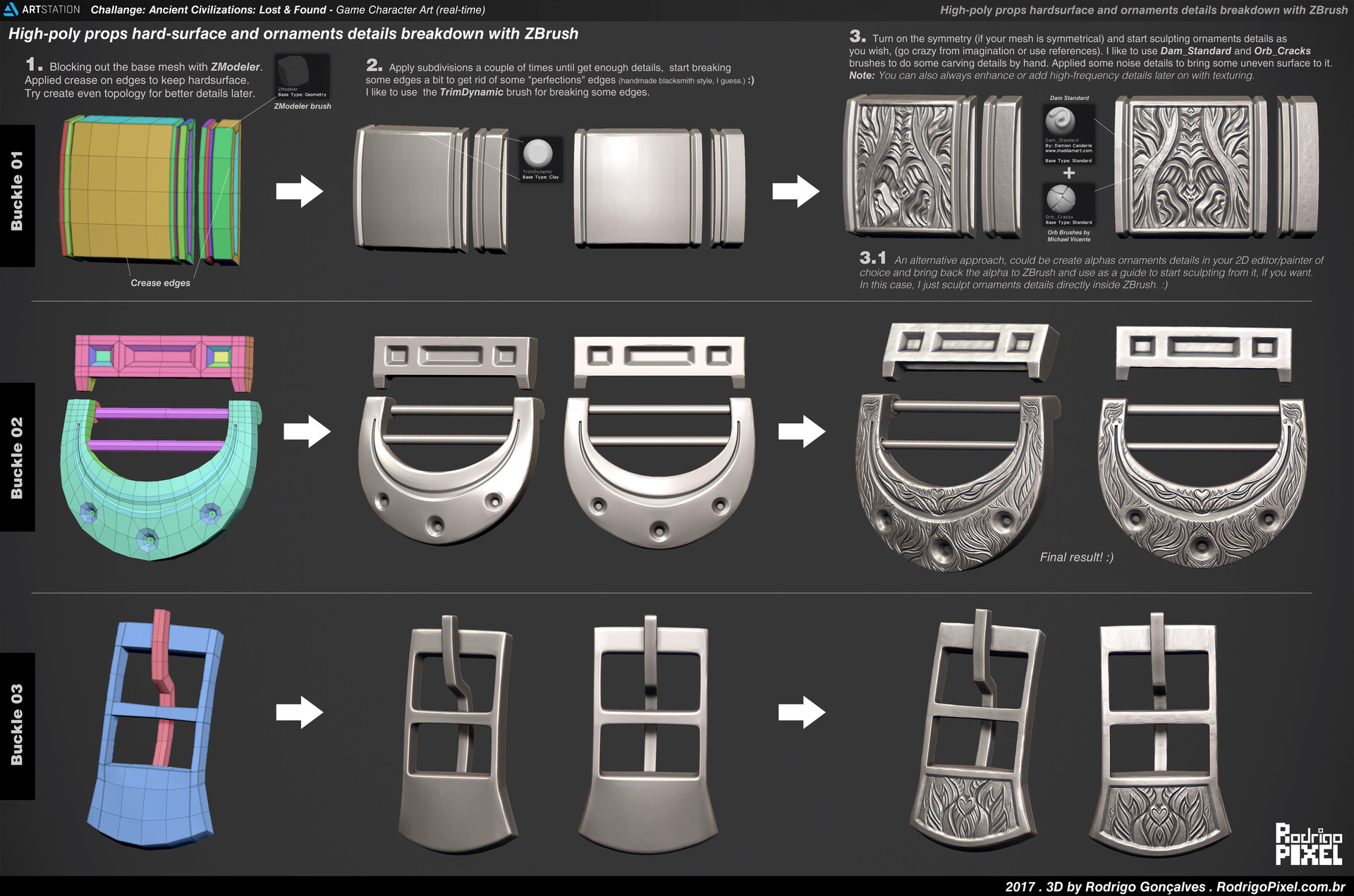
I love the "how to" images you made, its always interesting to look at different peoples workflows
Extremely awesome stuff, thanks for sharing!
But as an conceptual graphic designer, I can't get the purpose of this base.
It looks a bit sci-fyisch and it doesn't fit very well to the rest of the model and this is very sad I think. The model is very great and a nice looking and meaningful base would be far greater. I participated to the challenge as well, and I thought well, the base need some meaning to it - so I decided to get in contact with the concept artist and ask her about the character and lifestyle of the concepted figure.
She told me she is a nifty old shaman lady - had wih some dirty tricks behind her back to cheat their customers. So I decided to implement some hidden features on her body and on the base. From the presented angle, you were not be able to spot the 'magic-making-machines' but after watching her back, you see some assets of bertraying.
The base sould define the world of the character. It's a important feature for the character- at the moment it's just a weak hint
Anyway - thanks for you informational ressource. They are indeed amazing!
- gestoryscht, Thank you so much for thoughtful feedback, it helps a lot. I totally agree with your points for the base. I will improve next time! Cheers!
Here is one more breakdown, how I did the tattoos for Blacksmith. Hope it is useful for something.
High-hes image here!
@Sam Hatami, Wow, thanks for that, I'm happy to know that those breakdowns can be useful somehow for someone. Means a lot!
@kreativbloc, thanks a lot for the feedback. Definitely I need to improve the folds sculpts skills! I will get better next time.
@slosh, Thank you so much for the feedback for me to improve. It helps a lot!
Regarding the texturing, I do my base color on the highpoly inside zbrush to start (but no further detail, just basic colors, or gradients variations), I found better and quick to do hand-paint for the base color in zbrush (just preference) to have a base diffuse/albedo to start texturing. Like in this image.
High-res image link
and after that, I bake texture on substance painter with this workflow that I've learn from awesome Michael Pavlovich's video.
https://www.youtube.com/watch?v=627d4DSsDCY
Regarding Tattoos workflow/breakdown. Thanks for the tip! Definitely I know and understand that this can be achievable similar and easily in SPainter too or other similar software, and that is great. But in this case, I decided to do that tattoo using this workflow with Zbrush + Photoshop. Also, I know I could do a mask inside SPainter and export that as mask if need too, etc...but for this specific case, I few more comfortable do handpaint mask inside Zbrush, just feel better while painting handpaint stuff in some cases. But again, tools are just preference, and workflows too, and there are tons of ways of achieve same results, faster or simpler and I guess there is no right or wrong answer for that. I think as long as I can deliver stuff on time with good results enough for the project, I think that is the goal on the end. Here is my basic workflow I use between software while texturing if that helps answering anything.
High-res image link
Also, regarding the breakdowns that I create in general. I never assume everyone knows what I did, so while some trick/workflow, for sure might be simple and easy for some more experienced/exports artists, maybe it might not be so simple and easy for others who might want to start. Also, I try to explaining "the logic behind" the workflow itself and not just focus too much the "press here button" workflow. So that way, in most cases that info can be easily translate for whatever similar software you like, like SPainter, Mari, 3D-coat etc. Hope it makes sense. Again, thank you som much Slosh for you support and great feedback! Cheers!
Thank you so much everyone for the great feedback and support for me to improve!
Final results looks freaking amazing too, congrats. Hope to see more from you.
My friend, as a constructive feedback, the only thing you should try to "master" a bit more right now is the hair. It was the only thing that bugged me in the character cause i can see all the planes and it's a bit messy (form, depth and color wise).
I'm no expert on the matter, and it's a workflow that still confuses me a lot because there is not much updated info or tutorial. I know it's hard as hell XD but here are some people with cool examples, where you might try to dig some info out:
http://kollarandor.com/tutorial/fast-way-create-polygon-hair-character-maya/
https://www.youtube.com/watch?v=1Fs6rle_IbE
This fellow Polycount neighbour, @thomasp rocks in hair:
http://polycount.com/discussion/83970/sketchbook-thomasp/p1
http://polycount.com/discussion/171496/vertex-colors-vs-bitmap-texture-cost-performance-considerations
@andrelopes, Thanks you for the references and feedback!I Awesome references indeed, I will check that links further. Thanks a lot for that.
I totally agree with your points, by no means this hair I did is perfect and I would spend more time polishing everything if I had that time to spent for this challenge. Definitely hair always will be a eternal WIP for me and is something that I guess will learn over time by practicing more. Thanks for feedback for improvements! It helps a lot! Cheers!
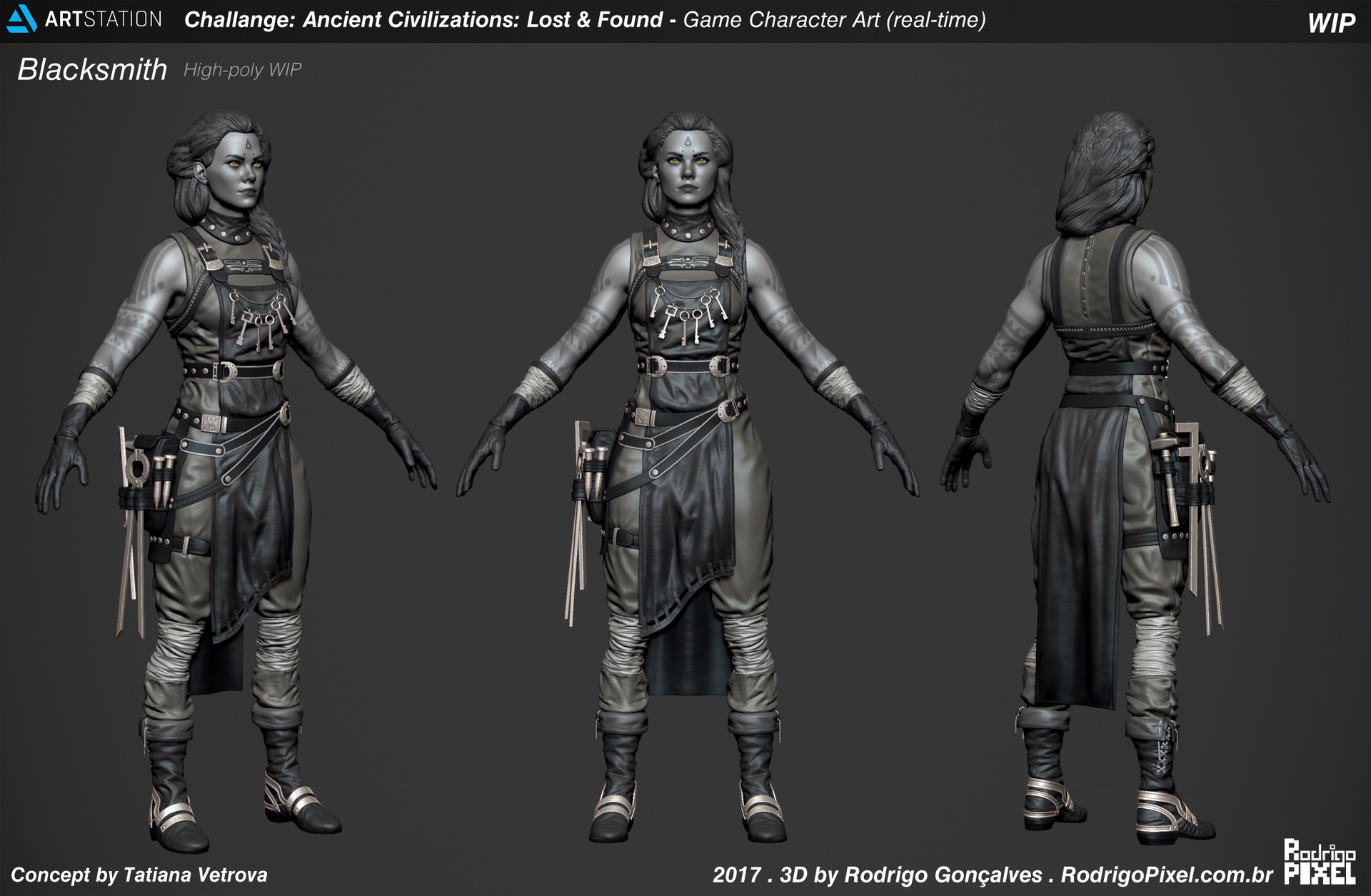
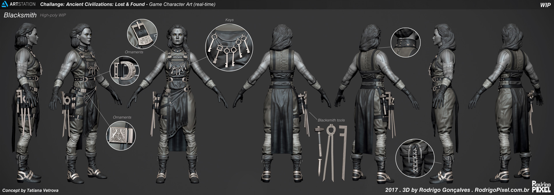
The only thing I don't think you touched on in your breakdowns and that I personally am finding a little underwhelming about the finished piece is the pose. I love how the character model itself came out, but even though I can see in the turn-around that she's crossing her fingers behind her back, on first look it really reads as one of those "artist hides hands behind back because hands are hard to draw" pose. For a character with so much personality in her clothes and props, I wish that she had more character in her pose! Besides that, really stunning work! I just know this is a thread I'm going to be revisiting to take a look at these breakdowns and tips again in the future!
@Maxilator, thanks a lot for the feedback. Definitely I need to improve the folds sculpts skills! I will get better next time.
@wingaersheek, thanks a lot for your feedback I'm glad you liked some stuff!
I totally understand your points about improve the pose, thanks for that. But I kindly don't agree with some part of it. Because, one thing is lack of experience/skill/knowledge to do/apply a proper pose, if that is the case, I agree, I might just need to spend more time with posing and experimenting with different poses to be good enough for that purpose. But another totally different thing is think that a "artist [hides] hands behind back because hands are hard to draw" pose. That is not true! I don't know if you saw the concept (by Tatiana Vetrova).
So technically, I just try to keep the same idea from the original pose, If that can be another better pose for her, this might be another question and maybe a matter of trying new poses until be better. Also, by no mean what I did is free from errors at all. Actually is totally opposite, I understand that I have a lot to improve and learn, and I already see much better the mistakes I did from all the great feedback to improve so far, and I really appreciate your time to do that too, it helps a lot, I mean that. But please, don't "judge a artist by its art" and assuming that I "hide" things, that simply is not true. Hope it makes sense.
Also, I don't think that is so "weak" pose, might not be a better pose for her, but is not a that weak pose either. I always try to look a strong silhouette while posing. Hope it makes sense. Again, thanks for your feedback. Cheers!
Serious kudos for the amazing work. The look, feel and pose is perfectly to the concept
Also, I understand your thoughts about the pose choices, there are always room for improvements in many things, anatomy, face, hair, pose, cloth folds, etc, and if could, I would expend more time improve and polishing everything and try new ideas for bases, etc, but this challenge hit an end deadline, so mistakes are expected for sure, but I will improve on next project. I just need keep practicing more in the right direction and that is why is important have good feedback for improvement. Again, thanks for the support and great feedback! Keep rocking! Cheers!
Your work is amazing. Congratulations for the first place!