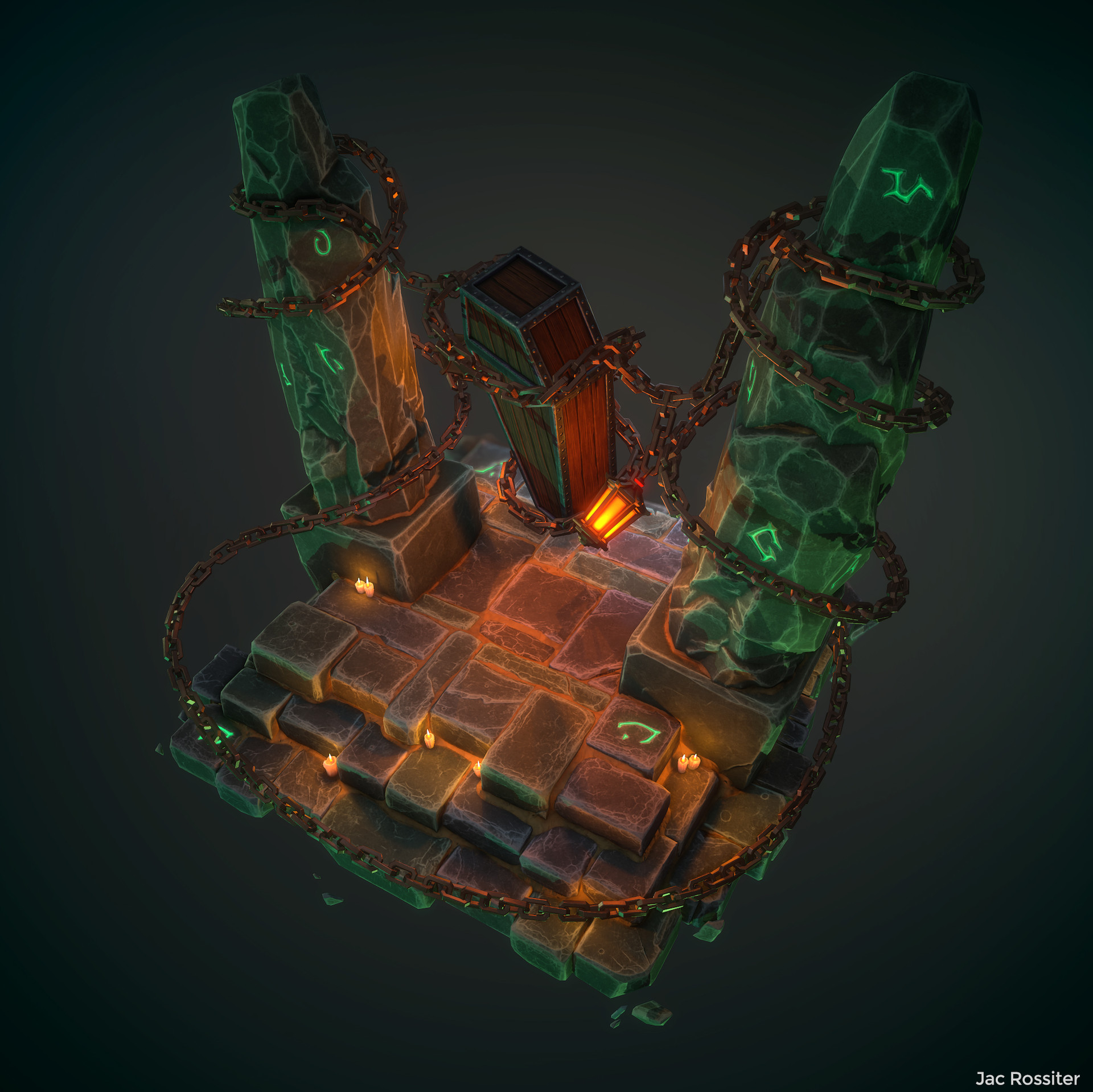
Stylised Diorama - Do not Disturb, May contain Boss!
Most Recent: https://www.artstation.com/artwork/8yv4


 The goal is to create a Stylised Diorama featuring some form of creature or entity bound by magic and chains in order to keep them in an eternal slumber.


For this project I'll be using Blender, ZBrush, Substance Painter/Designer and Marmoset Toolbag 3.
Feel free to post critiques and any advice you think will help


 The goal is to create a Stylised Diorama featuring some form of creature or entity bound by magic and chains in order to keep them in an eternal slumber.

For this project I'll be using Blender, ZBrush, Substance Painter/Designer and Marmoset Toolbag 3.
Feel free to post critiques and any advice you think will help

Replies
Next is a lantern I was working on today. I like where it's going but I think that due to their size I would be better off simplifying the design in order to make it more readable from afar.
This is my attempt at starting the highpoly, as you can see the details do not hold up overly well from afar.
Tomorrow I will revisit the lantern in hopes to make a more stylised and readable version.
Currently I feel like the two stone pillars are working well, but the stone slabs on the base could be pushed much further, really dig into them a bit, give them some more interesting grooves, wear and age, they're just really even right now and the subtle sculpting you have done to them doesn't feel like enough.
This will give it them much more character.
Everything in your scene has this really nice chunky feel to it, apart from the lantern, which feels small and the design doesn't seem to match everything else. Maybe try thicker pieces of metal, a few big bolts in it, a bit of character. The thin sections of metal aren't reading that well, plus with very little actual area that would give out light, it doesn't really look that functional. Maybe something closer to this?
The coffin looks good, but maybe add in some wearing and scratches where those big chains are rubbing against it and would be scratching and digging into it if they are supporting the whole object in the air.
Just some ideas
It's still not 100% but I think it's an improvement! Tomorrow I'll replace the metal ring on the top of the lantern for something a little chunkier like the chains. I'll also revisit the bricks and try a different approach.
I would appreciate any suggestions regarding the brick work detailing. I'm more than happy to go back to the HP and make adjustments.
I would echo the feedback given above. Some of your artistic choices could be a little more bold. Don't be afraid of being a little brutal.
If you make a crack in the stone, make a CRACK in the stone!
Definitely shaping up to being a nice little scene.
Next I may revisit the coffin and improve the textures. The wood especially needs some love!
I've also been working on the new version of bricks, should have something to post on that tomorrow
I really like how the rocks hold together with the sand (filler)
Might I suggest hollowing out the key hole in the lock.
@KurtPoly Thanks, I think I'll be going for the Purple lighting as I feel the green has too much of a scientific vibe.
Here's the latest version of the sculpted bricks. I'm going to make the ground and the pillars all into one piece and I think that will help make the stone work more cohesive. Currently I'm mocking up a lowpoly and I'm going to check how the highpoly details bake down and hold up in the scene.
Also you can add a bit of the sand to the stones itself not only in the corners so there will be smooth transition between amount of sand and not just straight line sand/bricks
Solid work, definetly improving!
@qwedeath Thanks for the feedback. I designed the rune on the coffin to be quite readable from afar while also revealing some detailing when looking up close. I've added some sand to the tops of some stone but it's not super intense right now, i'll look at pushing that effect some more. I think you've got a good point about making the sand blend better with bricks, I will try that!
@Loren Broach Thanks! That's exactly what I'm going for!
@s1dK @SpaceRogue@snoops3dThanks!
@Handwiches Yeah for sure. @Kashaar and @fearianwere the ones that suggested reworking the placement of the chains/coffin. I tried to take their advice but also just go a little nuts with it!
@Spoon Just wanted to say thanks for the feedback before on the bricks. It really helped get the ball rolling for me to be bolder artistically!
I'm glad if I could be of any help
@RustySpannerz @Elithenia @VeryCrunchyTaco@EJtheArtist Thank you!
@JLHGameArt Thanks! Yeah I went through a few iterations before I felt happy with it!
@Mossbros Thanks! I feel like this is a big personal milestone for me
@Tomiajayi Thanks! I've added those flames now!