The BRAWL² Tournament Challenge has been announced!
It starts May 12, and ends Oct 17. Let's see what you got!
https://polycount.com/discussion/237047/the-brawl²-tournament
It starts May 12, and ends Oct 17. Let's see what you got!
https://polycount.com/discussion/237047/the-brawl²-tournament
Revelation statue
Hi all, I'm starting to redo my final uni project to see how much I've improved in the last year and a half. My uni project was based on a story found in the last book of the Bible (Revelation) where the archangel Michael defeats the devil (who is in the form of a seven headed dragon).
This is what my uni project looked like

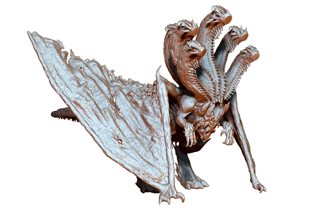
The biggest thing I wanted to change was the design and pose of the dragon. So the dragon is where I've started:

I'd love some feedback on any part of the old project so that I know what I can do better and I'd love feedback on my WIPs as I upload them. As you can see, at the moment I haven't designed the heads so it looks a little strange.
This is what my uni project looked like

The biggest thing I wanted to change was the design and pose of the dragon. So the dragon is where I've started:

I'd love some feedback on any part of the old project so that I know what I can do better and I'd love feedback on my WIPs as I upload them. As you can see, at the moment I haven't designed the heads so it looks a little strange.
Replies
I think it’s looking nice so far. A very dynamic sculpture. It will be interesting to see how you end up posing the new fight.
A couple things about the old one that were a bit difficult for me to see are that it’s difficult to tell where the body of the dragon is at. Like with the image on the right, it feels like the tale is going around a large rock, even though I’m guessing it’s part of the dragon’s body, from what can be seen on the left image. It’s just a bit difficult to tell how the body is wrapping around and interacting in the scene, at least from these views.
Also, there is something about the armor on Gabriel that when I was first looking at the image on the left, it was difficult to tell which direction he’s facing. I know from the spear that he’s facing forward, but there was something about the pose or the armor or something that makes it feel like he’s facing the other way when the spear is covered up.
Hope it all goes well!