Dragon Girl
Hi!
This was a creature character I worked on in Gio Napkil's organic modeling class.
I learned so much during this course! I still haven't settled on a good render/presentation for her.
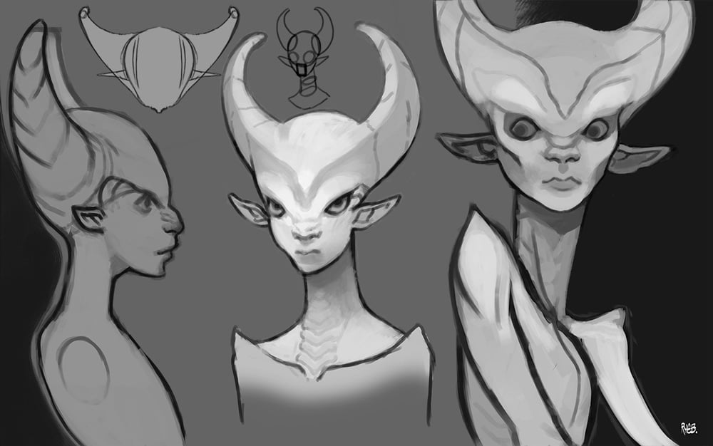
Concept was my own. I'm not a strong 2D artist though.
Please rip her apart so I can improve.





I'm considering doing a retop and paint on her to make her real-time, but to be honest I'm kind of sick of her for the moment. Need to work on something else first.
This was a creature character I worked on in Gio Napkil's organic modeling class.
I learned so much during this course! I still haven't settled on a good render/presentation for her.
Concept was my own. I'm not a strong 2D artist though.
Please rip her apart so I can improve.


I'm considering doing a retop and paint on her to make her real-time, but to be honest I'm kind of sick of her for the moment. Need to work on something else first.

Replies
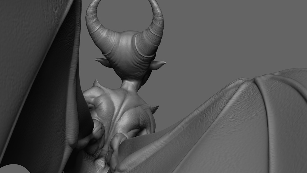
I would also think about whether texturing in the sculpt is making it stronger or not. Sculpting detail is a crazy chore, and generally its quicker and more effective to get surface detail in with texture maps. Again it's more of a personal opinion, but for me your sculpt would look a lot cleaner and stronger without the extra detail until you've got it realtime. I've just checked your mermaid, which has gorgeous clean detail, so I'm betting you have experience with how long it takes to get nice and effective detail in a sculpt. With this creature it feels like you've only gone half way, the detail isn't clean enough to be readable and especially in places like the wings, its making it look messy and lumpy rather than like a membrane skin.
Keep up the badass work!
Regarding the surface detail: I definitely agree that it's the weakest area and the one I have the least experience with. My teacher (who comes from a film background) wanted us to try sculpting it all by hand for the class, but I feel like I could have put another 40 hours into it and it still wouldn't be there.
So it sounds like the best thing to do would be a retop on the clean version and then just proceed to doing the surface details via texturing? My texturing skills are still pretty weak so I'll have to dig into some good tutorials.
I'm normally not one for pep talks, but when I see an artist get a bit too hard on themselves I always feel the need to point out just how much they're doing right. Cause yeah, I feel a bit overly critical of my own work a lot of the times too.
Things I like - The face. I think you're really killing it here! The face is really appealing to me, and there's very little I would change. It's hard to balance out the dragon features with soft feminine features and right now I think you have a pretty good blend. Maybe a bit of hard polish or trim-dynamic brushing around the brows for crisper shape definition could help her face pop a bit more to better match your concept.
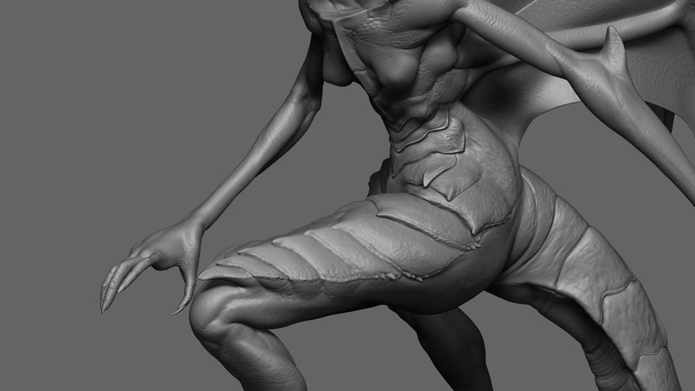
Muscles and anatomy. You've got this down pretty well. She's stylized but believable! The shoulders, back, legs and wings look fantastic! When you get into the more detailed phase of your sculpt I'd like to see some more defined transitional scales that blend the hard plate scales and softer leather parts together in areas where appropriate.
Things that could be worked on - The hips - She's very shapely down there and perhaps a bit over exaggerated? This could be personal preference on my end, but looking at your concept and what I'm seeing in the sculpt, I just like the proportion balance of your concept more. So yeah, either toning down the hips a bit, or widening the torso some could help balance proportions out. This is really an aesthetic choice though, and others might not feel the same.
Twiggy arms. Again, this is more of a nitpick, but I think the arms (especially when viewed at certain angles) look just a bit too uniformly thin and scrawny. Perhaps just beefing them up a bit at the shoulder and elbow joints and then tapering down will give you that skinny look but also add a bit more meat to the silhouette.
Overall, awesome work so far!