Sketchbook: Christoffer Sjöström
Hi guys!
Thought it would be nice to finally get my own sketchbook, after a time of sneaking around in the forums and looking at all these amazing work and feedback.
We´ll see how often I´ll post, probably at least weekly. So let´s start this!
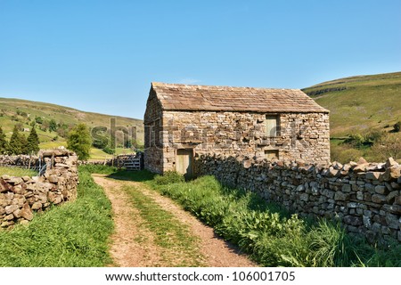
Right now I´m working on this British Countryside scene, which I´m hoping to get done by next week. But we will se, maybe need some more time for polishing.


Today I´ve been focusing on getting the texture for the storage room done.
Going for this kind of brick setup, with mixed sizes.

I´ve never really had a good workflow for creating damaged rocks, but found a amazing tut here on the forum earlier this day. Here´s some images of what´s done today. (The tut if anyones interested: http://lorentzen.se/annat/anders/polycount/meddun/stone_workflow_tutorial_by_keltro.jpg )


I still have to workout with the setup of the bricks, to get the variations and the tiling properly done. But I will take that tomorrow, it will be and interesting nut to crack.
Thought it would be nice to finally get my own sketchbook, after a time of sneaking around in the forums and looking at all these amazing work and feedback.
We´ll see how often I´ll post, probably at least weekly. So let´s start this!
Right now I´m working on this British Countryside scene, which I´m hoping to get done by next week. But we will se, maybe need some more time for polishing.


Today I´ve been focusing on getting the texture for the storage room done.
Going for this kind of brick setup, with mixed sizes.

I´ve never really had a good workflow for creating damaged rocks, but found a amazing tut here on the forum earlier this day. Here´s some images of what´s done today. (The tut if anyones interested: http://lorentzen.se/annat/anders/polycount/meddun/stone_workflow_tutorial_by_keltro.jpg )


I still have to workout with the setup of the bricks, to get the variations and the tiling properly done. But I will take that tomorrow, it will be and interesting nut to crack.
Replies
Thank you for your feedback! Not sure what your trying to say. I understand that the lightning in this specific picture is far brighter than the one in my scene. But that picture I only use as a reference for the brickwork which I'm making for the storage room next to the car.
Here's some other references for an example:
This one I´m using mainly for the layout of the scene. But I'm also inspired by some other setups as well.
While this one underneath, represents pretty much what the mood and storytelling that I want to get for my scene. And probably the one which setting I'm most going for. Not entirely sure though if I will go all in with this old picture format for the nice feeling or if I will stick to a more realistic lightning.
that being said though, I´ve been tweaking a bit more with the lightning in the scene to make it a bit more intense and a more yellowish kind of lightning.
But I guess that was your point? Mainly to get a more stronger lightning considering mine in the first pictures are too dark, especially if your looking at the house. But even though I´ve tweaked it a bit, I´ll have do some more when I´ll get back to it, as I feel something's still is lacking there.
I´ll probably will post some progress at monday!
And again thanks for the feedback, it´s esay to stare yourself blind in your projects after a while.
I´ve also finalized the walls for the storage house. Aswell making a roof for that one aswell.
Yesterday I started to play with the vines, making them feel a bit more thicker, which I succeded with I feel. But I will have to adjust the textures a bit, and get some better colours and variation for them. I also made the entrance for the main house with a wooden door and stone decoration.
Today I will focus to getting the vines right and remake the stonewall that goes around the house. Thinking either of making it a spline in unreal or making sets in maya, will see how that goes, but right now the edges are way to hard.
Since the last post I've made great progress. I´ve actually even think I will call it done for now. I have some things that I want to fix later on but today we started with our VR project. So I will focus most of the time on that the coming 4 weeks. Unfortunately I forgot some WIP screens for some props I´ve made. Right now I can't say I´m used to taking WIP shots. I certainly have to get better on that, instead of just posting progress screens.
Anyway, here you can see the "final" shots for now.
EDIT:
So what I did during this week was fixing the vines as the shading felt a bit off. I fixed that with changing the direction of the normals. I also made a spline out of the stonewall which worked splendid. Now the wall doesnät leave any hard edges which is wonderful. Will use this feature a lot in the future!
I also played around with the shading for the grass as I saw that I missed out on using the subsurface colour node aswell tweaked the colours for the texture. Before it felt a bit dead. I believe it has a much more believable feel right now.
I also noticed some minor details that felt a bit off. For an example the fallen potatosack. Before the potatos was just lying perfect in the bag, So I tweaked that. so it looks like everything as fallen out from the bag more naturally. I also added some fallen apples to add more variations to the ground. I want to add some small stones later on to add some more detail and live to the ground.
I also felt like the lawn was a bit empty so I started to add som furniture.
Some of the things I worked on:
I feel like I´ve been gone for too long!
Right now we have a 4 week game project for VR going on. So there´s a lot to do.
The last two weeks that has past, I´ve been mostly working on bringing in assets and UV map them.
For texturing we´ll be using a mask system with 4 tileable materials that will apply on the most common meshes to save time and memory. So it´s really nice to try these new ways off optimization, that I´ll never used before. I´ve also started to learn myself some Substance Designer and made my first material today! Unfortunately I don't have it with me.
Here´s some of the assets I´ve been working on. Most of these are jsut mockups though, which has been remade this week.
We´re doing a hotel with a basic IKEA setup, giving it a very simplistic look. It looks alright right now in engine. But we have get some more unique objects and storytelling in the enviroment I feel.
I will see if I can keep up with the posting aswell as start taking more wip screens.
Till next time!