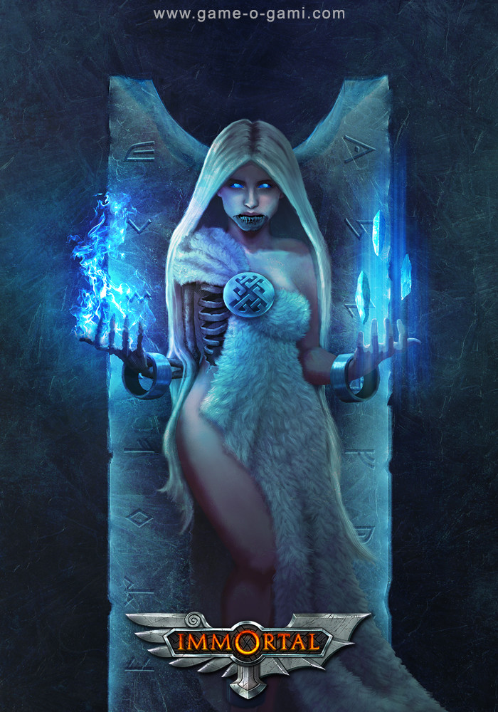
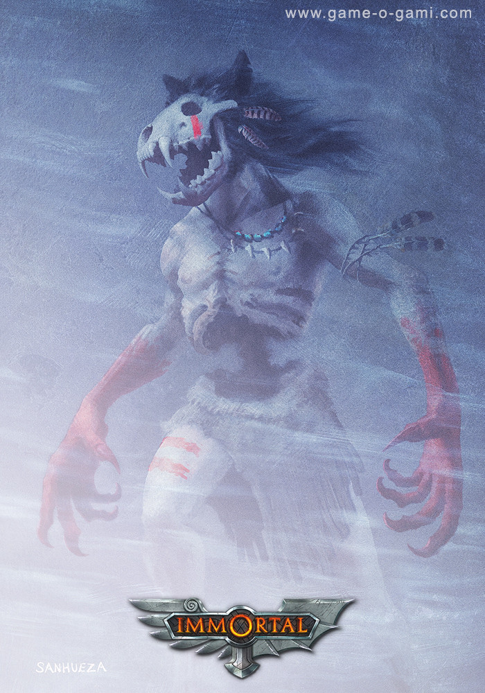
Immortal Battlegrounds - myths and legends card game illustrations
Hey everyone,
For several years I have been designing and developing "Immortal Battlegrounds", a strategy game of myths and legends. I ran a successful Kickstarter to fund production of the game, and will be finished with it soon. Through my game-dev studio, Game-O-Gami, I contracted some very talented artists (Milek Jakubiec, RING, Xia Taptara, Andrei Pervukhin, Mateusz Michalski, Jon Torres, Sebastian Horoszko, Grant Griffard, Monika Palosz, Kian Ng) to illustrate the various mythological characters in the game. I am also publishing an art book of mythology to go with the game.
you can see more about Immortal Battlegrounds here.
A big goal of mine for this project has been to also contribute illustrations to it myself (in addition to handling the art direction and graphic design.) Painting cards for Immortal Battlegrounds has not only been personally very fulfilling, but also great practice and motivation for developing my skills, attempting to match the level of the other artists working on the game. Below are a few of the card illustrations I have painted so far ("Hel", "Thunderbird", and "The Wendigo"), done in Photoshop.


Your thoughts on these are very welcome. Thank you!
My portfolio: http://sanhueza.artstation.com/
Replies
I must say, I'm very impressed! As someone who also works on an Indie Card Game Project, and who is not yet up to par with full-blown professionals I can definately feel why such a kind of motivation can be great.
I really like the fact that you're extremely consistent with your style regarding these card designs - this slightly grainy texture gives them a lot of depth of atmosphere.
The only thing that seems slightly off to me (though this may just be your style) is the shading on your female legs - they seem somewhat less dimensional than the rest - on "Hel" it seems rather flat, especially when compared to the arms. And I'm not sure about way the light hits Sekhmet's legs - I think there should be less light on her right sight (since the leg in the foreground actually gets more protection from the sun on this side because of the other leg) and somewhat more on her left.
I hope you appreciate some honest critique - keep up the good work!
I think your observations are pretty accurate. With Hel, I think it happened that way because the main light sources are further away from her leg - but really, that whole lower area should probably be deeper in shadow. I might go back and fix it later (since I can't leave anything alone...) For Sekhmet, the less-than-realistic light on her leg was actually intentional. I deliberately fudged the lighting on her front leg, in order to separate it from her back leg so they wouldn't blend together.