[UE4] Proxima - Antique/Sci-fi scene in the clouds
Good evening everyone !
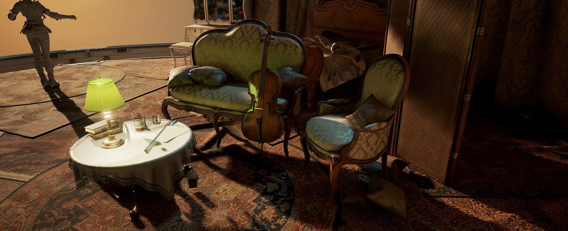
Here are some wip shot on my latest scene. I wanted to do an environment that mix a scifi architecture and some antique props and elements. This room is part of a bigger spaceship/station orbiting around an hypothetic planet of the Proxima solar system. It's also where this women spend most of her time. Which I need to model by the way. (Ciri is just here as a placeholder, I swear !)
To composition is pretty much set up. However there is still a lot of work to do on the dressing. I'm planning to add quite a fix elements that suggest that the place is messy, filling the space with book, clothes, etc ... The background is supposed to be somewhere above the clouds with a big moon or maybe a planet in the right part of the scene.
I'm also looking after feedback on the lighting. Something feels off but I can't really point it up. The carpets have too much contrast in the albedo right now, which I need to fix. The mesh of the curtain is not great and it's shader doesn't really behave nicely.
Any critique is obviously welcome !
EDIT: Final version here, more shots below !


Replies
http://polycount.com/discussion/63361/information-about-polycount-new-member-introductions/p1#make
The scene is looking good. Shadows are really black at the back, might want to add another lamp back there. Where is the big blue light coming from?
In term of lighting I was thinking about boosting the light bounces rather than adding a third light source, but the question is open right now. The blue light comes from the light reflection on a planet in the background. Since I haven't started working on that it's simply not there yet.
As for the lighting, does this space have a ceiling? I only ask because I don't see a shadow for it being cast on the wall. Whats going on with the furniture/violin? Is there a greenish light coming from that lamp? I'm not really digging that green response there. It looks like you are going for a warm glowy lamp-lit space, while also trying to have harsh sunlight at the same time, and its not mixing well.
I really like the long shadows and the low angled directional coming through the window. It looks great in your first shot, but when you see the back of the room, I'm not too fond of the brightly lit curtains. I wish there could be a little more indirect light back here. Maybe angle your directional down a little bit more, so the direct light doesn't cast all the way into the back?
You mention the shader for the curtains isn't working quite well, what are you trying to achieve there? What is weird about it?
Also I can't stop looking at that piano...just a well done prop, love the material response there.
The the ceiling is made of glass, like the bay.It gives me extra space to show the vista. The green reflection comes from the blind on the lamp. I quite like the color, it breaks up the area nicely in my opinion. I had a chat with a few collegues today and one of them suggested that I should move the lamp between the couch and the chair on a small table to use it as a rim light rather than something that light up in the same angle as the sun.
Not having the back lit means that I should rotate up the light quite a lot, breaking the sunset effect I want on that scene. What's bothering you with the curtains exactly ?
I want the light to go through the curtains slightly, like on any opaque curtain. The shader is there, but the accumulation of folds makes the result look weird. I'm not happy with them anyway so I'll just redo them.
I've been strugling quite a lot these day to get the effect I wanted. I ended up rendering my skydome with Vue and adding some elements as planes in the background. The clouds are really low resolution right now because it takes ages to render anything in VUe. I'll rerender them in a highier resolution once I'm happy with what I got.
I also made some adjusments on the lighting based on the feedbacks I've got here and there.
Again, any comments and critiques are more than welcome !
I updated the contrasts and the colors a little bit. I'm not sure about having the sun facing the camera anymore, might try something different at some point. In the mean time I started working on the character. Right now it's a full polygonal model and I'm going to start the sculpt soon. (please don't mind the breast she's supposed to wear a bra)
As usual, c&c are welcome.
It's been a while since my last update. I've redone the structure of the room as it was causing me too much trouble in terms of composition. The asset placement is the same, but instead of having a circular room I now have a rectangular space which is easier to dress. I've changed the window accordingly, removed quite a lot of carpets and added wooden floor. Everything is still wip of course.
I've started modeling small props for the dressing. I also need to improve the glass itslef and to add some more details in the vista.
I've also finished the character. Here is a couple of shots, you can go to my artstation post for all the views https://www.artstation.com/artwork/ar02X
I think a sunset lighting style with rimlights is a great idea. But I guess the moon can do that too eh!
To answer Tetranome, I had to make a choice between sunset et moon lighting as I don't have enough time to push for both. I stick to the sunset one as it was my initial choice and that the colour scheme felt nicer. I also had to tone down the amount of carpet on the ground as it was too noisy. But I might push their gamma value up a little bit as they don't stick out at all anymore.
Please tell me one thing, how did you make the clouds?
Actually the scene always had a 360 window with a canopy, like an observation bay sort of thing. The point of the curtain was to cover part of it and suggest that it could cover the window all along. Actually I initially wanted to suggest that the room wasn't supposed to be a bedroom of any sort and have been retrofitted to be just that for the character. That's why I had furniture placed in a really organic way with all the carpets to cover the floor and to make the place feel more cosy. But it was too complicated to imply and the overall result was week. That's when I choose to push for a more nested look for the room, with a square shape, an actual wardrobe and wooden floor. It looks much stronger that way.
Obviously none of the clouds are physical. I actually used a software called Vue to create an IBL as I saw some artists from 343 were using it to create their awesome skies in Halo 5. It's pretty straight forward and I suggest to check some videos online to see how it's used.
Edit: I posted the scene on artstation. There is much more shots there so give it a look !
https://www.artstation.com/artwork/0Vbg8
https://www.artstation.com/artwork/rLNna
Looked at your piece a second time... and man, it really tells a story. Very inspiring work!
And thanks to point out the story telling, I worked a lot on that!