Working on the Train
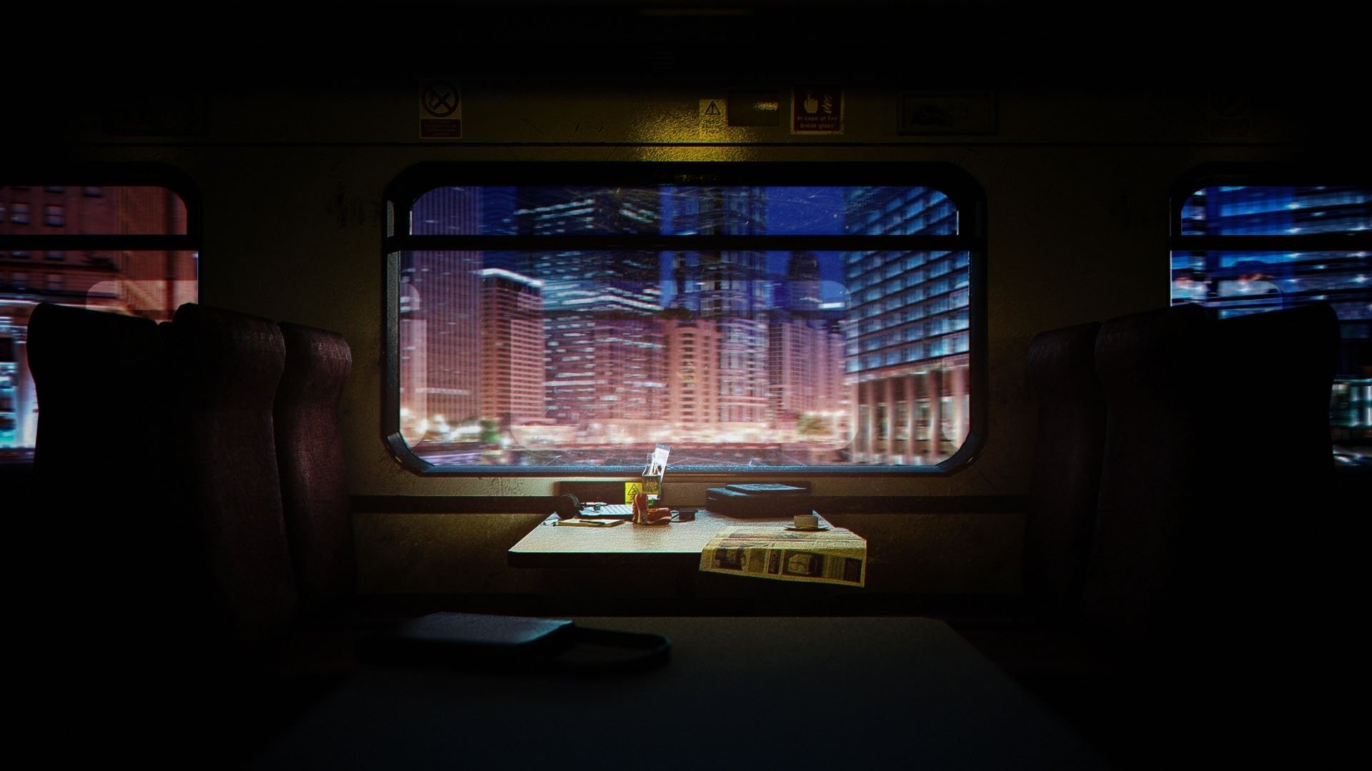
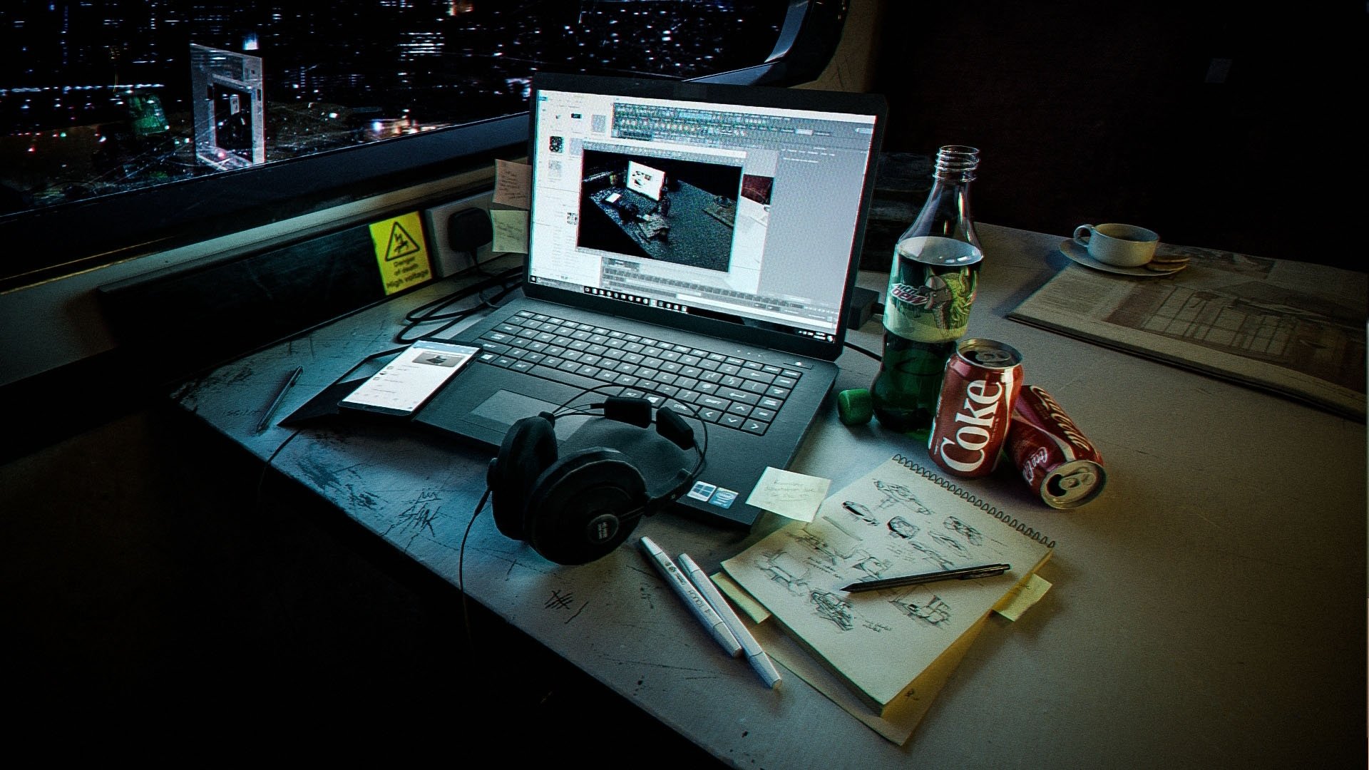
Finished outcomes of this project:


Older version with darker lighting:


I am currently a student and am still learning, so throughout my portfolio unit I have been trying to improve my skills and learn new techniques and shortcuts; for one of my projects I decided to create an environment (focusing on improving my lighting and shading) as that is what lacked in my portfolio from feedback I recieved.
I'm open to feedback so I may reflect that onto this project as I am thinking of creating a short animated sequence if I get the chance.
Thanks


Older version with darker lighting:


I am currently a student and am still learning, so throughout my portfolio unit I have been trying to improve my skills and learn new techniques and shortcuts; for one of my projects I decided to create an environment (focusing on improving my lighting and shading) as that is what lacked in my portfolio from feedback I recieved.
I'm open to feedback so I may reflect that onto this project as I am thinking of creating a short animated sequence if I get the chance.
Thanks


Replies
Also, PNGs make for a very slow-loading thread. You should use JPGs instead.
http://polycount.com/discussion/63361/information-about-polycount-new-member-introductions/p1#make
I didn't even think of that! I'll defo think about a loop type gif
I will be adjusting the grease on the keyboard to cover more and also reducing the dirt tomorrow.
Would like some feedback on this. Should I remove/relocate the bottle? and how can I make the bottle look more.. Plastic? it feel more glass to me.
Also some feedback on lighting? does the warmer suit this environment or the cooler?
Thanks!
Now really looking at it, that area is quite distracting, so this week I should be able to adjust that wall and replace that area under the window with a more flat and lighter blue so it's less distracting.
Thanks for the feedback all!
Can't explain how, just my first reaction to it was, "That's too static and glassy." Try adding some bubbles around the sides of the bottle and a little at the surface of the liqued, also I suggest giving it that fade look where it look darker in the center of the liqued and more transparent around the sides to convey the liquid has depth (can't think of the right terms).
A few other thoughts to apply to this or your next ventures, since you say you were pushing lighting and shading with this endeavor:
Fabric - Firstly I thought the fabric was much more interesting in red. It was a nice contrast to the bluer metropolis BG and screen and complimented the warm cabin lighting. Try to get a better unwrap or push for more detail in the modeling here. Also look into fabric shading with a scattering model at least. Fabrics have unique reflection profiles (micro roughness/BRDFs) which are nothing like those of other materials. There's a few ways you can do it.
Polycount - May I ask why this is a relatively low poly scene? I think it would jump up a notch in quality simply by having some subdivision going on. This is more a nitpick.
Paper - Get a scattering model on the paper, or do tests to get a realistic amount of transmittance. It really brings paper to life.
The bottle - Easily the least developed aspect here. Right now it comes across as glass as you mentioned. Check the IOR of plastics (slightly different from most glasses) and increase the roughness a bit. Also note that plastic has scattering, something absent here. That small diffuse from scattering brightens plastic up compared to glass which is strong, clean and clear refraction. I haven't looked at Mtn Dew in a while so not many notes on the liquid inside, but note that a non-clear liquid scatters and absorbs a lot of light and will not have clean refraction. Finally, the cap looks unfinished without having a molded grip but you'd have to tell me if that's the actual design.
In reality even glass will have slight diffuse properties, but this is significantly less than clear plastic.
From these notes I think it's clear that you've really succeeded here and have small bits of improvement in a specific area: Materials extending beyond diffuse and specular. The lighting is lovely, especially how it falls onto the table. The blue reflections balance nicely. So going on, look at real objects that use subsurface scattering and do some quick tests to visualize the difference for yourself.
Make something like a strawberry and test it with and without scattering and absorption. You may be surprised to realize that even in low light the difference (on, say, your newspaper) would be easily noticeable. Read about how scattering happens due to the internal structure of an object. It will also give you a good idea on why plastic scatters and absorbs light much much more than glass, "filling" it with light. Same for fabric. This is the hardest thing to get right because fabric really relies on its micro structure for its look so people typically use a custom shader. However with a good normal map and SSS you can pull off some nice stuff.
Hope all this helps! This scene turned out really awesome and if you applied these notes to another hour or two at it you could easily push this scene an extra 10 percent!
Thanks for the additional feedback, it really helps on improving and this being my first environment I'm proud of, I will definitely be aiming to improve and look more into the details you mentioned from extending to different materials and also the smaller the details you mentioned
Fabric: I'll definitely look into the micro detail you mentioned, any suggestions where I could start looking from?
The Bottle was quite tough for me as there was a lot of IOR and roughness adjustment going on and I kind of messed it up, so I'll be revisiting that and adjust the settings you mentioned. As for giving the liquid and reflection more depth, I'm not quite sure how to accomplish this effect, and suggestions where I could start from?
I will definitely be coming back to this project when I finish with other projects before I put it in my reel. Thanks!