FINAL Paul Miller-Character
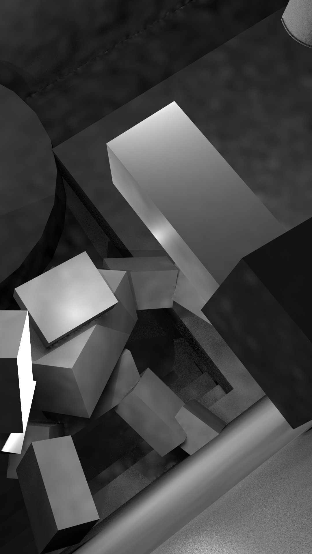
Whew, finally got around to getting some of this out the way. This is going to be a sweet chance to really put my all in, on some sweet composition and lighting. FIgure I'll get those out the way first. Here are my first passes at the scene. As you can totally see, I'm really into these Dutch Angles. I'm trying to make sure the whole scene has a sense of unease to it. I also want the line of action through out the whole scene to run diagonal, almost bouncing off the sides of the frame.
Edit: I have no idea why these are so big. I"m going to attempt to size them down tommorow.


Edit: I have no idea why these are so big. I"m going to attempt to size them down tommorow.


Replies
Doing some drafts of davids head. I figure he's a blue collar tough guy, with a rough history. I was thinking he'd be an Master machinist, which is why he was picked to travel through time to deal with some artifacts that'll help solve a problem. I like to give characters a purpose, however little, it helps me think about how they'd look, why, and what they'd be working.
This week is going to be sloowwwww. But Here are some heads for the traveler. I'm not even sure how old, or what gender I want to make that character. Not sure if you can tell, but there are quite a few influences from Majoras mask and skull kid in some of these.
So theres a sentry in my scene, I'd like this to look like a movie poster. And as for designing the sentry, i'm looking at a bunch of art deco, specifically Metropolis. Now I"m trying to avoid any intricate details on the surface for now, because whats important to me are the shapes. and there are few things I'd like to make obvious through design
>This thing is a guard, a sentry
> It is technologically advanced, however incapable of creative thought. It is a very advanced tool.
> It should look like it was made to put the town in habitants at ease, however not too human to be friendly looking. I"m looking for a cross between human enough and machine.
>Its capabilties are limited. While incredibly strong and very difficult to destroy, it doesnt have any energy or heat projection capability. Think a giant living statue. a Golem if you will.
>Its main purpose is to guard important items in the city. In this particular shot, its guarding entrance to a room that our protaganist is trying to get into.
PERSONALLY I'm feeling Option B the most. Option D looks too busy, Option A looks to graphic, and C looks too much like ultron.
Whew, finally got to blocking out daniel. Feelin pretty ok.
Try hard mode.....activate! I need one of those trophies. >:D
Your body proportion is doing alright so far, but i'd pull the neck up a bit, which will also give you a bit more space to work on the head.
Liking the concept heads for daniel, i think B is the best. For a 'master'.
Here's a couple of facial resources i've found super helpful.
https://archive.org/details/andrew-loomis-drawing-the-head-hands
Keep cracking on mate.
I think i can finish blocking out this guy tommorow, then moving on to blocking out the time traveler. I learned a bit today about the eyes, and triceps. I'm going to have a bit of trouble with the pants and feet. I"m not sure how i'm going to model the shoes, but hey. Also I started using some XMD brushes already, those things are fantastic.!
Trying out posign in Zbrush, I think i'm going to stick with Rigging a character in Modo, but this was a cool test in the mean time.
The last picture the setting are little different, I was having a little bit of fun in Zbrush. I'm not using it for the final render.
I gotta say, adding color makes a world of difference in my opinion. Really helps me find things that need to be changed and what not. Either way. I am having A BLAST so far.
Whew boy, working with marmoset toolbag 3 is outta control. I Cant wait for the fulll release. Cause baking in this program is NUTS.
This is my first pass with materials. I'm aiming for that Uncharted Look, as far as materials are concerned, but I"m afraid i'm not getting anywhere near close. I notice the skin on all their characters looks super wet, so I'll have to do more research on that. I mean If I end up getting even close to bioshock I'll be happy, but thats the bare minimum. There are a bunch of texture details I want to fix, So What I'm going to do is try to bring my Quixel info into Substance so I can reall get down. If that doesnt work, then quixel will be fine.
Also helps to keep some heads open in google images at the same time for reference. Sculpting something you don't know that well without reference can be a big time waster and can be very frustrating when you make bugger all progress, you'll learn a lot from looking at real heads.
Keep it up mate!
I appreciate partner.
Havent been able to work on this for about 1.5 weeks in any amount of time that matters.
Things I"d like to address before the end of the week
-alien skin, not looking rough enough
-Move around the cloth on the alien.
-Give the alien a more life like pose
-Some how make the skin more realistic on both characters I"m not sure how i'm going to accomplish this, but I'll figure it out like I normally do.
I really really want those trophies. I guess its time to take off the kiddie gloves. ha
does more contests like this in the future!
PS Please let me know if i updated this right, I really don't want to be disqualified because I'm off by a pixel or something.