The BRAWL² Tournament Challenge has been announced!
It starts May 12, and ends Oct 17. Let's see what you got!
https://polycount.com/discussion/237047/the-brawl²-tournament
It starts May 12, and ends Oct 17. Let's see what you got!
https://polycount.com/discussion/237047/the-brawl²-tournament
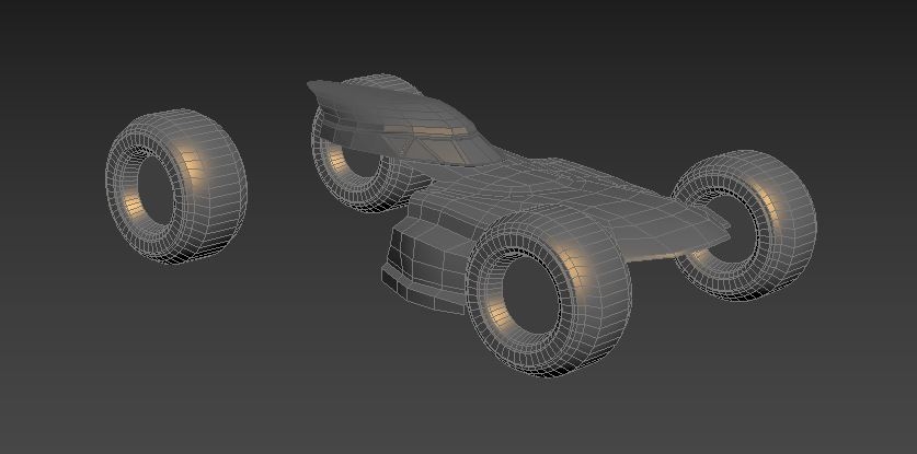
[WIP] BvS Batmobile
Hi guys!
I am working on the Batmobile from Batman V Superman, I plan to model it out in my spare time and then texture it in Quixel. I am hoping to learn Quixel along with making other things I am not comfortable with, this is my first try at making vehicles. I am using image references from the movie and other off set images.


I am working on the Batmobile from Batman V Superman, I plan to model it out in my spare time and then texture it in Quixel. I am hoping to learn Quixel along with making other things I am not comfortable with, this is my first try at making vehicles. I am using image references from the movie and other off set images.


Replies
Reworked on the body, fixed a lot of things, will continue again tomorrow.
Fixed the side armor (or whatever you call them xD)
I'm mostly trying to add this into my portfolio xD
https://hum3d.com/car-challenge-2016/
Somehow this is working, next up the turret and then the engine.
Unless you push the differences really far, and the material has a brief backstory that makes sense. For example, what if the Joker owned the batmobile, or this is a deep-sea submersible batmobile, or here's my version of a desert-camoflage batmobile, etc.
or bursting through the wall etc.
I still need to work on the rest of the vehicle and then the environment
you could probably improve on that though.
You could also include a blurry street-at-nighttime background, with a black gradient bottom so it fades away along the horizon.
You could go all bokeh on it.
Ill probably put the batmobile a bit more closer.
but I'm now making something else, found this from Google maps, it will be easier to light and detail.
Next up are the pipes, grills and the lights.
Bloom on the headlights is too strong, the round halos are too regular. I'd suggest toning it down across the board, maybe 50%.
Can you add a refraction pattern to the headlight spotlights, to get patterns where they cast onto the floor? For example
https://d114hh0cykhyb0.cloudfront.net/images/uploads/7quot-round-dot-approved-led-headlights-conversion.jpg
(searched for "headlight refraction pattern")
The edges of the orange-lit concrete on the right are impossibly sharp. It would help to break those edges up with a decal or edge wear.
http://wiki.polycount.com/wiki/Decal#Tutorials
The steel grate down the center seems overly bright. Might help to add stain patterns, especially down the center (think oil stains on a used highway).
http://l7.alamy.com/zooms/4980a4f8a24646f7ae9cf3afca16c0c3/view-of-cracked-and-worn-concrete-highway-with-moving-mini-van-admcpy.jpg
Also, need a visible light source for the yellow/orange light on the right.
Ceiling texture looks awesome! Floor texture looks low-resolution, but I think that's only because you're using depth of field. I would suggest increasing the focal range to remove this.