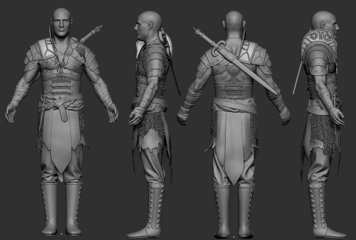
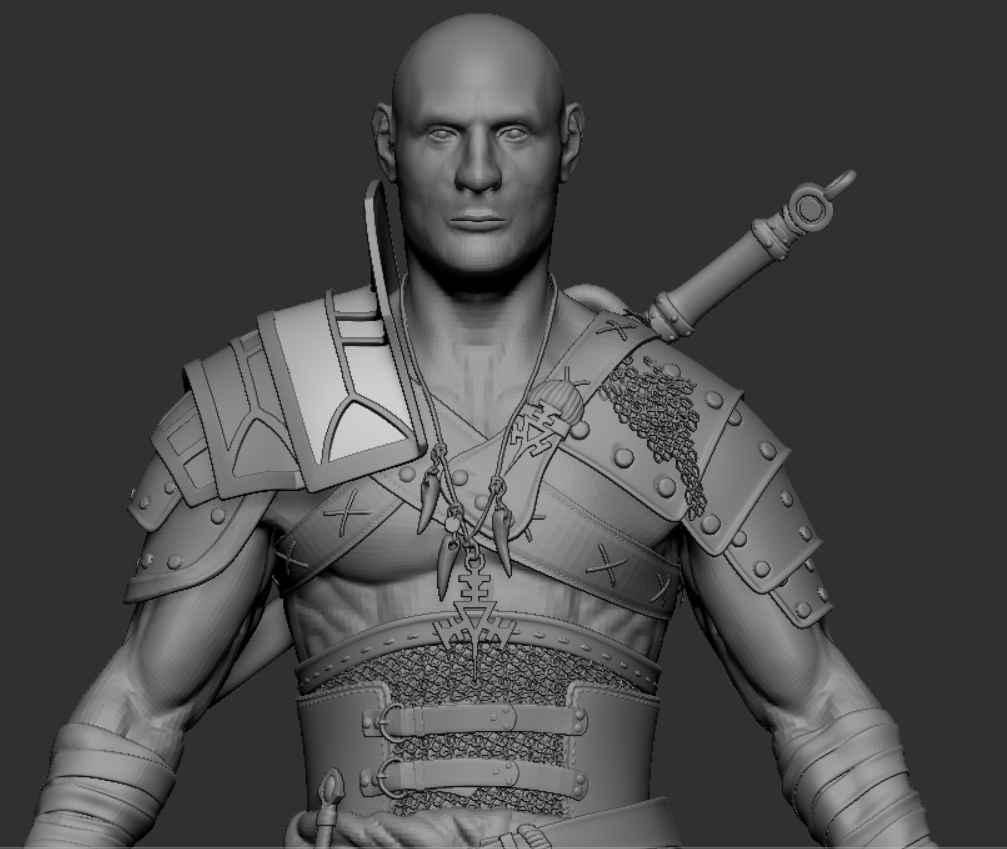
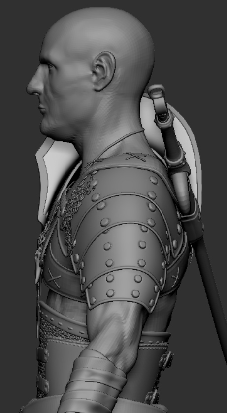
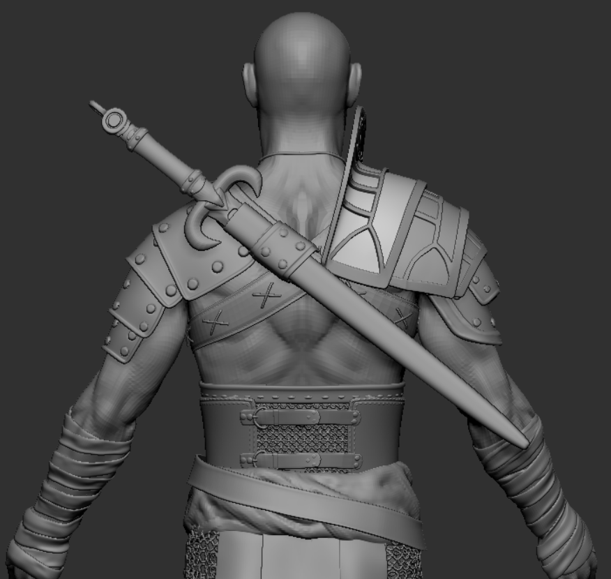
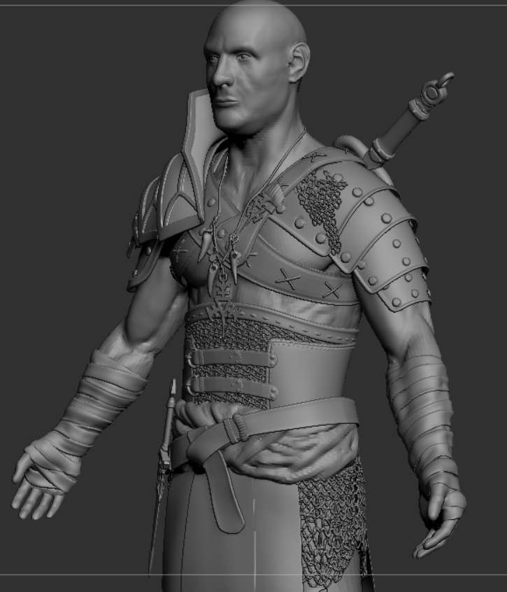
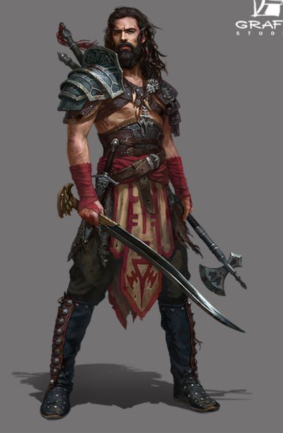
I've been working on this project for some time now and I have most of the forms in. So I was hoping I could get some feedback before I move into more details.
I would hide everything but the face and really work the forms, gather tons of reference, the eyes seem a bit small, so does mouth. Overall your face is really soft and mushy, try to define the planes of the face, i struggle with this my self but the more reference you gather the better
i did a quick draw over of what could be improved
Thanks man I really appreciate it going to work on it.
I think your face plane is rather weak. I don't know the actual terms, but it's on the side of the forehead, around the temple areas. And I personally would move the back of the jawlines higher. To line up with the lips.
Thanks for your input man,
I agree the back of the jawline was too low. I have a lot of struggle trying to bring in the planes of the face do you have any good advice how to get better at it? Or just practice a shit load haha. Anyway here is the updated face.
Dunno if your plan is to follow the concept precisely or not. I do not want to feel mean or hursh, just some thoughts for you.
Heres what i think: 1. the body props in the concept are a bit more slim compared with your model (more agile body- slimmer arms, neck etc) 2. the face - should be more like an arab or spaniard, your version feels abit too european or too generic- not much character in it 3. the pants- currently feeling a bit too slim- exaggerate the forms a bit 4. the boots- i would lift those boot shafts higher 5. the dagger and some armor parts and jewelry could be also bolder- bigger, more exaggerated forms.
I'm planning on following the concept pretty precisely I'm not going to change the body to be more slim i really don't feel like adjusting all armor again haha.I got to agree big time on the face that it looks too generic. That's probably because I used pretty generic face reference and also that I'm no master sculptor haha. I'm going to look for an Arabic/Spanish guy. And try to get some character into it.
For the pants you mean that they should be wider and more puffy (if that's a word) it is right?Going to pull up the boot shafts a bit more.
I'm only not sure about making the dagger bigger wouldn't that look weird in comparison with the hands?
But anyways thanks for all the help.
Glad i could help abit Yeah man, do as you wish, it is your freedom to act. Some reference what i meant..yeah that can be wider- especially from the front.
that dagger just felt a bit thin and small if i did side by side comparison with reference..might be my nitpicking.
I am sure it gets better after some updates! cant wait to see it.
Tried to fix the face this is what it became i feel like it got a bit better. Now preparing to get into mari to paint some texturing xyz displacements.
Thanks for your input but that brings the face pretty much out of proportion. But I do like the ears going to move them a bit to make them look more like what you have. And bring the jaw line up a bit.
Yes, as you wish..just keep in mind that you have no beard, hair or brows yet..you gotta test the face props with the hair and make adjustments if needed
Yes I have the beard and hair blocked out so I could see how it looked. But I can't change the eye size I measured the eyeballs and made sure they were 24 mm. So if i make stuff like that bigger I'm afraid it will start to look more to the stylized side what I don't want.
Hi! Good suggestion is to never start detailing or sculpting until the proportions are set and done, saves you a lot of work later on trying to fit sculpted piece unto a modified body. The anatomy def needs more work but that's something that takes years of practice and studying to really get, but I suggest you to look into scott eaton. I think the proportions needs to be exagerated, you sculpted some muscle and everything but I believe the shoulder looks tiny and unimpressive even with the huge armor on. You don't feel like he has that strong body with great posture and wide shoulder like he does in the concept. Hands for game character should not be modeled facing front, it should be modeled facing towards the ground. Overall the entire silhouette could help a bit more work, you want to add more shape to the body, shoulder, arms, calf etc. Good practice is too look at your 3d model with a flat color, no shading, just as a silhouette and see if it reads well.
Hope it helps
Hey,
I Will try to get the shoulders a bit wider and will look Scott Eaton up thanks, I never heard of him before. And I was wondering why the hands should be facing to the ground. From what I've heard so far you should try to sculpt things in a way they are mostly seen in the game. Or does it have something to do with the way people rig hands? And is it not better to sculpt the hands facing the way you want them to have in your final pose. For personal projects or is that not true?
I don't really know yet what is considered a good silhouette I will look into that. Do you have any good links for that by any chance?
Replies
I would hide everything but the face and really work the forms, gather tons of reference, the eyes seem a bit small, so does mouth. Overall your face is really soft and mushy, try to define the planes of the face, i struggle with this my self but the more reference you gather the better
i did a quick draw over of what could be improved
Some updates on the face
I agree the back of the jawline was too low. I have a lot of struggle trying to bring in the planes of the face do you have any good advice how to get better at it? Or just practice a shit load haha. Anyway here is the updated face.
Dunno if your plan is to follow the concept precisely or not. I do not want to feel mean or hursh, just some thoughts for you.
Heres what i think:
1. the body props in the concept are a bit more slim compared with your model (more agile body- slimmer arms, neck etc)
2. the face - should be more like an arab or spaniard, your version feels abit too european or too generic- not much character in it
3. the pants- currently feeling a bit too slim- exaggerate the forms a bit
4. the boots- i would lift those boot shafts higher
5. the dagger and some armor parts and jewelry could be also bolder- bigger, more exaggerated forms.
Keep it going! You will get there!
Thanks man this some nice feedback.
I'm planning on following the concept pretty precisely I'm not going to change the body to be more slim i really don't feel like adjusting all armor again haha.I got to agree big time on the face that it looks too generic. That's probably because I used pretty generic face reference and also that I'm no master sculptor haha. I'm going to look for an Arabic/Spanish guy. And try to get some character into it.
For the pants you mean that they should be wider and more puffy (if that's a word) it is right?Going to pull up the boot shafts a bit more.
I'm only not sure about making the dagger bigger wouldn't that look weird in comparison with the hands?
But anyways thanks for all the help.
Yeah man, do as you wish, it is your freedom to act.
Some reference what i meant..yeah that can be wider- especially from the front.
that dagger just felt a bit thin and small if i did side by side comparison with reference..might be my nitpicking.
I am sure it gets better after some updates! cant wait to see it.
Cheers,
Thanks man going to dive into marvelous again.
Hey,
Thanks for your input but that brings the face pretty much out of proportion. But I do like the ears going to move them a bit to make them look more like what you have. And bring the jaw line up a bit.
Good suggestion is to never start detailing or sculpting until the proportions are set and done, saves you a lot of work later on trying to fit sculpted piece unto a modified body.
The anatomy def needs more work but that's something that takes years of practice and studying to really get, but I suggest you to look into scott eaton.
I think the proportions needs to be exagerated, you sculpted some muscle and everything but I believe the shoulder looks tiny and unimpressive even with the huge armor on. You don't feel like he has that strong body with great posture and wide shoulder like he does in the concept.
Hands for game character should not be modeled facing front, it should be modeled facing towards the ground.
Overall the entire silhouette could help a bit more work, you want to add more shape to the body, shoulder, arms, calf etc. Good practice is too look at your 3d model with a flat color, no shading, just as a silhouette and see if it reads well.
Hope it helps
I Will try to get the shoulders a bit wider and will look Scott Eaton up thanks, I never heard of him before. And I was wondering why the hands should be facing to the ground. From what I've heard so far you should try to sculpt things in a way they are mostly seen in the game. Or does it have something to do with the way people rig hands? And is it not better to sculpt the hands facing the way you want them to have in your final pose. For personal projects or is that not true?
I don't really know yet what is considered a good silhouette I will look into that. Do you have any good links for that by any chance?
But anyways thanks it helps a lot.