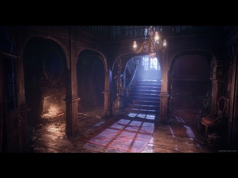
Mansion Hall
Hi everyone,
I'd like to share some images from the Mansion Hall environment I did a while ago. It was a project where I experimented a lot with contrasts between spooky and cosy moods in one single scene. Rendered it in Unreal Engine.
Got the Artstation page right here: https://www.artstation.com/artwork/deoLe
Article about the production here: https://80.lv/articles/joel-zakrisson-creating-contrasting-moods-in-ue4/


 https://www.youtube.com/watch?v=sVxk0CEK4Mw


I'd like to share some images from the Mansion Hall environment I did a while ago. It was a project where I experimented a lot with contrasts between spooky and cosy moods in one single scene. Rendered it in Unreal Engine.
Got the Artstation page right here: https://www.artstation.com/artwork/deoLe
Article about the production here: https://80.lv/articles/joel-zakrisson-creating-contrasting-moods-in-ue4/


 https://www.youtube.com/watch?v=sVxk0CEK4Mw


Replies
The lighting, the contrast between the moonlight and the fire really sets up the mood you aimed.
Everything is carefully modeled, i can't find anything out of place.
Top notch work!
Some questions, though (because this is something concerning me latelly, since i am planning on doing a similar indoor environment in the near future): did you aim at a specific texel density for this scene? If so, how did you achieve this consistency around the assets? Did you use a texture atlas or the individual assets have each one a separate material?
Looking forward for your future works!
Thanks a lot Macebo!
Texel density was never really a problem since I used quite high-res textures. Used a lot of 2K for larger individual assets just to keep the quality as high as possible. Most props and modular parts have separate materials (except for smaller similar props like books/paintings), but I got the consistancy by using my own saved smart materials in Substance Painter. So I already had a wood material set up in the program that I could apply to all wooden props. If color, brightness or roughness still looked off I could just tweak that with materials instances in UE4. Not sure if it's the best method, but it worked for this project!
Loving the lighting as well, the contrast between the oranges and the blues!