darksiders 2 texture workflow, need help from experienced texture artists!
Hey Guys!
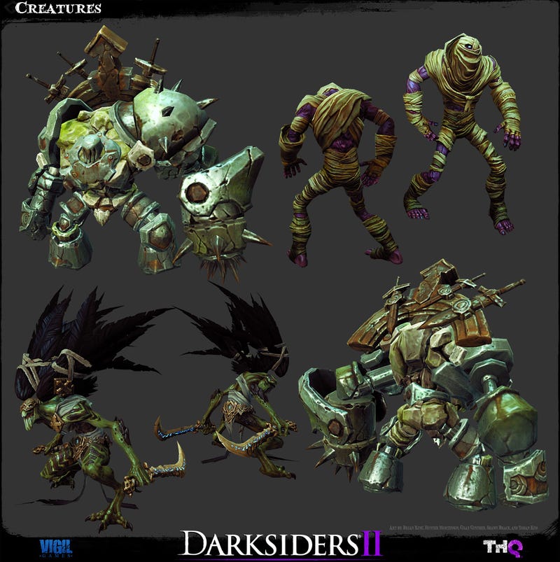
I need some help figuring out how to make art like they did in darksiders. I know I need to sculpt, bake, etc. But The one thing I dont understand is how to combine handpainted stuff, with foto texture. like this:


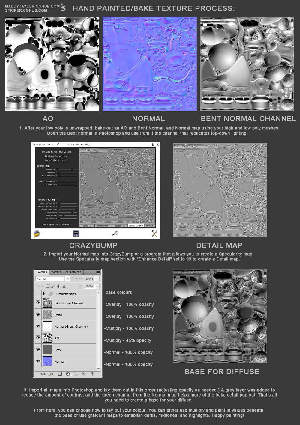
I found this on polycount:

But this misses some important information to me. I know ho to make a base texture and apply color, but how do I add texture to that? just putting textures on top and setting the blend mode to overlay doesnt look good. How should I go about doing this? Can someone give me an accurate description of the steps and layers you use? Remember I dont wanna know how to sculpt or make a base mesh, I'm pretty confident doing that.
I need some help figuring out how to make art like they did in darksiders. I know I need to sculpt, bake, etc. But The one thing I dont understand is how to combine handpainted stuff, with foto texture. like this:


I found this on polycount:

But this misses some important information to me. I know ho to make a base texture and apply color, but how do I add texture to that? just putting textures on top and setting the blend mode to overlay doesnt look good. How should I go about doing this? Can someone give me an accurate description of the steps and layers you use? Remember I dont wanna know how to sculpt or make a base mesh, I'm pretty confident doing that.

Replies
If you are using photo sourced textures you will need to paint over them to get them in the style you are looking for.
I would create groups in PS....Base color, Darks, Mids and highlights. then use constant colors and paint in the base....then darks...mids highs....
If your sculpt is good ...there shouldn't be a real need for photo source
Does anyone know what the layer order would be?
Maybe you can show us some of your own tests and studies so we can point you more in the right direction?
What is significantly different from the images in your artstation compared to the characters you shared? I'm not convinced that they used photosourced textures ( I've seen a lot of Darksiders art over the years tho its been a while) but it would be interesting to see examples pointing to otherwise.
As far as layer ordering: It doesn't matter. Whatever looks good. Overlay looks "bad" because it modifies the luminance of the layers underneath. A lot of people follow a quite logical process of painting their colors/details with lighting layers (AO, curvature, etc) on top. This gives good separability and control of the lighting info from the color info. On the flip side there are plenty of instances where you'd want a color layer to affect the lighting detail and might put it over your main light layers. There are also blending modes in photoshop that allow you to have a layer control the color of underlying layers without affecting their luminance.
Hopefully this helps you get a sense that you shouldn't worry about unimportant stuff like layer ordering; that there are multiple solutions to most problems.
@Jakob Gavelli Yeah They do (as well). I got in contact with a former vigil artist. So She is helping me, but I appreciate your efforts. She said there wasnt really a set way of doing things. Everyone had their own way of working, and it was just a matter of finding what works. So yeah texture brushes, photo textures, all kinds of layers :P. I have ,in the mean time, figured out a way myself, that might work and that is a little bit structured. I figured out the following:
layers:
-top-
[group] (hard light)
(-photo textures for details)
-hand painted stuff
-gradient maps for colors
-base texture (AO,cav,etc)
-photo textures (almost grayscale, with the exception of some color in the hihlights)
-gray(50%)
-bottom-
worked on some rock I did, but not sure how this works on other materials, would need to test it.
@somedoggy Hmm I think having a layer order that makes sense will help, I like to come up with way I can use to tackle any texture. yeah overlay looks pretty bad, but just setting a photo texture to color is not what I'm looking for either. They did actually use photo texture, but not in any specific way, indeed like you said, whatever looks good. On the character it was much less, but if you look at the rocks and most of the environment assets, they are pretty photo heavy. But Yeah I should just try to figure stuff out on the fly. Maybe the way I came up with works, maybe not. I'll have to see. Thanks for the reply.
Like I said I'll get help from some artist. Once I've figured out the best way of going about making textures like this. I'm happy to help anyone (that finds this thread, and has similar problems)! But I need to figure it out first :P