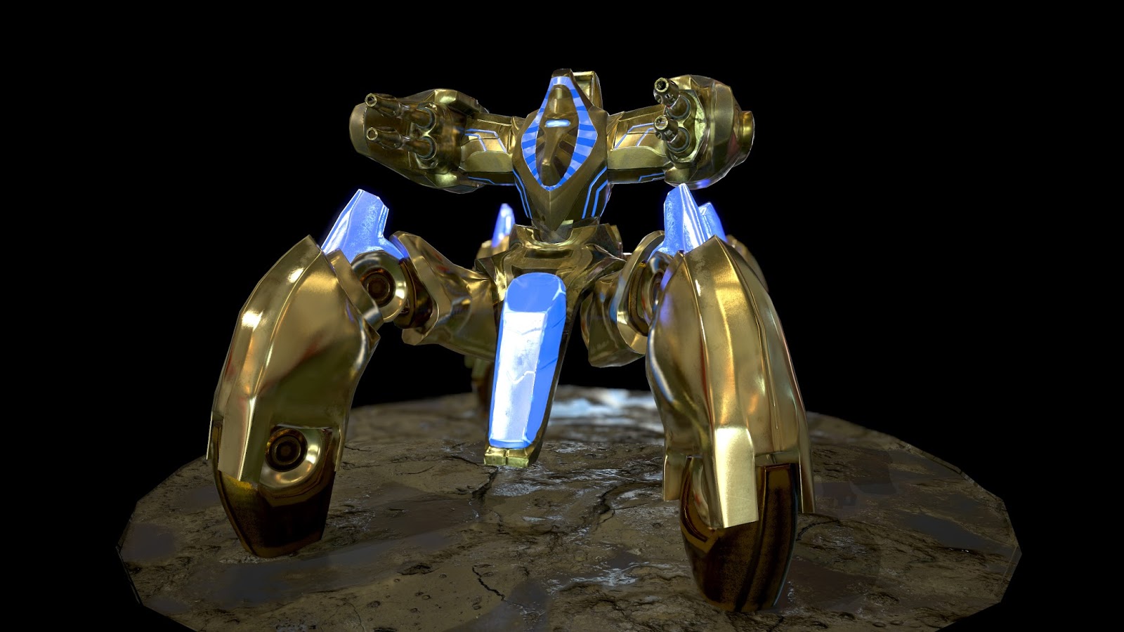
Immortal-WIP
SO I really liked the immortal from starcraft 2. Definetly my favorite unit, with all the pizzazz of a dragoon. and none of the funky patting. I was looking at my old portfolio, and realized I hadnt updated it in a year. Here are my goals with this particular piece
Completed in 50 hours.
30k
Modeled in Zbrush
Textured in Quixel
Rendered in Marmoset
(edit)
Gonna render it in Unreal 4 as well.
(Is there anything I"m not thinking about?)
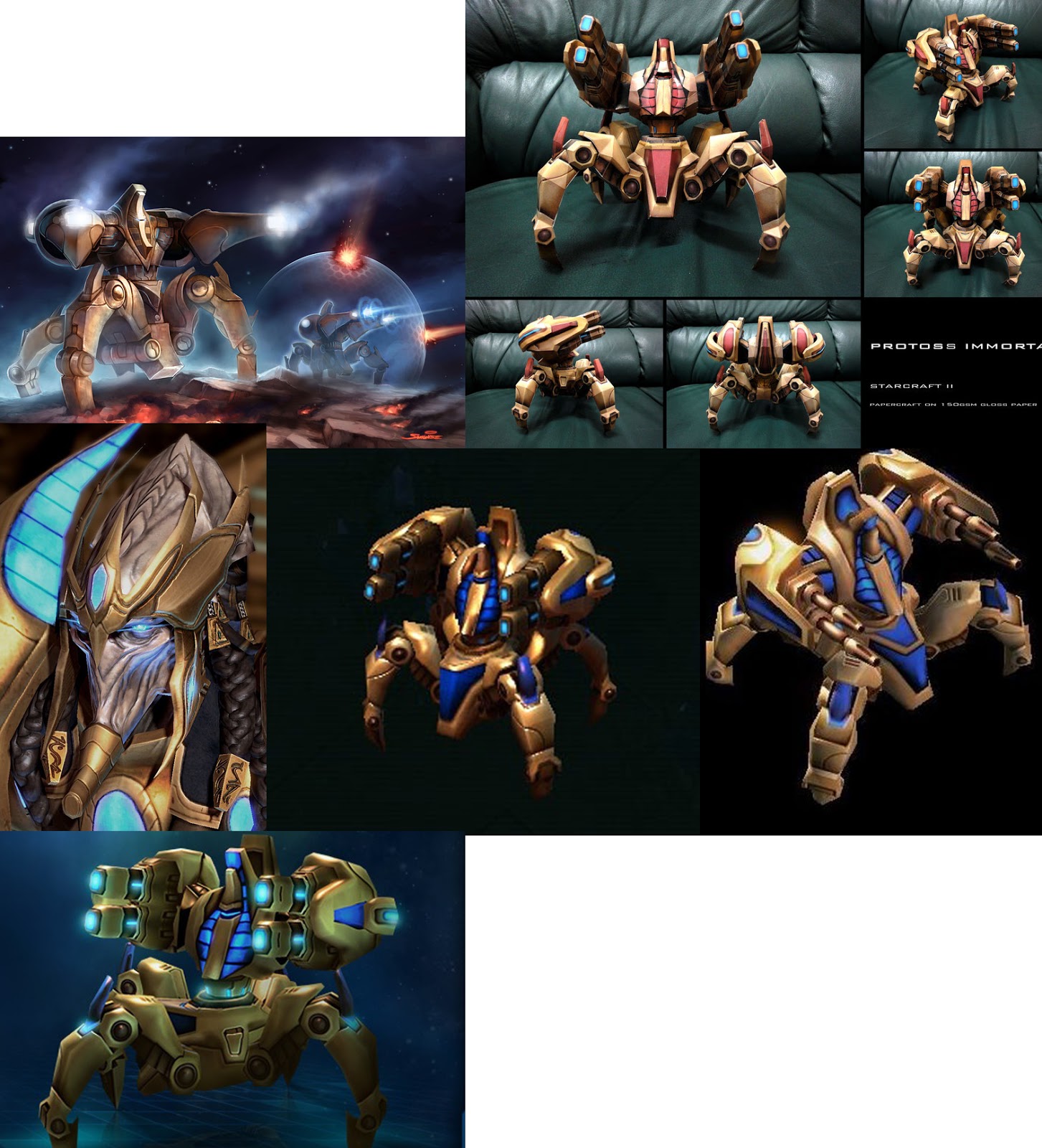
Out of all the immortal art out there, I'm going to merge the concept art with the in game model, because theres a lot of cool stuff going on, and I really dont want to give it up.
Critique it on the way if you please.
(MOST RECENT UPDATED).


Replies
Blockout
(COPY PASTED from blog).
So in this update, I took out a few creases. specifically on the back. The pink lines are where there were creases, but I took em out. and the yellow is where I'M not too sure I want creases there. The part I've marked on the picture, isn't on the pictures of the model i supplied, BUT I really like it, so I'm adding a different version to the model. I guess the next part I'll block out is the gun (cannon?)
This will be my last post for the day, I have a few concerns.
mainly how i'm going to retopologize this thing. I've highlighted the areas, where i'm not sure what to do. The main option I've come up with is z remesher with some guides.
Question: IF I just retopologize it (the model) by hand, will those holes bake in to mesh when I bake the normal map? I'm thinking ahead, I haven't even gotten to that part yet, so We'll see.
I also would like to make it one solid mesh, but as I'm typing this, I"m not sure if that's the best option. I've circled the areas that would be separate pieces, and I think this would work.
Question 2: How can I fuse the arm to the cannon piece. I mean, is there anything cool i can do here? because I can not for the life of me think of anything , and I'm guessing it'll just have to flow into each other like it does in the capture? Anyways, thoughts would be appreciated.
SO i think i'm making pretty good progress. I'm not completely sold on the barrels of the cannon design wise. They LOOK fine, but I'm not sure, it doesn't seem heavy enough to me, I may go back and change it. Where the arm part meets the Cannon, is giving me trouble, in that, I do not know what to put there. It is pretty annoying, If i cant think of something I'll have to leave it like that. Not my favorite option, but I'm not sure how mechanical pieces would intersect like that.
Thanks Brian. I was going to get to that once i had everything blocked out. I haven't even started adding details yet. You're saying i should bevel them now? Does it make a difference if I bevel the edges now, or before I start detailing it?
(Copy Pasted from Blog)
Another update on the immortal, tonight I could only get the blockout on the base done
It was a bit more difficult than I imagined, I was trying to get some big chunkiness going on, while making it still look believable. Also I really like the way the legs looked in the paper cut out of the immortal, and I was trying to go for that, I think it'll have to be taller to really accomplish that look. The paper model of the immortal is very skinny in the center, but its base is huge. Unlike the in game art . I'll have to play with it. I might go back and make it even bigger, but for now it think its alright. Gonna do the fun part tomorrow then.
I'm looking forward to the legs, I think that should be the "easiest" part. I being very generous with the term "easiest" haha.
PS
Went ahead and added a bevel to everything in the scene, I think it looks pretty ok!. that soft edge really makes it look neato.
His crotch component's forward element, for lack of a better word, seems too long. Have you tried just box blocking in your forms instead of getting pieces done one at a time to verify your proportions will work for the final sculpt?
I made a block out in the beginning, made a point to make the legs believably big. In the concept art, even on the game model, I always felt the legs were too...spindly, and thin and in no way would they support a heavy assault unit meant to take hits from the Likes of a Crucio siege tank.
There's a few things I'm going to change, that I didnt realize until I started typing this.
-In the concept art the guns are bigger, and legs are smaller. Same as the model PERSONALLY I don't like it, and I don't believe it, but I'll try it out to see how it looks.
-I"m happy with the gears on the leg, BUT I'm going to remodel the middle leg section, I'm thinking about how i'm going to retopologize it, and its going to be hellish. (to me, maybe to a more experienced individual they could accomplish it no problem, but as it is now, I'm just not a huge fan.)
-I would like there to be some mechanical stuff under the base plate of the immortal, right now its just empty space. I'll put a cube down there for now to fill it up.
(Copy pasted from my blog)
So theres a few issues. that I couldnt get to tonight:
-The legs are remarkably soft in comparison to the torso and arms. Now I think what I want to do is add some detail like whats in the torso area, BUT I do not know if that will fix the issue i'm having Int the concept art and even on the in game model, the legs are VERY blocky. I wanted to get rid of that look and smooth it out, because I thought it looked bad. But I may have to go back to that for the legs and remodel them
-The torso section is looking alright, but there are some lines that I think I might have misplaced. I was trying to break up the surface with some noise, and might have stopped some of the visual flow that is going on
-I do not mind the guns, but I wish I could think of something to put there. I do not know if I'll go back now. I'm already 24-30 hours in, and if I want to get this done by my time limit. I doubt i'll be able to go back to the arms.
I need to make a decision on how I'm going to retopologize this.
I want to be able to animate it So i figure just retopologize each pieces separately that I want rigged. That being said. I"m not sure that method will get me down to my 30k limit that I was hoping for. IF not I'll just have to optimize it further.
(Copied from the Blog)
SO i fixed the legs,
and I'm really into these legs. SO unless there's some surface error going on. I think i'm going to stick with it. I'll add some surface detail tomorrow and start to retopologize this stuff. Cant wait to start
Took the creese out, I wanted to see how that looked. It was bothering me in my sleep. I think I like it better t his way.
My original thought was
>Polypaint HP mesh
>project polypaint onto LP Mesh
-DO the bakes.
>bring it into Quixel
Does that seem reasonable to y'all?
Went ahead and polypainted it to mark the material IDs for later. Also I really wanted to see it in some kind of color.
SO i'm going to proceed with it in this order.
>Polypaint
>retopologize
>Project
>bake
>Quixel.
I'm thinking I can get this thing retopologized and baked this weekend.
That being said. I've never retopologized or modeled anything that has holes in it. (the cannon). I think I should try out some methods, on a cylinder or something before I really dive deep in it.
Also, when I project the poly paint data, I'm not too worried, although this has happened before where it gets messed up in certain areas. I figure I'll just correct it in zbrush on the LP model before I move on to any texturing.
Another update. First pass on the materials
There are few glaring issues that I've marked up. I'll go back and fix those this weekend.
As far as the materials, I'm not sold on the blue just yet, I think i get the idea. I want to make it glow, but i'm not sure how to make a convincing glowing crystal material. (khydarin crystal to be specific).
I think also, I'll have to make separate uvs for some decals or zerg blood, and I'll do that in Unreal
I like the brown metal on the bottom half of the immortal, but the top half is a little lacking to me, I'll have to go back and check that out.
The legs need to be unwrapped a bit better, because there are some artifacts (artifacts right? those are artifacts?) near the bottom. Otherwise the bakes are pretty ok.
I still have NO IDEA what to put under the immortal. What holds its legs together?!
I've got nothing for that. I'm gonna keep it blank for now.
It still not completely done to me, but Ive gotten to the point that, I dont know how to make the changes I'd like to make. When I come back to this I'll use substance to add details, I dont know substance right now so I'll have to learn it before i tackle this. I used quixel for this and really like the result. SO I imagine using them both in unison would be wicked fun.
Oh also, megascans for the ground. I think it came out cool. It really adds flavor to it. I think when I come back, I'll add a big pylon in the background, really give this scene some pizazz. And maybe add a hardened shield to the immortl too! that'd be sick.
This was a really fun practice in presentation. I think saturday I'll go through and add some light cards, and then pose this joker. I really wanted to model a zergling attacking it, but Thats another character model on its own. Anyways, GGWP My Life for Aiur
I tried cutting a seem along a hard edge, cause thats gotten me good results before., but I think the issue is it needs supporting edge loops.
As far as that top joint, I have no CLUE. What's going on up there. Been hitting a wall with that one.
It may just be that you need to have a more interesting environment map to reflect, but I think it'd be worthwhile to go back into Quixel and tweak that material a bit more.
I was JUST looking a that, and you're absolutely right. I gotta go back and tweak the hell outo f it, and if we're being honest. (probably should start from the beginning, but maybe i can just edit the reflectivity. IDK we'll see.)
Painted some details into the kyhdarin crystals to break up the surface a bit. I think that was the right move.
Been watching the cinematic though, and the armor is extremely detailed (that the protoss wear). I've got some cool stuff going on, BUT man I think i need to come in and break up all those big shapes even further.