Kriss Vector [RealTime Next-Gen Weapon]
Hey,
here's my latest weapon: The Kriss Vector SMG
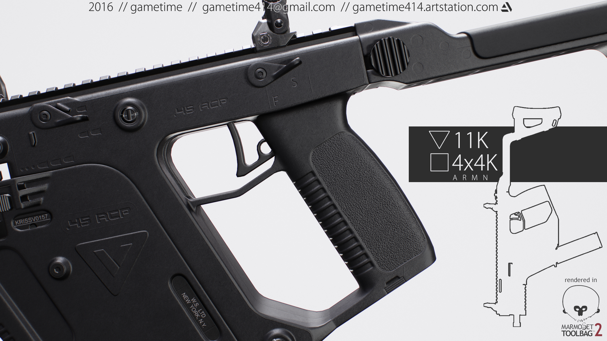
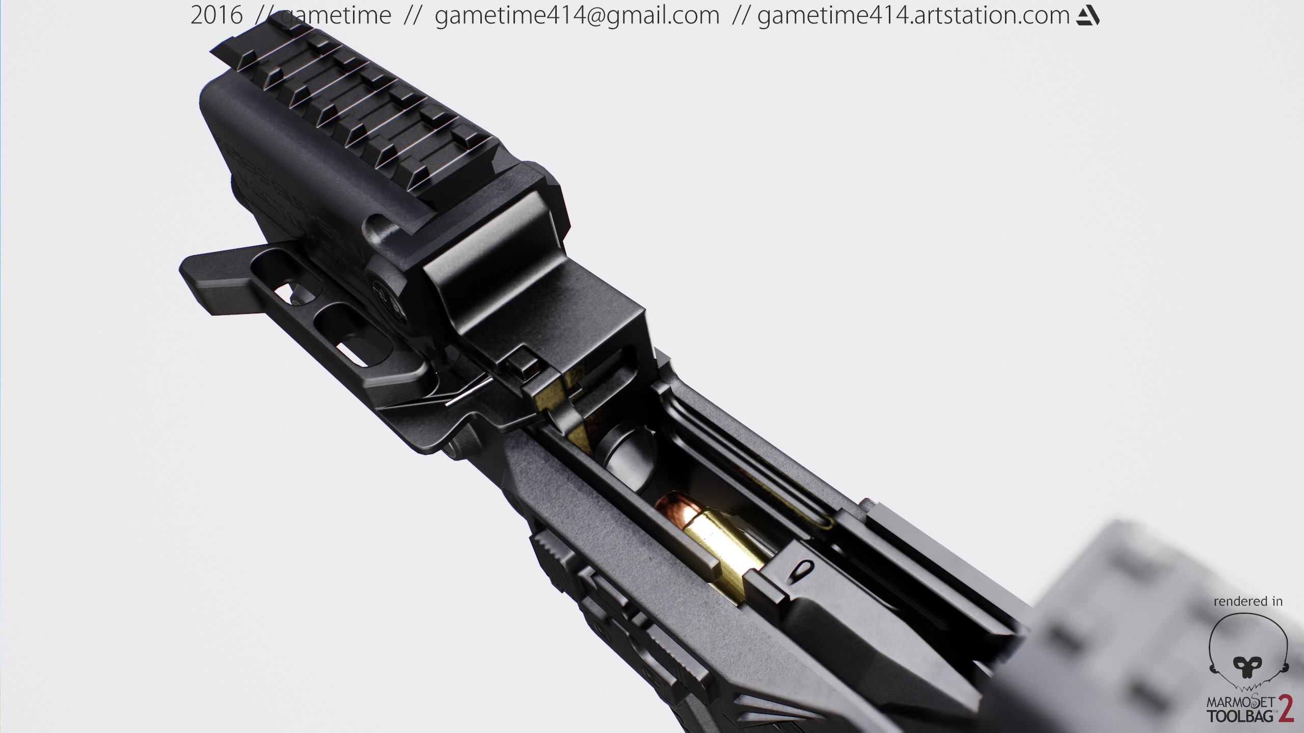
I've been hard at work, to make this the most realistic & accurate weapon yet. So I created the weapon from tons of references & also modeled almost all of the interior.
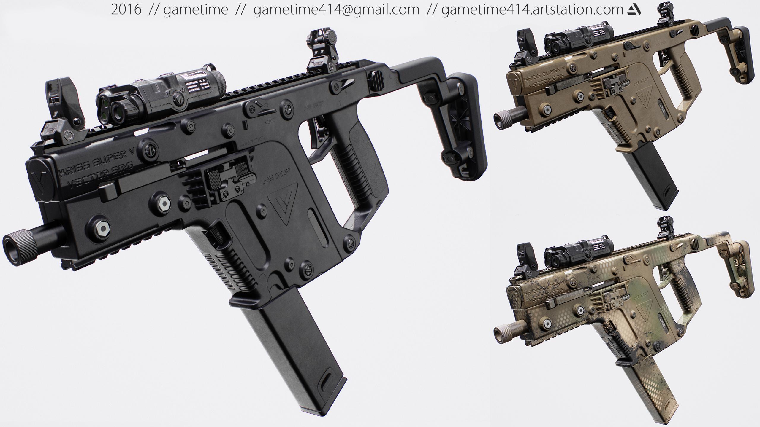
The weapon comes in at about 9k polys & a 4K texture sheet - PBR of course & in 4 versions:
1. Clean "Factory" Black
2. Black Used
3. Tan Used
4. Spray Paint Camo (my favorite)
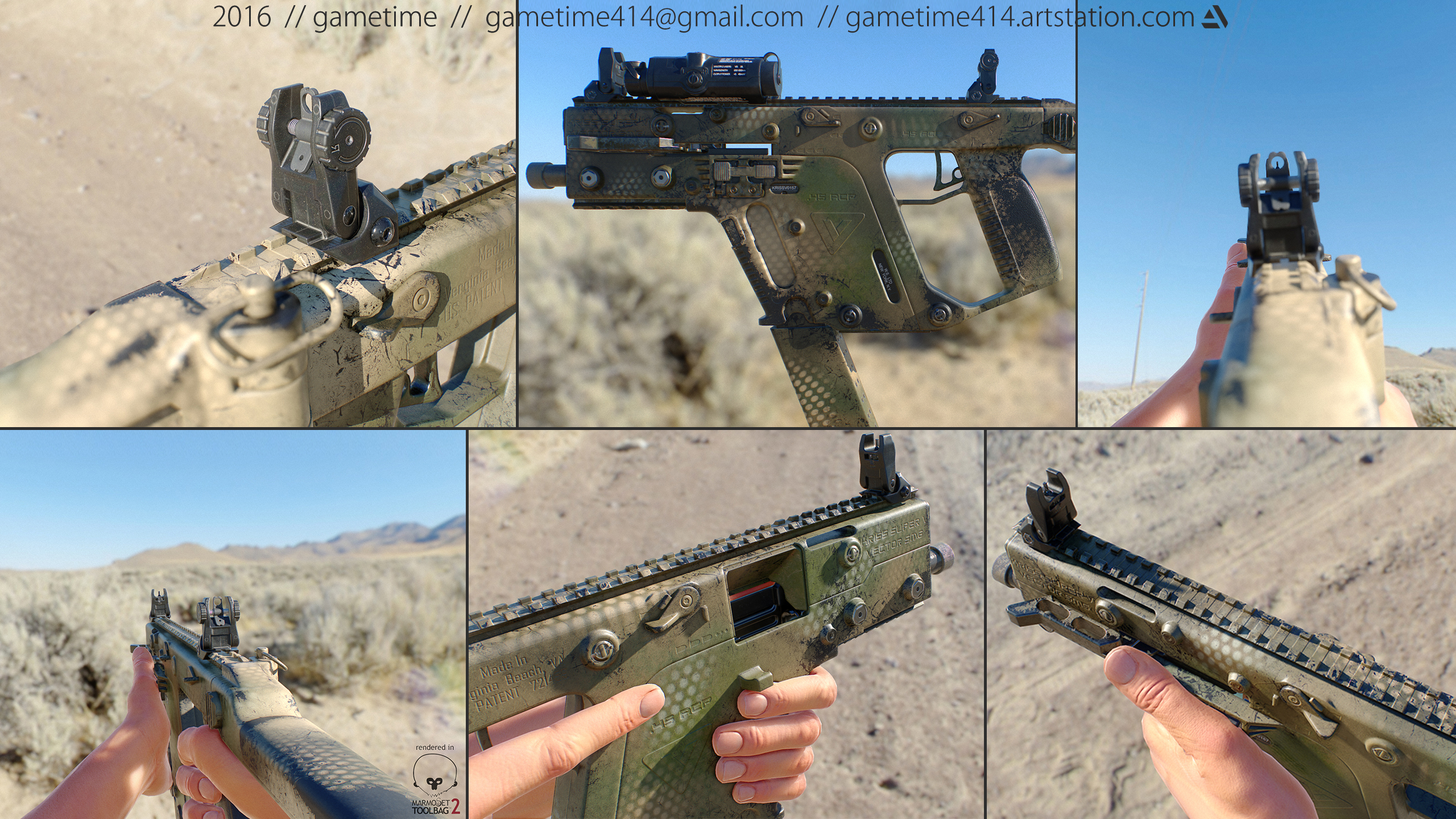
The sights are the IMI Defense 2-way Flip-Up sights, meaning they also have a low profile mode, which I think is really cool.
They add another 1.6k polys, making the whole 11k polys. The sights have their own 1K PBR texture sheet.
The weapon was modeled in 3ds Max, the textures created in Substance Painter with the help of Quixel's dDO.
The images are rendered in realtime in Marmoset's Toolbag 2.
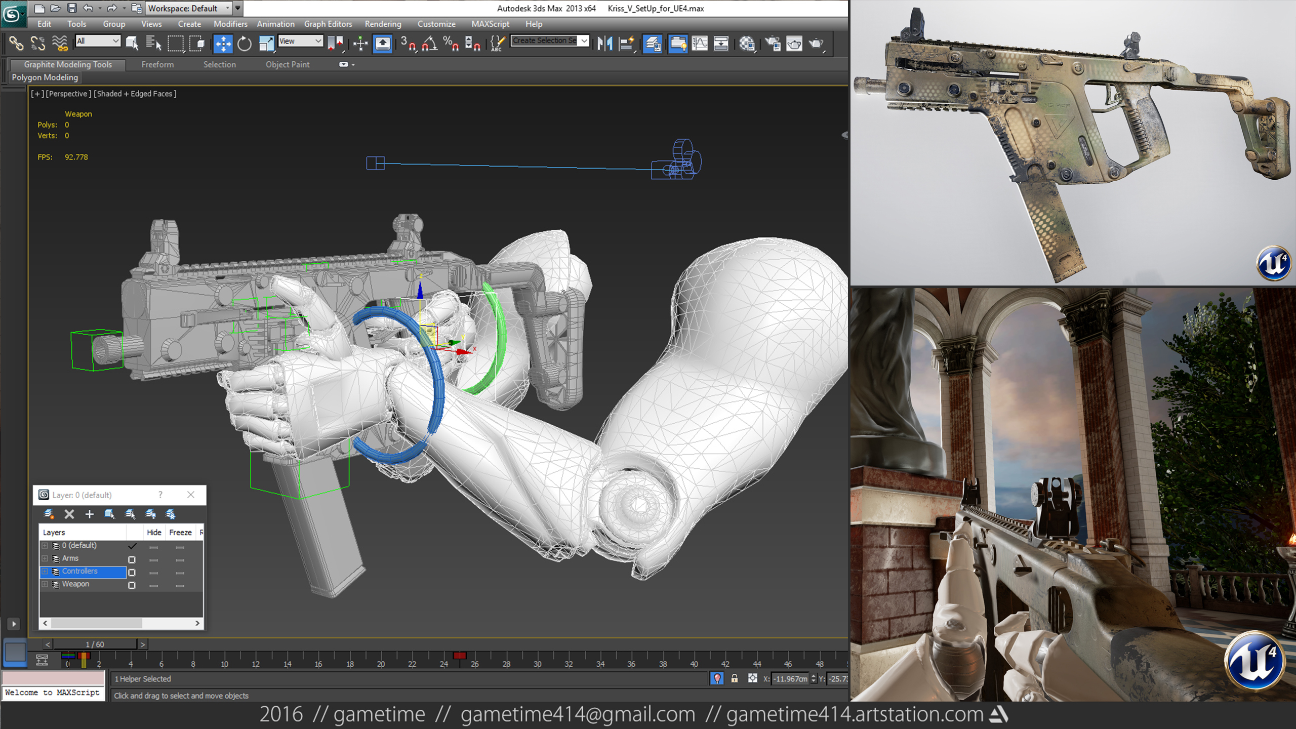
I also rigged it & made a basic "Idle" animation & exported it to UE4 so that the FP character can play with it.
Here comes the Juicy Part:
I would greatly appreciate it, if you guys would check the weapon out at my Artstation profile to see the marmoset viewer, the rest of the images & to give it a like or a comment if you wish. This would also help, getting it out of the "Newest" zone & into the "Trending" section.
So I'm counting on you guys to give it the push :awesome:
Link: https://www.artstation.com/artwork/4Ea3L

Link: http://https//gum.co/sfuL
I believe that's all I have to say for now. Of course any comments, critiques & suggestions are welcome
Some Pics:

here's my latest weapon: The Kriss Vector SMG
I've been hard at work, to make this the most realistic & accurate weapon yet. So I created the weapon from tons of references & also modeled almost all of the interior.
The weapon comes in at about 9k polys & a 4K texture sheet - PBR of course & in 4 versions:
1. Clean "Factory" Black
2. Black Used
3. Tan Used
4. Spray Paint Camo (my favorite)
The sights are the IMI Defense 2-way Flip-Up sights, meaning they also have a low profile mode, which I think is really cool.
They add another 1.6k polys, making the whole 11k polys. The sights have their own 1K PBR texture sheet.
The weapon was modeled in 3ds Max, the textures created in Substance Painter with the help of Quixel's dDO.
The images are rendered in realtime in Marmoset's Toolbag 2.
I also rigged it & made a basic "Idle" animation & exported it to UE4 so that the FP character can play with it.
Here comes the Juicy Part:
I would greatly appreciate it, if you guys would check the weapon out at my Artstation profile to see the marmoset viewer, the rest of the images & to give it a like or a comment if you wish. This would also help, getting it out of the "Newest" zone & into the "Trending" section.
So I'm counting on you guys to give it the push :awesome:
Link: https://www.artstation.com/artwork/4Ea3L
Even Juicier:
This is also the first weapon I'm selling and so I created a Gumroad Page. Needless to say, it would be great if you could check that out & maybe even give that little buy button a squeeze or recommend it to your people.Link: http://https//gum.co/sfuL
I believe that's all I have to say for now. Of course any comments, critiques & suggestions are welcome
Some Pics:


Replies
may i know what sort of HDRI did you use in those camo screenshots? looks really cool
here is the HDRI I used. Its free from the internet
Link: https://www.maground.com/Maground/image-store//image-sets/MHA_2217/ma-MHA_2217_hdrS.jpg
Looks great in both original and camo skin. Your Marmoset renders are photo realistic.
Really tried to achieve realism here and reading @vertex_ comment is exactly what one wants to hear
@BeardedMike & @Earthyn thanks & also thanks for the artstation support
Would like to hear your guys opinion: Do you think the little preview square (on artstation) would get more attention if I chose another image? Maybe one of the camo shots?
Cheers
thanks for the nice comments. They really push me to do more!
And that's partly why I decided to add a little "umpf" to this project. I saw a concept art by Carsten Courchaine over at artstation (https://www.artstation.com/artwork/wPJyO) and decided to recreate the style.
So this will be the "Kriss Vector Mod Zero"
PS: still using TB2
PPS: I will get back to the helmet soon.
First Screens
Rail and Silencer
anyways, I made a small video and here is the artstation entry. So drop by to leave a like if you wish. https://www.artstation.com/artwork/549wz