Home 3D Art Showcase & Critiques

GoPro3 Game Art

polycounter lvl 4
Offline / Send Message
CptAlbatross polycounter lvl 4
Hey guys, so I'm trying to practice game asset creation, specifically the unwrapping and texturing portion. I had this high poly model of a gopro lying around so decided to use it as an exercise.

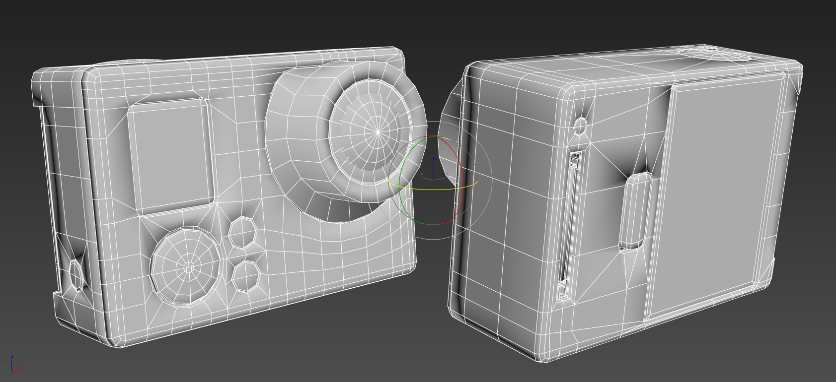
Here's the low poly of the camera.
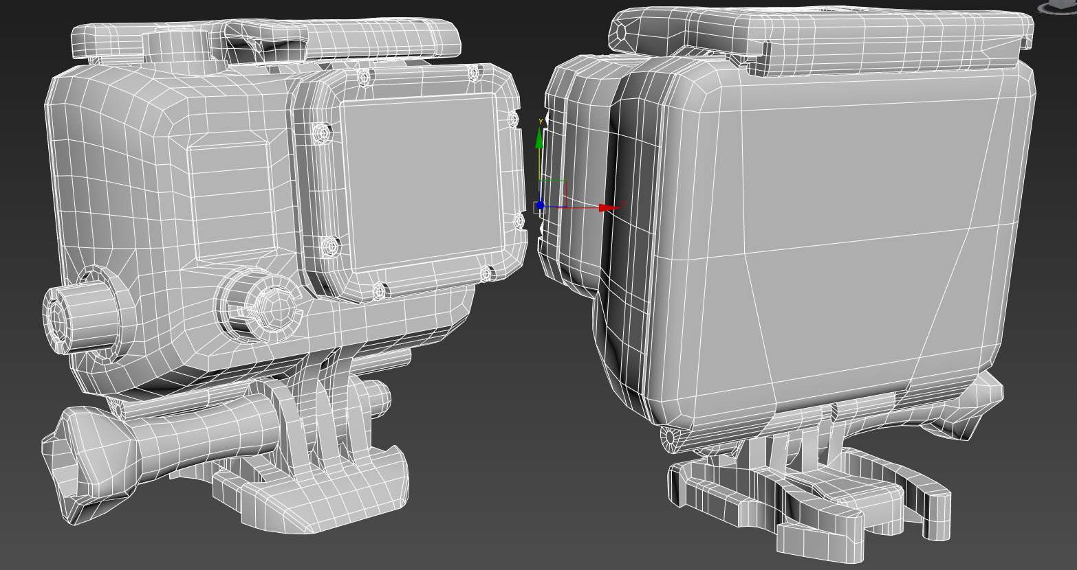
Here's the case that goes around it.
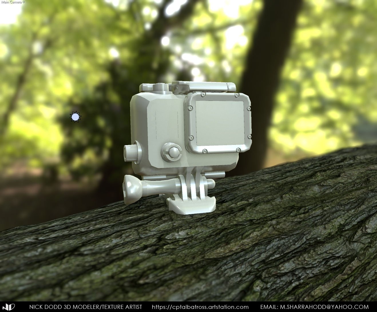
And here's the whole thing on a log made with photogrammetry textures.
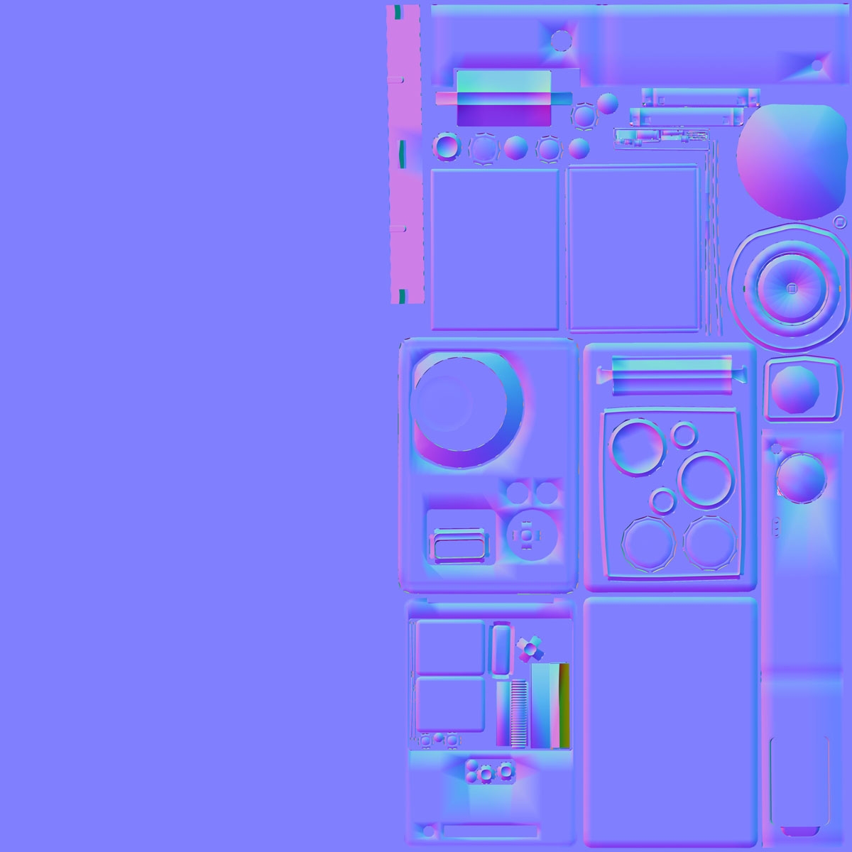
I've currently got the camera unwrapped and prepped for projection mapping and I also have it set to 1 smoothing group. Problem is when I render the maps, I'm receiving both the low poly and high poly normals information, which looks like shit thanks to "poor" poly flow.

Camera normal map. Pay no attention to the blank space, that will be used for the log textures.

What did I do wrong and how do I fix it? Any other critiques are also welcomed. Thanks for you time!

Replies

  • Cyph3r
    Offline / Send Message
    Cyph3r polycounter lvl 9
    Looking at your pictures it just seems to me your smoothing groups aren't setup right! Should take about 3 seconds to fix.
  • CptAlbatross
    Offline / Send Message
    CptAlbatross polycounter lvl 4
    Do I need to set the low poly model to one or multiple smoothing groups? I noticed when I did, I was getting hard creases on beveled edges.
  • Cyph3r
    Offline / Send Message
    Cyph3r polycounter lvl 9
    Someone will undoubtedly offer a more in-depth insight, but where you're seeing the hard creases where you shouldn't be, i.e the corners of the body, just make sure they're one smoothing group. 
  • kymo_thys
    Offline / Send Message
    kymo_thys polycounter lvl 3
    Are you using a cage? also make sure every different smoothing group is also separated as a different UV island, If you keep them together you bleed light information from the borders of your polygons on top of the other one. Also Can you show us the high poly too?
  • Gazu
    Offline / Send Message
    Gazu polycounter lvl 12
    Use TexTools in Max, and just go under Tools -> Smoothing Groups from UV Shells.
    This will setup your SGs to every single UV Shell, which works great.
    And when your LowPoly in Max has some Black Gradients or your normal map is full of Purple Gradients, then you have to Cut your UV Shells to smaller angles or add Support Edges to support the Smoothing Groups. Here give attention to a good Mix of nice LowPoly Shading and that you later on in the process can easily texture the prop. Larger UVs are better for texturing but will end in a bad gradient Shading. So...try it out.

    As far as i can see is that your SGs are not setup correctly and maybe you have to cut your Shells, so that your Smoothing Groups doesnt have to go over bigger angles. SGs are very sensitive and i know, that sucks :)
  • CptAlbatross
    Offline / Send Message
    CptAlbatross polycounter lvl 4
    kymo_thys said:
    Are you using a cage? also make sure every different smoothing group is also separated as a different UV island, If you keep them together you bleed light information from the borders of your polygons on top of the other one. Also Can you show us the high poly too?
    Yeah I'm using a cage. I did what Gazu said and adjusted the UV islands as their own separate smoothing groups. The results are looking better.


    Here's the HP model. It's from a cad file so it doesn't really have proper poly flow.

  • Gazu
    Offline / Send Message
    Gazu polycounter lvl 12
    Why you are using just one side of the Normal Map Texture?
    If you want a NON-Power Of Two Texture do the following :

    Make your UVs on only one Side of the 0-1 Space. So that one half is full of Shells and the other half is empty.
    When this is done, stretch your UVs to fill the whole 0-1 UV Space.

    Now when baking in Max type in a NON-Power of Two Value for example 1024 x 512. Or 2048x 1024.
    The Stretching will go back then and you have a NON-Power Of Two Texture without stretching.

    Oh yeah....and use Padding because of MipMapping.
    8 for 1k , 16 for 2k and 32 for 4k.
    But the Values can be bigger, i think it depends on how you layed out your UV Layout and how close the Shells are together.
    I like to use 64 @ 4K  ^^

  • CptAlbatross
    Offline / Send Message
    CptAlbatross polycounter lvl 4
    Gazu said:
    Why you are using just one side of the Normal Map Texture?
    If you want a NON-Power Of Two Texture do the following :

    Make your UVs on only one Side of the 0-1 Space. So that one half is full of Shells and the other half is empty.
    When this is done, stretch your UVs to fill the whole 0-1 UV Space.

    Now when baking in Max type in a NON-Power of Two Value for example 1024 x 512. Or 2048x 1024.
    The Stretching will go back then and you have a NON-Power Of Two Texture without stretching.

    Oh yeah....and use Padding because of MipMapping.
    8 for 1k , 16 for 2k and 32 for 4k.
    But the Values can be bigger, i think it depends on how you layed out your UV Layout and how close the Shells are together.
    I like to use 64 @ 4K  ^^

    The map is only half used because the other half is reserved for the log that this thing is sitting on. It was made from a set of photogrammetry maps I found here. Since I didn't make it, I didn't want to bring attention to it. I didn't know about the padding thing though, so I redid my UV layout to accomdate for the extra space. It's not super perfect, but I think it should suffice.

    Here's the new map.

    And here's the low poly scene so far in Marmoset.


  • CptAlbatross
    Offline / Send Message
    CptAlbatross polycounter lvl 4
    Update to my little GoPro project. It was pretty cool learning how to make the LCD screen texture. I think I'm finally getting a hang of how PBR texturing works. Next is the clear casing protective casing and then whatever post work I need to do in Marmoset. Comments and critiques welcomed!


  • kymo_thys
    Offline / Send Message
    kymo_thys polycounter lvl 3
    looking good, if it's meant to be viewed from this close though your low poly needs more segments on circular shapes, the buttons look really blocky atm. Also it could benefit from some miscoloration on some parts and you can also play around and add details in the spec or gloss map like fingerprints or general wear. Good luck with the case!
  • CptAlbatross
    Offline / Send Message
    CptAlbatross polycounter lvl 4
    Gazu said:
    Oh yeah....and use Padding because of MipMapping.
    8 for 1k , 16 for 2k and 32 for 4k.
    But the Values can be bigger, i think it depends on how you layed out your UV Layout and how close the Shells are together.
    I like to use 64 @ 4K  ^^

    So am I allowed to fudge these numbers a little bit? What's the downside to using sub 32 padding for 4k?
  • jaker3278
    Offline / Send Message
    jaker3278 polycounter lvl 8
    Am i right in saying you can never have to much edge padding? 
  • vertex_
    Offline / Send Message
    vertex_ polycounter lvl 7
    If you're targeting a game engine then you'll want to use that 32px of padding for a 4k map. The figures posted by Gazu are a good reference. Find a balance - you will sacrifice valuable texture space by using too much padding, but if you don't use enough then the in-engine mipmapping can cause nasty color bleeding on your UV seams.
  • CptAlbatross
    Offline / Send Message
    CptAlbatross polycounter lvl 4
    Well I finished the texturing for the case. It's not bad, but the transparent plastic leaves a lot to be desired. It looks thin, but I'm not really sure how to address that in Marmoset. Maybe use a cavity map? How would you even generate that out of Quixel/3ds max? Anyways, there's still some tweaking and fixes I need to apply, but this is what I have so far. Thoughts and critiques are appreciated.


  • CptAlbatross
    Offline / Send Message
    CptAlbatross polycounter lvl 4
    Alright guys, made a few tweaks here and there to the materials and am calling it in. While there are some issues here and there, I'm still pretty happy with the results and what I learned in the process of making this. Thanks everyone for the help! On to the next! Let me know what you think!


  • vertex_
    Offline / Send Message
    vertex_ polycounter lvl 7
    Good result and nice idea by mounting it on the tree. The transparent plastic leaves something to be desired. I'd recommend checking out Marmoset's fantastic tutorial on glass shaders if you haven't already: http://www.marmoset.co/toolbag/learn/glass

    It looks like you put some nice detail into the gloss map on the outer shell. It would be really nice to see that sort of detail on the rest of the model as well, like the black parts, as they are reading as a bit flat right now. You have a great artistic approach to that sort of wear and tear that the GoPro has gone through, it would be pleasing to see it continued throughout the rest of the model.
  • CptAlbatross
    Offline / Send Message
    CptAlbatross polycounter lvl 4
    vertex_ said:
    Good result and nice idea by mounting it on the tree. The transparent plastic leaves something to be desired. I'd recommend checking out Marmoset's fantastic tutorial on glass shaders if you haven't already: http://www.marmoset.co/toolbag/learn/glass

    It looks like you put some nice detail into the gloss map on the outer shell. It would be really nice to see that sort of detail on the rest of the model as well, like the black parts, as they are reading as a bit flat right now. You have a great artistic approach to that sort of wear and tear that the GoPro has gone through, it would be pleasing to see it continued throughout the rest of the model.
    Oh man, that's a pretty sweet tutorial. I was getting frustrated at why the case appeared so thin looking. I figured it was because I didn't have something a refraction or cavity map to indicate thickness.

    I played around with detail on the case, but had to remove it once I started exporting the mviewer file out. There wasn't enough resolution in the maps I had already and it was making the texture look noisey. I guess I should have split the case maps up even further, but I figured it's frowned upon to have too many map sets for a scene as simple as this. What are your thoughts about that? What's considered normal for number of map sets? How do you allocate that for larger scenes?
Sign In or Register to comment.