The BRAWL² Tournament Challenge has been announced!
It starts May 12, and ends Oct 17. Let's see what you got!
https://polycount.com/discussion/237047/the-brawl²-tournament
It starts May 12, and ends Oct 17. Let's see what you got!
https://polycount.com/discussion/237047/the-brawl²-tournament
Environmental Study Robot - Critique / Direction needed
Hey guys, just in need of some critique on this next project I started. I'm trying to make a robot that would analyze foreign environments using a set of tools on board similar to the ones the curiosity rover has. I'm starting to implement these features now, but was wondering if I should make changes to the current body of the mech.
First time making a robot this size so I'm still learning what makes mechanical pieces seem functional, I also feel like there's a lot of greeble going on and I'll try to replace a lot of those parts with more pure functional pieces rather than random noise.
Any feedback is greatly appreciated!
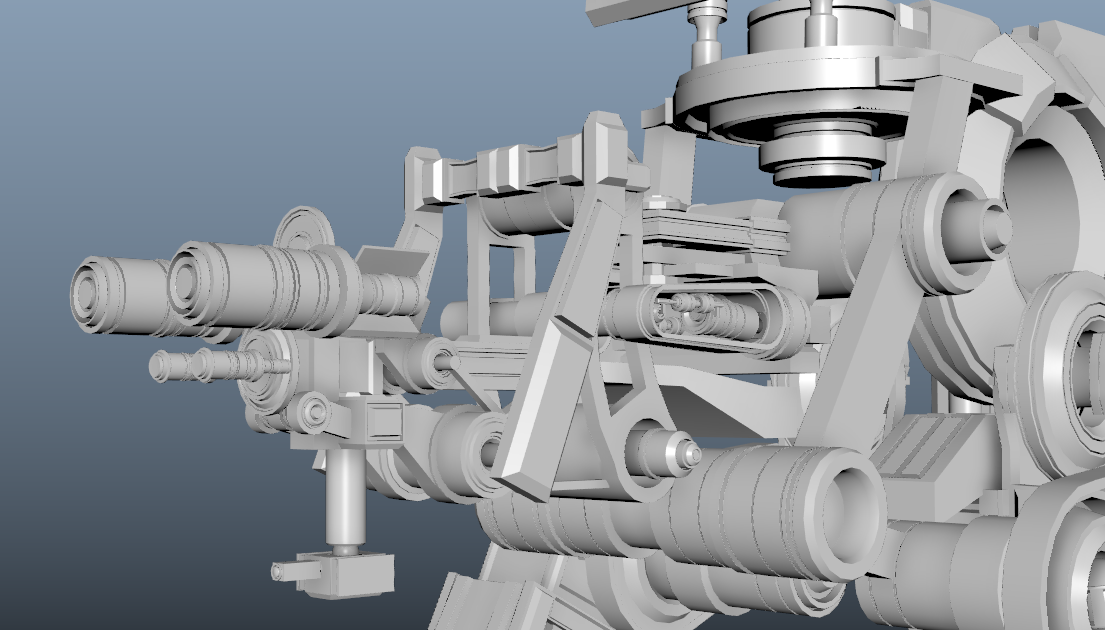
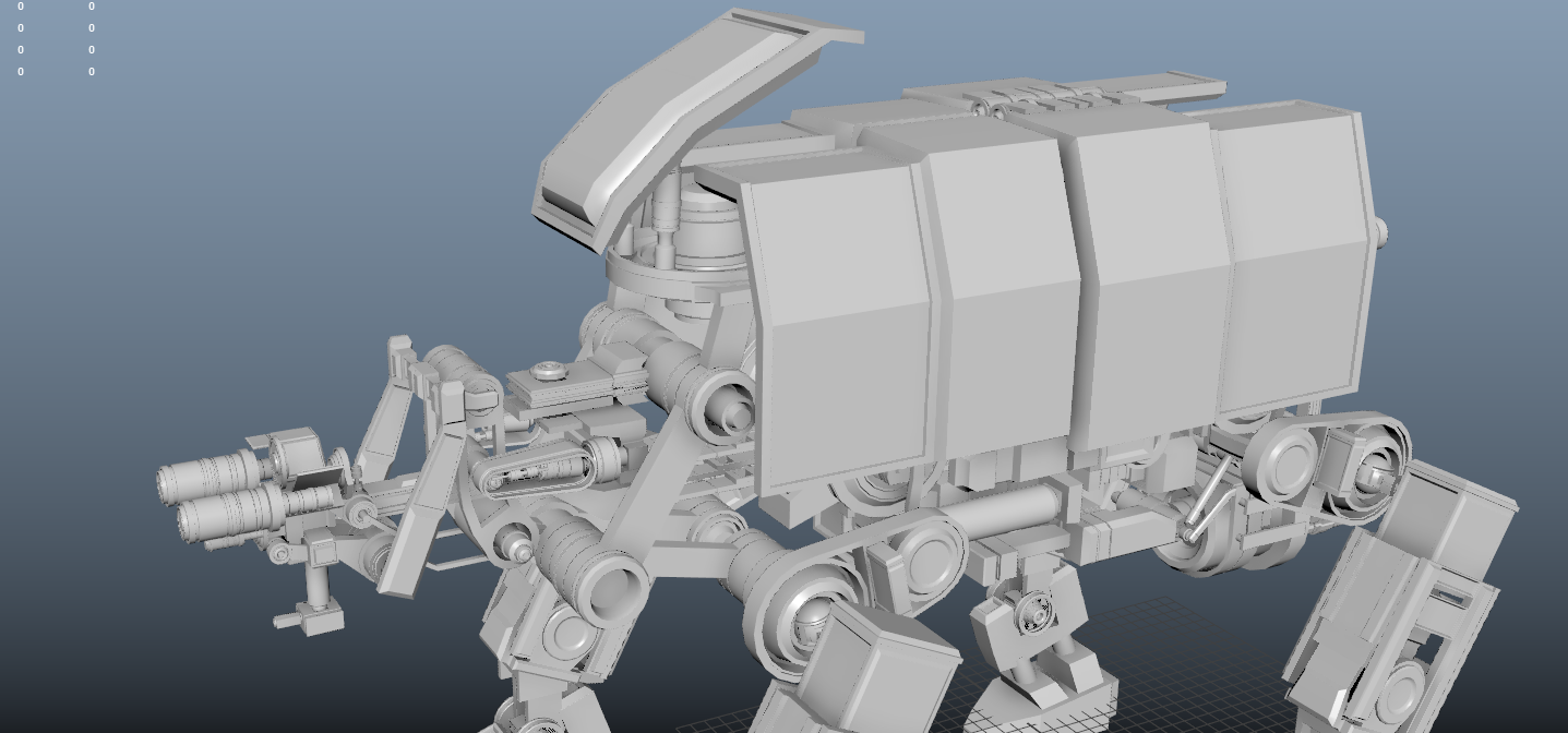


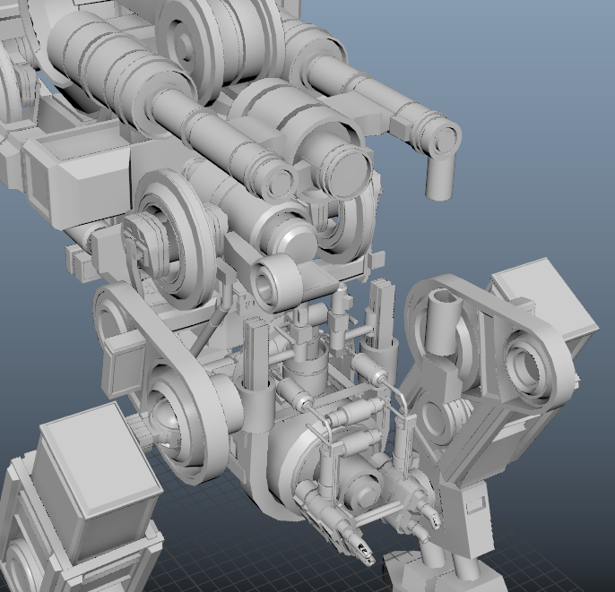
First time making a robot this size so I'm still learning what makes mechanical pieces seem functional, I also feel like there's a lot of greeble going on and I'll try to replace a lot of those parts with more pure functional pieces rather than random noise.
Any feedback is greatly appreciated!


Replies
I like the armadillo-esque plating on the back especially because it breaks up the visual noise. You need more surfaces like that to define the form in a more direct, digestible way for the viewer/player.
The shape language needs more definition. Right now it feels like a bunch of primitive shapes densely packed together. Some more nuanced shapes are necessary. They don't have to be complicated tetrahedron nonsense- take a look at Sparth, most of his hard surface scifi shapes are incredibly simple, but they convey the feel of the armor/machine/environment immediately.
Also take a look at Darren Quach for that kinda stuff. He has really cool organic hard surface mech designs. It will help to break up the cube/cylinder modeled blockiness that you currently have.
Good luck. It's a promising start, and I like the general direction, what you need is to keep whittling it down and making it more visually digestible.