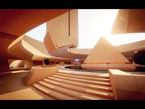
[WIP] Enlighten Contest - Future Courtyard
I've started on this contest and decided its due time to start giving updates.
I had to spend a decent amount of time becoming familiar with the project and Enlighten's workflow. It has been illuminating and I have definitely learned much more about its realtime GI capabilities. A couple links that have been of use are:
Alex Lovett's blog(creator of the original scene):http://www.shadowood.uk/Store/Store/
Unite talk on Enlighten: https://www.youtube.com/watch?v=NQLgR_a-g_8
Unity blog post on Enlighten that has some helpful hints on how your uvs are handled for a realtime bake: http://blogs.unity3d.com/2015/11/05/awesome-realtime-gi-on-desktops-and-consoles/
I think a large part of changing the
light will come from changing the original materials. Here is my work
in progress so far, mainly working with changing the normals.

As for the final look I'm largely inspired by various science fiction forms. I'd like to maintain the scene's function as a courtyard, but in a futuristic construction. Here are some of my references from well known movies.

Currently I'm trying to establish the base forms through the normal map and replacing the original materials

Replies
Hey guys, I've made some progress in my spare time.
I made a trim texture to reuse throughout the scene:
And here are some wip shots of the scene as I was going along, the last being the most recent:
Not a lot of time left as we are nearing the end, but I will try to get this looking like something as I continue to replace materials.
Thanks for checking it out!
I'm a little bit further on this shot. Still have some remaining areas of the scene to touch on, so I can show some more angles. Happy for the extension, thank you to the organizers for providing a bit of extra time on this one.
@HeliosDoubleSix
Hi Alex, thanks for the feedback! Really good point about keeping the albedo light so as to make the indirect lighting more visible. GI can be so subtle and soft that its easy to overpower it.
And I think I got a little heavy handed turning up the reflections...you can see it progressively get more and more shiny in my progress shots:)
This last bit is spot on about keeping a nice contrast between smooth and rough surfaces. Just like contrast between light and dark, the same also applies to shiny and matte. I will try to keep this in mind for future projects.
And thanks for writing up your blog and putting Unity through your extensive stress testing. You definitely laid the groundwork for us in this contest. I'll be sure to keep an eye out for your future work.
Cheers!
-Eric