Home 3D Art Showcase & Critiques

Abandoned Flooded Mall [UE4]

polycounter lvl 10
Offline / Send Message
Pinned
Sinister Exaggerator polycounter lvl 10
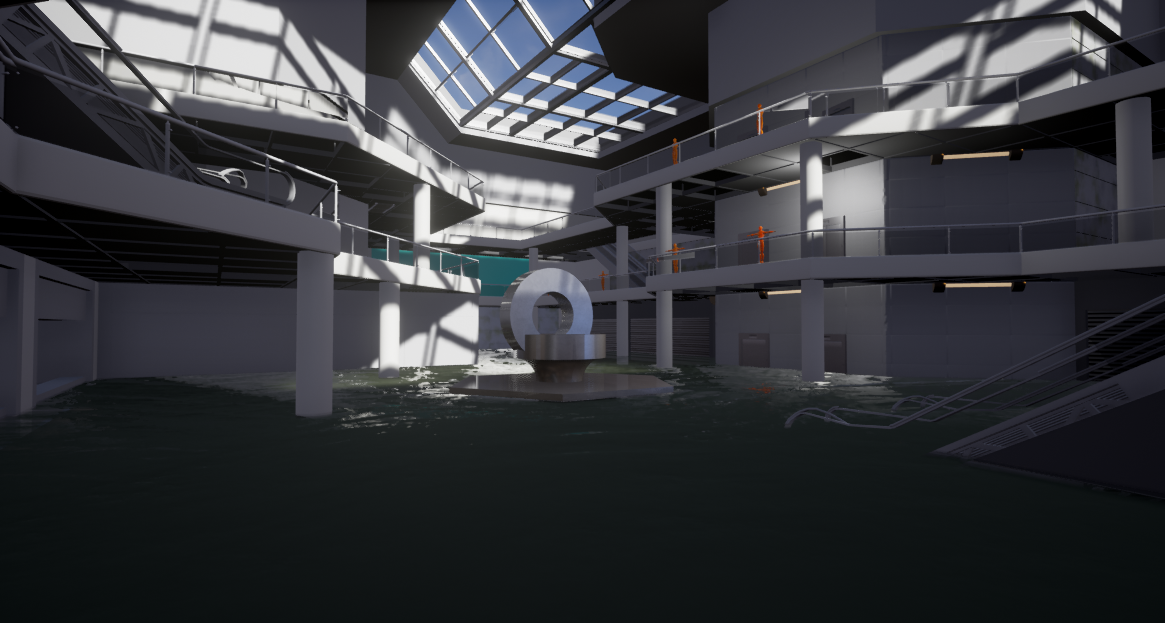
Hey Polycount, I have been working a section of an abandoned shopping mall based off of a concept image and references of a flooded and abandoned building slightly inspired by Mirrors Edge New Eden Mall. I am rather new to creating environments in UE4 and currently learning Substance Painter and Designer in order to create some PBR textures. Any feedback about the project would be appreciated. 

At the moment I'm working on replacing the blockout models, still not sure what i'm going to to do with the statue in the middle Im thinking some kind of fountain would look ok maybe keeping a modern art style. Anyway here is what i have so far.

Reference:

UE4:


Substance Designer Materials:

Dirty/Damaged Tile Floor


Replies

  • macoll
    Offline / Send Message
    macoll polycounter lvl 14
    Nice start ! I will keep my eye on this, gg ;)
  • Sinister Exaggerator
    Offline / Send Message
    Sinister Exaggerator polycounter lvl 10
    Hey guys just wanted to show a small update on progress I have been working on creating the wall texture trying to work in some moss and damage based on the concept above.  I have also blocked out some more shops and the department store. I will be updating here fairly regularly.

  • Sinister Exaggerator
    Offline / Send Message
    Sinister Exaggerator polycounter lvl 10
    Haven't posted on this thread in a while as I was working on finishing an old project. However now having finished it I am back working on this again  :D.


    Arcadia Department Store

    Still blocking out what I think will look good for the Arcadia department store I am not used to working in a modular parts fashion so its a bit of a learning process for me. 

    My Precious Jewellery Store


  • Giacomo X
    Offline / Send Message
    Giacomo X polycounter lvl 6
    Looking good. I'd add much more ambient light in the scene overall--it's hard to tell how well your textures are working because the light areas are SO bright and the shadows are SO dark...even if it's physically correct, my eye still needs to work to read the scene.

    I'm not sure about the level of contrast in the floor tiles either...again, it's a bit hard to read spatially. If it were me I'd make the individual tiles closer in value to each other.

    As always, just my two cents.
  • Sinister Exaggerator
    Offline / Send Message
    Sinister Exaggerator polycounter lvl 10
    Thanks for the feedback Giacomo. I agree I need to add more ambient light I'm still not sure how I can make it look natural as I want the place to have an abandoned feel with electric power having been out for some time. But from the point of view of the viewer i can see that  it doesn't show the texture work too well. 

    With the tile texture I wanted to make the tiling look damp and worn hense the dark colours I'm not sure that making the tiles match each other better would be a good as it won't display the pattern too well. I am planning on adding detail through decals dirt layers and cracked parts etc. 

  • Giacomo X
    Offline / Send Message
    Giacomo X polycounter lvl 6
    Hi- Just to clarify: the basic issue with the scene right now, I think, is that the lighting and the textures are SO contrasty that it's getting hard to read.  I put together a couple images below to hopefully explain--in the simplest way possible--what I'm getting at.  And yes, it does need to look "natural" and "realistic"--but people playing the game shouldn't have to work to figure out what they're looking at, either. Just my two cents.


  • Sinister Exaggerator
    Offline / Send Message
    Sinister Exaggerator polycounter lvl 10
    Thanks for the informative example this will help a lot . I will investigate how I can implement this in UE4 after I have finished blocking out the various stores and placements in the scene.
Sign In or Register to comment.