The BRAWL² Tournament Challenge has been announced!
It starts May 12, and ends Oct 17. Let's see what you got!
https://polycount.com/discussion/237047/the-brawl²-tournament
It starts May 12, and ends Oct 17. Let's see what you got!
https://polycount.com/discussion/237047/the-brawl²-tournament
[UE4] Bevelle Final Fantasy 10 Remake WIP
Hello everyone,
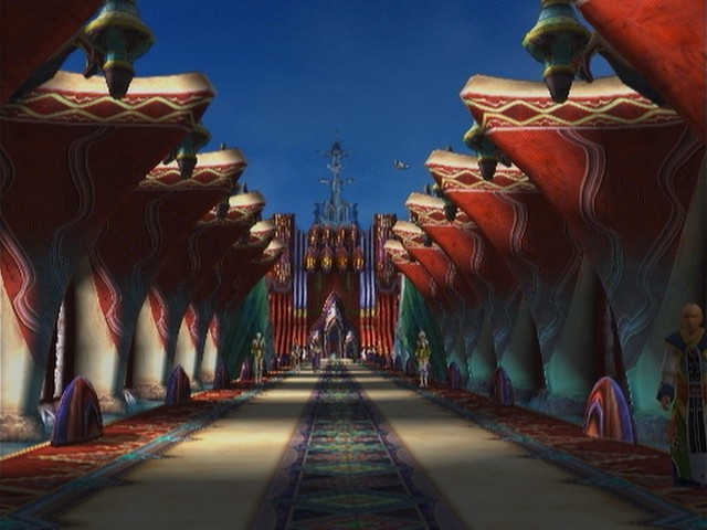
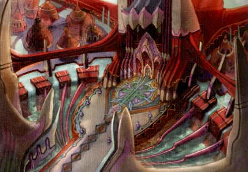
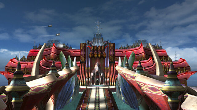
The girlfriend was playing final fantasy 10 last week and it made me wonder what Bevelle would look like in an up to date engine. Now that the 4.12 update is out I decided to give it a go while I apply for jobs.
In its current stage I have created all the models I think I will need using any refs I could find (If there is anything that looks off comment the error). The next stage is to start high poly sculpting the incredible amount of elaborate designs dotted around the level.
Crit is welcome
More of my work : www.paulscottdesign.com
Twitter https://twitter.com/Pasco295
Refs:
Current Level:


The girlfriend was playing final fantasy 10 last week and it made me wonder what Bevelle would look like in an up to date engine. Now that the 4.12 update is out I decided to give it a go while I apply for jobs.
In its current stage I have created all the models I think I will need using any refs I could find (If there is anything that looks off comment the error). The next stage is to start high poly sculpting the incredible amount of elaborate designs dotted around the level.
Crit is welcome
More of my work : www.paulscottdesign.com
Twitter https://twitter.com/Pasco295
Refs:


Current Level:


Replies
Texturing has begun! Got the middle of the paths done today and the stone flooring. It's kinda hard to work out some of the materials in the game since everything is quite flat with no reflections etc, but I imagine its a mix of metals and stonework so that the materials have some nice contrast with each other.
Each section of the middle path is 1.4k tris but with this project I'm more concerned with getting as much detail in with geometry than getting really low poly models. I used each diamond as material divider for this path so it starts the metal/stone contrasting.
For the stone flooring I've just done a basic world position material with random macro variations, they give it some slightly wet areas and generally break up the major forms of the texture.
started trying to get an idea of the lighting at night.
Didn't get many models done today because I spent so long on the sculpt/materials for the wall segments and planning out the night lighting
Here is the basic lighting plan for the night. I have only lit parts that have textured models for now and I am going to use the orb things on the walls to light the pathway. Also I'm thinking of adding little lights on the path kinda like landing lights, would that be too much ?
Here is the pulsing light running through the walls. I only added it to a few different cables and the major forms of the sculpt so it didn't get too over the top. It really adds to the scene at night time and is quite subtle in the day.
This looks like a fun environment to make. Some very unique shapes.
Any chance you can throw a character guy in there for scale? Something just seems off to me. Like the walkway is too skinny or something.
Overall I think your walkway is reading as too noisy. You have a lot of modeled detail that is catching like and creating shadow, and a lot of contrast with that middle strip. The black in particular is quite bad.
Note how, in the reference, although there is variation on the floor, the value shift is not as strong as yours, and a lot of the details are flat, so they still have a clean read down the hallway.
I would recommend you consider taking many of the floor details that are modeled out, and make them painted details on the floor instead. It will reduce visual noise along the path, as well as make for a walkway that can actually be walked on (people would be tripping all over this thing :P)
I've also reduced the height of the path trims by 70% so they are a lot more flat and made the blacks in the middle section a little less bold so they stand out less. Does this look better?
Thanks!
Yeah it's all real time and I plan on making the finished version downloadable if anyone would be interested in having a closer look.
The wall pieces with the wiring(underneath the windows) look amazing. Perfect amount of liberties taken with how the steel crosses over the trims, very interesting to look at.
My only critique/suggestion is with the main walkway. I think trying to stick with the overall silhouette(trapezoid) is really creating a contrast between your small and big details. I'd say don't be afraid to really vary up the slanted parts and take the same liberties you did with the side walls to get some interesting silhouette changes against the really long and straight lines the walkway is creating right now. I'd also say check the green channel on your white marble, the cracks looked inverted.
Otherwise great progress and keep rolling!
Do you think turning the sloped bit into a set of stairs goes too far from the original design or will be enough to make it less of just a repeating path?
Got a lot more of the path done now and the stone of the columns is quite a nice contrast to all the metallic framing around it.
I would remove the artifact or at least tone it down, I think it might also be worth it to paint the stone instead of tiling it, the cracks seem a bit too symmetrical/perfect looking. It might not be tiled but then maybe tone down the cracks a bit or something, but it's looking great! :pleased: