Indoor Hideout Environment in UE4 [WIP Thread]
Hey guys, recently graduated student here, and I've started working on an environment. Although I've occasionally browsed polycount, I've never posted anything on here..but I really want to improve my work, so I will be posting my progress on this thread as I work.
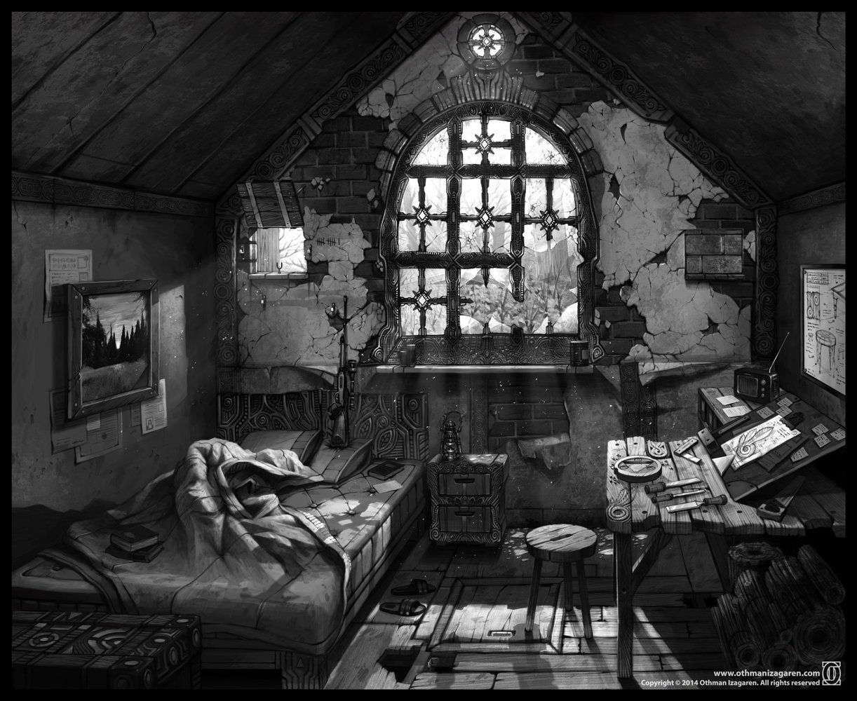
The environment will be closely based on the concept art below, from concept artist Othman Izagaren (Website here). As a student I mostly worked on outdoor environments and not very much inside of UE4, so I think this will be a nice experience and change of pace.
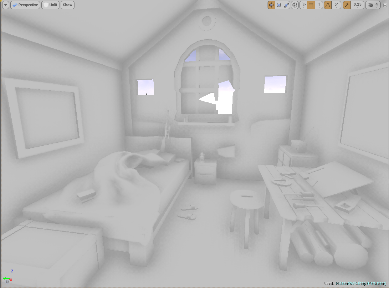
I've actually already built a low poly first pass of most of the assets in maya, and have made slight changes here and there, to match the overall closeness of feel of the space. Below is a screenshot of the assets brought into UE4; no textures or anything, just wanted to lay things out for now.
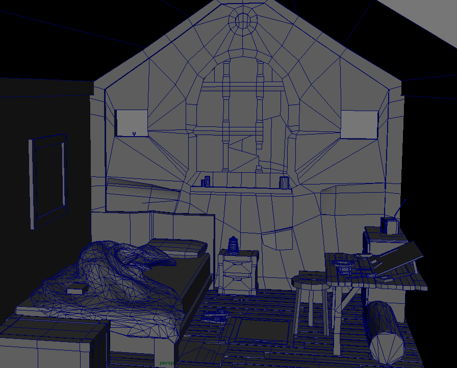
And here is a screen shot of the (mostly) same layout in maya with wireframe.
As first passes tend to go, things are subject to change (the window model for example), but I would love any comments or feedback anyone may have of this. And like I said, I am fairly new to UE4, so as I go, I would greatly appreciate any feedback that is offered.
I have done some UV's and a couple of textures, but I will work a bit more on them before posting them here.
The environment will be closely based on the concept art below, from concept artist Othman Izagaren (Website here). As a student I mostly worked on outdoor environments and not very much inside of UE4, so I think this will be a nice experience and change of pace.

I've actually already built a low poly first pass of most of the assets in maya, and have made slight changes here and there, to match the overall closeness of feel of the space. Below is a screenshot of the assets brought into UE4; no textures or anything, just wanted to lay things out for now.

And here is a screen shot of the (mostly) same layout in maya with wireframe.

As first passes tend to go, things are subject to change (the window model for example), but I would love any comments or feedback anyone may have of this. And like I said, I am fairly new to UE4, so as I go, I would greatly appreciate any feedback that is offered.
I have done some UV's and a couple of textures, but I will work a bit more on them before posting them here.

Replies
Anyway, here is a render of the current progress:
Right now you really have only one angle where light enters, rather than very bright light coming from everywhere outside. If you can get this sense of volume it will help fill your space up and as a nice consequence naturally introduce some of the saturation @mhofever mentioned.
@mhofever I actually added some desaturation to the scene so the values wouldn't be mixed because of color, but yeah it's probably a bit subdued.
@Savannakhet I agree, that needs to be pushed. I'll work on popping that.
@somedoggy So currently the directional light is turned down kind of dim, and I am getting most of the lighting from various spotlights with shadows turned off. I can bump up the intensity, but do you know if there is a way to sort of widen the incoming light to modify the patch of light on the ground? (Not sure if light even works that way, if anyone with more expertise could weigh in, id appreciate it greatly).
To be honest, I've been struggling a bit with indoor lighting in unreal. Its got amazing automatic features but it seems like a lot of work is involved to get different results. For example I have set the FOV on my scene camera to 70, but it seems like that causes bloom light shafts to disappear (works fine in editor view, but it happens when game is played). I'd love any advice in general on what I can do with lighting.
Well first, light shafts only visible in unreal when looking into the light source. An unfortunate limitation of the technique.
There are a few things you could do for such a small scene such as render a ton of volumetric particles in the space. Ive done this and with some tweaks it looks pretty great. If you're interested ill follow up!
Now for the lighting. No, you can't really just "open" a light up, but you can increase its volume. Archvis often does this by having white emissive or bounce planes outside their structures. Or you can make a point or directional light with a big radius, enough to cause that kind of spread.
But what I would do us model out a rough exterior with some simple material work done, setup in a way that it bounces light that produces light like in the original.
To deal with bright lights you'll want to toy with the exposure and tonemapping options. Real life is very bright, brighter than most people are comfortable putting their light values at, but proper tonemapping will produce a much more dynamic image.
Edit:
On my desktop now I just noticed your glass seems to not have a material ATM. If I may suggest, I've gotten great results with this setup:
https://facepunch.com/showthread.php?t=1377629&p=50002674&viewfull=1#post50002674
I like your advice using bounce lighting and tonemapping, I will definitely look into doing that. I'm also super interested in this volumetric particle setup you mention; please, do share!
As for the glass, yep that is a work in progress, and that material setup you sent will help me when I am setting that up. Thanks!
There's a trick to getting this to work, but it is very performance heavy and so works best in small scenes like this. Firstly you want to make a particle system. Making it have big, long-lived particles that move and spin slowly. You should see it sit at the max number of CPU particles. What you want is as much coverage and overdraw as possible. Like I said, performance heavy (and we're not halfway there yet). But if it's just for a portfolio you can afford to have luxuries like this and treat Unreal more like an offline renderer.
Then make a material for the particles that has an opacity with a gaussian type falloff, mixed with a bit of a photoshop cloud filter texture for some visual noise. Multiply this by a "Alpha" float1 parameter you create, then plug that all into a Depth Fade and then into Opacity. A greyish albedo works best, and plug in an inverted normal map so it scatters the light towards the camera. Make a material instance so you have quickly controllable opacity through that Alpha parameter. Changeup the basic formula of this material setup to get really any kind of lit particle you like.
Now, UE4 computes a volume texture shadowmap for translucent materials. You have direct control over the volume texture's resolution but since it's a volume and not just 2D, increasing this gets expensive.
The console variables are:
r.TranslucencyLightingVolumeDim (YourNumber) <- The expensive one. I max this at 200 on my GTX 670.
r.TranslucencyVolumeInnerDistance (YourNumber)
r.TranslucencyVolumeOuterDistance (YourNumber)
With just trial and error, adjust the latter two until you get the most detail out of your Dim setting.
https://docs.unrealengine.com/latest/INT/Engine/Rendering/LightingAndShadows/LitTranslucency/
The nice thing is that you can just bump the Dim value up and down as you work, and set it to a high value when you're ready.
I'll leave this too, because it shows that this technique is versatile for a number of things. Translucent ring material receiving detailed shadow from a planet:
Also, sorry for the long delay between updates again, was in a bit of a crunch mode at work and didn't have too much energy to spend on this until today.
After taking advice from here and from friends, here is another updated shot:
I lowered the desaturation intensity, popped the detail textures on a few assets, lit the top of the table, added in some bounce lighting, and made a better glass material (thanks again for that resource, somedoggy--though I did a much more simplified version of the one you linked to). I am certain there is much more to do, but unless there is something glaringly obvious, I think I will be moving on to a new project for the time being. Thanks again for all the help!