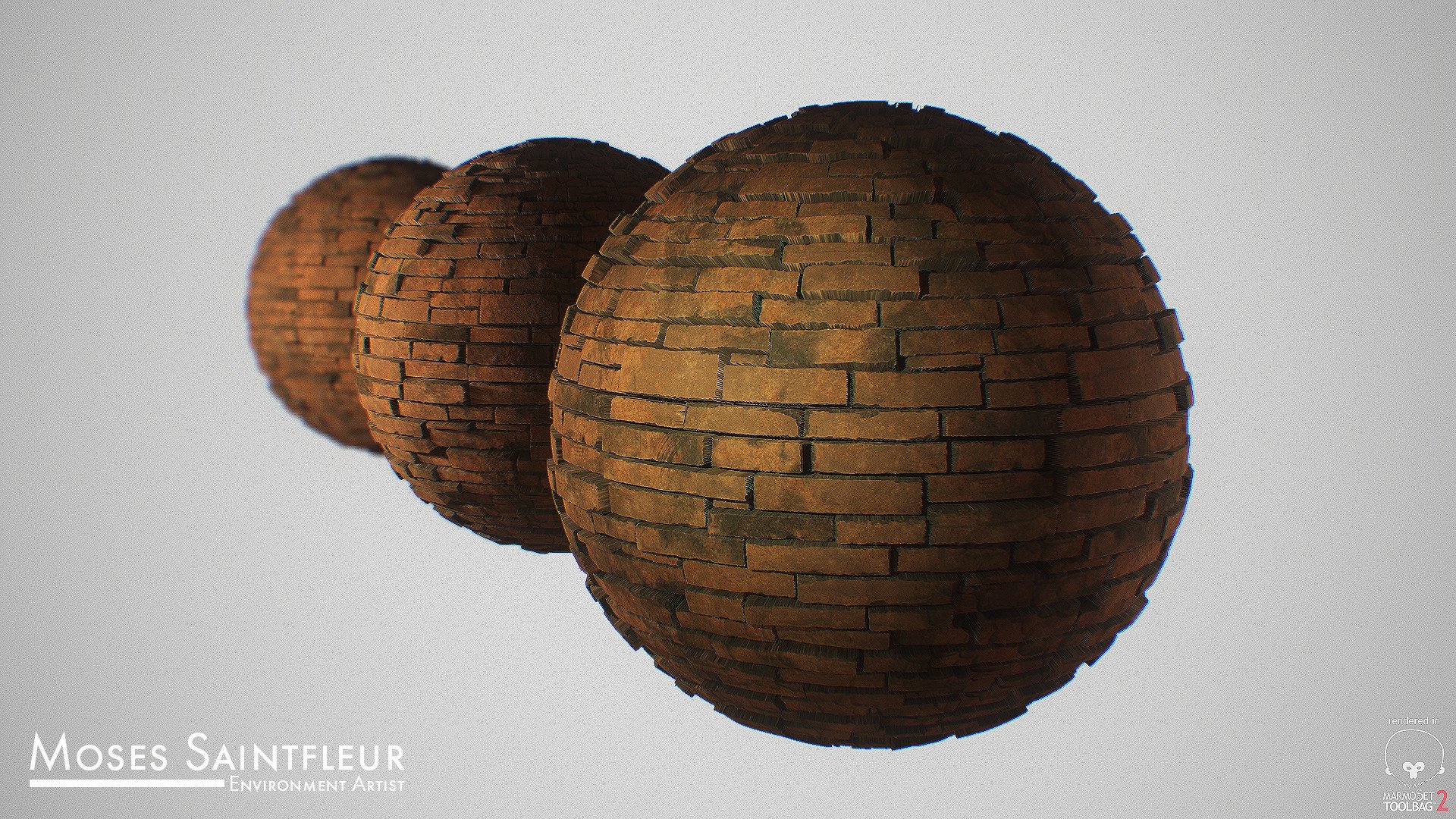
So I'm working on this environment for my portfolio and I'm kind of stuck right now. Maybe I've been staring at the computer for too long but my brain is just out of it right now. I don't have a name for this environment yet so lets call it "Side Quest" for now . I'm going for a medieval fantasy atmosphere. I'm heavily inspired by Dark Souls, Chrono Trigger, and The Witcher in terms of story and visual quality. I Just want to create something that has a strong composition. Something intimidating, yet inviting and mysterious. I'm just playing with shapes right now but If anyone could even do a paint over that would be amazing and I'd really appreciate it. I've included a few engine screenshots, one of my reference boards, and 2 materials I've made.
I'm now establishing the basic architecture with a few modular pieces I made and single brick meshes to break it up a bit. It's still very repetitive but I'm trying to take it one layer of variation at a time.
This is looking pretty nice! There is a lot of architectural interest with the shapes and composition you have going so far, and those substances look great! The bricks ARE repetitive at this point, but not necessarily in a cringe-worth way - I think it's just from the lack of anything else. If you add in plants/vines, dirt, grunge, windows, etc, I think it will look just fine as the scene comes together more.
I'm cutting back on the scale of the environment since I want to make something as detailed as I can in the amount of time I have. I'm also dedicating this week to getting as much of the basic structure done before I add in any other details like rubble/vines/other props.
Looks really good, I don't know if you are planning on this but the walls could use some color variance in corners and stuff like that, you could easily do that using vertex painting.
Can someone help me solve this problem i'm having? I'm using displacement but for some reason the tessellation multiplier won't add anymore geometry after 5. Anything above that does nothing. It's like the tessellation multiplier output is clamped to not go any higher. I'm getting low res areas and I really don't want to add anymore more divisions to the model in maya. Here's a screenshot of my master material with height set up. The values here are set to 0 since my material instance has the edited values.
I will also mention that it may be worth turbosmoothing and then displacing in 3ds max (or whatever modeling program you use). Then you can optimize it a little and bring it into unreal. I notice pretty big performance drops with tessellation if it's all over the place in comparison to just having some extra polys.
This is already turning out to be something really nice. I love the use of the foliage. Which colors are you thinking for the final composition? For the flags and the sky?
Glad you guys are liking it! Here's my color palette and I answered some of your questions
Q: Is this going to be a full blown level or just a small scene? A: It's just a small scene i'm doing for my portfolio class. Wish I could expand on it but time constraints.
Q: Which colors are you thinking for the final composition? For the flags and the sky? A: I posted my color palette so you can see the colors I'm working with. I'm also thinking about making the flag red but I'll see. I should get that done by today though since I already sculpted it and just need to texture it. Hopefully Apex Cloth works for me first try for the cloth simulation . I also have to learn how to make a skybox for the sky.
The foliage and bricks work very well which you've executed skillfully.
You're doing great and think you should continue forward but, I had an artsy thought while viewing your latest: "98dteurltua2.jpg". Green foliage on light grey brick became suddenly familiar to other environments created these days. On the one side, you're nailing your targeted Art Style boards. On the other, it's lacking unique characteristics that expand the style by introducing something new.
Excellent work!
Thanks for the feedback. And I agree. It is lacking something unique. I'm currently messing around with some ideas but if you have any suggestions feel free to let me know.
I reworked the lighting a bunch and added/changed some things. I still have tweak a few things and make a few more textures but I may just use photos and take them into Bitmap 2 Material since they won't be seen up close. The final result shouldn't look much different from this since I'm nearing the deadline but please, if you have any suggestions on how I can make this better feel free to tell me what you have in mind.
I think it's too bad you're missing out on all the nice range of colors with that yellow tint you have there. I'd probably bring it back to something like you had before? Maybe its just me ^^ but I prefer it , the yellow tint reminds me of older games when Bloom was THE thing xD
I have to agree with Chris. I did a pass over it making adjustments for changes I'd like to see and it ended up looking similar to Chris's. Personally I think introducing some magenta's, cooling the scene off, and adding some slight extra contrast improves the scene quite a bit. It makes your trees, flag, and most importantly your main focal point really pop.
Thank you guys for the feedback. But I do prefer the warmer colors. I'm trying to match the atmosphere of the Witcher since I plan on applying to CD Projekt Red and think that matches that atmosphere a little more.
Looking really nice! The material definition is top notch! The warmer tones are great, but the cooler tones work well too. May go a long way to include a couple different lighting setups.
I like the warmer version as well. Perhaps try and use those cooler values in the shadows. I'd recommend not sharpening the render so heavily and backup your files so you have the option of re-rendering it in the future. I think you're doing great, nice piece.
Hey guys. I had to finish up the environment a bit earlier than I wanted to . I have to get an internship next term since i'm in my final year in college and I'll need something to show to studios. I'll probably end up coming back to this in the future but until then, here it is. And in the end. The title remained to be "Side Quest" xD https://www.youtube.com/watch?v=t5VixGAOj4I
Replies
Q: Is this going to be a full blown level or just a small scene?
A: It's just a small scene i'm doing for my portfolio class. Wish I could expand on it but time constraints.
Q: Which colors are you thinking for the final composition? For the flags and the sky?
A: I posted my color palette so you can see the colors I'm working with. I'm also thinking about making the flag red but I'll see. I should get that done by today though since I already sculpted it and just need to texture it. Hopefully Apex Cloth works for me first try for the cloth simulation . I also have to learn how to make a skybox for the sky.
You're doing great and think you should continue forward but, I had an artsy thought while viewing your latest: "98dteurltua2.jpg". Green foliage on light grey brick became suddenly familiar to other environments created these days. On the one side, you're nailing your targeted Art Style boards. On the other, it's lacking unique characteristics that expand the style by introducing something new.
Excellent work!