PC-CSGO|AWP Mekanikal Lazor (Finished)
Workshop link:
http://steamcommunity.com/sharedfiles/filedetails/?id=692429220
PRESENTATION SHOTS:


Hello all. I'm new to this CSGO workshop thing. Having seen the post for this contest I decided to give it a shot.
I decided to pick AWP because the rarity is Restricted as compared with AK and M4 hence to say I thought it'd bear less expectation. Without further ado, I hereby first talk about my concept.
I wanted to create a weapon concept that combines mechanical metallic look with laser since laser was the hype back then in the 80's.
I did not use any illustrated reference or picture of such therefore I do not have a reference sheet. I mostly draw from what I had in mind. Here's the early sketches of what I had in mind.

Note: That AK was just a random text, I did not intent on making an AK finish.
The skull was meant to look like those humanoids in Terminator movies. But later I decided to omit it anyways. As well as the engine components.
Here's the drawing I did by hand. I'm poor with geometric drawings. So this was how I depict my awp to turn out.

Also I intened the Triangle with 3 dots laser pattern like the one seen in Predator (with Arnold Schwarzenneger - hope I spell the name correctly) yet again I decided not to.
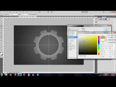
According to the rules, every content made has to be original and 100% self made. And so with photoshop I made using shapes manipulation and various layer styling, I created the gear part which I include on the butt of the AWP.

I created the metallic look with a grey colour, adding some noise and horizontal motion blur. The gears were made using polygon tools following this tutorial:
"Adobe Photoshop Tutorial| How to Create Gears" by MasKeD GFX
url:
 https://www.youtube.com/watch?v=q3qABbdNU3E
Replies
Firstly, testing with simple solid colours:
Then I proceed to paint over the awp body and add a butt component with the gear designed I made earlier.
Then as I worked on it I added more design elements.
I made it look kinda like metals stitched together. This will make it look like cheaper props used in the oldies sci-fi.
Next I added blue elements into the design. I spent hours tweaking and making new design elements one by one. It's a shame though that most of the details get left out because the actual weapon turns out kinda small.
I ran into another problem after that. I couldn't get the scope and top part of the awp and the barrel to show the designs in-game. After searching over forums I found that I need to make an alpha channel. So I tested it using solid colour.
Several days later, I have completed the designs for these parts. Now there's numerous more smaller parts left that I don't know where each belongs.
I made blue light balls design for the barrel because I though I would look cool. BUt it turns out duller in-game. Can't be helped since the game has its own lighting system. At the butt I added a text AWP made using numerous red squares so it looks like pixels. Bright pixel forming 8 bit words is also a characteristic of the 80's era where digital media and gaming consoles start to gain popularity.
I found a useful application that helped bring me out of my predicament. Took me a long time to figure out I could just use another application to load the 3d obj and apply the textures. Though I can't paint and see the changes live, but it is way better than having to open the game client several dozen time to figure out each component. For that I used GLC player.
link: http://glc-player.net
Thanks to that I can finally finish my design. Here is a screenshot taken using GLC player (because csgo in-game workbench doesn't allow full rotation and full view aside from green screen mode). Please Valve, at least allow us to view in full rotation!
Man is that barrel long or what!
As finishing touches. I added some text onto the AWP skin. I added a colourful "MEKANIKAL LAZOR" on the sides. And a black text "VALVE CORPS" at the butt.
Disclaimer:
The word VALVE CORPS is only a design element. I have no connection or affiliation whatsoever with Valve the owner of steam and CSGO as such any failure to meet expectation due to poor design is purely my own and has nothing to do with Valve.
I just though adding a company name would look more 80's ish. I recall oldie sci-fi always have these on everywhere. Like Weyland Industries in Alien movies, Capsule Corps in Dragon Ball by Akira Toriyama etc. Besides, this is still CSGO we're talking about. So everything technically belongs to Valve anyway (please don't sue me).
Okay, here's the finished texture sheet.
This is somewhat precise. I don't think this allows for much offset and variance though
Alright, earlier on I did mentioned I used some text as finishing touches in the weapon finish. Here's the 2 i used.
This is created using a Font Family named "Still Time Regular" created by Raymond Larabie.
Source: http://www.1001fonts.com/still-time-font.html
In fact, I liked his fonts which are styled more 80' ish I ended up using his other fonts as well.
This was made using the font "Stormfaze" by Raymond Larabie.
Source: http://www.1001fonts.com/stormfaze-font.html
I also used his fonts on my cover image:
The word "MEKANIKAL" was written using the font "Venus Rising" by Raymond Larabie
Source: http://www.1001fonts.com/venus-rising-font.html
The word "Lazor" was written using "Astron Boy" font also by the same creator.
Source: http://www.1001fonts.com/astron-boy-font.html
The word "AWP" was written using Still Time Regular as described above.
All these fonts used have Standard Desktop License that allows usage for various purposes including game graphics and artwork.