Scrounger - a Short Film made in CryEngine
Hello Polycounters,
So, I've been busy over the last long while, making a short film/trailer in CryEngine. The challenge I had set myself was to make absolutely everything myself - models, textures, materials, design, concept, lighting, story, animation, rigging, and music. It was a lot of fun, and a lot of work.
For this film, I was going for something I thought would be original - just made up in my head, and brought into the world, piece by piece, and doing my best to stay clear of cool, and overly ornate. Also, I did not want de-saturated, grim and gloomy, but a brighter-looking future, which I thought would hit the spot for once.
Ok, I am going to make a bit of a write-up for this, in case someone is interested. All assets I've made are basically fit for a game - somewhat low poly, except perhaps for the characters, which I felt needed that extra detail to be convincing.
The look itself I wanted as close to cinematic as I could get, which was a bit of a study in itself. It isn't easy in a game engine.
What makes something look movie-like? If I could define it for myself, I could work on getting to that point, and so on. Basically, what I thought was high contrast lighting - very bright, and very shadowy, though not to the point of being washed out, and always to highlight the mood one is going for.
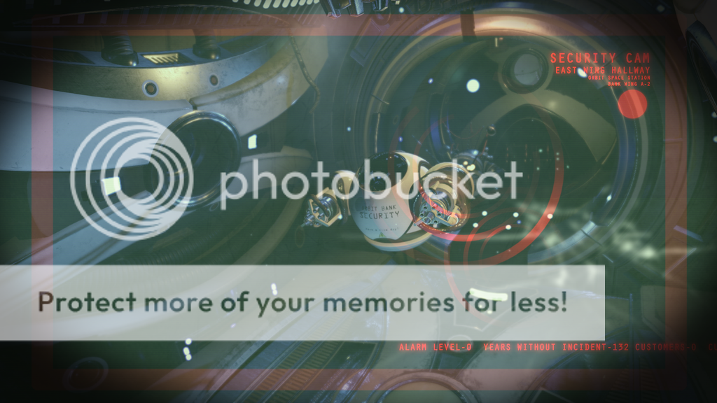
As for the design, I wanted something unique - so large swooping shapes - circles, and lots of protrusions for the light to catch on. Another thing was lights built into panels - flashing - red alarms, arches, windows, robots, aliens, fear, a planet view, and what ever else I could think of.
I sat down early on and made sketches of the various parts that were to make up the space station. It all kind of had to go together, but I also went for something familiar - as if time, in regards to inventions, had gone differently in that world.
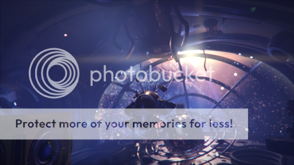
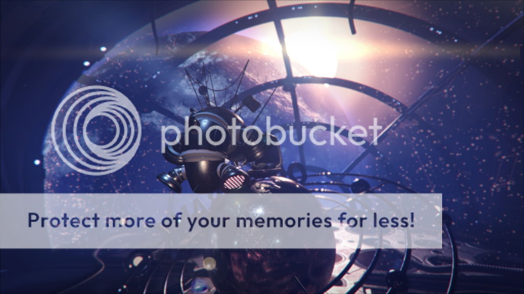
So, I thought at first: how about a museum in space? I went with that for a while, but changed it to a space station on Mars - built into the mountain side - red dust swirling, rocks and cliffs, but what swung it to what it is today, was I was dead-set on a view of Earth at night, as the Sun rises behind it's cloudy surface. That really settled it.
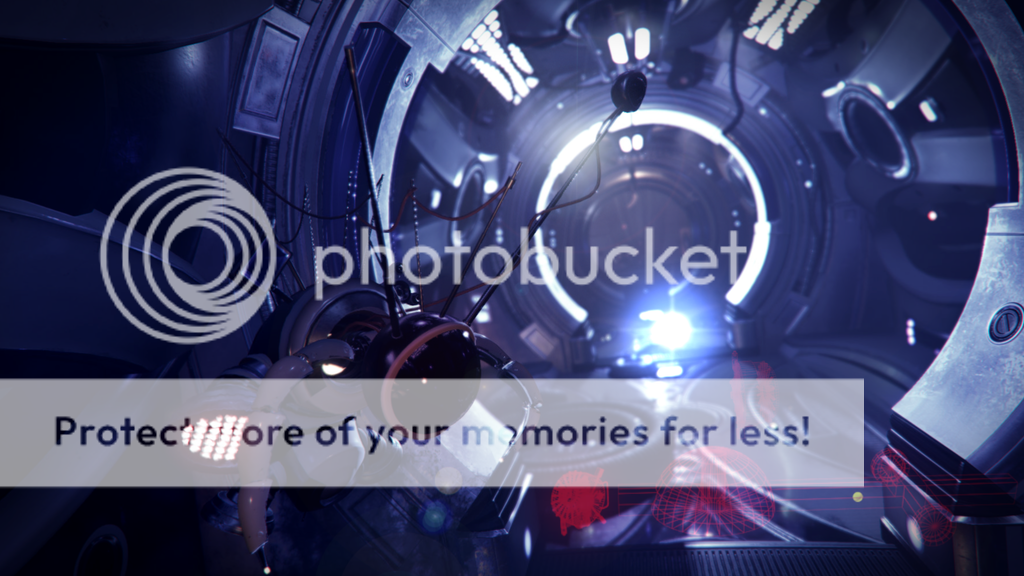
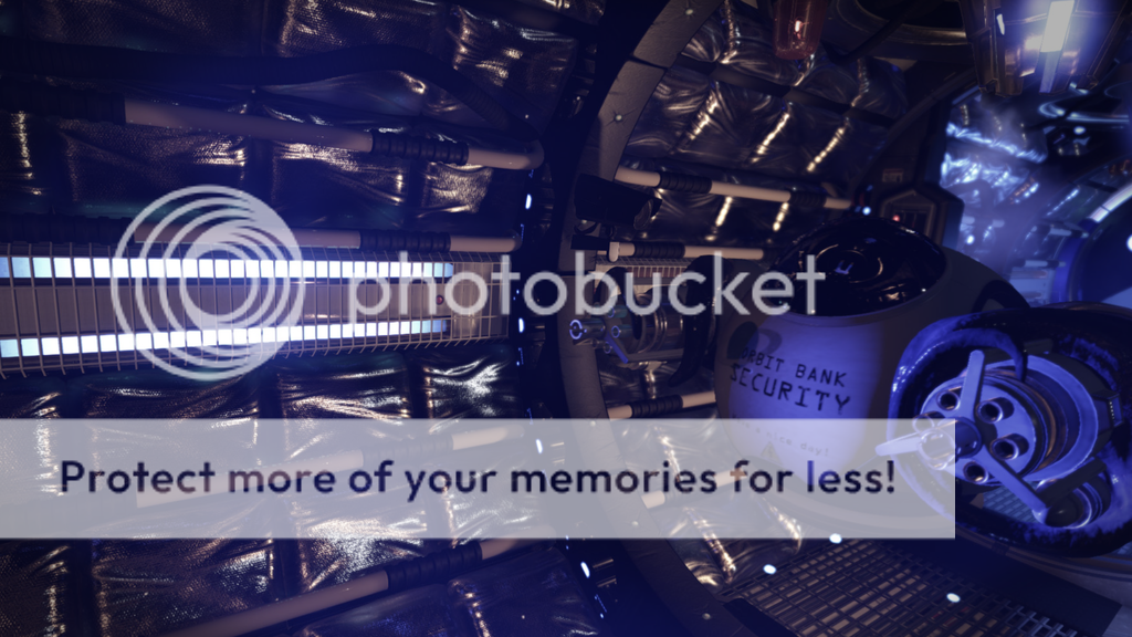
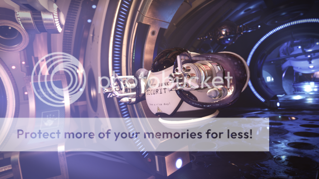
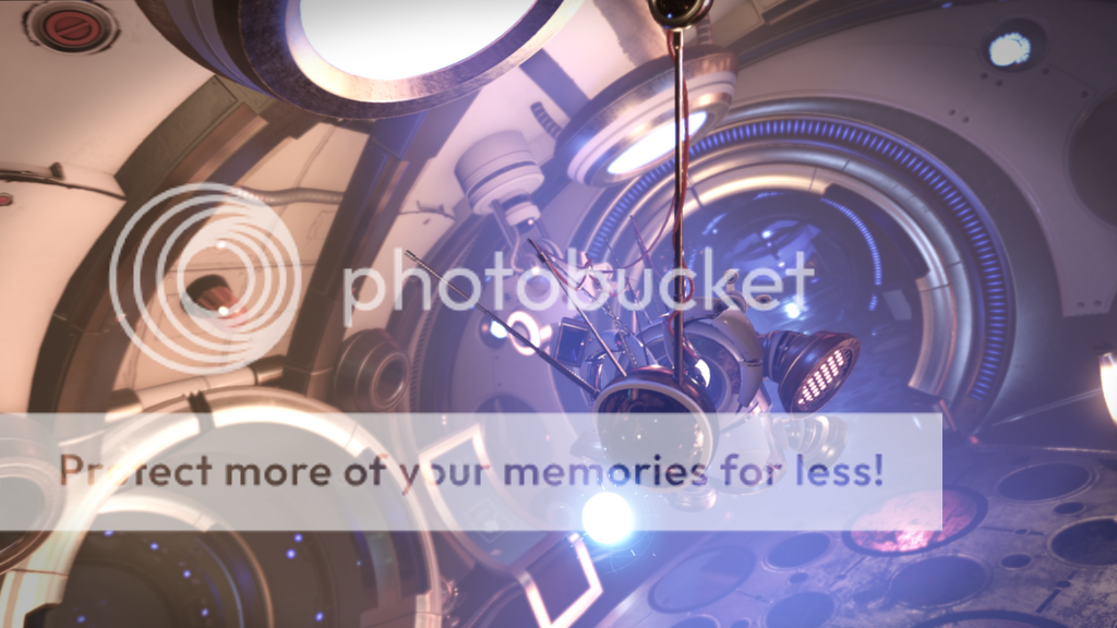
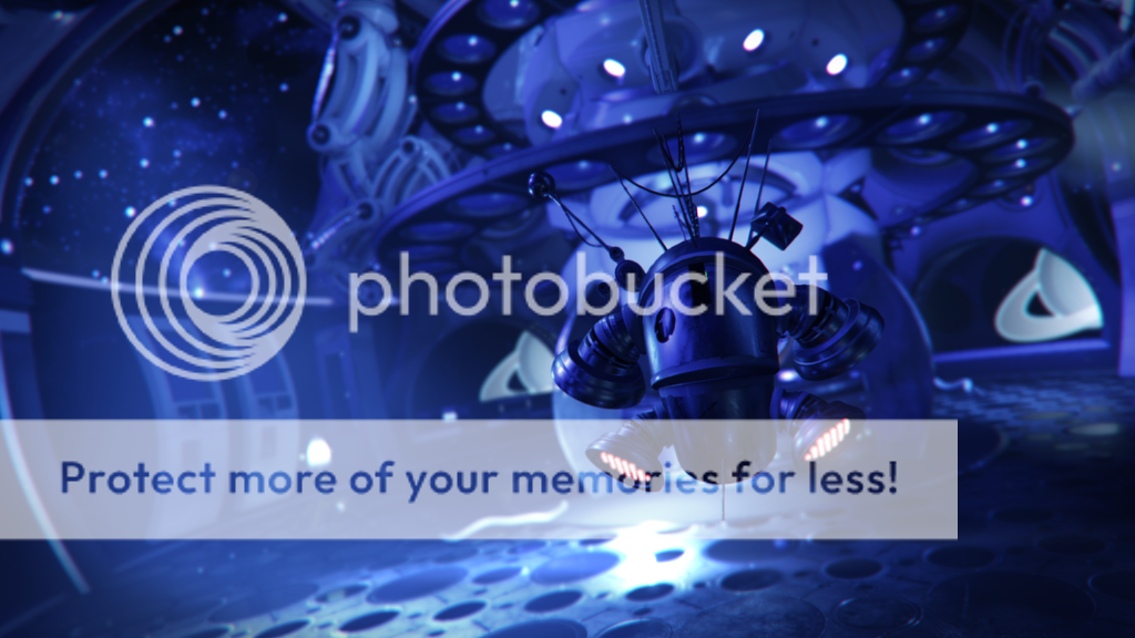
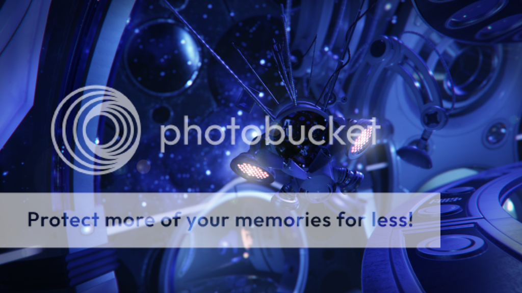
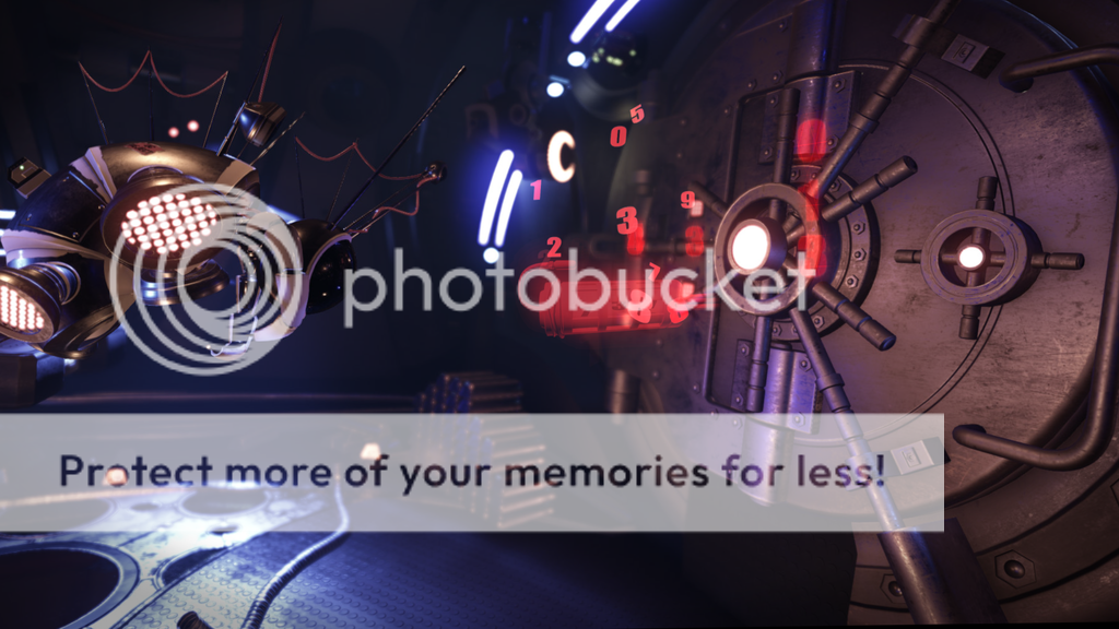
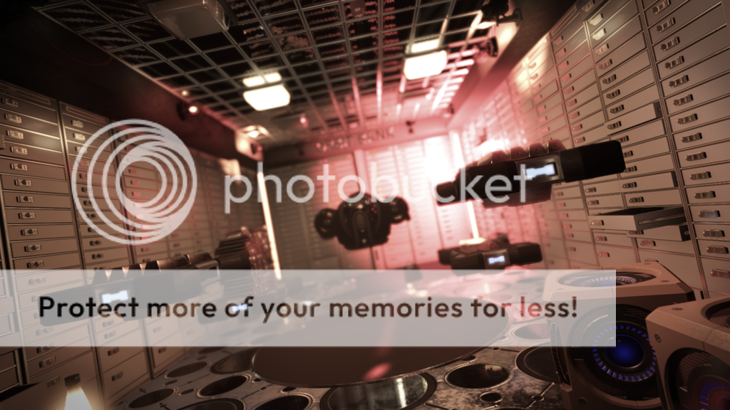
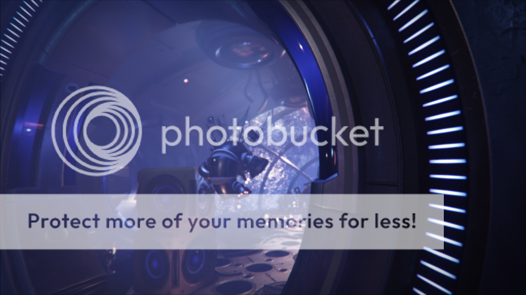
From that, I made corridors of anything that would be my version of sci-fi, and a main lobby area, with large lamps - fairly well mono-chromatically lit in a blue cast from stars projected onto the walls, with large battery chargers for the sentries, hanging like claws waiting to shut close; as well as the vault room, of course.
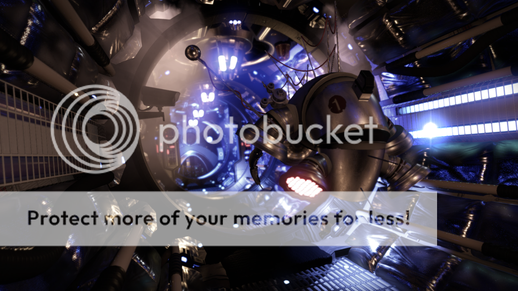
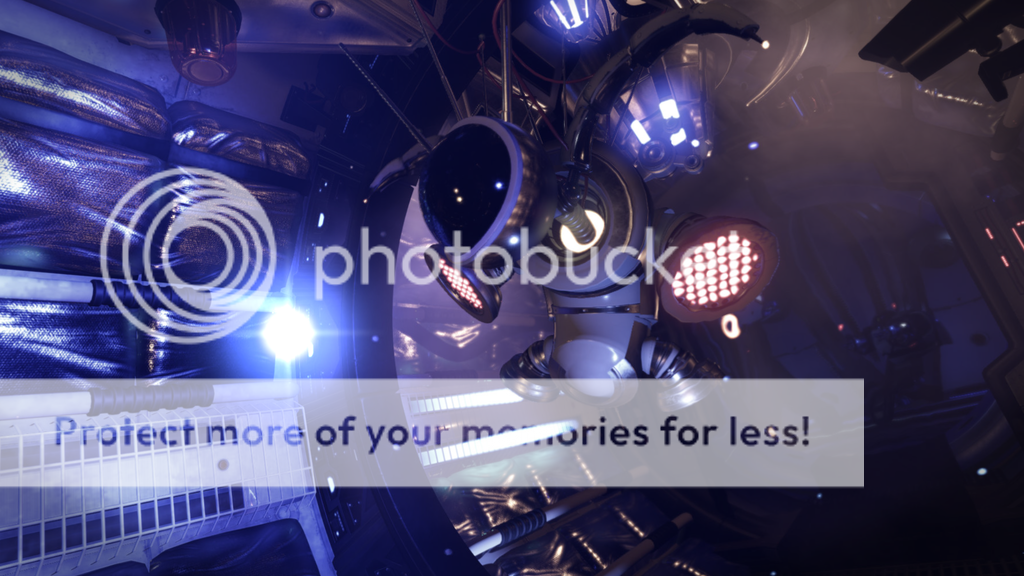
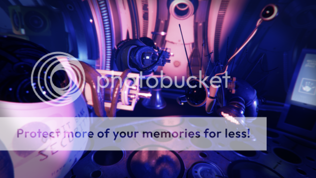
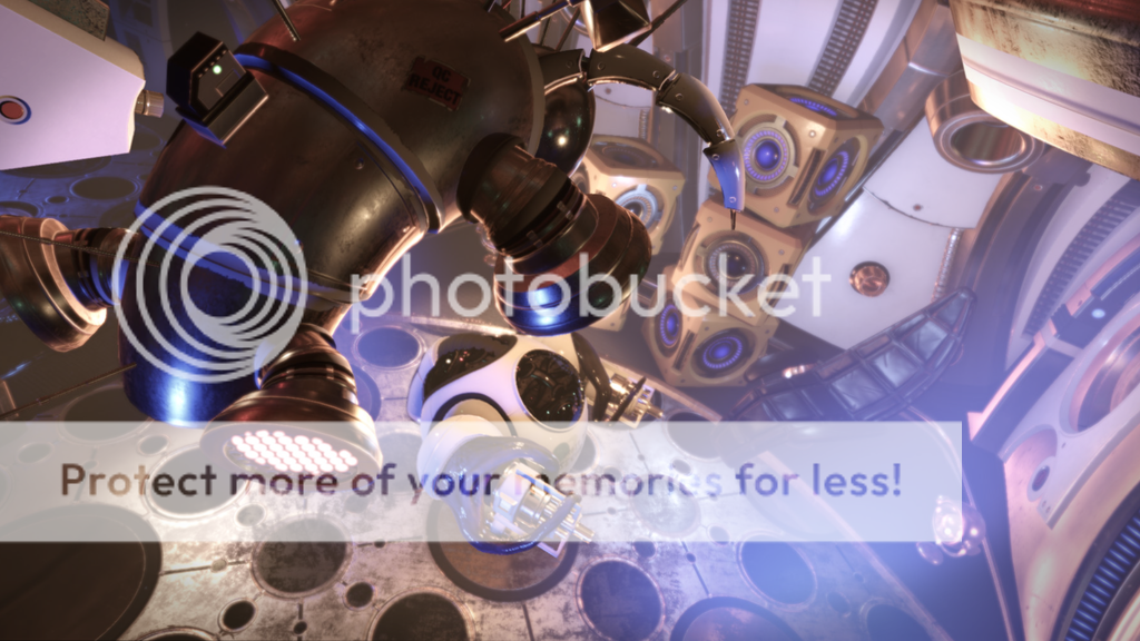
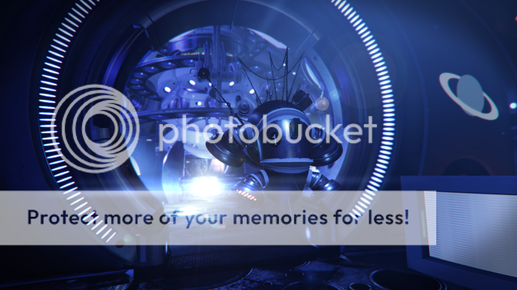
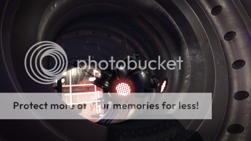
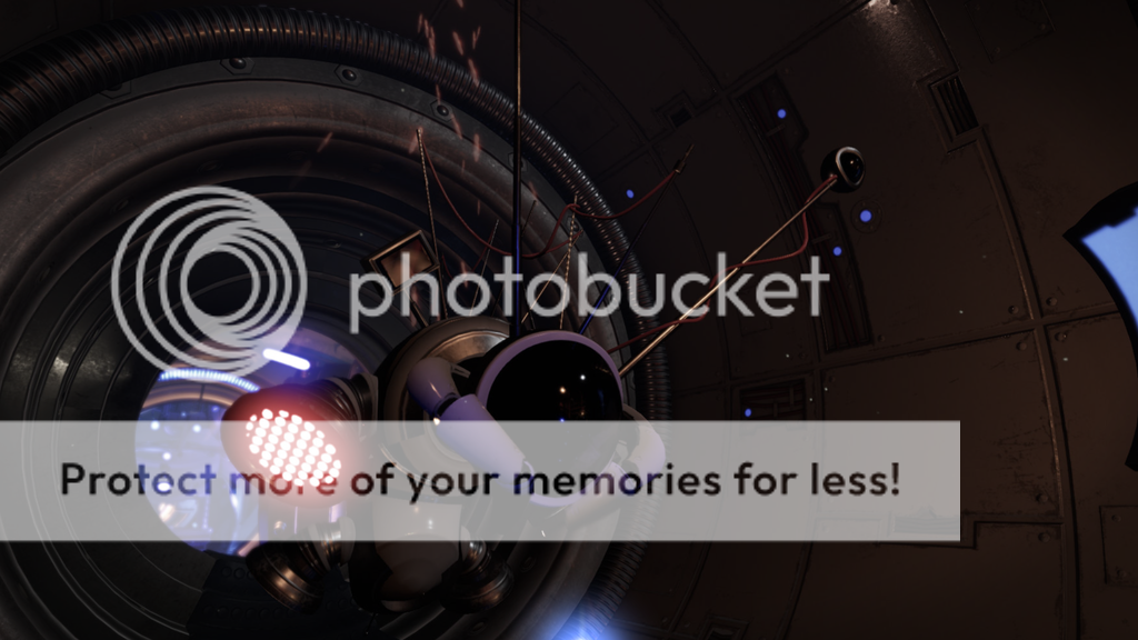
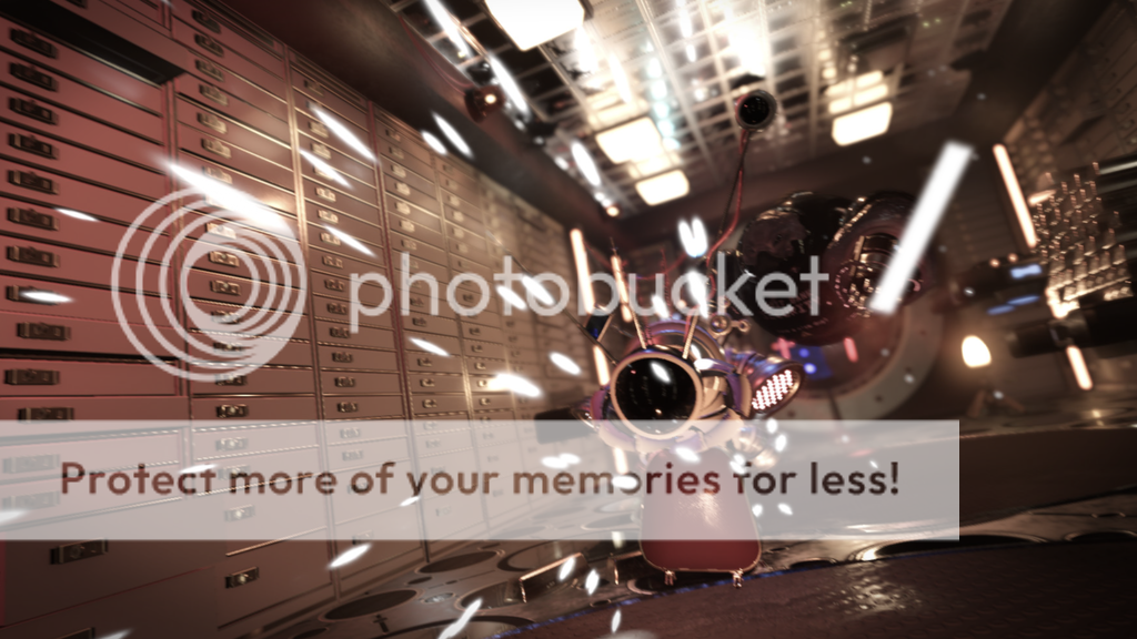
As for the characters, I wanted fairly simple - two or three characters, and no more. Actually I had different designs for both early on, but thought I needed to push the looks of them a lot more, and thereby came up with the rather 'punkish' look of the main character, with the antennas running down his head and back like a Mohawk - and generally a bit of a mish-mashed construction, as well as skittish, and insect-like in nature. That look came about with me closing my eyes, and drawing the 'shadowy' shapes I could see in my head, as silhouette - something I, for myself, call shadow drawing. It was a good way of getting that 'inner' image down as a guide to work from.
It was a challenge (for me) animating the characters, as they had no voice, and no facial features to show emotion, and what exactly went through their minds. I am not an animator, and don't claim to be one, so I tried my best showing that through hand gestures and head movement, as well as whole body movement. Obviously it could have been done many ways, but that is what I could do within a reasonable amount of time.
As for the story; well, the story, for what there is, is whatever you think it is. I didn't want to hold hands, and really wanted it left to the viewer to decide. There was an elaborate story in my head - a sentimental one, but I thought I didn't need it once it was all done. Also, it is trailerish in nature - a bit un-ended, and certainly open to interpretation.
At the end of it, I of course needed music. I have a background as a classical pianist/organist, and thought I'd tackle that as well, and came up with a very simple theme, I then wanted to see if I could spin into a more complex yarn. I wanted a slow beginning, a ramp-up to a hectic middle, for it to die down to its beginning, and fade away unfinished. For the music, I also wanted something original sounding, and therefore went with piano (naturally), and some more 'synth' sounding accompaniment. Overall, it went a bit better than I feared it might otherwise have gone. I am rusty in the composition department, so I weren't sure how it would go.
Anyway, there is a lot more I could say, but don't want to go on forever. The programs used were: CryEngine, 3DS Max, ZBrush, After Effects, Photoshop, and FL Studio, for the music.
So, I would for sure like a job in 3D and am, as of now, looking.
Hopefully you like it. It was an interesting project
Here's the link to the Short Film:
https://www.youtube.com/watch?v=1V85Fw5H5jE
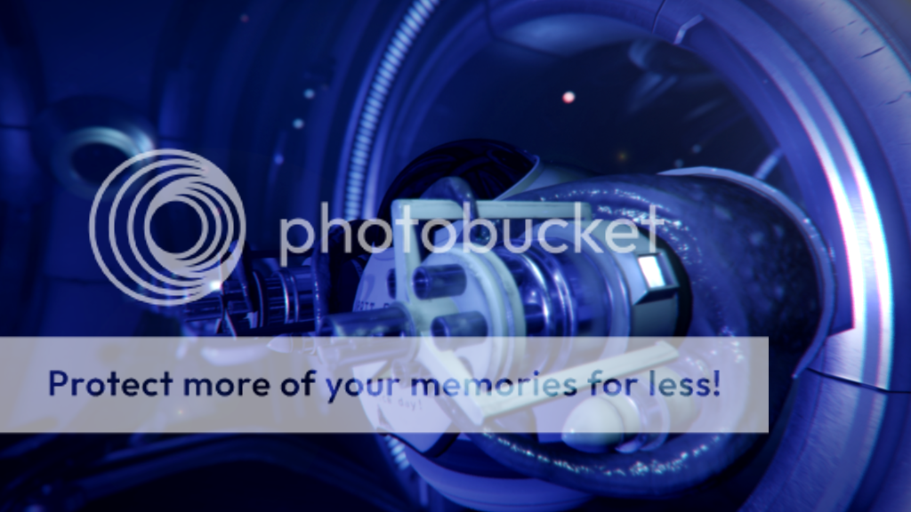
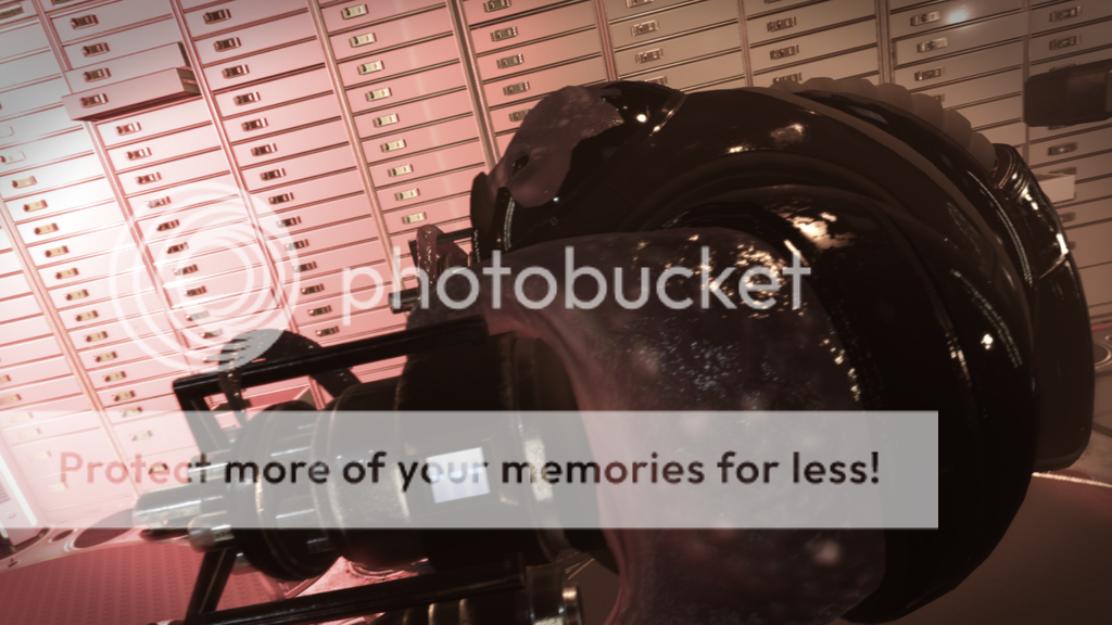
And, here are some stills from Scrounger. A lot actually didn't make it into the final film, and a lot of items didn't make it either, but it was a bit of try this and that, and then cut rather brutally to fit my music. Once the music was made, which was close to the end, I knew I had to make the clip fir to that, so that was a saving grace (4 mins).
Portfolio: http://www.henriks3dworld.com/
























Thanks for looking!
Henrik Larsen
So, I've been busy over the last long while, making a short film/trailer in CryEngine. The challenge I had set myself was to make absolutely everything myself - models, textures, materials, design, concept, lighting, story, animation, rigging, and music. It was a lot of fun, and a lot of work.
For this film, I was going for something I thought would be original - just made up in my head, and brought into the world, piece by piece, and doing my best to stay clear of cool, and overly ornate. Also, I did not want de-saturated, grim and gloomy, but a brighter-looking future, which I thought would hit the spot for once.
Ok, I am going to make a bit of a write-up for this, in case someone is interested. All assets I've made are basically fit for a game - somewhat low poly, except perhaps for the characters, which I felt needed that extra detail to be convincing.
The look itself I wanted as close to cinematic as I could get, which was a bit of a study in itself. It isn't easy in a game engine.
What makes something look movie-like? If I could define it for myself, I could work on getting to that point, and so on. Basically, what I thought was high contrast lighting - very bright, and very shadowy, though not to the point of being washed out, and always to highlight the mood one is going for.
As for the design, I wanted something unique - so large swooping shapes - circles, and lots of protrusions for the light to catch on. Another thing was lights built into panels - flashing - red alarms, arches, windows, robots, aliens, fear, a planet view, and what ever else I could think of.
I sat down early on and made sketches of the various parts that were to make up the space station. It all kind of had to go together, but I also went for something familiar - as if time, in regards to inventions, had gone differently in that world.
So, I thought at first: how about a museum in space? I went with that for a while, but changed it to a space station on Mars - built into the mountain side - red dust swirling, rocks and cliffs, but what swung it to what it is today, was I was dead-set on a view of Earth at night, as the Sun rises behind it's cloudy surface. That really settled it.
From that, I made corridors of anything that would be my version of sci-fi, and a main lobby area, with large lamps - fairly well mono-chromatically lit in a blue cast from stars projected onto the walls, with large battery chargers for the sentries, hanging like claws waiting to shut close; as well as the vault room, of course.
As for the characters, I wanted fairly simple - two or three characters, and no more. Actually I had different designs for both early on, but thought I needed to push the looks of them a lot more, and thereby came up with the rather 'punkish' look of the main character, with the antennas running down his head and back like a Mohawk - and generally a bit of a mish-mashed construction, as well as skittish, and insect-like in nature. That look came about with me closing my eyes, and drawing the 'shadowy' shapes I could see in my head, as silhouette - something I, for myself, call shadow drawing. It was a good way of getting that 'inner' image down as a guide to work from.
It was a challenge (for me) animating the characters, as they had no voice, and no facial features to show emotion, and what exactly went through their minds. I am not an animator, and don't claim to be one, so I tried my best showing that through hand gestures and head movement, as well as whole body movement. Obviously it could have been done many ways, but that is what I could do within a reasonable amount of time.
As for the story; well, the story, for what there is, is whatever you think it is. I didn't want to hold hands, and really wanted it left to the viewer to decide. There was an elaborate story in my head - a sentimental one, but I thought I didn't need it once it was all done. Also, it is trailerish in nature - a bit un-ended, and certainly open to interpretation.
At the end of it, I of course needed music. I have a background as a classical pianist/organist, and thought I'd tackle that as well, and came up with a very simple theme, I then wanted to see if I could spin into a more complex yarn. I wanted a slow beginning, a ramp-up to a hectic middle, for it to die down to its beginning, and fade away unfinished. For the music, I also wanted something original sounding, and therefore went with piano (naturally), and some more 'synth' sounding accompaniment. Overall, it went a bit better than I feared it might otherwise have gone. I am rusty in the composition department, so I weren't sure how it would go.
Anyway, there is a lot more I could say, but don't want to go on forever. The programs used were: CryEngine, 3DS Max, ZBrush, After Effects, Photoshop, and FL Studio, for the music.
So, I would for sure like a job in 3D and am, as of now, looking.
Hopefully you like it. It was an interesting project

Here's the link to the Short Film:
https://www.youtube.com/watch?v=1V85Fw5H5jE
And, here are some stills from Scrounger. A lot actually didn't make it into the final film, and a lot of items didn't make it either, but it was a bit of try this and that, and then cut rather brutally to fit my music. Once the music was made, which was close to the end, I knew I had to make the clip fir to that, so that was a saving grace (4 mins).
Portfolio: http://www.henriks3dworld.com/


Thanks for looking!
Henrik Larsen

Replies
kind regards.