BAD ==> GOOD
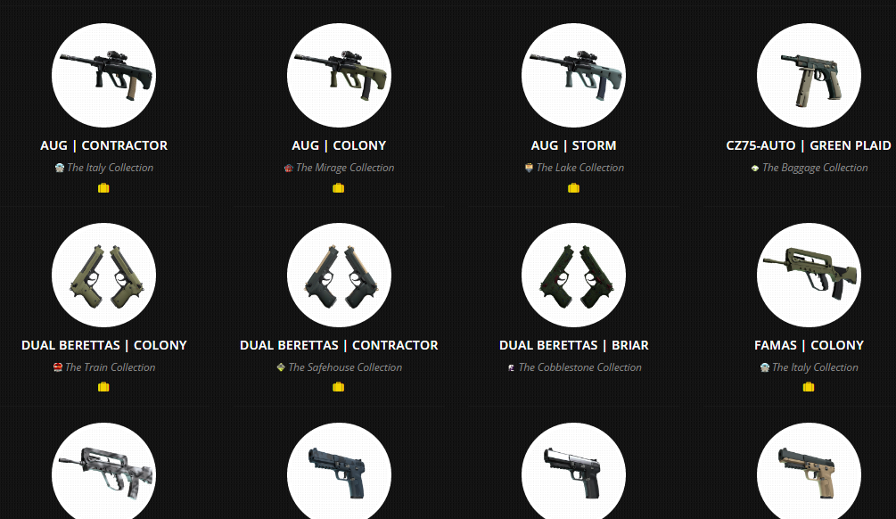
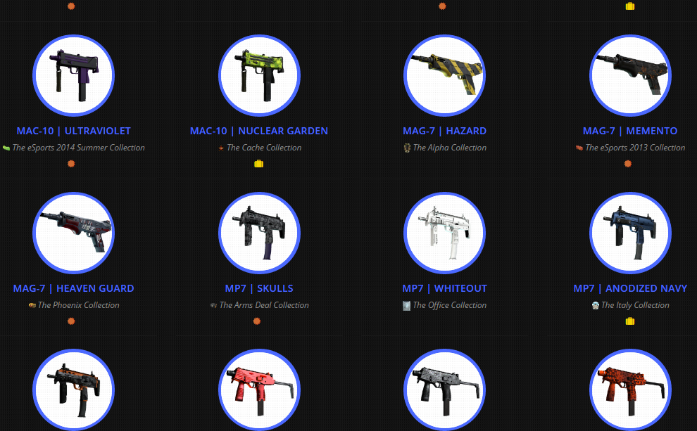
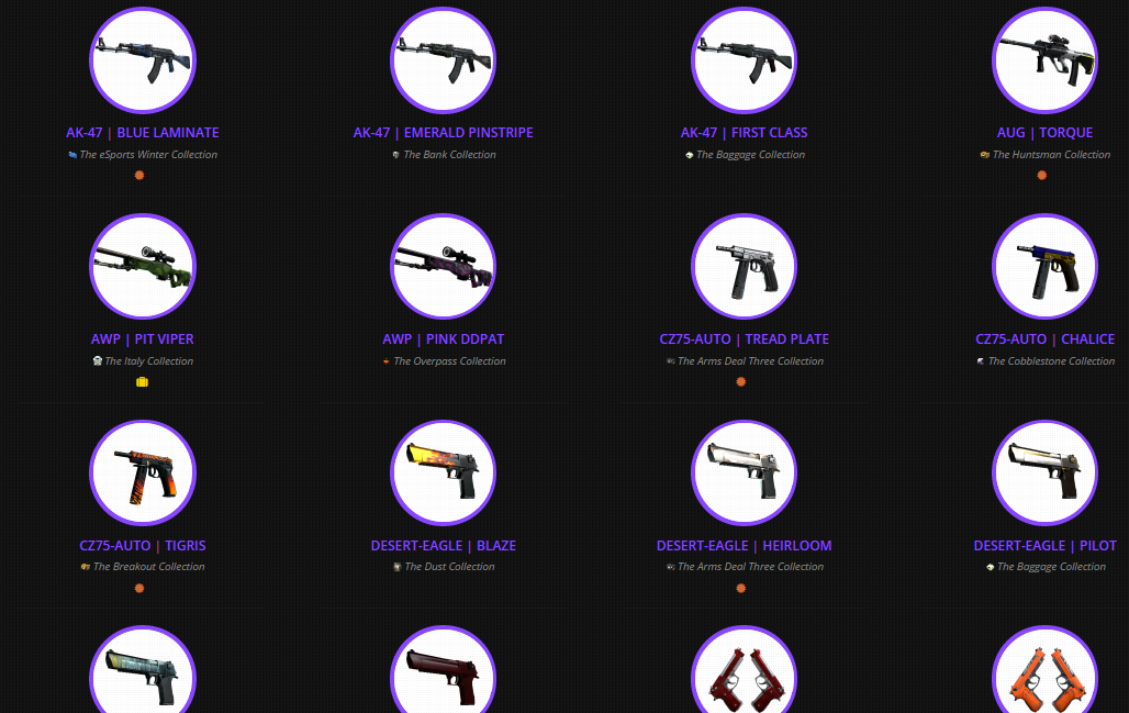
Consumer, Mil-Spec, Restricted, Classified, Covert
PC-CSGO | AWP Celestial Pioneer WIP
INTRODUCTION
This is the Work In Progress post for the AWP Celestial Pioneer.
(I do want to point out that I do know how bad the name sounds but I am not creative enough to come up with something else. I'll change it! - hopefully, anyway)
I'm probably the last person to start a skin to this late but I didn't have the time beforehand :'(
I am somewhat worried that I will not make it in time but that should just be motivation for me to give it my all!
Here is a moodboard I used today. I might make a new one per each update/post as it will keep my mind fresh but this is the first one. (Knowing life I will get too lazy to make more moodboards)


ANALYSIS + PLANNING
I want to have leather in the middle of the gun that is similar to the lady's suit. White and weird looking. I will have to add a lot of wrinkles etc.

I'm might not have a scope because this skin is meant to be restricted and those are a mid-tier.
For those who don't know, it goes something like this:
(I used http://skins.csgodb.net/ to easily look at the rarities of skins and to create screenshots and to analyse the patterns (etc) below.)
*Consumer skins tend to be a monochromatic pattern of sorts, which usually is somewhat bad looking and this results in extremely low prices on the steam market.

*Mil-Spec skins are a bit better and have some theme or detail visible but are still very bland or boring when it comes to colour and how it interact with the guns geometry.
Usually both the geometry use and colours are quite random/bad. This is why the prices tend to be around £0.10 - £0.50

*Restriced is the tier I have to aim for so this might be a bit longer than the others.
From what I've seen, these skins can have EITHER bright colours with a lot of patterns or fit the geometry well with dark, damaged looking rendering.

I will try to go for the "good work of geometry but weird use of colour" option. It will be a bit hard as picking the colours seems to be an art by itself.
I am not a very experienced artist and have never worked on anything that would have to satisfy such a large audience (CSGO fans). I need to get this perfect. I will probably make 3-4 versions to make sure
I was thinking of versions consisting of;
*Blue-To-Purple
*Lime-To-Green
*Orange-To-Yellow
*Red-Purple-Orange-Yellow
*Classified make a better use of colours and geometry but often use less rendering.
*Covert are cream of the crop.
SOME OLD TOSH
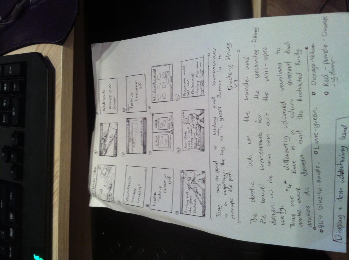
I also planned out the workshop page layout during a break. Pardon the bad artistic skills and atrocious handwriting but I didn't have much time. I hope it gets the point across!
I will be creating some SFM images to promote the skin. As far as I know, I am allowed to do this provided I use 4 or more unedited Workshop images and in-game images.
I do know a little about Source Film Maker but any tips would be great guys!
Well that's enough for today. Now I need to pray I make it in time

Replies
"Deleted" Duplicated Post.
(I didn't notice there was a comment approval thing.)I know it's an anti-spam system but it is annoying nonetheless. These were all copies of the post above. There were like a few of them before. I didn't know what was going on, I thought it was an error so I tried reposting my posts. This was meant to be posted at like 23:00 or something yesterday but it posted at 13:00 today.)
DAY 2
Not gonna lie. Day two was incredibly productive.
I exhausted my Spotify playlist multiple times but I have finished a large part of the skin.
I added colour to the sketches and experimented with some shapes to see if it looked better. At this point I didn't think about making it suit the Restricted tier but rather just wanted to come up with stuff to put that would fit the geometry of the skin in an eye-catching way. I recommend everyone does this as you can always remove parts of the design later.
For some reason, I was thinking of race cars so I added stripes and lines that to me conveyed speed. For example, in the back there are two light grey stripes and there are two black stripes at the beginning of the barrel.
I was thinking of incorporating some bio-mechanical... things... around the handle of the gun which would stylistically resemble the Xenomorph look so I started making some shapes, and eventually came up with design that had subtle resemblance to the Xenomorph body shape.
I added dots on the barrel which made it look so much better. I also made slight changes to the entire gun. I am using this since I over-writ over some saves so I cannot take screenshots now
Now that I had something to work with, I projected the texture onto the AWP model, exported the texture and poped it into the Workbench.
I took screenshots and put those into Photoshop so that I could further improve the design but also easily know what it would look like in-game.
I went through this idea generating process a few times and I think it worked out quite well!
I made the logo thinner, added another triangle and stitchings. I tried to go for a leather look on the white area. I was inspired by the upper lady on the top of the first moodboard. (The final version of the leather looks much nicer)
I further messed with ideas but ended up removing almost all of them as I remembered for which weapon Tier I was shooting for
I imported the skin into the game.
I replaced my AWP | Worm God with my Celestial Pioneer skin. (Pardon the stickers. Didn't want to scratch them off)
To find out how to get custom CS skins in-game, watch this video by BananaGaming. It is very helpful, though somewhat dates. Common sense will fix the issues though
If you look at the handle, you'll see what I was talking about beforehand.
I ended up removing it as it looked too good to be in the Restricted tier. I decided to give that area a somewhat shinny plastic look as the rest of the gun has pretty good geometry so I had to counterbalance. I talked about how I'm going to "balance" everything in the first post above.
If you look at the barrel, you'll notice a bit of the default texture. I think the transition was bad, which is why I changed it later but the idea of having that makes my AWP somewhat unique.
I would like to thank Coridium as he made a wonderful tutorial explaining how the wear system works! (
All over changes are minuscule and are probably not worth mentioning
I further messed with the handle but only made it worse. I also decided I will make the scope default too. It will make it have a lower tier look which I needed as the skin looked slightly above the Restricted tier at that point.
Now I wanted to change the details and mess with the Phong Exponent and Intensity to give it that metal/plastic shine.
These are not the final lighting choices but I only took one screenshot
After making a lot of changes I decided I was happy with the skin for today. I made some renders and messed around with ideas.
I finished both textures after ages of trying out custom brushes and experimenting with how I want the material to look. The black still looks... meh but it can't be amazing. #JustRestrictedRarity
TBH, it doesn't look that much similar to the lady's jacket, but getting it just right would be really hard. Something I don't think I would be able to do.
3D Coats renders are always good
The black texture looked really flat in-game so that gave me multiple headaches
This is the old flat version I was talking about. Again, pardon the stickers. I know they take so much space and cover the center but I really don't want to remove them. Plus, since this will be an affordable/Low Inventory budget AWP, people will probably put stickers all over it and this shows how it will look with them.
I decided to test out other colours. Also, in this image I have updated a texture using some custom brushes. It looks less... bad... but still not getting where I want it to be.
Purple looks nice and since I am making 4 versions, it might take a place within the 4 versions.
Also, I really like the look of the handle. It gives that suble nudge towards Aliens and yet still looks plastic enough to lower the quality of the skin enough for it to be Restricted.
Needless to say the focus point of the skin will be the middle. This is sort of unique as the other Restricted AWP, AWP | Worm God has the focus point at the back of the gun.
Look really weird this way. I am probably going to try and create a better blue version.
I will probably change the scope again. I am not liking the damaged look. I want it to be somewhat clean.
I don't know how much I have to show and or what is enough for me to not be disqualified, so I will do a little moodboard creating step by step with analysis.
I want to change the purple/yellow to an 80's looking chrome.
This colour choice would be good for my skin. They rendering on the edges would be hard to do on the skin though, so I might have to look for others.
A thing to keep in mind whilst creating the skin is purple and pink. Some dividing lines would be good too.
The first one but in the second ones colour scheme would be somewhat good.
there are almost perfect. The dark in the middle makes it have the look I would go for.
The colour and gradients are really good. I will probably make the blue look really similar to this.
I will try to wrap up all the differently coloured designs tomorrow. If I finish, I will go onto promotional imagery. Fingers crossed SFMs are not against the rules!
For those who want to see what I've done, here is some of it.
It really tilts me how I structured the layers in this. *Slaps my past self*
I remade the layers into one group and kept the colour yellow and orange separate but... well... not separate enough so I had to go through and redo the yellow.
The base yellow and orange version is pretty much done but the Chrome is taking an age-per-inch. I fear I might not make it in time more and more
The fact that I am really tired doesn't help at all either
But I will plow through this till the end!
I put too much effort to quit now. I'd really need a shit sandwich right now xD
I am making some headway with the blue chrome version.
I will upload and get the Yellow version ready as I fear time again. Here's the same images but bigger.
I decided to make a;
A Full Yellow Version
A Half Chrome Version
A Full Chrome Version
And if I have time, a 4Fun Version
This is what the Mixed version will look like. I'm not gonna lie. I'd buy this if it was affordable!
I also made a custom scope. It looks cleaner but still has little enough detail to lower the weapon's looks to the Restricted rarity.
When under lighting, it shows that it's flat. My leather texture has no such problem but this does. I might just leave it. It looks good 90% the time. The Restricted rarity gives me the ability to toss that little detail to the side - or at least I hope :'(
I have to go through so much clean up but at least I only have to do it once and then I can just copy the Alpha channel.
Phew
Considering this is provided by Valve, I doubt they will have a problem with SFM posters.
I edited my SFMs and now I created the logo. It's bad but it's not what counts!
The circle is meant to be planet. The arrows are meant to show the "1" travelling. The 1 is meant to represent being first as you know... "pioneer"... and all.
My justification is it suits the logo
model
Anyway. Enjoy this
I realized how helpful this is when working on these
For all the creators reading, if you make something, post it to reddit. There are always some nice people there
Photoshop
3D Coat
ZBrush (not much though)
I don't know what else to mention so you will find some little things around here.
Also, I finished the Mystiful Mix variant!
model
This is how I did it. The images were made in SFM and edited in Photoshop. It does take some practice though, so try it all out before doing it for real on some project!
The point is that not everybody will want it. That is why more people get it, get "meh" about it, and open another case in hopes of getting a covert.
I was trying to make covert contenders before and that's how I got 80%+ at 5000 views. I need to get this into my head and focus on the positive comments! #JustArtistThings
Side note, if you want to know what software I used. (I might be repeating myself. I think another post, "didn't post")
I use;
3D Coat - to get the models and edit them, via projection etc
Photoshop - to edit the projections and when I'm done and happy with the skin I use,
SourceFilmMaker - to get images of my good looking nice and to make it similar to the in-game lighting.
Ladies and gentlemen, can he make it? Find out on the next episode of
WORKSHOPPER DIARIES
Sponsored by Frustration™I may or may not need to use this /\
On a more positive note, I really like how the description looks. I am somewhat proud of what I managed to make in like 3-4 days
At least I can still hope to get the Swag Bag
Sometimes I hate Reddit ;_;
Sometimes I love reddit
I love how this became a Blog about being a workshopper
They start insta-high, then a wave of dislikes comes in, but gradually, over a period of 4-8 hours, the likes come in and get it to a decent point.
I am dying right now, so I do apologise for any mistakes I make.
Cheerful Chrome is done xD
SFM time. Then CSGO time. Then Photoshop time. Then Workshop time.
So much to do ;_;
Rushing has never been done like this before.
I hope 4 skins is not spamming the workshop ;_;
Didn't recieve much input here but Redditors are being oddly nice today! Are the gods of the internet smiling upon me today?
Also, this is no longer a WIP thread, blog or anything like that. This has become a personal twitter xD
Prediction
Welp. GG. I went through the workshop and found the future winners.
1. PC-CSGO | AWP - FEDERATION (Blue) By M1nd
http://steamcommunity.com/sharedfiles/filedetails/?id=693333846&searchtext=
2. PC-CSGO | AK47 - Pandorum by Emu
http://steamcommunity.com/sharedfiles/filedetails/?id=688970852
Kinda sad how they already have skins in-game but they deserve their place as the skins are amazing!
On a positive note, that Swag Bag is mine! MINE I SAY!
Finished AWP Celestial Pioneers
Anyway, here are the 3 finished AWP | Celestial Pioneer variants!
Cheerful Chrome: http://steamcommunity.com/sharedfiles/filedetails/?id=693418704
Youthful Yellow: http://steamcommunity.com/sharedfiles/filedetails/?id=692636976
Mystified Mix: http://steamcommunity.com/sharedfiles/filedetails/?id=693184107
Notes
Sorry for turning this from a WIP update thread to my diary but I see no point deleting anything. Also, sorry for any mistakes I made in these posts. I was in a constant rush. I might go through the post later on, but it is quite long so I will probably not pick out them all