The BRAWL² Tournament Challenge has been announced!
It starts May 12, and ends Oct 17. Let's see what you got!
https://polycount.com/discussion/237047/the-brawl²-tournament
It starts May 12, and ends Oct 17. Let's see what you got!
https://polycount.com/discussion/237047/the-brawl²-tournament
Runescapify
Hello friends,
I have been getting mentored by some of you fine folks on #model_design for poly modeling. This is very much a hobby for me, I tend not to give it too much time. However, I'd like to create this thread as a incentive for me to make a small poly model once a week.
Inspiration is very hard to come by, specially for things that are easy enough for beginners to build. As such, I have decided to simply take snapshots of simple things in Runescape and use them as a baseline for some models I will be making.
My goal will be to respect the inspiration as closely as I can but there will be times when I am not strong enough to model a certain piece. I am open for feedback but keep that in mind and give me a few pointers on how I can obtain a given look; since if its not an exact match, it's likely a fault in proportions/not knowing how to model a certain type of face etc.
When I am too busy on a given week, I will simply go back to any previous entries and apply some changes to it; this will result in a bump in the version number. Green header implies a change for THIS week. I will submit on Mondays and use the rest of the week to work on the next week's submission and read the forums for feedback.
Week of May 23, 2016 - Lumbridge Fountain v1.0
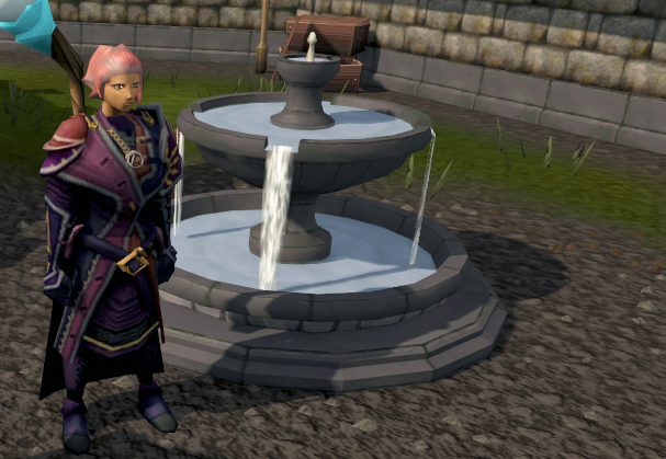
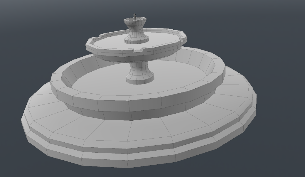
Starting small; a picture of the reference followed by my version. I did not watch the poly count. Made it in four parts with different sides. Mainly used bevel tool here...
Week of May 23, 2016 - Lumbridge Fountain v2.0
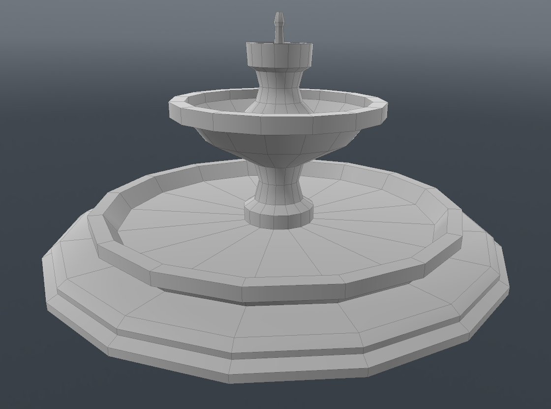
A second iteration after taking in the suggestions pointed out by Kris; thanks Kris!

Week of May 30, 2016 - Latern v1.0
A bit ahead of schedule, but I have a lot of time this week so I figured, I should do more models. This week might have two submissions
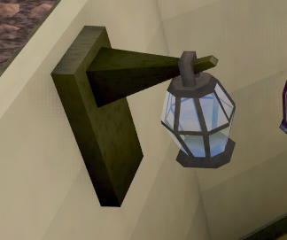
Here, I noticed that the edges/rims of the latern are purely done via textures, so in the model below, they are absent.
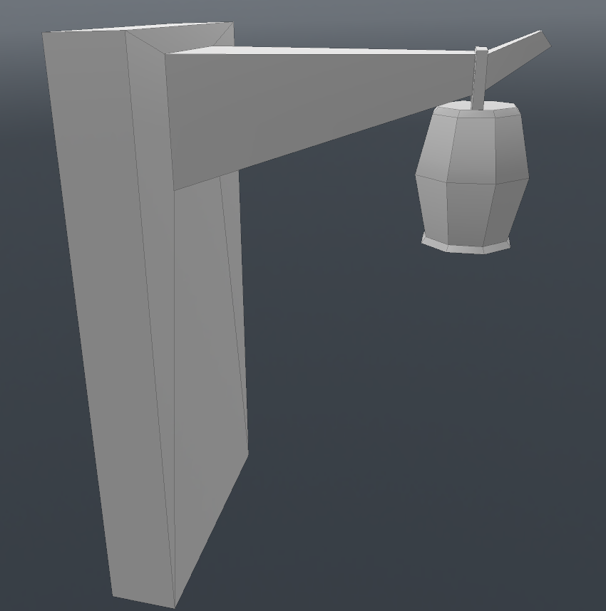
I also did some UVs for these, check them out in the replies.
I have been getting mentored by some of you fine folks on #model_design for poly modeling. This is very much a hobby for me, I tend not to give it too much time. However, I'd like to create this thread as a incentive for me to make a small poly model once a week.
Inspiration is very hard to come by, specially for things that are easy enough for beginners to build. As such, I have decided to simply take snapshots of simple things in Runescape and use them as a baseline for some models I will be making.
My goal will be to respect the inspiration as closely as I can but there will be times when I am not strong enough to model a certain piece. I am open for feedback but keep that in mind and give me a few pointers on how I can obtain a given look; since if its not an exact match, it's likely a fault in proportions/not knowing how to model a certain type of face etc.
When I am too busy on a given week, I will simply go back to any previous entries and apply some changes to it; this will result in a bump in the version number. Green header implies a change for THIS week. I will submit on Mondays and use the rest of the week to work on the next week's submission and read the forums for feedback.
Note: This is not supposed to be a thread for others to submit their creations; please use the low poly thread of that. This is very much a personal thread where I will post things I create and look for feedback and have a general conversation. I am also open for requests but please keep in mind that I only want to do basic poly models; no textures; no cloth; no physics etc just yet.
Week of May 23, 2016 - Lumbridge Fountain v1.0
Starting small; a picture of the reference followed by my version. I did not watch the poly count. Made it in four parts with different sides. Mainly used bevel tool here...


Week of May 23, 2016 - Lumbridge Fountain v2.0
A second iteration after taking in the suggestions pointed out by Kris; thanks Kris!


Week of May 30, 2016 - Latern v1.0
A bit ahead of schedule, but I have a lot of time this week so I figured, I should do more models. This week might have two submissions

Here, I noticed that the edges/rims of the latern are purely done via textures, so in the model below, they are absent.

I also did some UVs for these, check them out in the replies.
Replies
In regards to the fountain, I think you've done a wonderful job. My only critiques would be that the very top level of the fountain seems just a tiny bit higher poly than needed. For this level of work, the 3 edge loops you have at the middle of the concavity could probably be cut to just one (maybe two a bit more spread out) and that the two edge loops in the top 3/4th of that piece also are unnecessary on the mesh. (I see the ring on the texture of the original fountain, but they're not actually doing anything on the fountain mesh itself.)
The proportions are also a bit off - the original has a smaller base and seems to be a bit taller, and the middle water basin on the original seems to be a bit deeper.
That being said, you're off to a good start! I would also watch the way you've made the water planes as an n-gon (a face with more than 4 sides - 3 sides = triangle, 4 sides = quad) because just about every engine I've worked with likes triangles. Quads (that you created the mesh in) are fine, as they are automatically cut in half to make triangles. n-gons, however, will also be automatically converted - and not always in the way that you think or want. (Thus, it's usually better to create it in the way that you want to start with.)
Also, just a personal preference, but I'd also suggest doing UV maps and textures along with your meshes. If you just model things for too long, you're going to get ahead of yourself and end up making meshes that you don't know how to UV map or create proper textures for when the time comes.
I agree with all of the points you have said. As such, I have made a completely redone the models with proper proportions. I opted to take a top view and a side view screenshot (as best as I could) then made the model. The new v2.0 model (added in the original thread; green header at the time of this writing) is made completely from a single piece using only poly bevel tool.
For the top white spout, I removed some geometry by adding a small edge at the bottom to cut it off from the rest of the 16 sided geometry (I had way more sides in the first version) then I removed every other edge from the spot piece (see supplementary image attached to this reply); this is probably not a good practice... :P
I also opted not to make the indents from which the water is falling as I am not sure how they are made. I did try to simply add some more edge loops to get that width, then removed the three polygons and used bridge tool, but it looked rather odd.
Addendum: Agree about the UV. I will UV the final fountain some time. Definitely not texturing (at this time) as that is a different beast; saving all of my work for that later.
I have decided to do a simpler model and make UVs for it as well. It was an odd exercise to say the lest. I had to project the model into rectangular/cylindrical UVs, and move edges around and align them. I still have not understood how to UV in a way that manages seams, perhaps you guys can expand on that...
In regards to seams, eh, it's a mixed bag. A game like Runescape is practically nothing but seams. Depending on what program you're mapping in, you'll eventually learn how to control where your meshes are unwrapping at by marking seams, and/or how to stitch the UVs back together to control where the seams are so that they are hidden. If painting textures the 2D way, you can also make them seamless by using offsets and clone stamping - among many other methods.
Currently, a lot of workflows are moving towards just painting directly on the mesh - I.E. zBrush, Mudbox, Substance Painter, and even newer versions of Photoshop will allow you to open a 3D model and paint directly on the mesh, and the program then creates the texture based on the UV coordinates. You can paint on a seam and the program will automatically "catch" the pixels and place them where they need to go so that it wraps around and appears seamless.