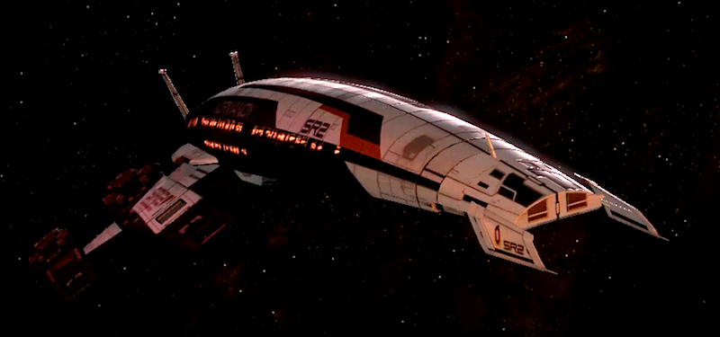
PC-CSGO | AK-47 - Martian Travel (Patina Skin) + Cutting Edge (Gunsmith)
Well I forgot to create a thread at the start when i decided to try and make some skins for the competition, so il post my journey of where I started and how I've come to the point i'm at.
Still open for peoples contribution on what they like, don't like and what changes you think you look the best for the project. (PS. I will try to explain some of my english terms for american/other folks along the way too)
1) Introduction.
Like many others when i saw 70/80's sci-fi i instantly went for a "Hotline Miami" themed colour palette because this just screams this space era at you.

Straight off the bat i wanted to go for the ak-47 skin. I've made skins before but when i designed for the AK i would always have problems fitting my designs in because of its awkward shape. I also wanted to have an animal, 'retro-fied' in this art style. Im not the best at drawing and prefer making more geometric art pieces but i thought id at least give it a go.
2) I started by drawing out different designs and seeing what i though might look cool. I got more involved with the idea of a dragon, or panther on the side of the weapon, and their claw scratching down the side.

3) I dabbled about on Photoshop for a couple of hours and started bashing up some designs. I was getting frustrated because nothing i could create could live up to my expectations in my head. AKA im bad at drawing animals.
4) From this though i thought maybe instead it would be could to design a skin with a space-ninja theme just... well... because it might look cool. I went straight in from Photoshop on this one and unfortunately didn't record my progress. Sorry guys. But in the end it looked like this:

I wasn't in love with this design and thought it looked somewhat naff. So changed, tweaked and moved things based on my friends comments and came to this:

I still wasn't won over by this design and decided to take a break. I left it a day, went and watched Euro-vision (song contest in europe), got absolutely smashed with friends (drunk) and then woke up the next day with a headache, and new inspiration.
5) After waking up on Saturday I sat down, had a look at what id completed, and didn't like any of it. I must of sat there for at least 2 hours with no ideas and still having a creative block. I changed attitudes, no longer wanted a space animal and to follow this colour palette as loads of submissions at this stage had used it and i wanted to create something new and fresh for the competition.
I left it another day and went to school, hoping that id get some inspiration for the next day and bash out a sick looking design (make a good looking gun skin).
6) Here we are today then. I sat down in front of my battle-station (computer) and was just staring at a plain skin wondering what i wanted to do. Nothing... I then went onto csgo and started messing about with the sliders. I was changing weapon skin, phong values and that, and then i stumbled on something. All this time I've always designed using the "Custom Paint Job" material for CSGO and this has given alright results. But i found something new, using the "Patina" finish and the random values i put in the phong boxes. I had this really neat, shiny metal texture (as shown):

This is probably due to my ignorance that i've never seen this option, but i knew that this was the style that i wanted to go with.
7) I then changed all course. Went to the drawing board (photoshop) and then had a light-bulb moment. I had this crazy idea to have a somewhat simple/complex design that would work nicely with this shiny finish. I went straight and blind into Photoshop, using surgery like placement as i drew lines and shapes around the skin. I stylelised the finish, create a neat looking polygonal overlay that would help give background to the skin, and also make the shapes pop. I went with a red accent as i felt it looked really marshan and retro. Looking at it in the end it somewhat resembles a mass effect style, not my original plan, but still looks sick none the less.

8) Lastly i finished and clean up all the skins edges on the UV map, took things out and replaced then an i was left with this:

Tbh when you see the grey's and red like this it doesn't really look nice at all. Once in csgo though, with the patina finish, it gets a really nice specular, shiny glow. And the final skin with modifications i've received from my friends and community members looks like this:


These have no filters and are directly from csgo. I feel the skin looks really nice with this simplistic, retro & modern style that looks space-age, takes design cues from shuttle architecture and overall just looks cool to me.
Tell me what you guys think, what should be changed, and if you liked my previous designs. Thanks for the opportunity to enter this competition and hopefully we'll be able to see this in game
Update:
Due to people liking the original design i made, i tweaked it a bit with request and will also be uploading this:

Still open for peoples contribution on what they like, don't like and what changes you think you look the best for the project. (PS. I will try to explain some of my english terms for american/other folks along the way too)
1) Introduction.
Like many others when i saw 70/80's sci-fi i instantly went for a "Hotline Miami" themed colour palette because this just screams this space era at you.

Straight off the bat i wanted to go for the ak-47 skin. I've made skins before but when i designed for the AK i would always have problems fitting my designs in because of its awkward shape. I also wanted to have an animal, 'retro-fied' in this art style. Im not the best at drawing and prefer making more geometric art pieces but i thought id at least give it a go.
2) I started by drawing out different designs and seeing what i though might look cool. I got more involved with the idea of a dragon, or panther on the side of the weapon, and their claw scratching down the side.

3) I dabbled about on Photoshop for a couple of hours and started bashing up some designs. I was getting frustrated because nothing i could create could live up to my expectations in my head. AKA im bad at drawing animals.
4) From this though i thought maybe instead it would be could to design a skin with a space-ninja theme just... well... because it might look cool. I went straight in from Photoshop on this one and unfortunately didn't record my progress. Sorry guys. But in the end it looked like this:

I wasn't in love with this design and thought it looked somewhat naff. So changed, tweaked and moved things based on my friends comments and came to this:

I still wasn't won over by this design and decided to take a break. I left it a day, went and watched Euro-vision (song contest in europe), got absolutely smashed with friends (drunk) and then woke up the next day with a headache, and new inspiration.
5) After waking up on Saturday I sat down, had a look at what id completed, and didn't like any of it. I must of sat there for at least 2 hours with no ideas and still having a creative block. I changed attitudes, no longer wanted a space animal and to follow this colour palette as loads of submissions at this stage had used it and i wanted to create something new and fresh for the competition.
I left it another day and went to school, hoping that id get some inspiration for the next day and bash out a sick looking design (make a good looking gun skin).
6) Here we are today then. I sat down in front of my battle-station (computer) and was just staring at a plain skin wondering what i wanted to do. Nothing... I then went onto csgo and started messing about with the sliders. I was changing weapon skin, phong values and that, and then i stumbled on something. All this time I've always designed using the "Custom Paint Job" material for CSGO and this has given alright results. But i found something new, using the "Patina" finish and the random values i put in the phong boxes. I had this really neat, shiny metal texture (as shown):

This is probably due to my ignorance that i've never seen this option, but i knew that this was the style that i wanted to go with.
7) I then changed all course. Went to the drawing board (photoshop) and then had a light-bulb moment. I had this crazy idea to have a somewhat simple/complex design that would work nicely with this shiny finish. I went straight and blind into Photoshop, using surgery like placement as i drew lines and shapes around the skin. I stylelised the finish, create a neat looking polygonal overlay that would help give background to the skin, and also make the shapes pop. I went with a red accent as i felt it looked really marshan and retro. Looking at it in the end it somewhat resembles a mass effect style, not my original plan, but still looks sick none the less.

8) Lastly i finished and clean up all the skins edges on the UV map, took things out and replaced then an i was left with this:

Tbh when you see the grey's and red like this it doesn't really look nice at all. Once in csgo though, with the patina finish, it gets a really nice specular, shiny glow. And the final skin with modifications i've received from my friends and community members looks like this:


These have no filters and are directly from csgo. I feel the skin looks really nice with this simplistic, retro & modern style that looks space-age, takes design cues from shuttle architecture and overall just looks cool to me.
Tell me what you guys think, what should be changed, and if you liked my previous designs. Thanks for the opportunity to enter this competition and hopefully we'll be able to see this in game
Update:
Due to people liking the original design i made, i tweaked it a bit with request and will also be uploading this:


Replies