The BRAWL² Tournament Challenge has been announced!
It starts May 12, and ends Sept 12. Let's see what you got!
https://polycount.com/discussion/237047/the-brawl²-tournament
It starts May 12, and ends Sept 12. Let's see what you got!
https://polycount.com/discussion/237047/the-brawl²-tournament


Replies
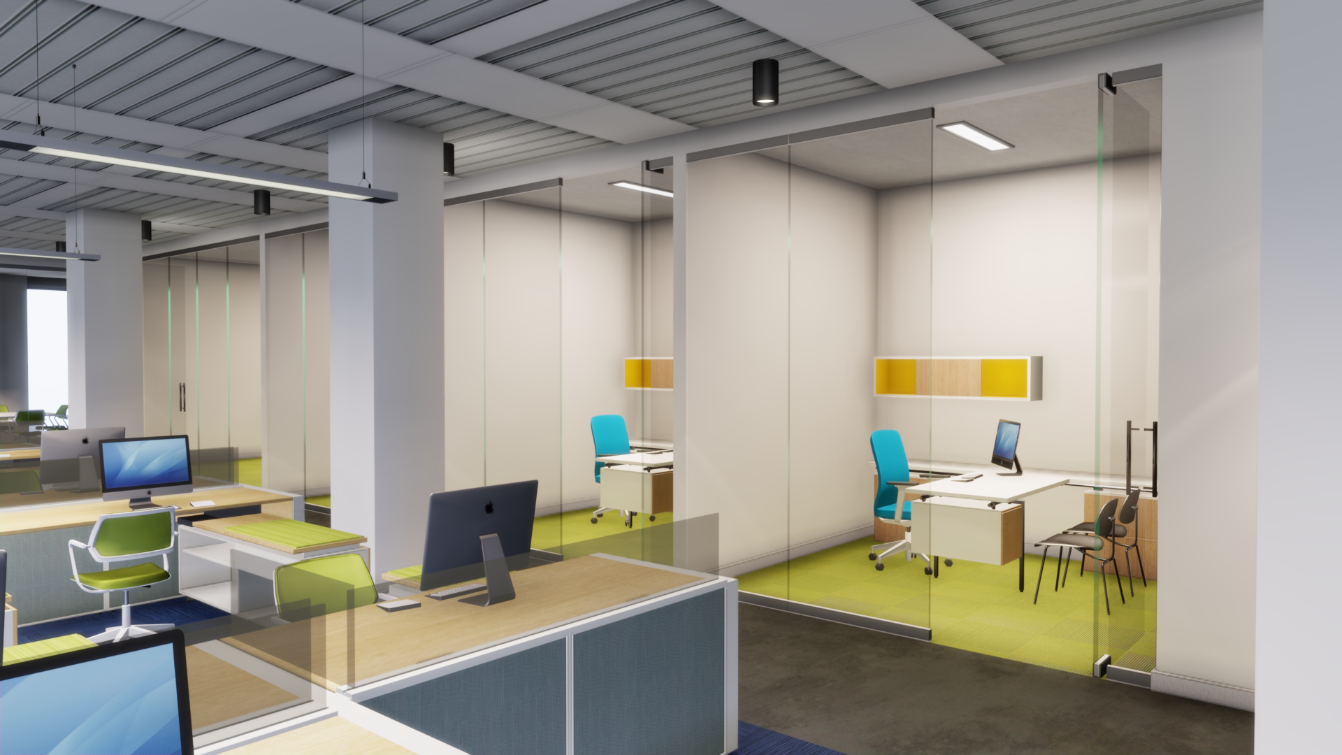
I think your lighting is nearly there! If you wanted to make it look more presentation-worthy, consider introducing more coloured lights. Looking at office photography on google, alot of it features a cool outdoor light flooding into the space. Retail photography is often done at twilight in order to push the contrast between the cool outdoor light and the warm indoor light, making things more visually interesting.
Something else you could look into are reflections on all your glass surfaces. Those would be especially useful since it would help sell ' modern chic office' Generally, your surfaces look very diffuse. Are you able to make use of local reflection volumes?
Finally, if its within your control ( and if things still aren't working out) you could try colouring one wall a saturated colour. Disneyland designed its scenery to look good even in flat overcast lighting by designing in large patches of local colour. You could try using the blue or lime green already in your scene.
If all else fails, you can use some beautiful photography as reference and just balance the lighting in your scene out to match. Best of luck!