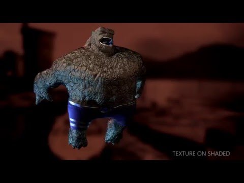
2016 Demo Reel
Hello,
I just finished up my demo reel. I'd like to get some feedback. I'm especially interested in my topology. I've been working on it quite a bit, but I think I need some more feedback. Thanks!!!!
 http://www.youtube.com/watch?v=adgIYm9P-Vc
I just finished up my demo reel. I'd like to get some feedback. I'm especially interested in my topology. I've been working on it quite a bit, but I think I need some more feedback. Thanks!!!!
 http://www.youtube.com/watch?v=adgIYm9P-Vc
Replies
I think its going a bit too fast to appreciate it.
Also I might reconsider those backgrounds, and the pedestal they're standing on.
Overall, to me, things are difficult to see.
I'm not really sure the benefit of looking at this versus your portfolio. I much preferred looking at your portfolio.
You might also consider putting the polycount in the shot, and maybe a still of the texture map. This seems kinda bare bones at the minute.
Hope this helps, partner.
1. Name eMail
2. Software used
...
Last. Contact
That just feels like a more flowing information pipeline.
What i am not crazy about, eventhough you clearly know what you are doing and you seem to be pretty good, is that it's all just kinda fanart, sadly no original character (i remember a video / post of an insane war machine (from Iron Man) ZBrush concept sculpt, in which the creator said, that he was adviced to tackle original stuff since fanart is not all that great for applications). Just something to keep in mind for the future.