The BRAWL² Tournament Challenge has been announced!
It starts May 12, and ends Oct 17. Let's see what you got!
https://polycount.com/discussion/237047/the-brawl²-tournament
It starts May 12, and ends Oct 17. Let's see what you got!
https://polycount.com/discussion/237047/the-brawl²-tournament
Speed Level Design Series
Hey everyone,
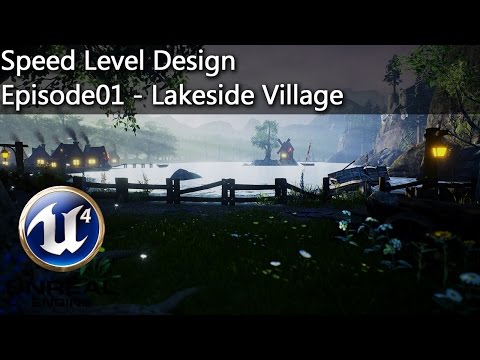
today I started my "Speed Level Design Series" on youtube, where I will be uploading weekly to learn and improve my skillset in that direction. I will update this Topic here weekly as well with the upcoming episodes
Here is a screenshot of today's result and the video:
Please leave me any feedback here or on the youtube comment section
I know the reflection on the lake is jerky, but I kinda simply forgot to fix it.
Episode01: Lakeside Village

 https://www.youtube.com/watch?v=j7AAW9Oy7Jk
today I started my "Speed Level Design Series" on youtube, where I will be uploading weekly to learn and improve my skillset in that direction. I will update this Topic here weekly as well with the upcoming episodes
Here is a screenshot of today's result and the video:
Please leave me any feedback here or on the youtube comment section
I know the reflection on the lake is jerky, but I kinda simply forgot to fix it.
Episode01: Lakeside Village

 https://www.youtube.com/watch?v=j7AAW9Oy7Jk
Replies
Here are some shots and the video
Screenshot:
Video:
Screenshot:
Video:
I am not very happy with it this time. My conditions were only to use the assets given from the infinity blade asset package. I am not certain what exactly it is I don't like about it, but there is something..
After all level design is a marathon not a sprint
I would recommend you register on mapcore if you want more feedback. Your thread here seems to get ignored for some reason.
The project and level I am currently working on is here:
http://polycount.com/discussion/171335/ripper-vr-unreal-4-vr-experience#latest
And thanks for the website, I will look into it right away
Anyone got some good critique on the lighting?
I am really satisfied with the outcome for this one as it pretty much evolved as I imagined it when I started the scene. tipps and critique always appreciated.
If you haven't actually made any of the art and are just placing most of this stuff, it's really hard for anyone to give you any feedback to be honest.
Same goes for you @Tidal Blast
I am aware that I am not making a new UT map from scratch. I am photobashing in unreal. It's like concept art. it's a speed level design and not a level design in the traditional fashion.
And as I mentioned in one of the videos. This whole videoseries is just a little project I do once a week alongside my main game project, where I do focus on "real" level design. I figured it's a nice thing to do in my spare time that wouldn't do any harm and would love to have some feedback rather than lectures what "level design" is. Thank you.
I would love to see these start shifting towards having more photoshop in the workflows. I kitbash all the time to get some interesting compositions and silhouettes I can take into photoshop and experiment on top of, or use later for mood/style reference based on what kind of scene I'm working on.
I would say my only critique is the lighting feels consistent within all the scenes. The sci-fi are all very dark and blue, whereas the majority outdoor scenes have a sunset/dusk setup(aside from the castle). It would be interesting to see some of these scenes have multiple different lighting setups to convey different moods.
New Video here:
https://youtu.be/WwfkMY_XRDU