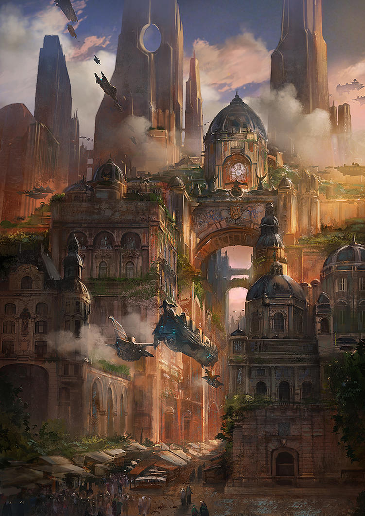
Hey guys! I've been working on a new scene for awhile now. It's a good ways along, but nowhere near done (textures, props, and lighting are not done). Thought I'd post to see what people think so far!
Hey Emma! So 3 things that stand out to me right now is that I'm not a huge fan of the angle that you're capturing this at, I think it's giving a bit of an odd perspective. The second thing is that the lighting is too even right now. The shadows aren't very dark and there isn't really much color difference from the front of the scene to the back. Try and think about color zones in your piece and maybe add some different color areas to help make the space feel larger and lead the viewer through it. The last thing is if that's your character scale, the grass you have is gigantic.
Hey Nick! Nice to see you on polycount, and thanks for the feedback! Perspective is fighting me hard in this scene. I think when I fill out the area behind the gate it will get a little better, but my foreground needs some more help too. I'll give it some more work on sunday after I get my first pass at market stalls in. So you say color zones, and that sounds really cool, but I confess to having no idea how to accomplish it. If I googled color zones Unreal could I find some great tutorials? Fixed the grass.
You'd go about the color zones with mostly just using point and spot lights with different colors throughout your scene. Also looking at it again, I think that your directional light is really not doing you much help. It's currently washing out all the buildings on the right side. I think you may want to try reworking the light angle, maybe try just moving it around in your scene and changing the intensity/color a bit to see what kinds of effects you can get. Also, do you have a sky light in your scene for bounce light? And do you have any reflection captures?
Point and spot lights are a good idea, I'll give those a shot tonight! I have a sky light for bounce and a reflection capture. Windows are a struggle though, I'm not sure the best way to approach them.
Did a lighting pass. Foliage in general isn't baking right, and I can't really diagnose the problem. The trees, in particular, are way darker than they should be, though the grass seems relatively fine.
What Nick has picked on about colour zones is very true, however I think one thing that's very important in this is the fog for a sense of distance, yours doesn't have much so everything seems quite flat towards the camera.. have you played around with your fog settings yet? I haven't played around with fog as much these days but I believe there's a setting that allows you to see the fog at a distance in the air... if you play with those settings it will make your background buildings look much higher / further away.
Just a suggestion
As for the aesthetic of this, I'd say the concept has more of a Victorian street feel to the ground level of the street as yours is coming to me as a little more Fable 2/Medieval with all the grass and brown concrete... I would imagine the street to be a little more like this... (Couldn't paste the image link here sorry haha)
or this...
Generally a little more brick road/pavementish
I hope these help you develop this a little more... these reference images are just to give you a feel of what I believe the ground level should feel like... I could be wrong, people may not agree so I mean by all means discard critique at will haha.
Hey I think that the really square building just to the right of the center could use something to break up the silhouette of the top, because right now I can't stop looking at the giant cube. You were probably planning on adding more cool stuff back there anyway though
Replies
So 3 things that stand out to me right now is that I'm not a huge fan of the angle that you're capturing this at, I think it's giving a bit of an odd perspective. The second thing is that the lighting is too even right now. The shadows aren't very dark and there isn't really much color difference from the front of the scene to the back. Try and think about color zones in your piece and maybe add some different color areas to help make the space feel larger and lead the viewer through it. The last thing is if that's your character scale, the grass you have is gigantic.
Nice to see you on polycount, and thanks for the feedback!
Perspective is fighting me hard in this scene. I think when I fill out the area behind the gate it will get a little better, but my foreground needs some more help too. I'll give it some more work on sunday after I get my first pass at market stalls in.
So you say color zones, and that sounds really cool, but I confess to having no idea how to accomplish it. If I googled color zones Unreal could I find some great tutorials?
Fixed the grass.
Preview Lighting:
Lighting baked (trees darker) :
Just a suggestion
As for the aesthetic of this, I'd say the concept has more of a Victorian street feel to the ground level of the street as yours is coming to me as a little more Fable 2/Medieval with all the grass and brown concrete... I would imagine the street to be a little more like this... (Couldn't paste the image link here sorry haha)
or this...
Generally a little more brick road/pavementish
I hope these help you develop this a little more... these reference images are just to give you a feel of what I believe the ground level should feel like... I could be wrong, people may not agree so I mean by all means discard critique at will haha.
Keep going! this has loads of potential right now
I think that the really square building just to the right of the center could use something to break up the silhouette of the top, because right now I can't stop looking at the giant cube. You were probably planning on adding more cool stuff back there anyway though
looks super good right now!
Can't wait to see where you take it!