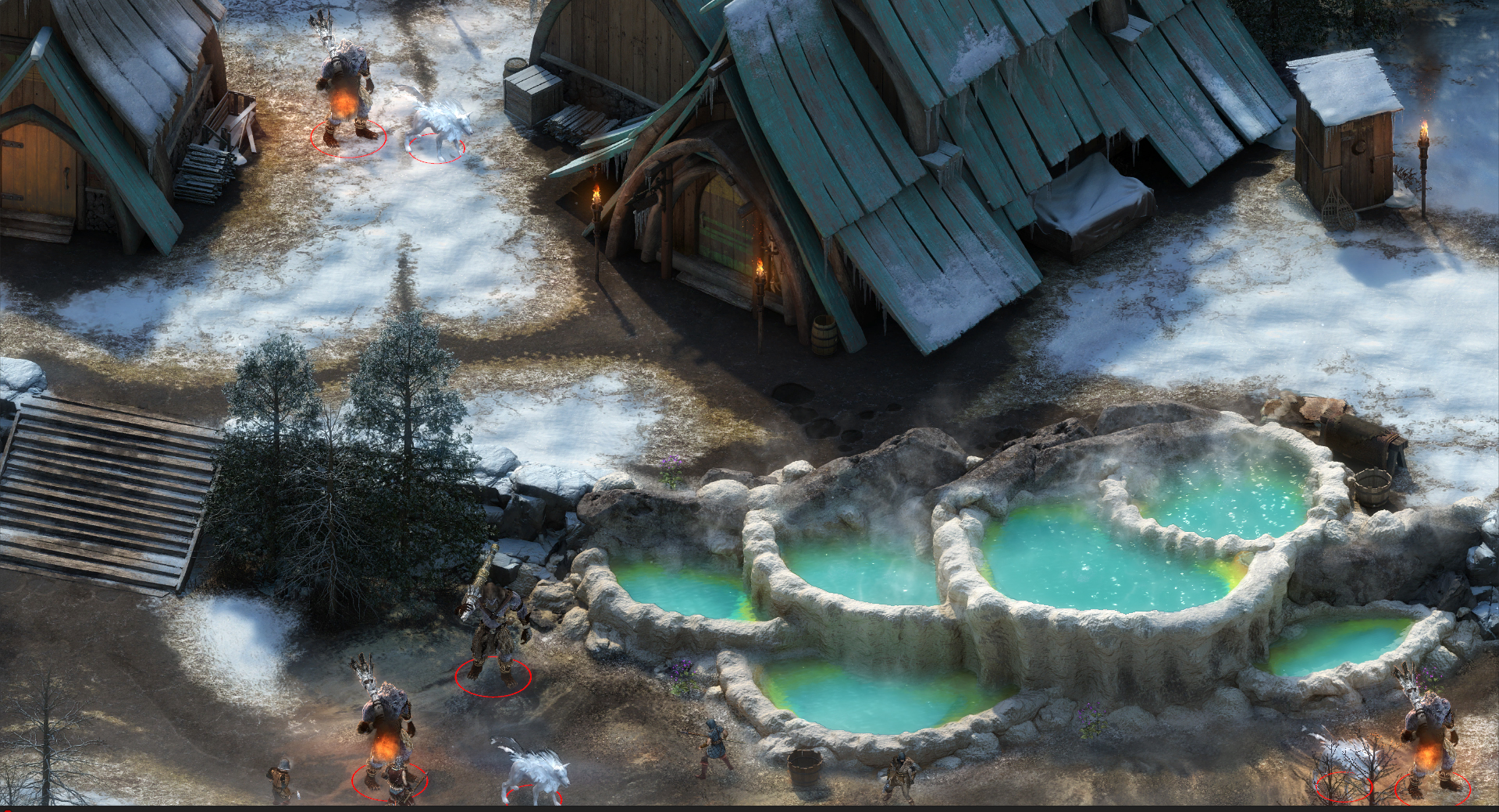
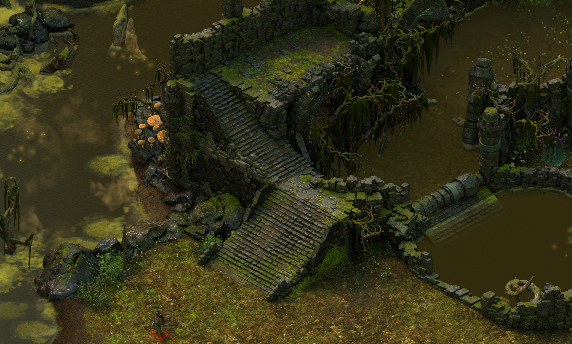
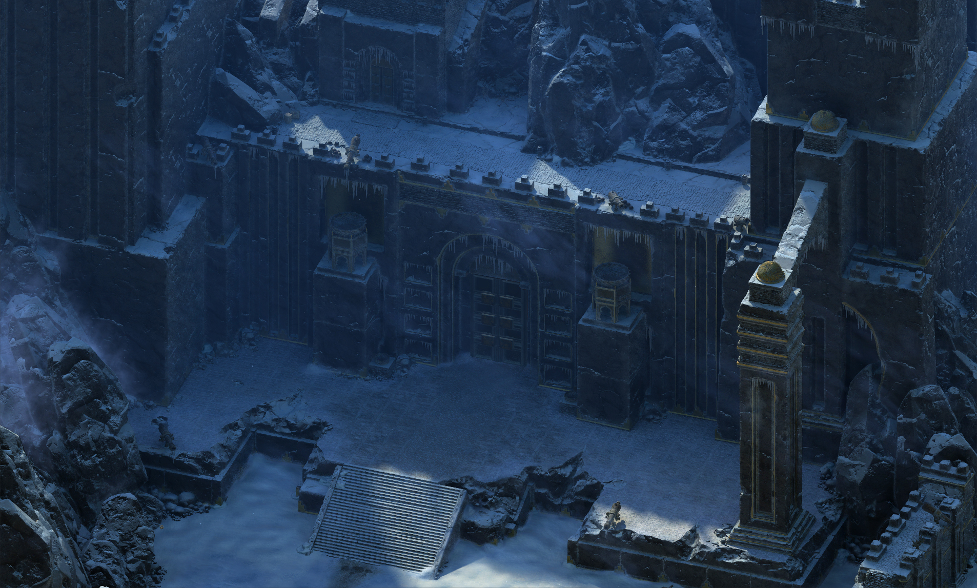
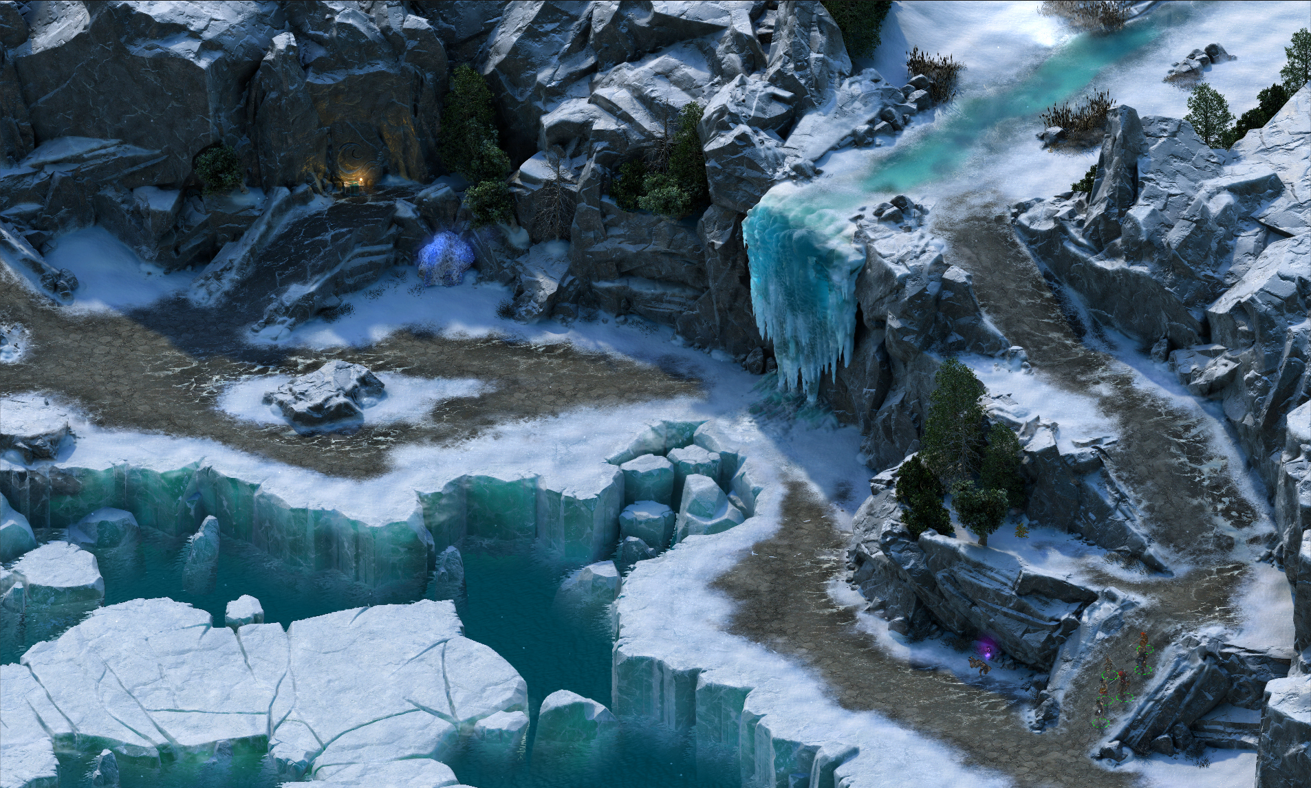
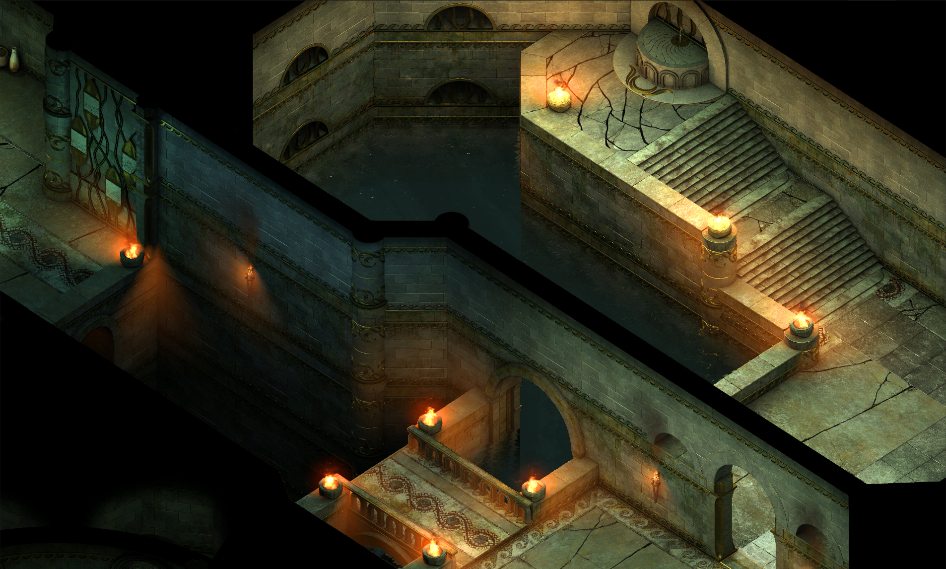
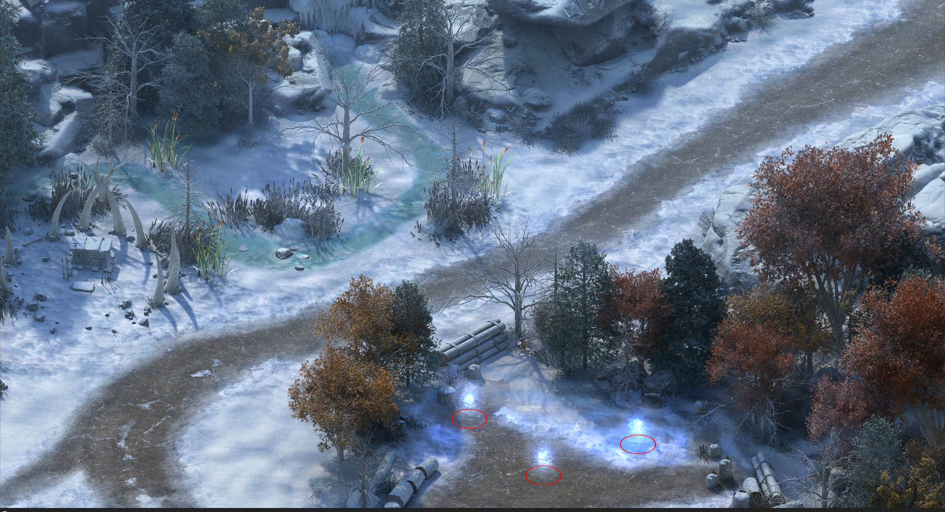
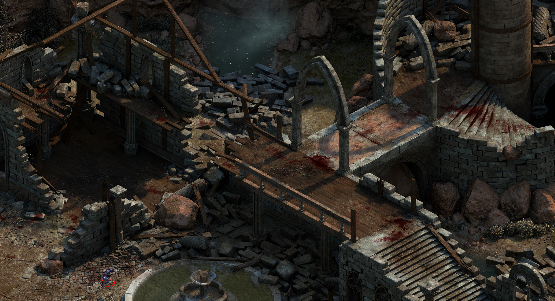
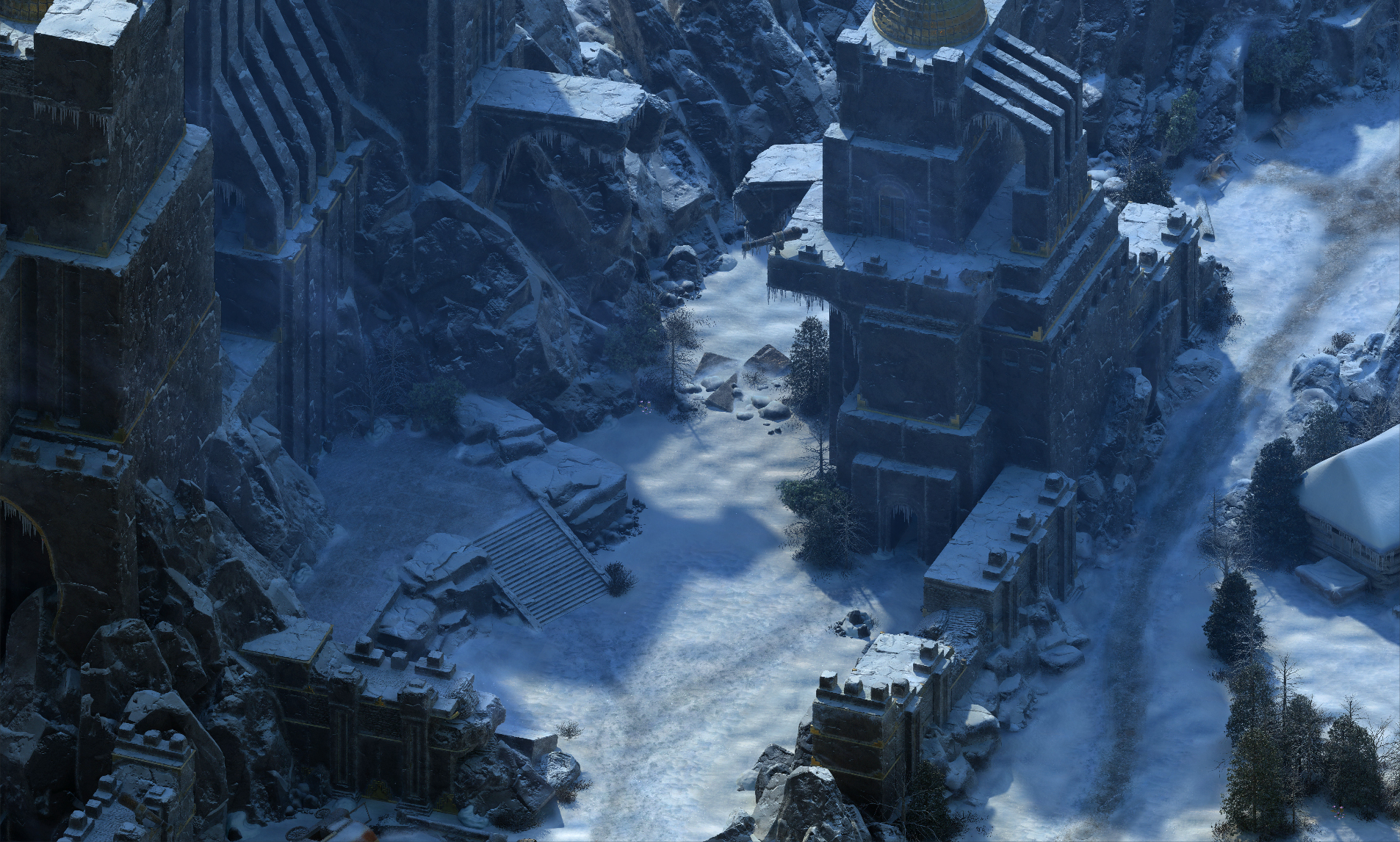
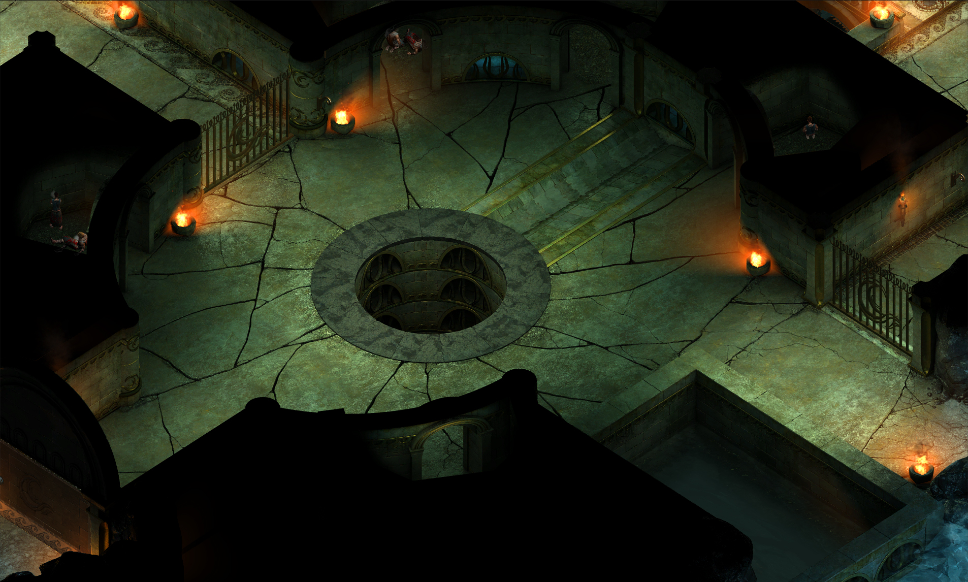
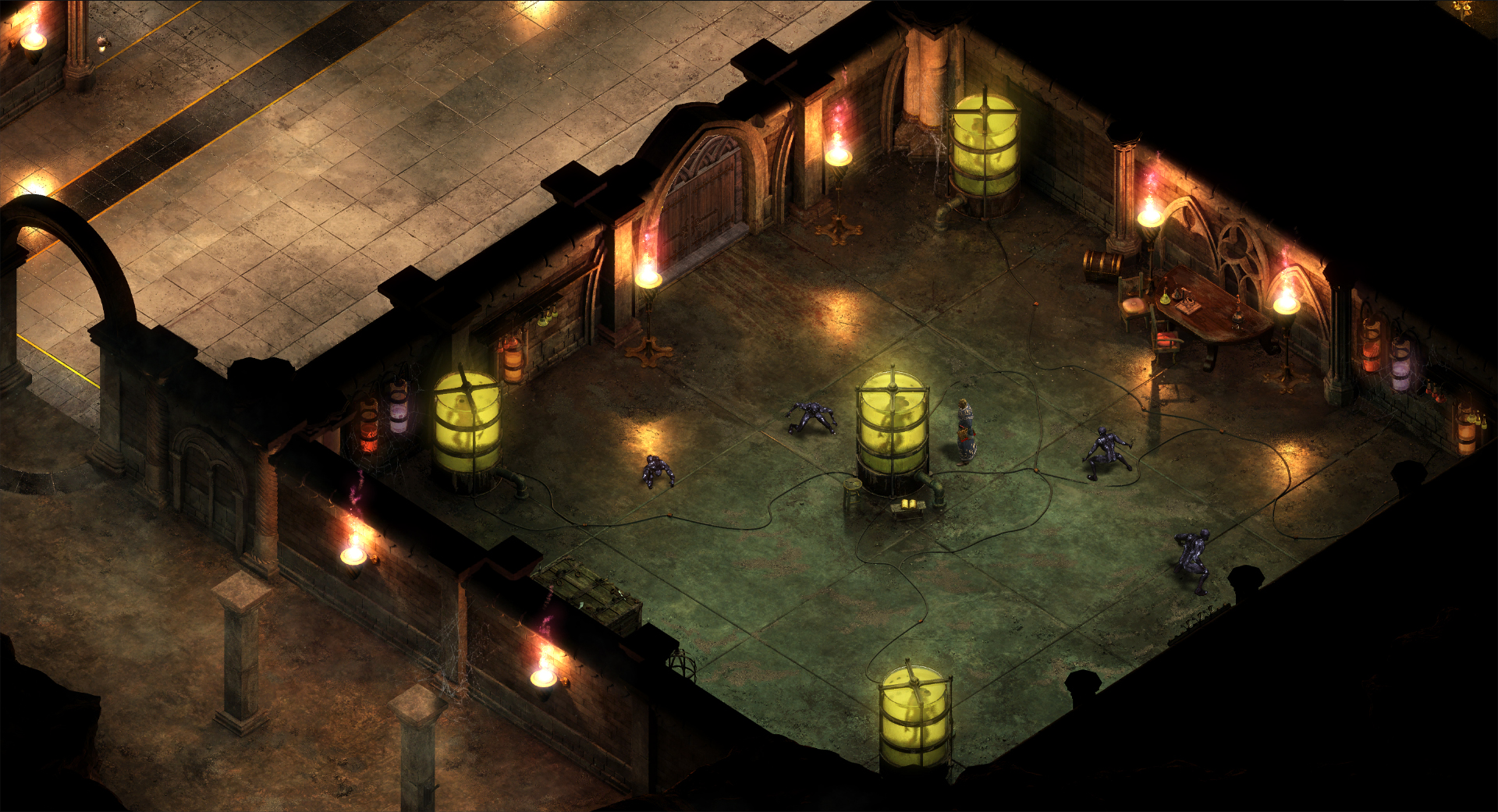
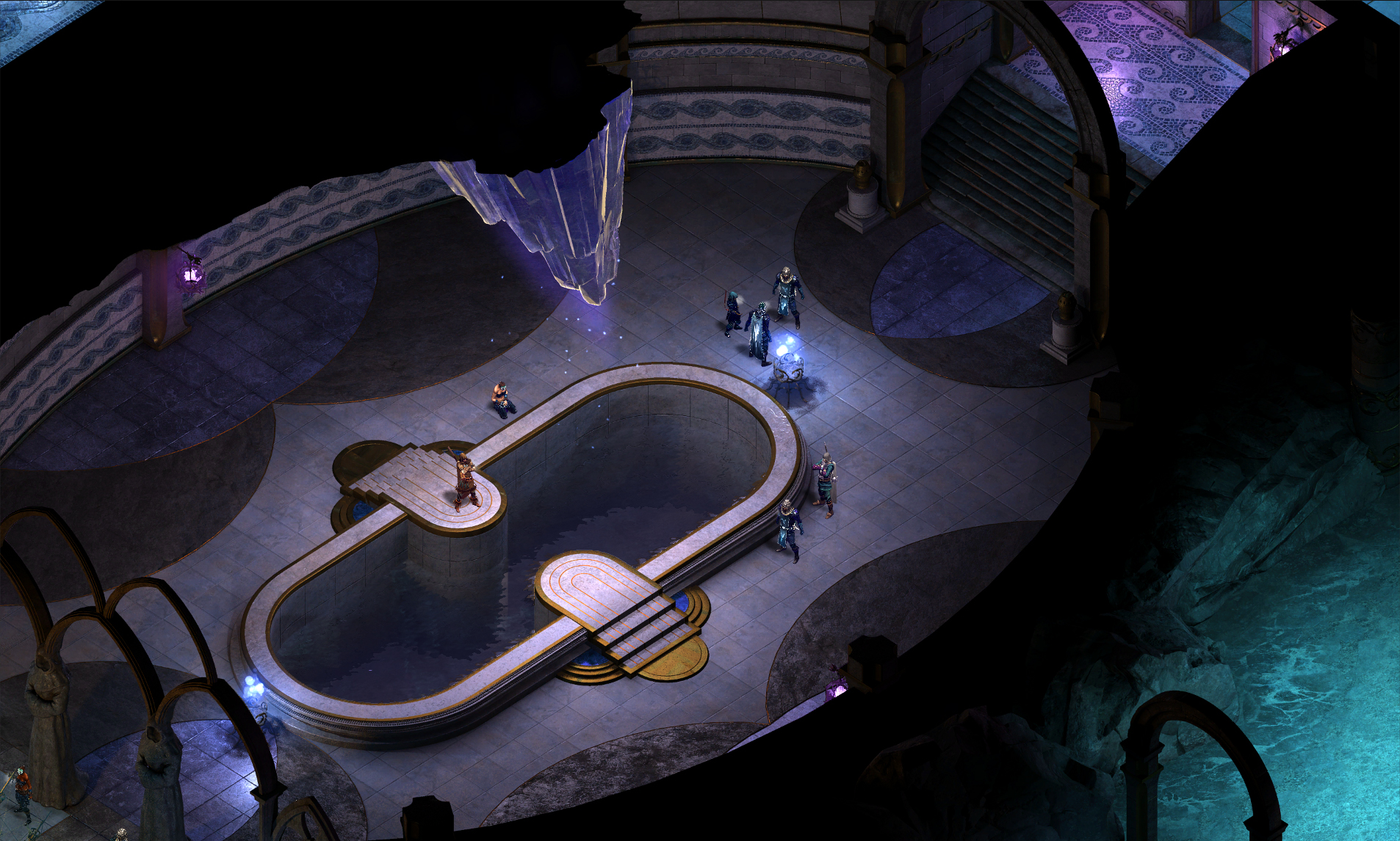
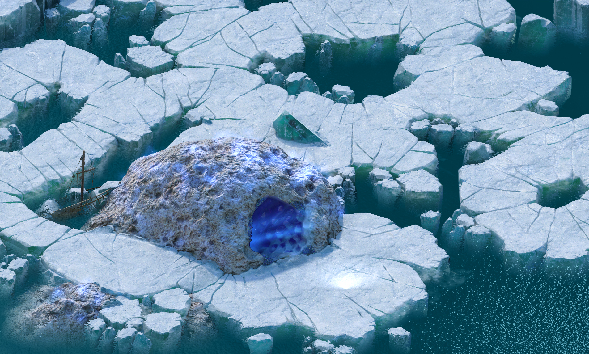
Hey all. I'm Sean Dunny and recently I've worked as the lead environment artist on the two expansions for Pillars of Eternity, the White March Parts 1 and 2. With the second part having just been released on February 16th, here are a few of the scenes I've made for the game. All of these are pre-rendered in Maya using Mental Ray and some have had some additional paintover work by myself or our lead artist/concept artist, Kaz Aruga. Hope you guys enjoy!
Thanks! I don't have any wires on me at the moment. I could look into grabbing some screens, but I'm not sure how useful they'd be. A lot of them would just be incomprehensible.
We were under pretty short timeframes for these scenes; we rarely had more than a week. The workflow that tended to work best was often to throw something in zBrush for 30 minutes or so, decimate it to a reasonable polycount, and then toss a tiling texture on it. An example is the skeleton in the first image. I think the skull is somewhere around 100k triangles and then I just blended an ice texture and an oxidized bronze (although that piece had a fair bit more time in zBrush than just half an hour). There wasn't a lot of time to put things into a 'proper' workflow. I spent a lot of time making materials that would hold up well at our camera angle and distance. Things like a refractive ice shader or a material that projects snow on the top faces of surfaces came in really handy. One of the nice things about this being pre-rendered was that I could often just throw polygons at it until I got a result that had the requisite level of detail and then just let material definition take care of the rest. Going back to that first image, the walls of the abbey are all brick meshes. They show off the snow shader well and it's easy to take a few out to make room for additional geometry (windows, doors, whatever). Since we only ever see one camera angle, we can just bash together pieces that are hidden from view. We do use some more modular approaches in places, notably interiors. This only gets us so far though because the designers tend to do things... unconventionally and with little regard to standard sizes in their layouts. I end up making some kind of pillar or edge piece for each tileset that I make just so I'm covered in case of weird designer shenanigans and hide any unfortunate seams. Each scene tends to be made using wildly different techniques so if you have any specific questions I'd be happy to answer them.
Hi, I would like to say that all locations are wonderful and - as a big fan of Baldur's Gate saga - I really like them Due to the lack of time I've played only the main game but I hope that in near future I will be able to try both "The White March" parts also.
I have one question about locations. As I understood you have no polycount limit on your models 'cause all scenes were prerendered in Maya, am I right? So your goal was to make everything as good in quality as you can and didn't you have to be strict with a polycount and wireframes?
Ps. And one more questions - about interiors/dungeons. How did you make lightning in those scenes? Are there any main ambient light placed?
Those are great Loved the game although I didn't went that far in the story !
My only criticism would be the lack of animations on the background. Even just a couple of moving grass blades and moving trees would have been great but I get that it would have been hard to implement !
@Araiel Thank you. Yeah, you're correct. So, we didn't have any real hard poly limits, but we did have to work within the limitations of our own machines. It wasn't until relatively recently that we had a distributed rendering system up and running, so render times were a concern. There were times where it became a bottleneck in the process because we just couldn't get our renders out fast enough. Poly count didn't have a super huge impact in comparison to things like lighting and reflection, but it was definitely something to keep in mind. We also had to work with lots of layers because with large scenes we would get significant viewport lag. The big dwarven fortress scene in the first expansion clocked in at around 200 million triangles before its revision pass (which added a fair bit of geometry in addition to what was there). We have to keep things in layers and hide and unhide as we go otherwise it's just impossible to work in the scenes. That aside, yes, we weren't overly concerned with poly count or texture resolution and given our timeframe, even if we had wanted to make things 'efficient' we wouldn't have been able to fit it in the schedule. As for interior areas, in the base game our lead environment artist, Hector Espinoza, came up with a method of lighting where we would just use non-rendering planes with emissive materials. These were actually much faster to render than real Maya lights. They don't cast shadows though, so we can't really use them for key lighting, at least not by themselves. We would use them as ambient lights in an area or to achieve lighting effects that wouldn't actually happen in real life. An example of that is that we would make a horseshoe shaped light plane around doorways to give them a highlight and make them stand out from the room behind them. We used these in conjunction with point lights for interiors.
@Cremuss Thanks. I agree, we have to rely heavily on effects to add life into the scenes. We actually looked into moving foliage at the beginning, but time and tech constraints prevented us from doing so. In future projects though it is a priority for us to get more moving assets into our scenes and work more on improving what we've developed for Pillars.
Awesome work! But I have a question. Since the environments are prerendered, how do you make it so that characters can move behind walls or buildings? Asking this assuming that the characters move on top of a prerendered image. Please correct me if I am totally off base.
Beautiful work, I still remember backing the project when it popped out on Kickstarter years back and you've really channeled the look of old Infinity Engine games. Really great to hear about your workflow, although I'm shocked by how short your deadlines were.
I've yet to finish the game, but now that both expansion packs are out, I finally have to give it another go
@Knoor Thanks. We render out a number of passes with our master beauty shot including a world position pass. We use these passes to properly occlude characters and even allow us to have moving dynamic lights affecting the pre-rendered background.
@teaandcigarettes Thank you! Yeah, it was kind of a crazy schedule. Fortunately as we went we built up a large library that we could use to speed things up. We also got good at learning where you can cut corners.
@indik Thanks! We appreciate comments like that. Keeping the soul of the IE games was a big goal for us and it's always nice to hear when people feel we hit it
Hi, really nice enviroments you guys made! I don´t know if you are able to provide some information of how the rendering and sorting of the 2D elements work. I was looking at some dev videos of how the levels look in 3d (background plane and perspective projected geometry) and its still not clear for me hoe you guys manage the seperation of foreground and dynamic stuff. Also - do you render shadow in the "big" renderings or is this also part of the z-path rendering of the engine? Thank you
@Christian Nordgren Thanks! I spent a lot of time figuring out that ice shader, and I'm glad it had an impact
@Digitalwerk Thanks. So, everything dynamic is an actual 3d mesh in Unity, the characters, effects, doors, etc. The background plane with the rendered image is just sitting behind them and their materials are set up to respect the world position map that we rendered out. This way the engine knows where every pixel is in that background image relative to everything in the scene and sorts them accordingly. All of it is just programming witchcraft combined with our render passes. We render shadows in the static passes, but dynamic objects cast their own shadows as well. We have directional lights in the scene mimicking the angle of the sunlight or (in interiors) set to something more neutral that lights the characters well. The shadows obey the same world position data that all the dynamic objects do.
Really awesome job on this. Bauldur's gate and the Icewindale series are among my favorite games and this one really gave me that fix i was looking for. You guys did such a great job bring back the nostalgia.
@Tomiajayi Yeah, I'm definitely familiar with Ultima. We mostly looked at Baldur's Gate and Icewind Dale as references, but the similarities with UO are absolutely noticeable. Thank you!
Replies
We were under pretty short timeframes for these scenes; we rarely had more than a week.
The workflow that tended to work best was often to throw something in zBrush for 30 minutes or so, decimate it to a reasonable polycount, and then toss a tiling texture on it. An example is the skeleton in the first image. I think the skull is somewhere around 100k triangles and then I just blended an ice texture and an oxidized bronze (although that piece had a fair bit more time in zBrush than just half an hour). There wasn't a lot of time to put things into a 'proper' workflow. I spent a lot of time making materials that would hold up well at our camera angle and distance. Things like a refractive ice shader or a material that projects snow on the top faces of surfaces came in really handy.
One of the nice things about this being pre-rendered was that I could often just throw polygons at it until I got a result that had the requisite level of detail and then just let material definition take care of the rest. Going back to that first image, the walls of the abbey are all brick meshes. They show off the snow shader well and it's easy to take a few out to make room for additional geometry (windows, doors, whatever). Since we only ever see one camera angle, we can just bash together pieces that are hidden from view.
We do use some more modular approaches in places, notably interiors. This only gets us so far though because the designers tend to do things... unconventionally and with little regard to standard sizes in their layouts. I end up making some kind of pillar or edge piece for each tileset that I make just so I'm covered in case of weird designer shenanigans and hide any unfortunate seams.
Each scene tends to be made using wildly different techniques so if you have any specific questions I'd be happy to answer them.
I have one question about locations. As I understood you have no polycount limit on your models 'cause all scenes were prerendered in Maya, am I right? So your goal was to make everything as good in quality as you can and didn't you have to be strict with a polycount and wireframes?
Ps. And one more questions - about interiors/dungeons. How did you make lightning in those scenes? Are there any main ambient light placed?
Loved the game although I didn't went that far in the story !
My only criticism would be the lack of animations on the background. Even just a couple of moving grass blades and moving trees would have been great but I get that it would have been hard to implement !
Thank you. Yeah, you're correct. So, we didn't have any real hard poly limits, but we did have to work within the limitations of our own machines. It wasn't until relatively recently that we had a distributed rendering system up and running, so render times were a concern. There were times where it became a bottleneck in the process because we just couldn't get our renders out fast enough. Poly count didn't have a super huge impact in comparison to things like lighting and reflection, but it was definitely something to keep in mind. We also had to work with lots of layers because with large scenes we would get significant viewport lag. The big dwarven fortress scene in the first expansion clocked in at around 200 million triangles before its revision pass (which added a fair bit of geometry in addition to what was there). We have to keep things in layers and hide and unhide as we go otherwise it's just impossible to work in the scenes. That aside, yes, we weren't overly concerned with poly count or texture resolution and given our timeframe, even if we had wanted to make things 'efficient' we wouldn't have been able to fit it in the schedule.
As for interior areas, in the base game our lead environment artist, Hector Espinoza, came up with a method of lighting where we would just use non-rendering planes with emissive materials. These were actually much faster to render than real Maya lights. They don't cast shadows though, so we can't really use them for key lighting, at least not by themselves. We would use them as ambient lights in an area or to achieve lighting effects that wouldn't actually happen in real life. An example of that is that we would make a horseshoe shaped light plane around doorways to give them a highlight and make them stand out from the room behind them. We used these in conjunction with point lights for interiors.
@Cremuss
Thanks. I agree, we have to rely heavily on effects to add life into the scenes. We actually looked into moving foliage at the beginning, but time and tech constraints prevented us from doing so. In future projects though it is a priority for us to get more moving assets into our scenes and work more on improving what we've developed for Pillars.
@KatieJ
Thank you!
I've yet to finish the game, but now that both expansion packs are out, I finally have to give it another go
@teaandcigarettes Thank you! Yeah, it was kind of a crazy schedule. Fortunately as we went we built up a large library that we could use to speed things up. We also got good at learning where you can cut corners.
@peanut Thank you.
@indik Thanks! We appreciate comments like that. Keeping the soul of the IE games was a big goal for us and it's always nice to hear when people feel we hit it
The ice looks really cold blue and has a mesmerizing effect
great work!
I don´t know if you are able to provide some information of how the rendering and sorting of the 2D elements work. I was looking at some dev videos of how the levels look in 3d (background plane and perspective projected geometry) and its still not clear for me hoe you guys manage the seperation of foreground and dynamic stuff. Also - do you render shadow in the "big" renderings or is this also part of the z-path rendering of the engine? Thank you
@Christian Nordgren Thanks! I spent a lot of time figuring out that ice shader, and I'm glad it had an impact
@Digitalwerk Thanks. So, everything dynamic is an actual 3d mesh in Unity, the characters, effects, doors, etc. The background plane with the rendered image is just sitting behind them and their materials are set up to respect the world position map that we rendered out. This way the engine knows where every pixel is in that background image relative to everything in the scene and sorts them accordingly. All of it is just programming witchcraft combined with our render passes.
We render shadows in the static passes, but dynamic objects cast their own shadows as well. We have directional lights in the scene mimicking the angle of the sunlight or (in interiors) set to something more neutral that lights the characters well. The shadows obey the same world position data that all the dynamic objects do.
@Minos Thank you!
@beccatherose Thank you very much!